Blog

  • My Story: A Chance for Senior Citizens to Connect on the Internet Comfortably

    Overview

    My Story is a website designed specifically for senior citizens to create and share stories on. These days the world is more connected than it’s ever been, but often times as designers we don’t take into consideration the challenges the elderly face when dealing with technology. Our goal with My Story was to create a platform that anyone could use no matter their age or tech capability. Of course we acknowledge that in order to create a successful product, you must have a specific audience to target, but we figured if at the very least we could get seniors to understand the flows, than anyone could. Part of our success in doing this was our focus on creating skeuomorphic elements that users could easily identify with, like the ‘Bookshelf’ or the ‘Story Viewer’. By incorporating skeuomorphism and applying our research in design for the elderly we were able to create a site that users could sign up for and share stories from.

    The Team

    • Corey Hensley, Front-end Developer, WordPress Developer, UI Designer
    • Phoebe Bostwick, Back-end Developer, PHP/JS Developer, Front-end Developer
    • Seamus Donaldson, UX Designer, Front-end Developer, UI Designer

    Context and Challenge

    Background

    My Story was one of many ideas pitched at the beginning of our junior year’s workshop class. Everyone was tasked with coming up with an idea for a website or an application that a team could develop in six months, and My Story was one of the ideas selected. After voting and choosing who would do what, My Story ended up with three members, each with a set of skills and strong suits.

    The Problem

    Seniors are often overlooked as users of technology because a majority of the world has written them off as people who either have no business using technology or simply don’t believe that they’re equipped to understand it. Therefore their needs don’t get taken into consideration. While it is true that there are seniors out there that have no interest in joining the world online, it is still our job as designers and problem solvers to create user friendly solutions for everyone, not just the people who know it best.

    So it was our mission to create something that could be easily understood by those who are not as familiar with the inner workings of technology.

    Project Goals and Objectives

    From the very start we knew this would be an iterative, intensive process; if we were going to be designing for an audience that we personally had never addressed, we needed to understand how they thought, and the best way to do that was by actually meeting with them. Thus it was crucial that early on we made a connection with a senior center where we could go and do consistent usability testing.

    Phase One: Research

    It was clear from the start that whatever we designed needed to be backed up with thorough research and testing. What this meant for the team was that we needed to really dive in and understand technology from a seniors point of view. Since we didn’t have easy access to our target audience, we had to get creative when it came to gathering our research, so we tackled it in a few different ways.

    Survey & Interviews

    The first thing we needed was a proof of concept…would people actually use this? What would people use it for? Why would they want to use it? How often would they use it? What other sites do they use? What would they be willing to share?

    To answer these questions we needed a survey that we could send out to the masses, so we turned to our favorite free survey tool: Survey Monkey. Using the questions above we were able to gather over 60 responses, and as a result we found that there is a demand for My Story and people reported they’d use it.

    Competitive Analysis

    Since there were already successful sites out there with similar concepts to My Story, we decided to do a competitive analysis to figure out what features we wanted on our site, and what features we could do without.
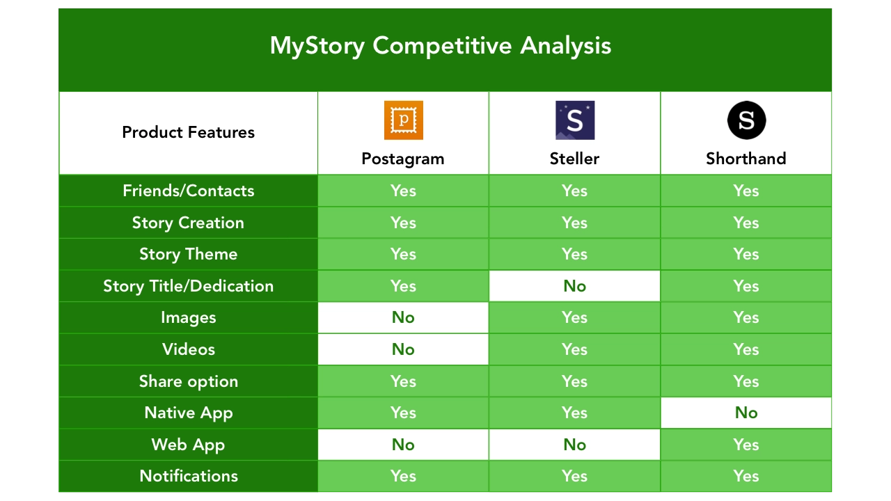
    Chart comparing websites similar to My Story's concept.

    Design for the elderly

    Before we could jump into any kind of design we needed to understand the challenges seniors face when it comes to interpreting content displayed on a web page, so a lot of our research was focused around text legibility and color contrast.

    • Icons should be simple, concrete symbols that look like the objects they represent and should be easily distinguished from others.
    • Buttons should have a minimum height of 40px and should include a label as well as an icon associated with the function of the button.
    • Fonts must be no less than 16pt and sans serif should be used for all text exceeding one sentence.
    • Colors should be high contrast as to distinguish background from the content within.

    Phase Two: Strategy

    Personas

    Once we had a solid understanding of how to design for seniors, and what exactly we wanted to include on our site in terms of features, we needed to come up with a few user personas that we could refer to as we began creating the site.

    Target audience (60+ age range) & Secondary audience (40-60 age range)
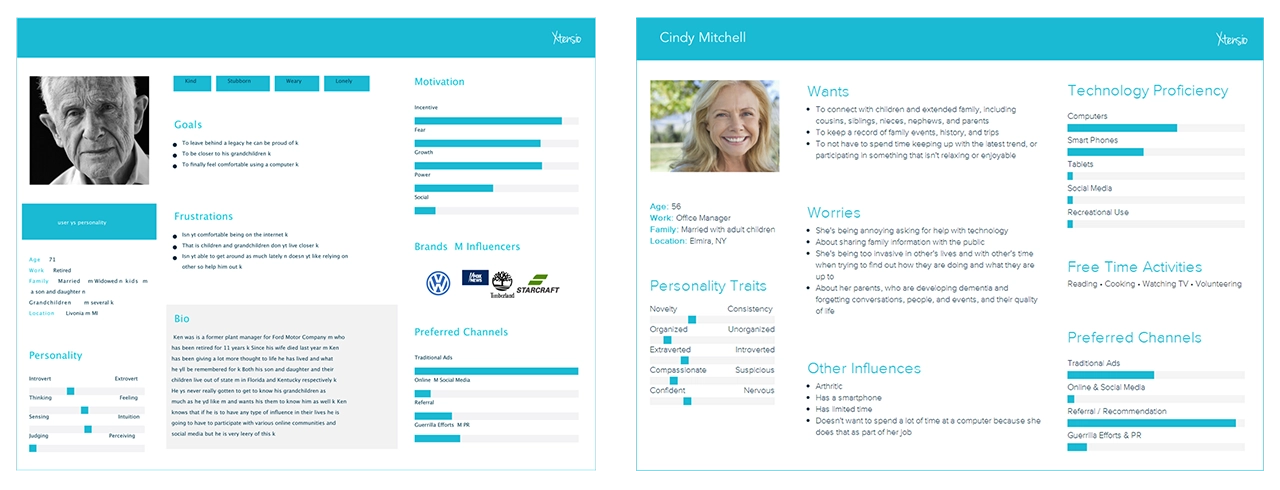
    User personas representing what type of users My Story is created for.

    User Flow

    After defining the functionality of our site, and the different pages we wanted to include, we created a site map in order to understand how users would navigate from page to page. This came in handy as it gave us an overview of how the site would work, and where users could go depending on where they were on the site. Our goal was to make every single page accessible with three clicks or less, and the sitemap helped us visualize what that would look like.
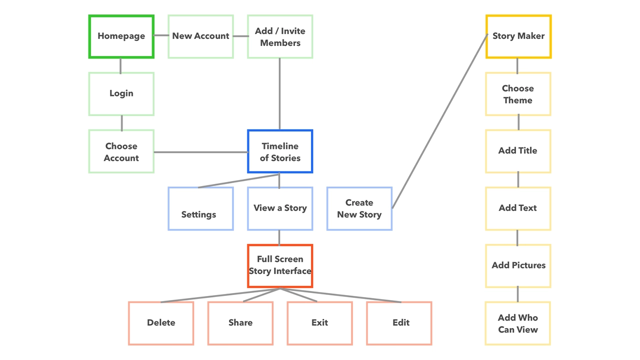
    Map of how the site works, visualizing where each page leads.

    Phase three: Design

    Sketches

    Before we could start designing our interface on the computer we needed to brainstorm all the possible ways we wanted to display the content. Using pencil and paper, we were able to come up with many different concepts that we could quickly cover.

    Tools

    All sketches were done with good old fashion pencil and paper.
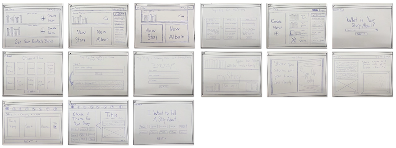
    Interface sketches for My Story.

    Low-Fidelity

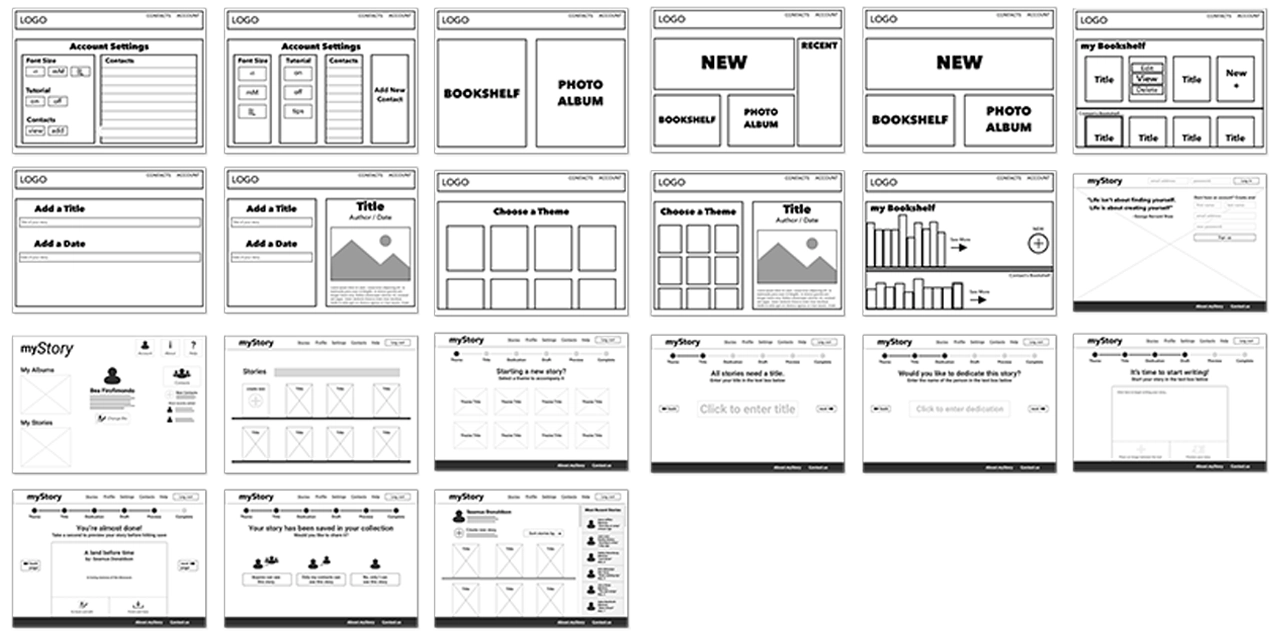
    Now that we had a solid foundation for the design of the site, we jumped into sketch and began wireframing.

    Tools

    Low fidelity screens were created in Sketch and Adobe Illustrator.

    Tools used to make the low-fidelity prototype, including Sketch and Adobe Illustrator.

    Low-fidelity prototype of My Story website.

    Mid-Fidelity

    After showing our class the progress we had made with the wireframes, we got feedback and decided on a layout that we could then refine and begin to stylize. Using the research we had done on fonts, we decided on ‘Cabin’ as our main font, and used it across the site with varying weights. We also brought in images and reworked the UI based on the feedback we got during critique.

    Tools

    All mid-fidelity screens were created in Sketch, then copied and pasted into Adobe Experience Design. Using XD we were able to create a flow connected by premade slide transitions. This wasn’t used for testing because it was too low-fidelity. We put it together so that we could better understand the flow of our story creation process.

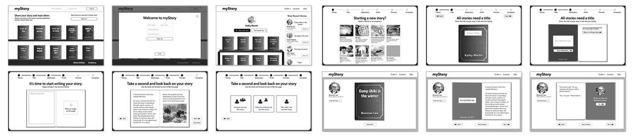
    Tools used to make the mid-fidelity prototype, including Sketch and Adobe Experience Design.

    Mid-fidelity prototype of My Story website.

    High-Fidelity

    At this point we had all the screens designed and were ready to implement colors and images across the site.

    Tools

    All high fidelity screens used in the prototype were exported from Sketch using the Flinto plugin. We were then able to manipulate the elements in Flinto to create links between pages using custom animations.

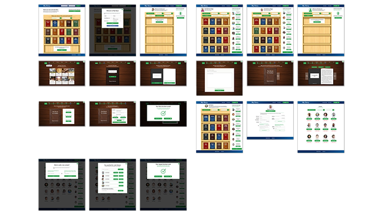
    Tools used to make the high-fidelity prototype, including Sketch and Flinto.

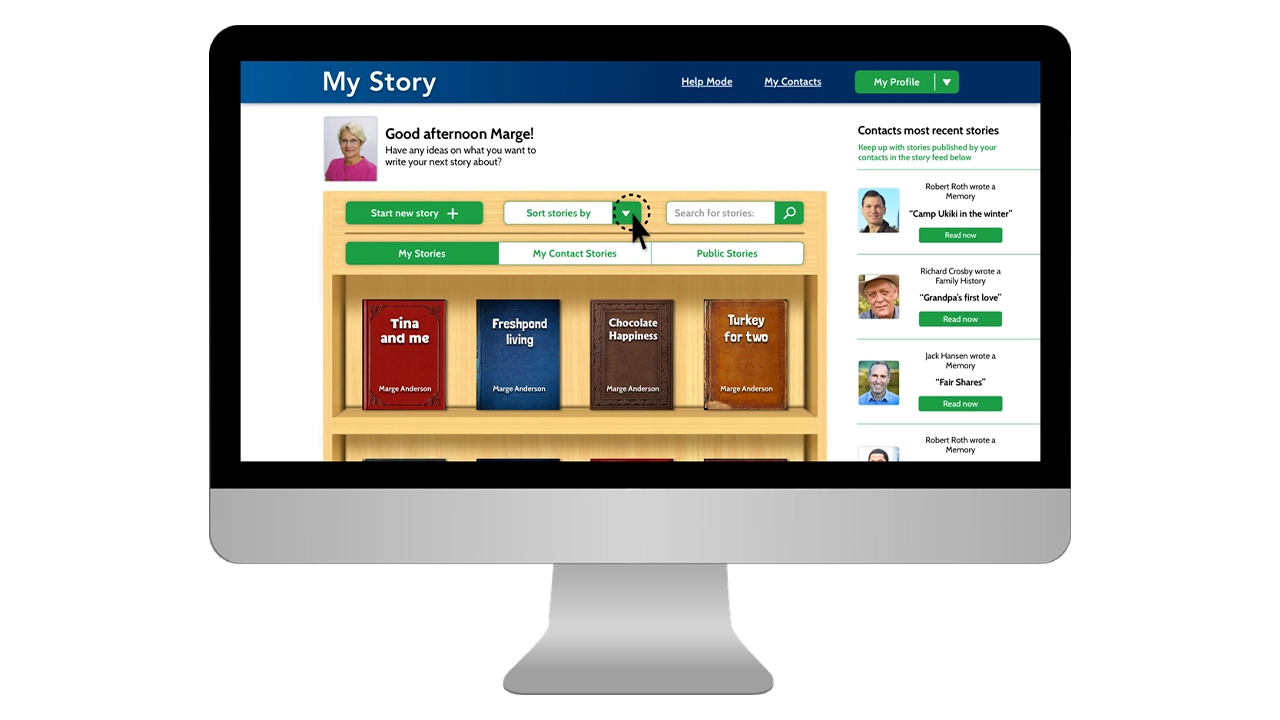
    High-fidelity prototype of My Story website.

    Final prototype of My Story on a screen.

    Usability testing – Prototype

    For two weeks we performed usability testing with both the primary and the secondary audiences. Each of us showed off the prototype, and explained to testers before they started what the site was about, and what the main features were. We also explained that they were testing with a prototype and some things may not be perfect. After we did our introduction we let them click through while asking them to complete certain tasks. Throughout testing we took notes, which we then reflected on as a team when we got back together.

    • Pop-up screens on dark overlays were confusing and disengaged users
    • Contact feed was distracting and was unnecessary
    • UI elements on the story creation page needed to be clearer and less distracting
    • Progress bar needed to be more distinguishable

    Phase Four: Development

    Initial Challenges

    At first we were a little bit worried about accomplishing all the things we wanted our site to do, in code. For a three person team, it seemed like a lot and with only three months left we knew we had to hit development hard. What we had promised for the final was a website that a users could create an account on, add contacts, share stories, and customize stories by theme. Not to mention the challenges we would have creating all of our elements with skeuomorphic styles… we had a lot to tackle but tackle it we did.

    Development Research

    The first thing we did was a ton of research. Because none of us had ever created a website with such a laundry list of features, we were for the most part going in blind. Quickly we realized that WordPress would be the most sensible place to start because it was built for content management and our site had a lot of it. We also decided that we would start with the ‘twenty sixteen child’ theme because it was already organized and had page templates for things we would need to eventually build ourselves.

    We then turned to the Ultimate Member plugin which seemed to solve all of our problems when it came to accounts and friends, but it also came with a set of challenges that sometimes slowed development. Without Ultimate Member we would have had to create a database from scratch that could store account info, request friends, and save stories. That said, Ultimate Member is also an extremely robust plugin so in order to target certain elements in PHP or CSS it took some digging.

    The other challenge was creating a custom animation that would naturally resemble a page flipping in a book. Luckily we found a script in a jQuery library called booklet, and just brought it into our code and customized it to fit our needs.

    Execution

    With all the research that we had done, we had a pretty good idea how to accomplish our goals so week after week, we just knocked items off our needs and wants list until we were down to our wants. The site was initially set up using a WordPress child theme called ‘Twenty Sixteen’. This gave us a solid foundation to start on. From there we began styling the home page. Since we wanted to create a minimum viable product as soon as possible for testing, we started with the skeuomorphic bookshelf on the home page. We used mix-it-up and a grid system to create the books and brought our bookshelf in as a background that could be populated.

    Our next step was implementing Ultimate Member. We started by getting account sign up working, and then moved on to adding friends. This was the easy part. The true challenge was how we were going to store the data specific to those accounts, and how we would be able to create share options based on the decisions users make.

    The next step was creating a taxonomy for our theme,s which would bring in a book cover style as well as a unique title text. We did this by pulling the category data and assigning a corresponding class, which would then display selected theme styles.

    Usability testing – Live site

    Once we had reached a point in development where our live site had the core functionalities of creating accounts, posting stories, and viewing stories, we decided to begin testing. The reason we chose to use the live site instead of the prototype was so users could then make their own decisions and become familiar with the flow. We also shifted our focus from design to development and a majority of our UI changes were reflected in the live site as opposed to the prototype.

    • Story creation was drawn out and disengaged users
    • Story creation flow didn’t reflect a natural thought process when coming up with stories
    • UI needed to be more consistent across all pages to convey navigation
    • Users needed a delete and edit option for their stories
    • Prompting language on story creation process needed to be more specific

    Conclusion

    It has been incredible to see a vision like My Story turn into a reality. Over the past six months we’ve taken a concept from nothing to a fully fledged website and we couldn’t be more proud of the work we’ve done. While we haven’t gotten every last thing fine tuned and styled, we were able to knock everything off our needs list, and we are successfully delivering on what we’ve promised. If we were to take this to the next step, we would implement some type of social media login, potentially allow for sharing on social platforms; we would also find a way for authors to include images in their stories, and would look to refine the skeuomorphic elements even more to create that feeling of a real book. All in all, My Story has been an amazing experience for all of us, and from the testing to the debugging, we’ve learned a lot.

    Final Showcase
  • Landmark: Finding, Recording, and Checking off Bucket List Places

    IDM362: Interactive App Design II by Kristen Rehm

    Overview

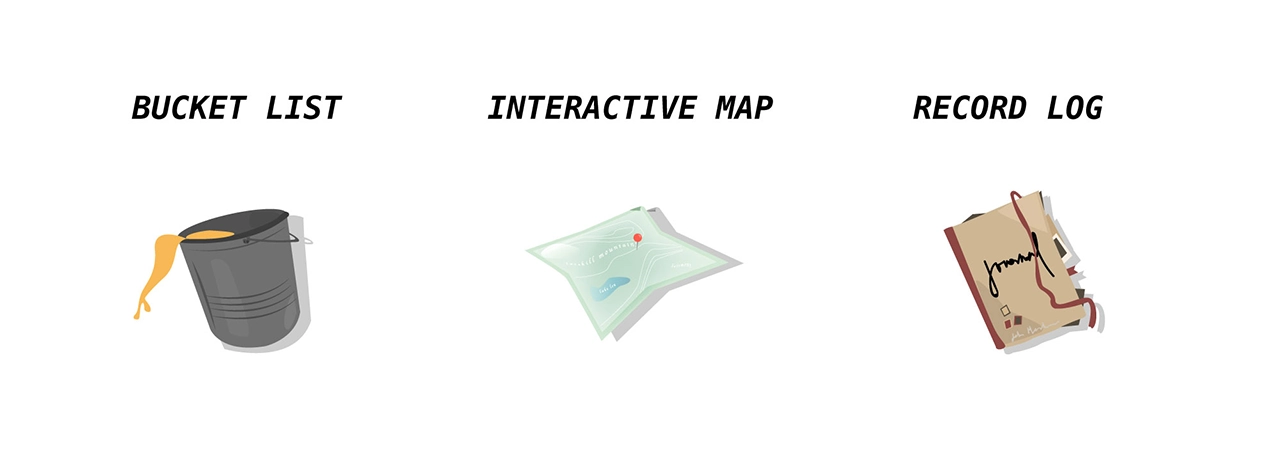
    Simply put, Landmark is a travel companion application. But it’s also much more than that. The idea for Landmark originated as an AR application – one where a user could pick up 3D collectables once they’re at a physical tourist attraction. However, time (and knowledge) constraints left me condensing the idea into a tracking application instead. Landmark allows its users to track the tourist attractions they’ve visited, and create a bucket list of the ones they want to visit next. It features an interactive map, where users can explore the city they’re in, and see the popular spots to visit within.

    Context and Challenge

    This app was created with the intention of solving a problem – the cluttered camera roll. Oftentimes people who frequently travel, document their experiences by taking lots of photos on their mobile devices. But there isn’t a satisfying way to track where you’ve been, or what you’ve seen while traveling. Sure, you can scroll through vast amounts of pictures to finally find your selfie with Mount Rushmore – or you could use Landmark to document the experience, have it conveniently saved in one location, and to find new places you’d like to go next. Landmark is designed specifically to inspire it’s users to add to their bucket list.

    Creating a native app for the first time meant a lot of challenges – aside from learning the ins-and-outs of xCode. One of those was discovering a solid task flow from screen to screen; what did users want to see first? Were they more interested in the map or the bucket list? The places they’ve already visited, perhaps? This led to user testing, which helped me solve some of these problems upfront. But as with any project, more roadblocks – and need for iteration – came after.

    Process and Insight

    While creating Landmark, there were some ideas that I had to scrap. I originally was going to have a search feature for different cities and locations, thinking this would be the best way for people to discover new places for their bucket list. However, I found that users typically already have an idea in mind of where they’re going next – or want to go. Rather than having search functionality, I created an add button that allowed users to input their own locations and landmarks. This allows for more customization, and a more personalized experience.

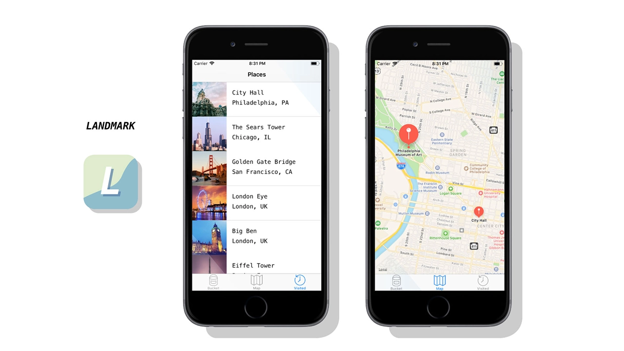
    Three main features of the Landmark app: A bucket list, an interactive map, and a record log.

    Solution

    Landmark helps users record where they’ve been, when they visited a famous tourist location, and keep track of what they want to see next. It provides a unique space for this task, and is a great application for anyone who wants to travel more, document their experiences, or see what else is out there that they might’ve missed. I ensured the task-flow was simple and straightforward — there’s nothing more stressful and frustrating than not understanding how an application works. It might be simple in nature, but this really allows users of Landmark to take it and run with it. After several uses, Landmark becomes a reminiscent journal of sorts – one where you can enjoy the things you’ve done and seen, and look forward to the future and what’s next.

    The Results

    Despite being unable to create all that I envisioned, I think Landmark is absolutely a success. I wanted an app that users could keep returning to in order to track where they’ve been, and I’ve successfully created that. While additional features, such as AR collectables, gamification, etc would have been added bonuses, Landmark serves it’s original purpose, and serves it well. That being said, I am incredibly happy with the outcome of this app, and would enjoy working on it more in the future to live up to the higher potential it has.

    Final product including app icon and example screens.

  • Window Shopping: A Fashion Show in Your Pocket

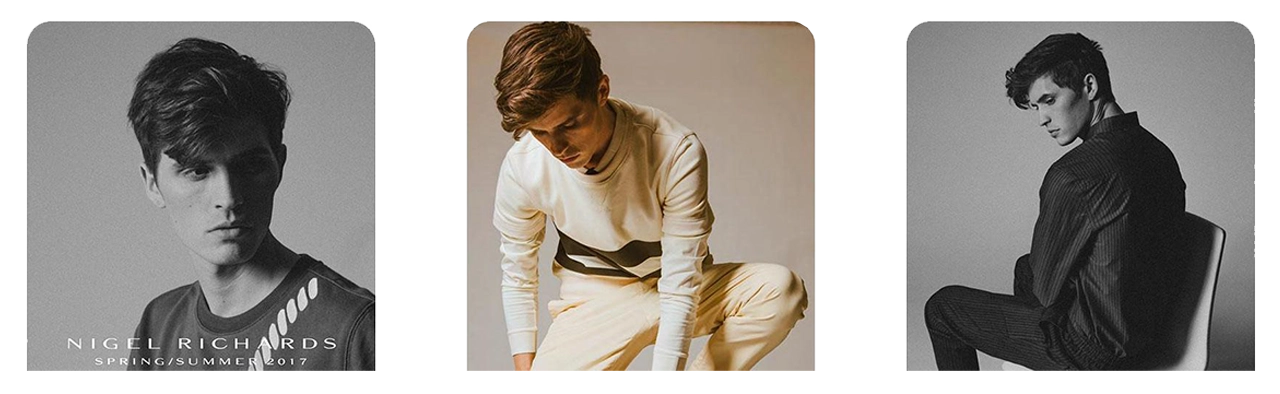
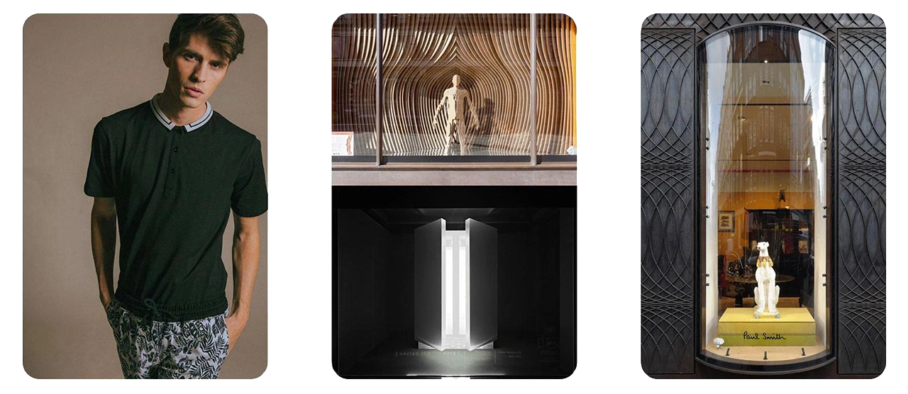
    Images of models used to base the Window Shopping App off of.

    Team

    Brendan Luu & Brendan Russo

    Technologies

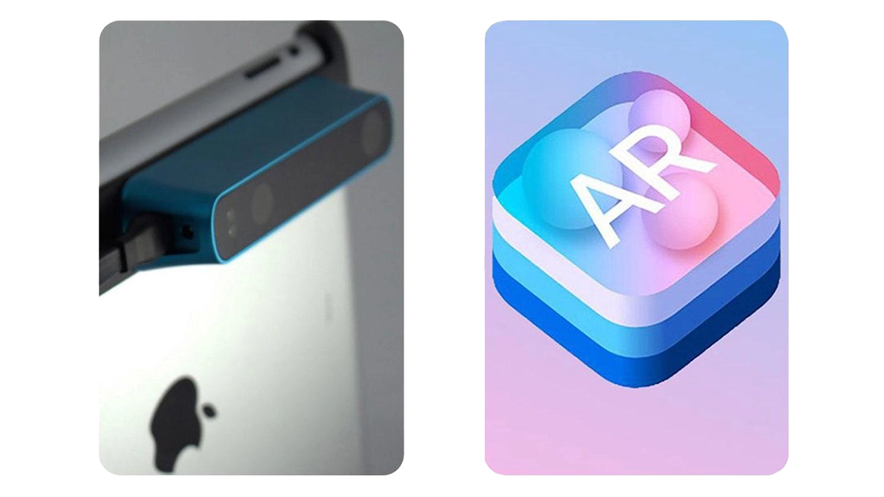
    We used the structure sensor, an IR 3D scanner attachment for the iPad Pro, to scan photo-realistic mesh of clothing on a model.

    We then placed the 3D models into augmented reality using Apple’s ARkit, a framework released last year that unlocks depth sensing technology into iOS 11 devices.

    Technology used to create the Window Shopping App. On the left is the 3D scanner attachment, and on the right is Apple's ARkit.

    Goals

    • Experiential retail experience in augmented reality
    • Communicate brand identity
    • Seeing from the brand’s POV

    Online shopping has changed the retail industry, that is undeniable. We believe AR is an upcoming technology.

    Communicating brand identity means a lot more than just staying within design guidelines and displaying styled outfits. We have set out to help tell the story of Nigel Richards. Our storytelling approach enlists elements such as motion, pose, mood, and flow in addition to the standard aesthetic decisions. AR allows us to attach a meaningful story to the product more so than in a traditional retail experience.

    Lookbooks have been around for decades but have barely evolved. It makes sense, they’re an industry standard and there has been a proven best way to do it. We believe the goals of a lookbook; again promoting the brand, communicating pricing to buyers, and gathering a collection, can all be done more effectively in AR.

    Audience

    • Millennial shoppers
    • Fashion industry natives

    After speaking with the Design and Merchandising faculty from Drexel’s Westphal College, we identified a few different types of people that would benefit from seeing clothes in AR. First, millennial shoppers who purchase clothing online.

    Younger shoppers are more aware of new tech and more comfortable with AR so are a good audience for us to target with this app.

    We believe millennial shoppers would be a strong group of “early adopters” of this kind of retail. This will help open other groups up to such technology.

    The D&M faculty also said that fashion designers could use this app to display their clothing at retail expo’s where hauling physical merchandise is often difficult to manage. These types of environments also don’t lend themselves to communicate branding and mood like this app could potentially do.

    Inspiration

    Images that inspired what the Window Shopping app would do / look like.

    We took inspiration from Nigil’s Spring/Summer lookbook, we liked his clean and modern aesthetic. We also looked towards physical retail for inspiration for how clothing is displayed in stores today.

    We really liked the idea of displaying one look at a time and making it the highlight of the environment, similar to a true fashion show experience. The idea of revealing clothing by coming up from the ground was inspired by Louis Vuitton’s runway show where models arrived out of elevators.

    We also identified Paul Smith as a similar designer brand with established aesthetics. The concept of the elevator was also inspired by his use of capsules for window merchandising.

    How It Works

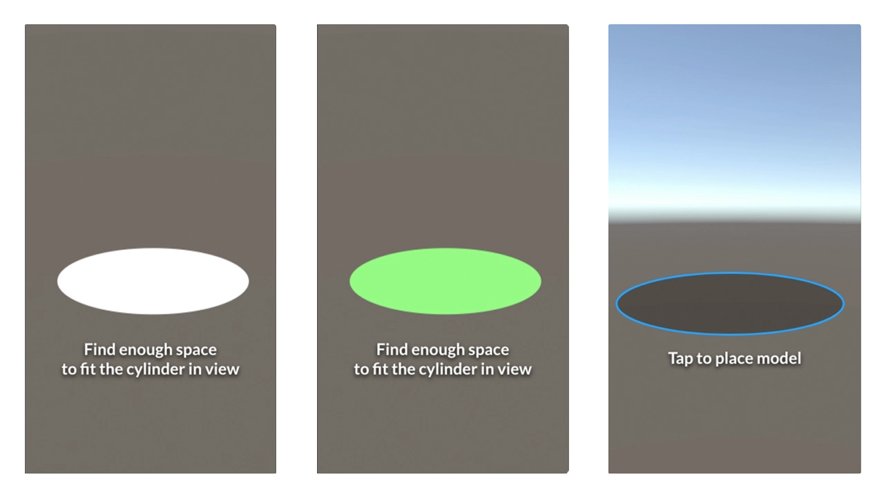
    Ask user for them to find enough space to fit a circle in perspective that will measure the same as our unity scaled scene. This way we know they will have enough space for the scene.

    Tapping the screen when you think there is enough room will confirm that step.

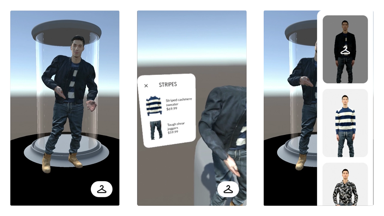
    Screen asking user to set up a circle. This is where the model is able to change between outfits.

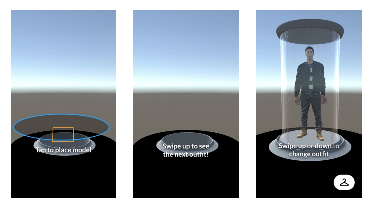
    Scanning would then begin. Once complete users would be asked to tap within a blue circle that mimics the size of the initial circle to place the scene.

    Orange square will show up where users tap within the placing circle. This is the scene placed. The empty elevator tube is now visible.

    Users are then encouraged to swipe upwards to view the first model in the set. This is to try and enforce the mechanics of the app. We want users to be able to simply swipe through the app, up and down, to view different looks.

    Screen asking user to place a square, which will place the model on screen. After placing, app gives instructions to swipe for different outfits.

    The rack button is now visible as the model comes into view. The swipe up or down text comes into view and fades out after a few seconds.

    Model walks out of the elevator and starts motion, dancing in this case.

    Tapping the model brings this AR interface up that describes the outfit in more detail. Tapping the X on this interface closes it.

    Screen with model showing off outfit. When tapped, app will tell user what clothes the model is where and the clothes' prices.

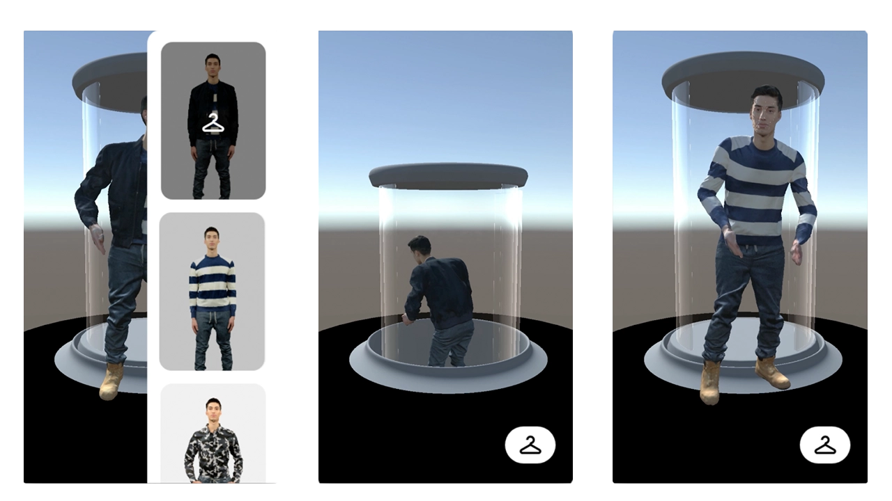
    Tapping the rack button brings this rack view in from the side. This list scrolls and tells you what outfit you are currently viewing. Tapping outside the rack view boundary will close the view.

    When rack view is up, tapping a thumbnail will bring up said outfit from the elevator.

    When changing outfits, the model will walk back into the elevator and go back down.

    Once the old model has gone down, the newly selected model will rise up.

    Screen showing the model doing an outfit change.

  • The Basement Exhibition: A Visualization of Punk Aesthetic

    Introduction

    This project was created by combining the ideas of wanting to recreate what it is like at a house show / punk concert in a 3D space and as well try to use augment reality to fully surround a user in visuals via a faux portal.

    These two concepts were brought together and the result is The Basement Exhibition.

    Team

    Jake Bender & Jake Culp

    Goals

    • Provide users with an immersive experience that includes both visual and audio elements
    • Give the user the sense that they are stepping into a different world
    • Allow for the user to interact with the exhibit and be able to step in and out of it with ease.

    With these goals in mind and the short time frame we were given, it was crucial to immediately start development and begin wireframing and creating moodboards so we could see how the application would look and run.

    Process

    Audience

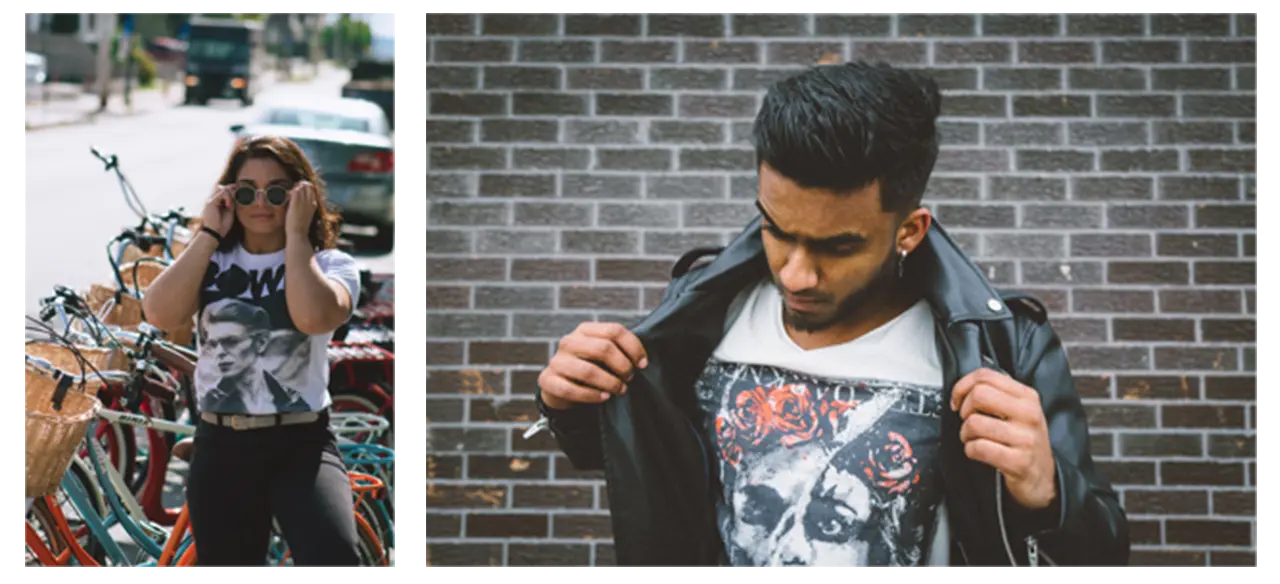
    Before creating a moodboard and wireframes, we needed to identify who exactly our audience was. We determined that the majority of users would be between the ages of 13-21 and would have some sort of punk music background. These meant moving forward we needed to heavily focus on incorporating the punk aesthetic into our design layouts.

    Pictures of two people representing fans of punk music.

    Inspiration

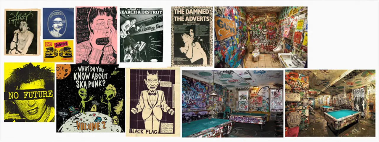
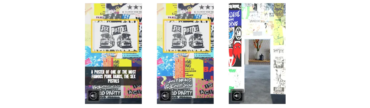
    We took inspiration from old punk flyers, posters, and zines that we had collected online. We noticed after awhile that the punk aesthetic was very jarring and in your face. The colors were very bright and text would sometimes be placed directly over images without the thought of design in mind. We drew so much inspiration from these pieces of art and wanted the experience we were developing to really allow for the user to see up close and in detail these pieces of art.

    Mood board containing punk flyers, posters, and zines that inspired the style of The Basement Exhibition.

    Technology

    To create the application we used Unity game engine along with Apple’s ARKit to allow for the user to place their exhibition wherever they want.

    Logos of Unity game engine and Apple ARkit.

    To allow for the user to simulate a teleportation into a new world we had to implement custom shaders and materials into our Unity project. This was our biggest challenge with getting this functionality up and running. Once this process was complete the rest was creating the room in Unity and refining the details of the user interface.

    User Flow / User Interface

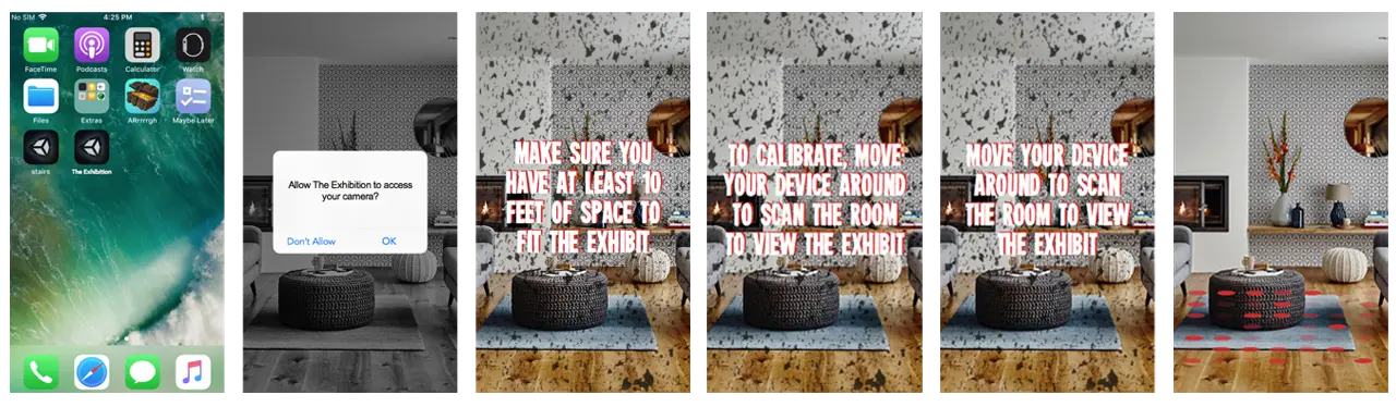
    When it comes to the design of the user interface, we wanted for the setup process to be easy as possible for the user. This is due to the fact that the biggest impact the application has on the user is done after they have finished setup.

    Keeping our punk aesthetic and moodboards in mind, we decided to have a simple layout of steps that the user would complete in order to properly place their exhibit.

    Screens showing how to set up The Basement Exhibit in a home.

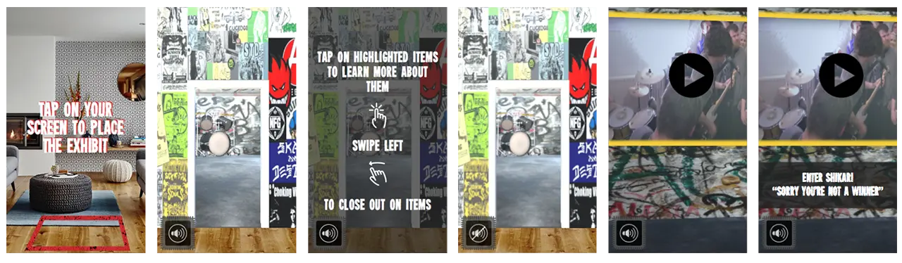
    Once the user has properly placed their exhibit, they are prompted to then walk through the portal and be seemingly taken into a different world. This world has the feel of being in a basement where a punk show is about to take place. Along the walls of the basement are posters and flyers that the users can view and look at.

    Screens showing The Basement Exhibit loaded and instructions on how to move around.

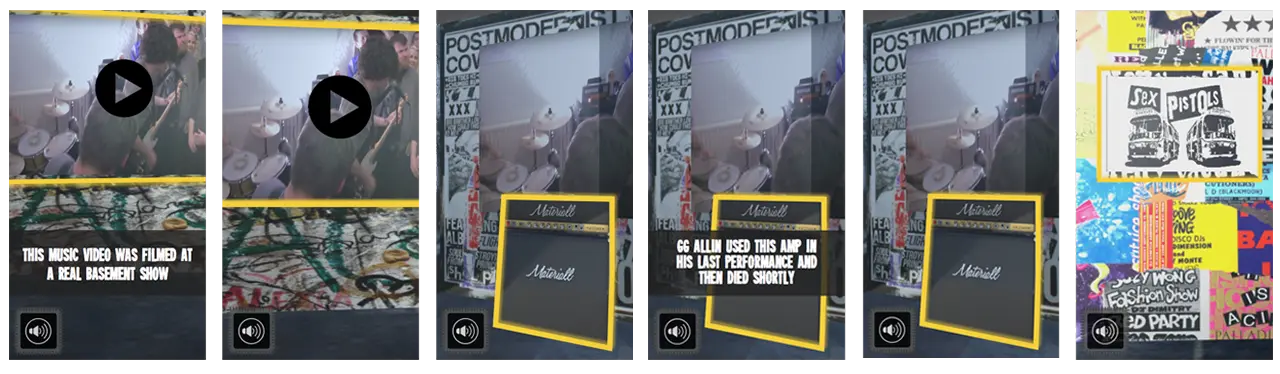
    As well, there are future goals to implement interactive objects and videos in the basement space. Users could then tap onto the items to learn more about them. This gives the users more ways to interact with the exhibit and can create a more long lasting and enjoyable experience.

    Screens showing the features of the exhibit, including videos and objects.

    Object being narrated as user taps on them.

    Takeaways

    A huge takeaway from this project is seeing how much 3D objects can really help sell an augmented reality experience. Seeing the graphics that we had implemented into the design of the basement in AR made them seem almost life like and we think that they alone could have been enough to fully immerse a user into the exhibit.

  • Animal Crossing Zodiac

    IDM231: Scripting for Interactive Digital Media I

    By Sarah Bray – 2018

  • Pokemon Zodiac

    IDM231: Scripting for Interactive Digital Media I

    By Joseph Lunine – 2018

  • Jazz Musicians Zodiac

    IDM231: Scripting for Interactive Digital Media I

    By Clay Tercek – 2018

  • Cherri Cola

    IDM222: Web Development II

    By Hannah Mystic – 2018

  • Portfolio: Ryan Van Dongen

    IDM222: Web Development II

    By Ryan Van Dongen – 2018

  • Portfolio: Clay Tercek

    IDM222: Web Development II

    By Clay Tercek – 2018