Blog

  • Coalescence: An Interactive Pop-up Gallery Highlighting the Work of Two Philadelphian Artists

    The Team

    • Jordan Gulbronson
    • Jackelyn Hayduk
    • Yuling Liao
    • Arielle Mohr
    • Jacob Pettit
    • Anna Radford
    • Matthew Raghunauth
    • Junfei Teng
    • Angel Wu

    The Overview

    As part of undergraduate degree requirements and a group of nine Interactive Digital Media students, we worked on a nine month capstone project in which we created an interactive pop-up exhibit housed in Drexel University’s Pearlstein Gallery that highlighted the work of two minority creators through experimental technology and experiences. With 4 different interactions using web technologies (NFC chips, iPad web applications, the Leap Motion and a 60 inch multi-touch screen) and a user centered design process we were able to engage visitors in learning more about the artists’ creations and their cultures.

    Other requirements of this project including identifying our project goals and criteria. For our project we focused on two main criteria, innovation and challenge as well as hybrid concept. For innovation and challenge, we expanded on our user experience skills by bringing them into a physical space alongside digital spaces. We also focused on curatorial design which was a new skill for us but was essential for a successful exhibit. As for the hybrid concept, we created an exhibit that spans both the physical and digital world through the use of prints, projections, multi-touch screens and gesture controlled experiences.

    Project Goals

    • Highlight the work of individuals from communities that are underrepresented.
    • Celebrate Diversity
    • Engage & Make an Impact

    Criteria

    • Innovation & Challenge
    • Hybrid Concept

    The Context and Challenge

    Background

    We started brainstorming for this project in Summer 2017 but officially began the process in Fall of 2017 when we started our senior project classes. After brainstorming and many meetings with various outside sources to find our content, we chose to highlight the work of two Philadelphian creators, Ange Branca, a Malaysian chef who is the owner of the restaurant Sate Kampar, and Lendeh Sherman, a Liberian fine artist currently studying at Jefferson University. This project was completed in June 2018 after being displayed in Drexel University’s Pearlstein Gallery. Additionally, we were awarded a Swift Fund scholarship to alleviate production costs.

    The Problem

    For our project, we decided to push the limits of what we learned in our classes that revolved around web and app design/development and move them to a new setting involving exhibit design and experimental technologies. By applying the skills we learned, doing independent research and consulting many outside sources such as Night Kitchen Interactive,a firm that specializes in interactive exhibit design, we were able to develop Coalescence: An Interactive Pop-up Gallery Highlighting the Work of Two Philadelphian Artists. The focus of this exhibit was in response to the tension within our community caused by the current political state. We decided to utilize our given platform to try and unify our community members by engaging them in an immersive art/technology experience that teaches them how culture can inspire creativity in the community.

    Goals & Objectives

    As we are all interested in art and experimental technologies, this led to the decision to blend the two into a museum experience. As a group, we defined early on that we wanted to create something that pushes the boundaries of what we learned in our classes, which was another reason we decided on making an immersive, interactive experience. We knew with this project that we wanted to make an impact, so we decided to showcase underrepresented immigrant communities by highlighting the work of two Philadelphian artists who use art as a way to express themselves and their cultures. By using experimental technologies to engage our visitors we hoped to encourage them to learn more about the cultures around them.

    The Process and Insight
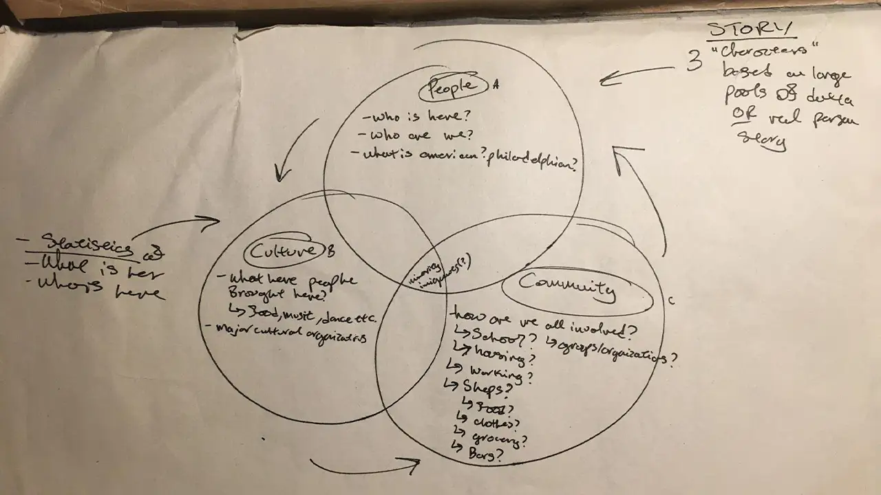
    Venn diagram of what to include to convey the Coalescence team's chosen topic, including people, culture, and community.

    We began by choosing a topic/focus for the exhibit to follow.

    Our first step in this process was to figure out what our exhibit was going to be about. At the beginning we wanted to focus on immigration and educate our audience through data visualization. However, after independent research and reaching out to cultural and immigration networks throughout the city, we realized, the topic was too broad, even when we refined it to immigration in Philadelphia area. After meeting with Rashidah Salaam, a design professor at Drexel University, we were able to get in touch with Ange and Lendeh, and changed our direction to showcase the work of individual artists related to their cultures.

    Once we met with the artists, we started to brainstorm interactions that not only fully showcased their creative work but were also engaging and interactive. We knew at first that we wanted to include iPads, touch-sensitive projection, multi-touch screen, AR, NFC chips, LEAP motion and the Kinect. Most of these technologies were available to use though our college department. After a lot of refining, we settled on 4 different interactions involving NFC chips, iPads, the Leap Motion and a multi-touch screen. We further developed these interactions through heavy research, personas, user journeys, wireframing, sketching, mockups, style guides, prototypes, development, usability testing, construction, including 3D printing and laser cutting, and final implementation.

    We explored various possibilities for the display structures housing our artist’s biographies and works. For example, our first idea was to buy wood and build the structure ourselves. After going through the logistics of building each structure by hand, we came to the conclusion that buying tables from IKEA would be the easiest and most cost effective way to construct these display stands. For the physical posters, we experimented with different mediums and materials and eventually decided on sewing the printed material on top of the painted fabric to mimic the designs and colors from our user interface and style guide.

    Research

    In the beginning of the UX phase, we defined our target audience type and created user personas along with user journeys.

    Our six target audience types were: college students, college professors, potential employers, student parents, young siblings, and grandparents.

    Below are the user personas we created:
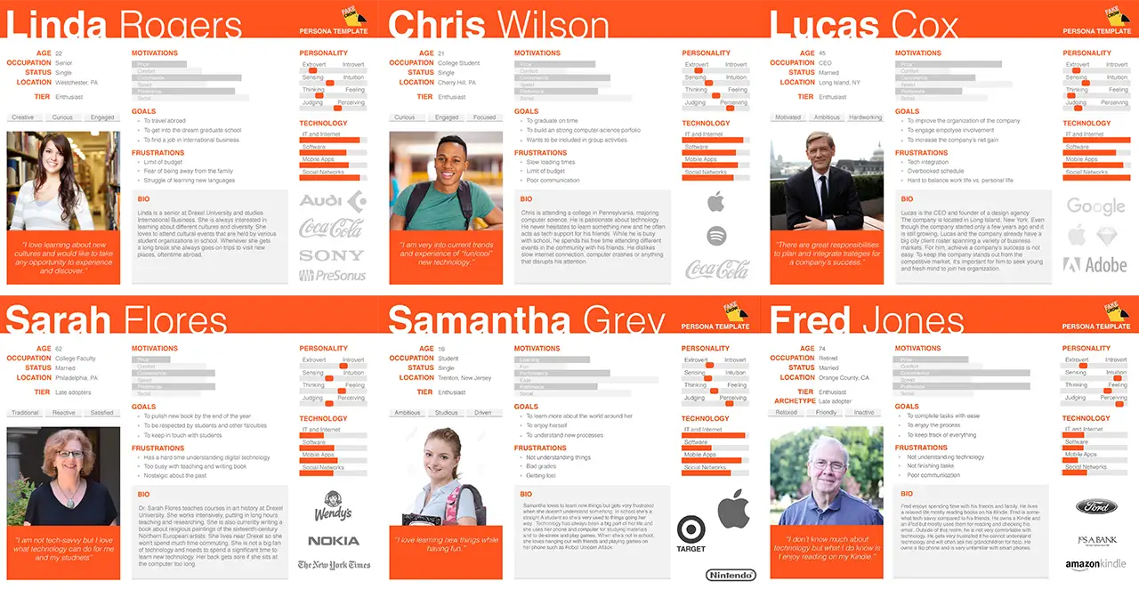
    6 user personas representing the audience the Coalescence team created their project around.

    Based on the user personas we were able to develop the user journeys. Below is an example of the user journey, and more details can be seen on the google sildes.
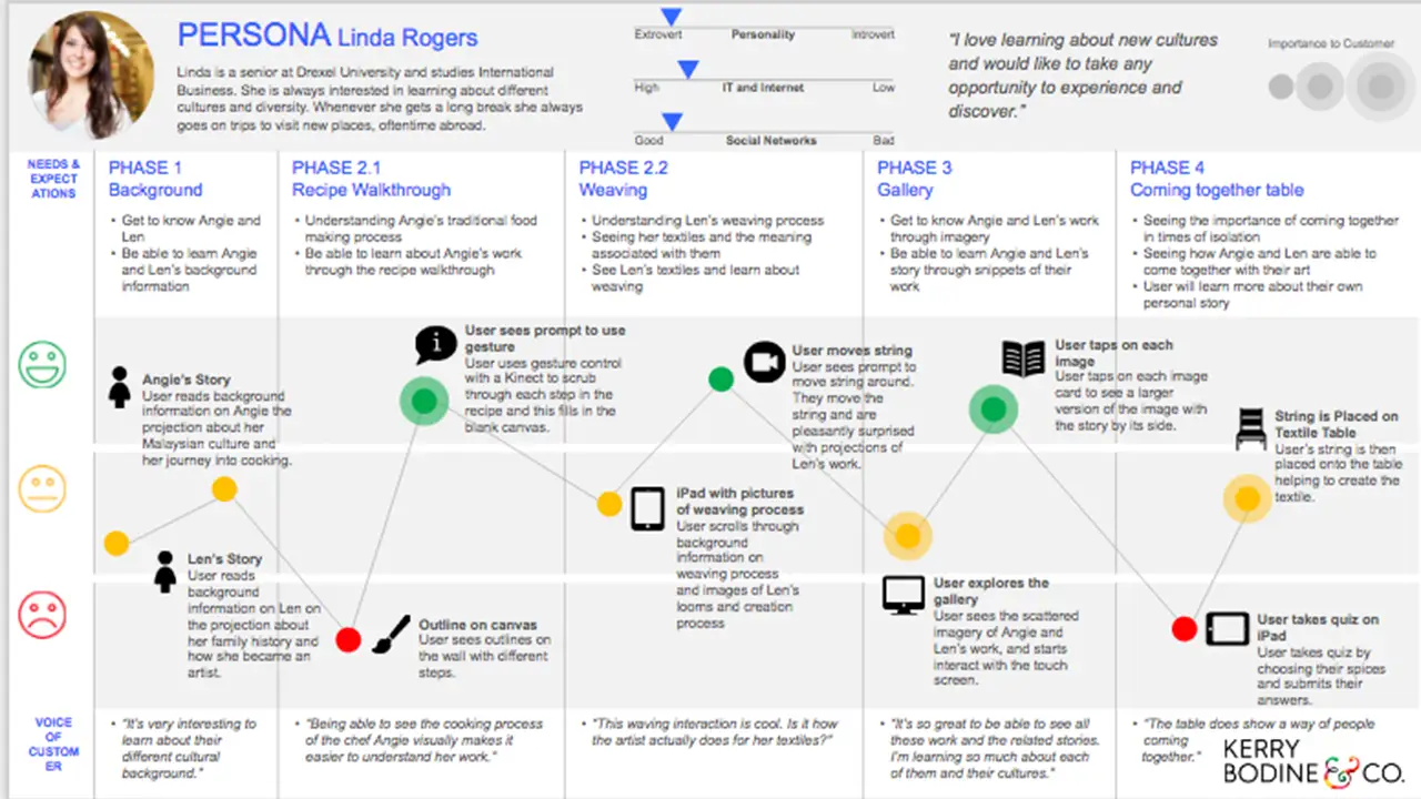
    Journey of needs, expectations, emotions, and thoughts a user might have when experiencing the Coalescence exhibit.

    Design

    Sketches

    In the beginning of the design phase, we drew sketches to help us brainstorm some possible designs for the different interactions with the chosen technologies in mind.

    Here are some of the initial gallery sketches we drew:
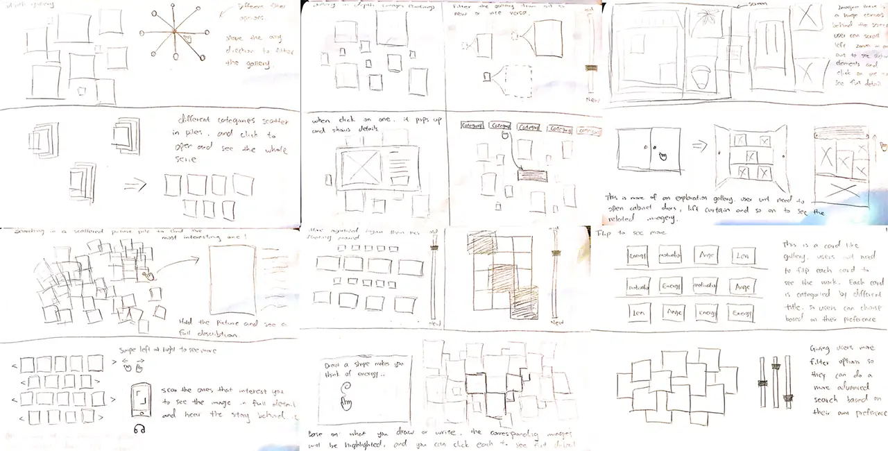
    Sketches showing how the gallery would be designed.

    Here are some initial sketches we drew for the general interactions:
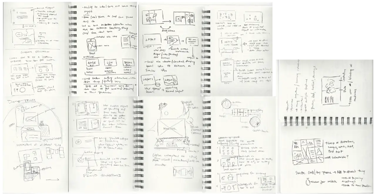
    Sketches for how the Coalescence team wanted users to interact with the exhibit.

    Here is an example of the initial loom sketch:
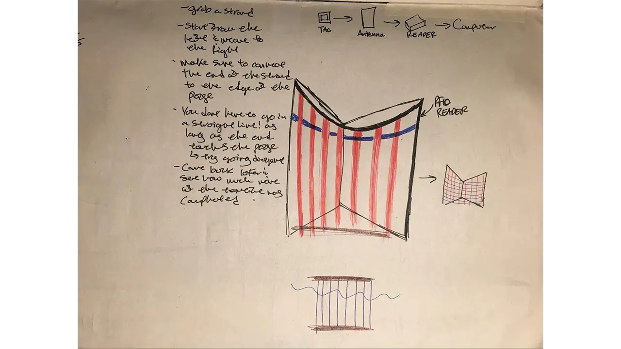
    Sketch for the design of the loom.

    Here are examples of the initial mural sketches:
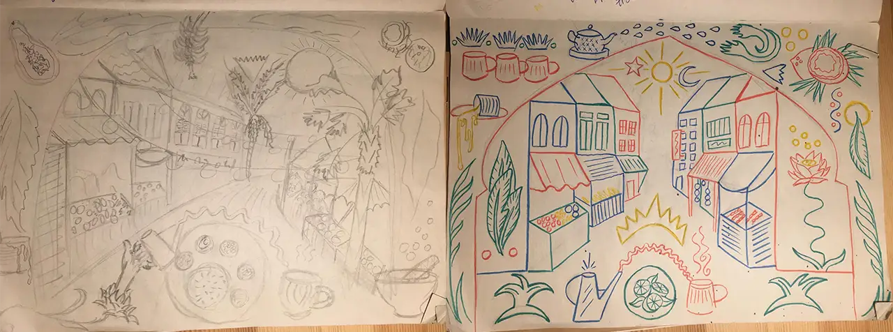
    Sketches of the mural's design.

    Wireframes

    Moving forward beyond sketches, we created digital wireframes to better illustrate the decided designs.

    Here are the wireframes of the initial energy table interaction:
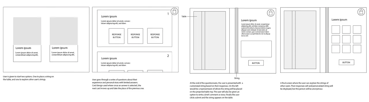
    Low-fidelity wireframes showing what the user would click through at the energy table.

    Here are the wireframes of the initial gallery interaction:
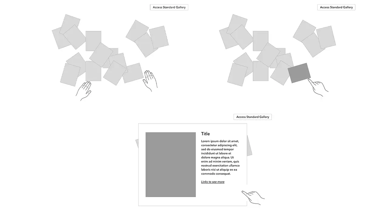
    Low-fidelity wireframes showing what happens when users interact with the gallery.

    Here are the wireframes of the initial loom wireframes:
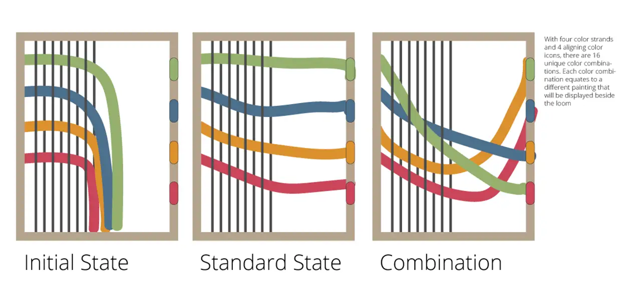
    Wireframe showing how someone can play with the loom's colors, making many different combinations.

    Another wireframe showing how someone can play with the loom's colors. leading to another painting in the exhibit.

    Style Guide

    The palette for the exhibit was inspired by the backgrounds of the artists. Green, red, and yellow are significant in Malaysian culture, but most of Len’s work uses earth tone and nature based colors, so we toned down the hues of all colors for a more neutral palette. We were working with great reference material from both creators that were either hand made or artifacts from the past, so we created handmade textures, patterns, and a layered effect to create something akin to a college of the two artists.
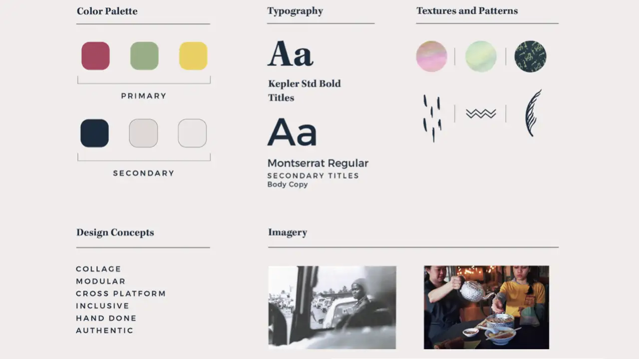
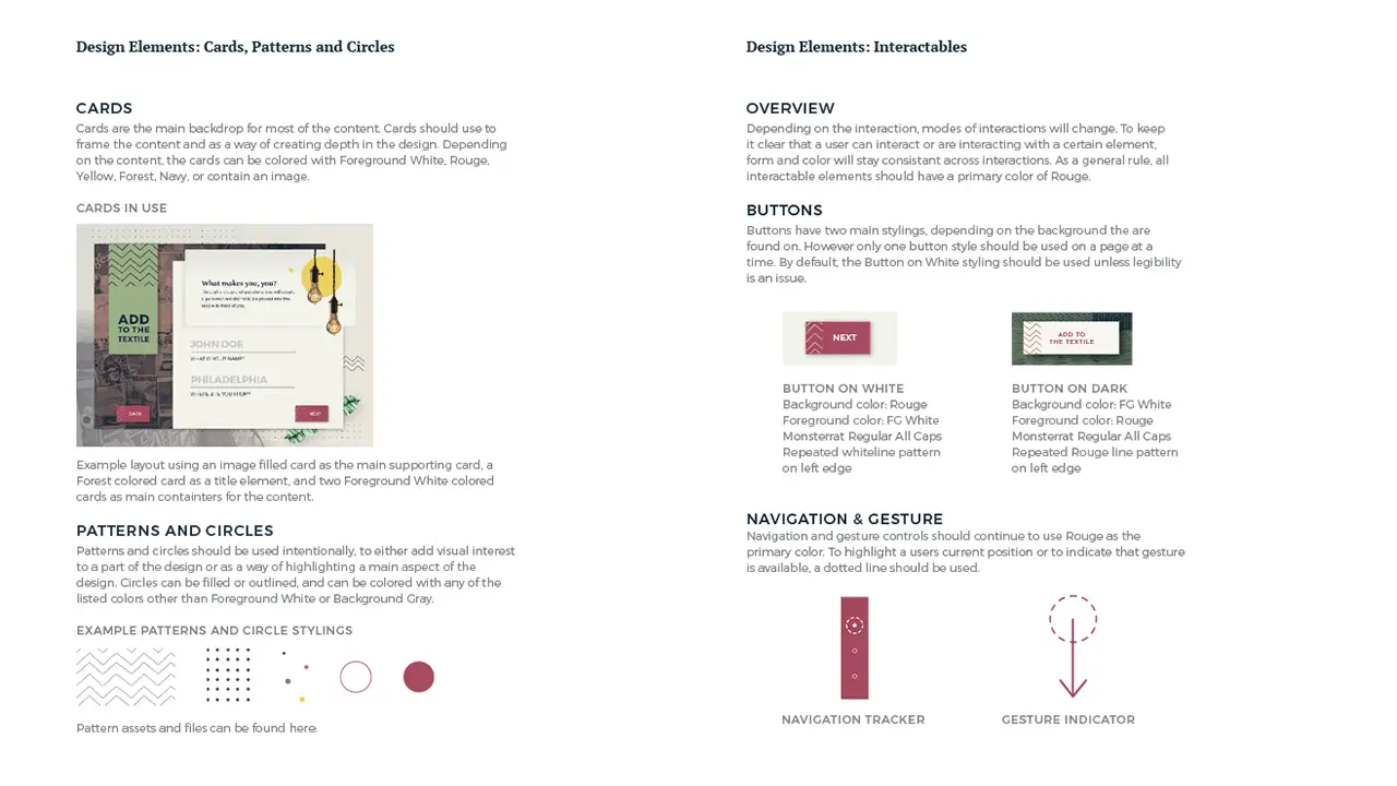
    Colors, textures, patterns, fonts, concepts, and imagery that conveyed the style of the Coalescence exhibit.

    Design elements used in the Coalescence exhibit.

    Prototypes

    Once we decided on the design styles, we moved forward by changing the wireframes to prototypes and adding the colors and patterns in from the style guide.

    Gallery

    Here is the initial gallery prototype. Our initial thought behind the collage allowed users to sort through scattered photos which open in a card layout to display more information.

    Due to our agile process we were able to catch the limitations of the technology early and adjust our interaction to provide the best possible experience for our visitors. Because the touch screen could not be laid flat and the initial idea we had for the gallery didn’t work well on a flat surface, we changed the gallery to a more collage like design. Our users, after doing A-B testing, also confirmed our decision.

    Here is the prototype of the first version of the collage gallery:
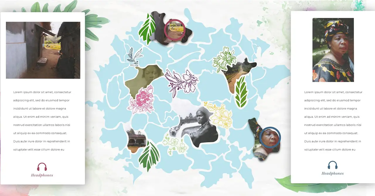
    Initial design of the gallery after the interaction prototype.

    Here is the prototype of the second version of the collage gallery, and it is the final version displayed in the exhibit.

    Mural

    Here is the initial prototype of the mural interaction. The idea is that the outlines on the canvas only show partial information and the digital projection reveals the whole image by filling in colors, images, and texts on to the canvas.
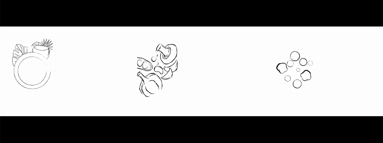
    Draft of the mural for Coalescence exhibit.

    Then we altered the design of the mural to represent a Malaysian street scene. We wanted to introduce an element of discoverability where users can explore the market, and learn more about different foods that would be found there.
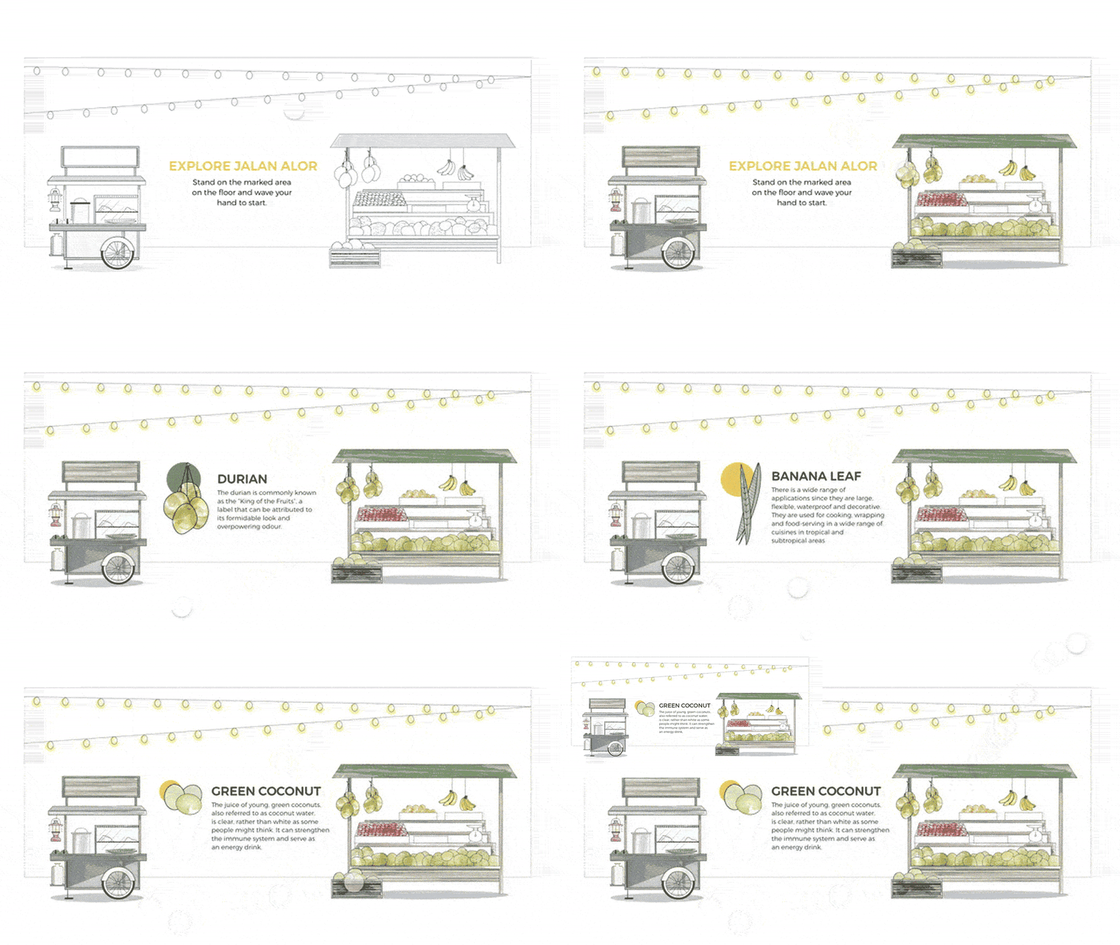
    Second iteration of mural, showing how clicking certain items on the mural will open info graphics about selected item.

    This is the final design that we ended up using for the mural. With this design, the interactive portions of the mural are within the archway shape. The parts outside of the archway are elements that show more about Ange, her restaurant, and Malaysian cuisine.

    Energy Table

    Here is the initial prototype of the energy table interaction.

    This is the prototype we ended up using for the exhibit. It allowed users to leave their own personal mark on the exhibit and demonstrates that while we are all different we can come together to create something new and beautiful. Users could enter a little bit of information about themselves in order to create their personalized energy form. The descriptive movement types were inspired by Len’s artwork she designs inspired on different energies that she feels and the spices were inspired by Ange’s cooking.
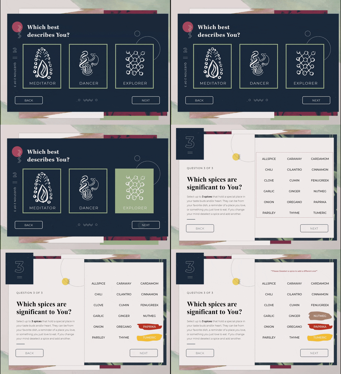
    Final interface design of the energy table, showing how users tap through each screen.

    Loom

    Here is the initial prototype of the loom.
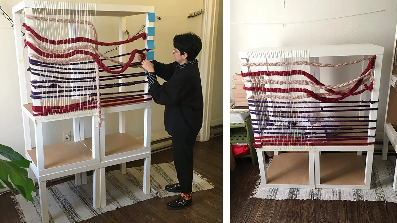
    Rough prototype of loom for Coalescence exhibit.

    Here is the improved version of the loom prototype, and the version we ended up using. This design of the loom contained bigger strings which allowed for an easier grip for our users.


    Code/Dev

    Explore Stage

    This is our exploration phase of using the leap motion and touch sensitive technologies. We also experimented with augmented reality.

    Energy Table

    This shows how code can be used to create colored strands using user input in our initial prototype.
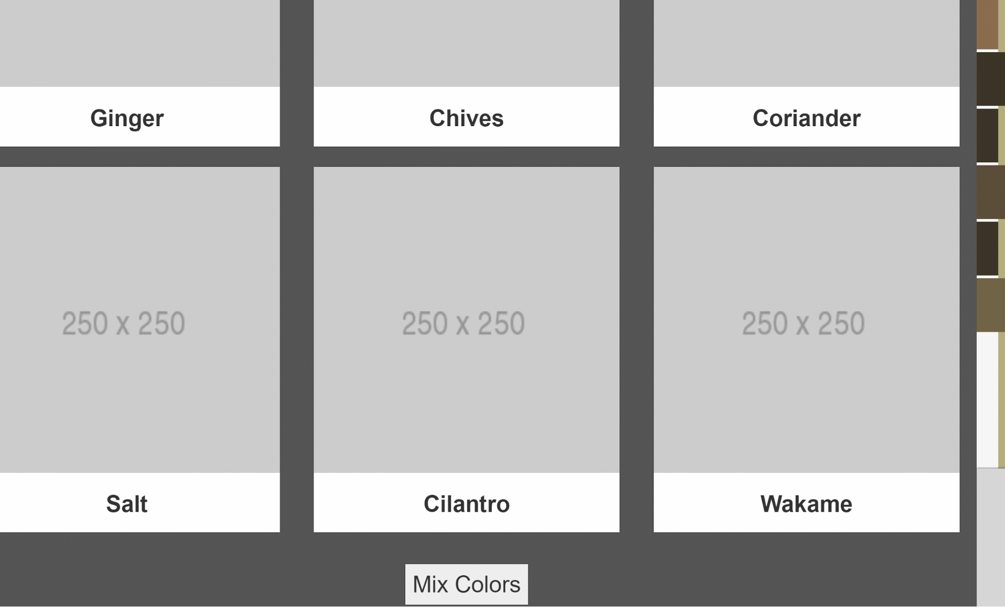
    Initial prototype of energy table where each input has a designated color.

    Mural

    This was an experimentation using the Kinect and LEAP motion as different options for controlling the mural.

    Gallery

    These are initial proofs of the multi-touch functionality used in the gallery.


    Here is our first attempt at a collage type design using the multi-touch screen.

    Physical Prints/Structures

    Here are examples of our initial structure builds in which we used IKEA tables and printed materials.
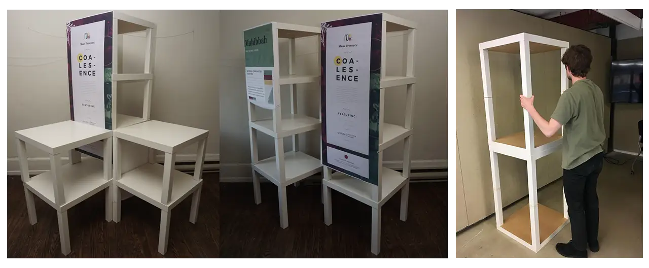
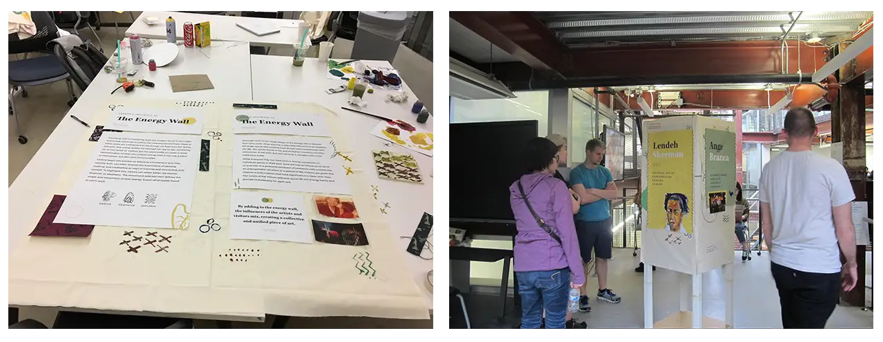
    Building structure for exhibits out of IKEA furniture.

    Printed assets and fabric used to decorate the main frame of the structures.

    These are the design of the physical structures with copy placed on to them. We hand painted and sewed on all the design assets on to the canvas.

    Usability Testing

    Tests for all the activities at the Coalescence exhibit.

    Throughout this process we were able to conduct over 100 usability tests which resulted in many changes leading to more intuitive and user friendly designs. Here are brief summaries of what we learned from our testing sessions.

    Gallery

    Based on user feedback, we changed from the previous design to the current design but still kept the explorative yet informative experience. After identifying and solving the challenges, users thought the collage design is visually more interesting and the interaction is more cohesive.

    The Loom

    The loom was very difficult to make user-friendly because we were creating something that we had never done before. By giving our users more guidance through instructions and onscreen feedback we were able to make the process much more intuitive.

    The Mural

    In the beginning of our testing users found the gesture controls hard to use but by changing the controls to be much simpler by eliminating a clicking function and creating less cognitive load, users found the mural much easier to use.

    The Energy Table

    At first users were not clear on the connection or meanings behind the energy movements or the spices. After refining, we added in more context explaining the energy movements and usage of the spices, so our users felt more connected to their selections and the artists.

    To see our notes and analyses for these tests, click here.

    The Solution

    Here are the final results that were shown in the exhibit held on June 11, 2018 from 6-9 p.m. All of the images/screen grabs seen below were taken/used in the exhibit.

    Gallery
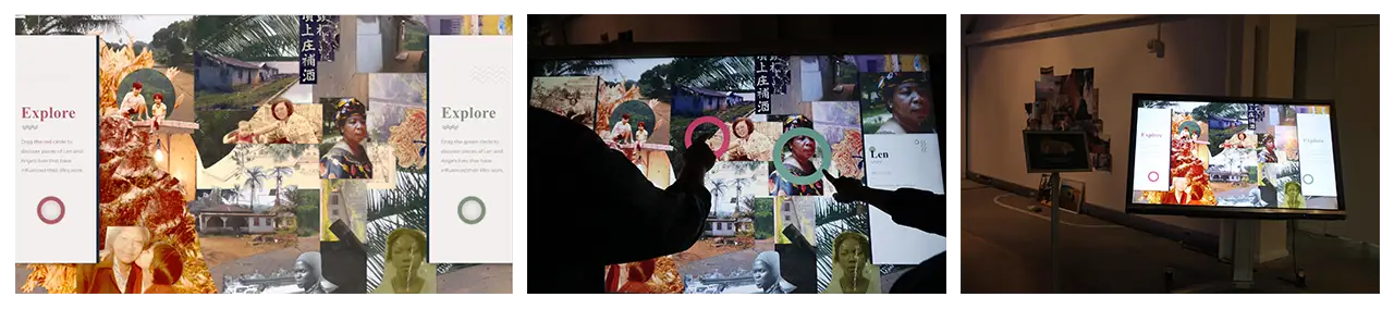
    Final screen of the gallery activity and the display in action at the Coalescence exhibit.

    The collage introduces visitors to the backgrounds of Ange and Len. Using a multi touch screen, 2 visitors can simultaneously hover over and interact with photographs using their respective cursors. Each photograph is a significant person, place, or object to the creators which visitors can learn more about on the side cards. The collage format of these photos allows for an element of discoverability, where users must explore the whole piece to learn more, but it also represents the blending of individuals in cultures. By having 2 visitors be able to interact with this at once, we hoped to create a shared learning experience while also reducing wait times to use it.

    Mural
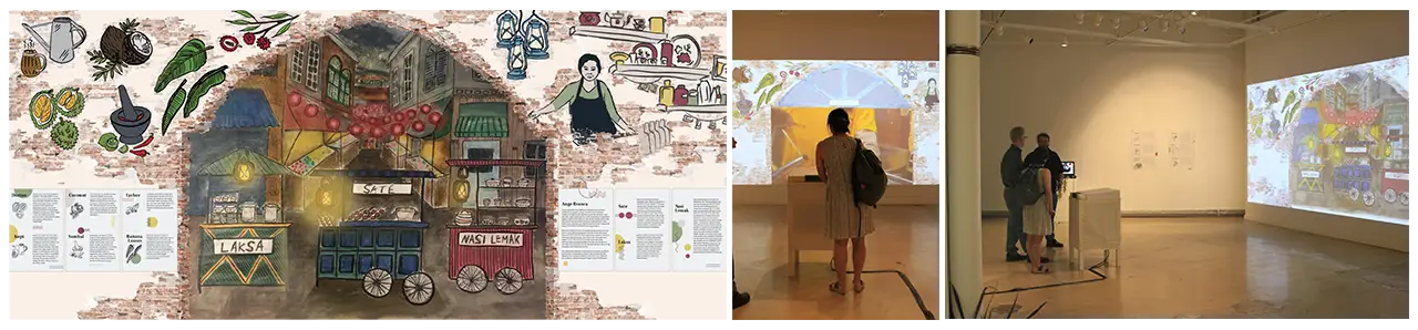
    Final mural screen and the display in action at the Coalescence exhibit.

    With this digital mural design, the interactive portions of the mural are within the archway shape. Users were able to select food carts representing different traditional Malaysian dishes/drinks, such as Nasi Lemak, Sate and Kopi, and once selected, watch videos of these dishes being made. The parts outside of the archway are elements that show more about Ange, her restaurant, and Malaysian culture.

    We wanted users to feel like they were looking into the scene and were able to interact with the things they see. So, we decided to use gesture control technology. We used the Leap Motion, which allowed users to use their hand motions to interact with the mural elements.

    Energy Table

    The energy table allowed users to leave their own personal mark on the exhibit and demonstrated that while we are all different we can come together to create something new and beautiful. Through use of Socket.io and Javascript, the visitors could enter a little bit of information about themselves to create a personalized energy form. Visitors chose a descriptive movement type inspired by Len’s artwork and up to 3 spices inspired by Ange’s restaurant.
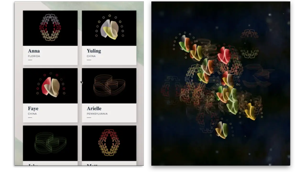

    The colors and shapes each person made at the energy table and the final image combining everyone's colors and shapes.

    Visitors coming together as a community and participating in the energy table activity.

    Once their energy was created the visitors added it to the collective energy energy projection where they could view their energy interacting with everyone else’s and the explore interaction where other visitors could see the stories told by others.

    The Loom
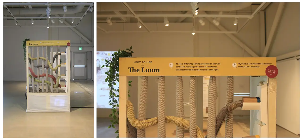
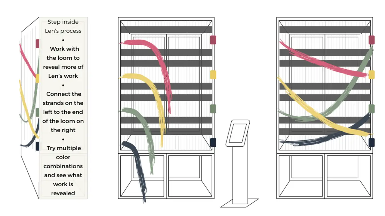
    Final loom booth and instructions on how it works.

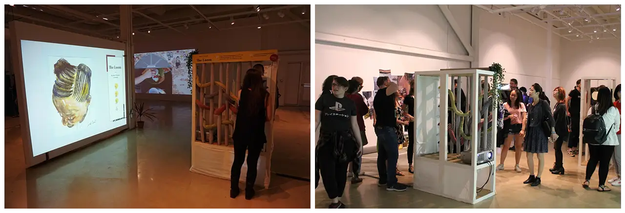
    Visitors interacting with the loom.

    The Loom was built specifically for the tactility and connection to Len’s work it provided. Allowing users to participate in the textile creation process while also exploring Len’s paintings created an enjoyable and personal experience. The Loom uses NFC technology to create a digital change on a projection through the connection of physical strands to NFC readers. Connecting the four threads displays one of 24 paintings created by Len.

    Developing the Loom was challenging because it not only included new technologies we had no experience with, but also relied heavily on the seamless connection between the physical and digital interaction. To ensure we had as little room for error as possible in the design, we worked with Adept Inc. to create and 3D print holders for the threads and NFC readers.

    Physical Exhibit Setup

    This is the layout of the exhibit we went through many iterations creating as we adapted the space in the Pearlstein Gallery to fit our needs.
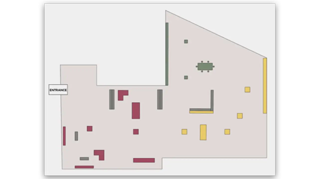
    Floor plan of the Coalescence exhibit in the Pearlstein Gallery.

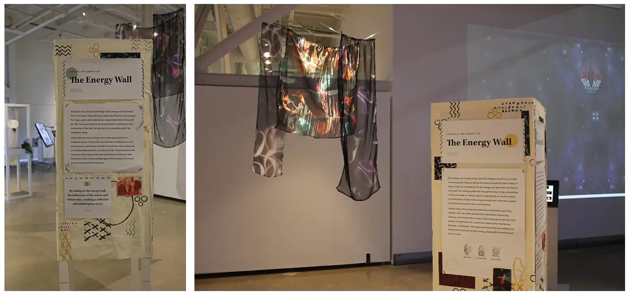
    These are the final structures and physical setup in our exhibit. Len’s artwork can be seen hanging throughout the exhibit and it complimented the interactions and information displayed. We also filmed, edited and created short interview films starring our two artists that were featured throughout the exhibit which can be seen on the smaller televisions within the structures.
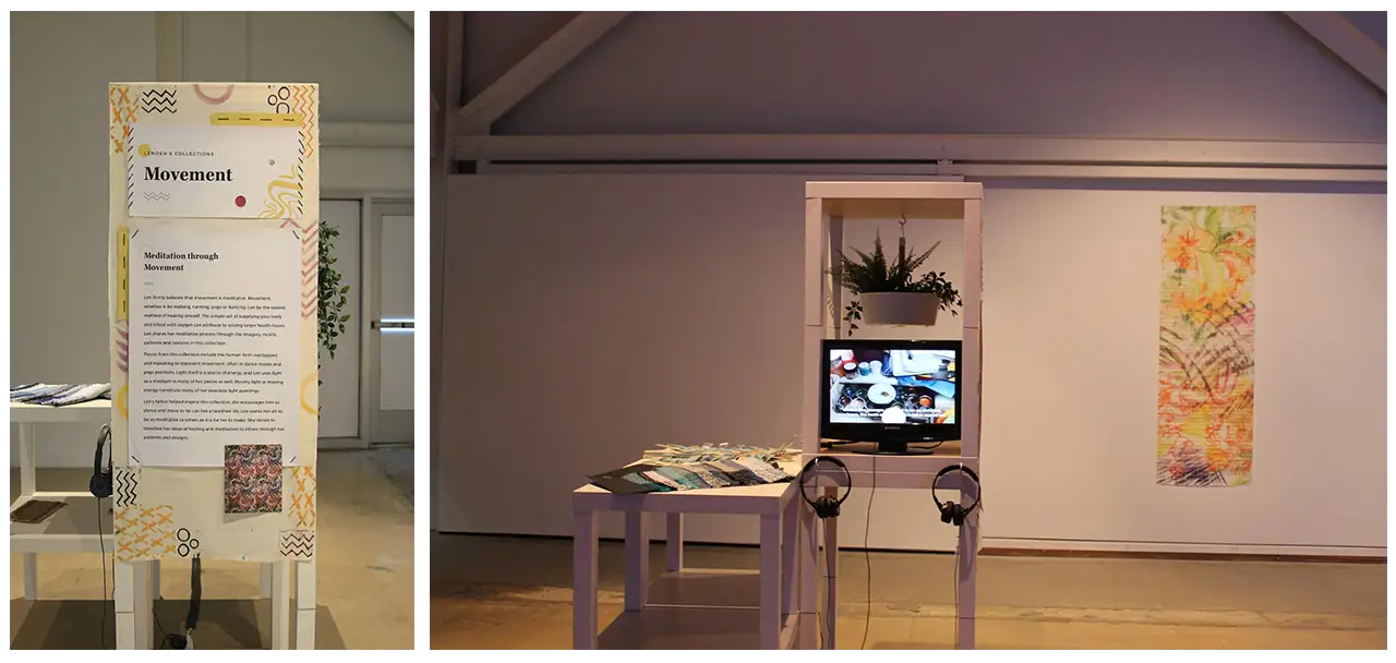
    Final setup of 'The Movement' booth at the Coalescence exhibit.

    Final setup of 'The Energy Wall' booth at the Coalescence exhibit.

    Paintings hung around the Coalescence exhibit by the featured artists.

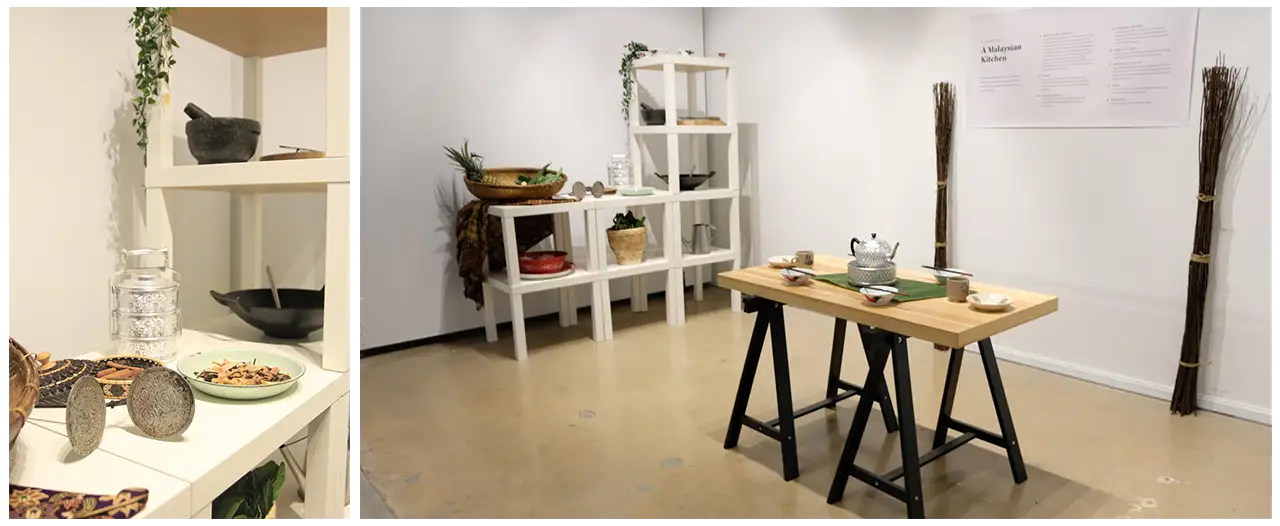
    Final setup of 'The Malaysian Kitchen' booth at the Coalescence exhibit.

    One of the most important aspects of this exhibit was the physical set up. We featured a traditional Malaysian kitchen set up, along with many items found in Ang’s restaurant and hometown. Ang provided us with spices, fruits and vegetables used in her kitchen for users to touch and smell. This was to connect users to her cooking and cultural connections that were shown within the mural, collage and energy table.

    Len’s artwork highlighted her creative influences and culture, as it featured her family in Liberia and her different mediums, such as textiles and printed material. The textiles were displayed around the loom to help compliment each other, the Liberian family printed collage was shown next to our digital collage and the energy pieces were featured next to our energy table to help immerse users in our artists’ worlds.

    The Results

    Overall, our exhibit was a huge success, as we had over 200 visitors come to see our show. At the exit, we set up a survey table where visitors could leave their final thoughts on the exhibit. We asked visitors to rate how easy the interactions and exhibit were to navigate. The survey results showed that most users found the exhibit easy to navigate and the interactions intuitive to use. A majority of users rated the energy table as their favorite interaction in the exhibit, which was rewarding to hear because this was the interaction in which users shared that they felt most connected to our artists. Many visitors shared that they would like to return to our exhibit in the future. Coalescence was an inspiring experience not only for our visitors but also us, the creators, as we were able to immerse ourselves in the creativity and culture within Philadelphia as well as push ourselves to build an inspiring experience through our research, testing and desire to make an impact. Below are some of the final remarks from our visitors, that show the impact this exhibit made on them.
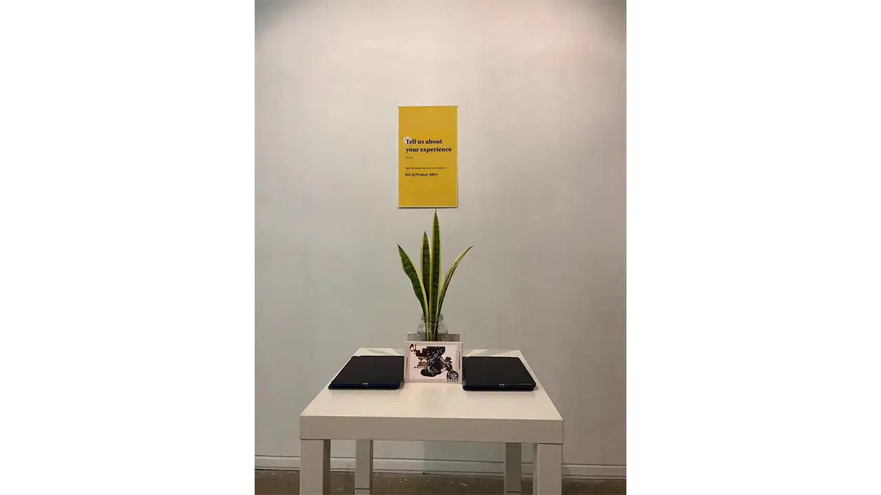
    Booth asking visitors to leave their final comments on the Coalescence exhibit.

    “I really enjoyed the exhibit. I would love to see exhibits like this become a common experience at all museums. Amazing!”

    “The graphic design was astounding and interior design was comforting. It really matched the vibe of your two featured artists”

    “I also really appreciate how much every aspect of the exhibit, down to the backdrop of the descriptions and the plants on the wall, was stylized and designed. This exhibit was unlike anything I’ve experienced before, and I hope to be able to see it again somewhere.”

    “It’s incredibly well executed and unified. The amount of thought put into this shows. It beautifully tells the stories of the women this exhibit centered on.”

    “It was a beautiful experience and an amazing exhibit. It was so unique and you can tell a lot of time and effort was put forth”

    “I loved the look into the lives and culture of these two beautiful creatives and feel very blessed about my chance to see it”

    “Fun, well integrated design and technology, thought provoking while simple enough to engage”

    Senior Showcase

  • Schmear It Ordering App

    Overview

    Over the past 10 weeks our group has been working closely with Schmear It and their customers to create a brand new mobile ordering experience. We conducted primary research, went through multiple rounds of ideation and user testing, and ultimately created a final interactive mockup in Sketch and Flinto. Through this process we learned the importance of collaboration, user testing, team meetings, and understanding business requirements. We are extremely pleased with the final application and hope Schmear It’s users love it as well.

    Team

    • Alex Aslid
    • Alex Huffaker
    • Yuan Li
    • Miles Waldron
    • Jordan Zagerman

    Context and Challenge

    Schmear It is a local Philadelphia bagel food truck established in 2013 and recently expanded into a physical location in October 2016. Our team was tasked with developing a mobile application for Schmear It that provided mobile ordering, rewards, and business information for their customers. This application would substitute their existing order ahead solution on their website. We worked closely with Schmear It and their customers to test and develop this mobile application over the past 10 weeks.

    While Schmear It already had a mobile ordering function built into their website. It wasn’t advertised or communicated to users very clearly on their website (especially the mobile site) or at their physical locations. The goal of this application was to bring mobile ordering to Schmear It in an accessible and discoverable way for users, while preserving the unique personality and branding Schmear It has developed. The application should also promote their build-your-own option as this is their preferred way for people to order and their collaboration with charities.

    Process and Insight

    We began the design process by establishing a relationship with Schmear It. We created a business model canvas and project model canvas for the company. After that we began visiting the truck and store to observe the ordering process and the customer experience Schmear It provides.

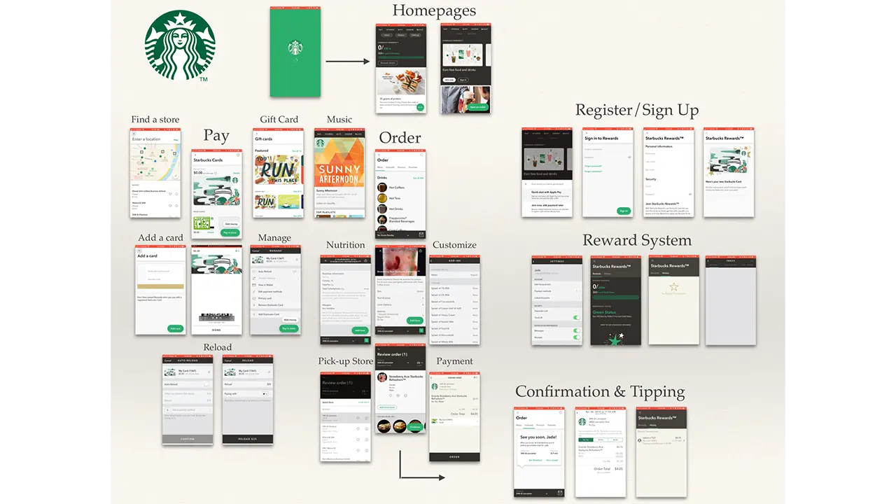
    From there we began conducting competitive research on competing mobile ordering applications to determine what ideas, flows, and features were already on the market. We determined our target audience based on the surrounding area and the customers we saw from visiting Schmear It. We determined our primary customer types were students, commuters, medical professionals, and to a lesser degree tourists.

    Study of the Starbucks ordering app

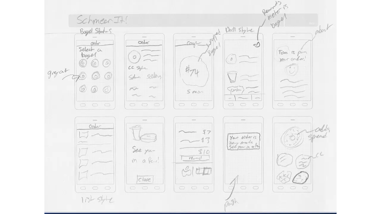
    After our initial research and planning, we began to sketch wireframes for potential designs and user flows. This process, like every process was collaborative and we went through 2 rounds of wireframes before moving to digital mockups.

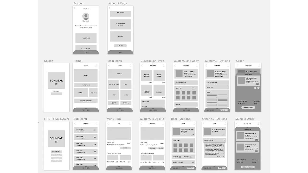
    Wireframe sketches of the Schmear It ordering app.

    From there we made individual mood boards that we combined into a unified team mood board with our color palette, potential iconography, fonts, etc.

    Images and colors that inspired the style of the app.

    We then began creating wireframes in Sketch and tested paper prototypes with users.

    Low-fidelity prototype of the screens.

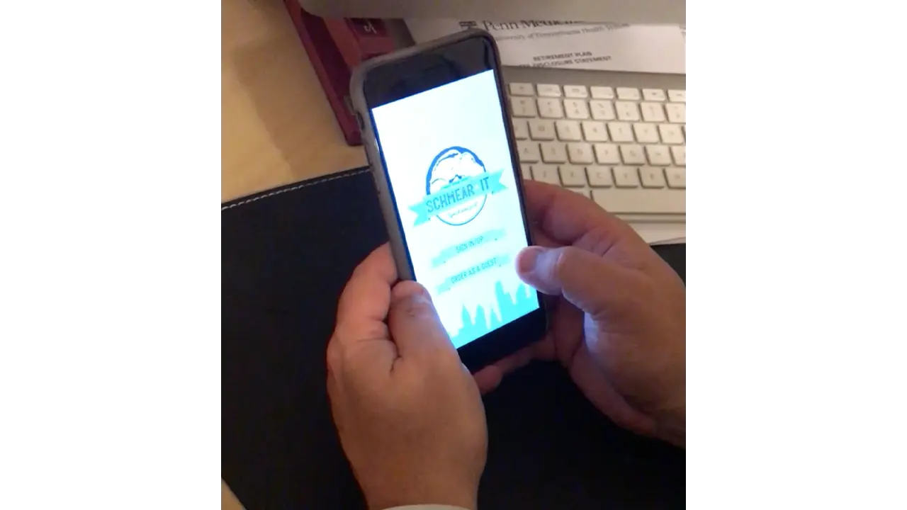
    After testing with paper prototypes we moved into testing digital mockups with scripted user interviews. We repeated this testing every week from weeks 6-10. After each round of testing we regrouped as a team, discussed our user feedback, and determined what changes needed to be made for the following week. Collectively we tested with approximately 50 users over weeks 6-10. In week 7, we began using Flinto to add animation and navigation to our prototypes. The navigation went through several revisions as the first few prototypes were difficult to navigate. By week 10 we had a final prototype that went through one final round of testing and validation.

    Person testing a prototype of the Schmear It app.

    Overall we split the initial wireframe sketches and user testing between each team member. Alex Aslid created mockups in sketch and the final presentation. Alex Huffaker helped create standardized UI elements in Sketch and the final case study.
    Yuan Li created the initial wireframes in Sketch for testing and assisted Jordan with animations in Flinto. Jordan Zagerman focused on talking with the business, users, and later animations in Flinto. Miles was responsible for creating graphics and did the final work in Sketch before it was passed off to the Flinto team.

    Solution

    From the start we wanted ordering to be as easy and fast as possible. This was a defining trait that drove our design decisions. This led to the removal of an initial sign up screen and was a driving factor for the adoption of an ever-present card style cart.

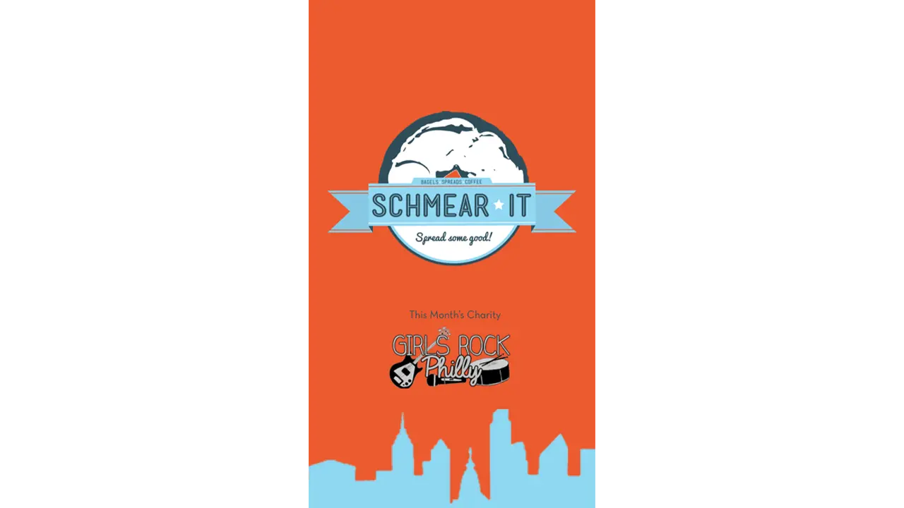
    You can see the application clearly promotes the charity Schmear It is working with that month as well as displaying their logo and branding.

    Startup screen on the Schmear It app.


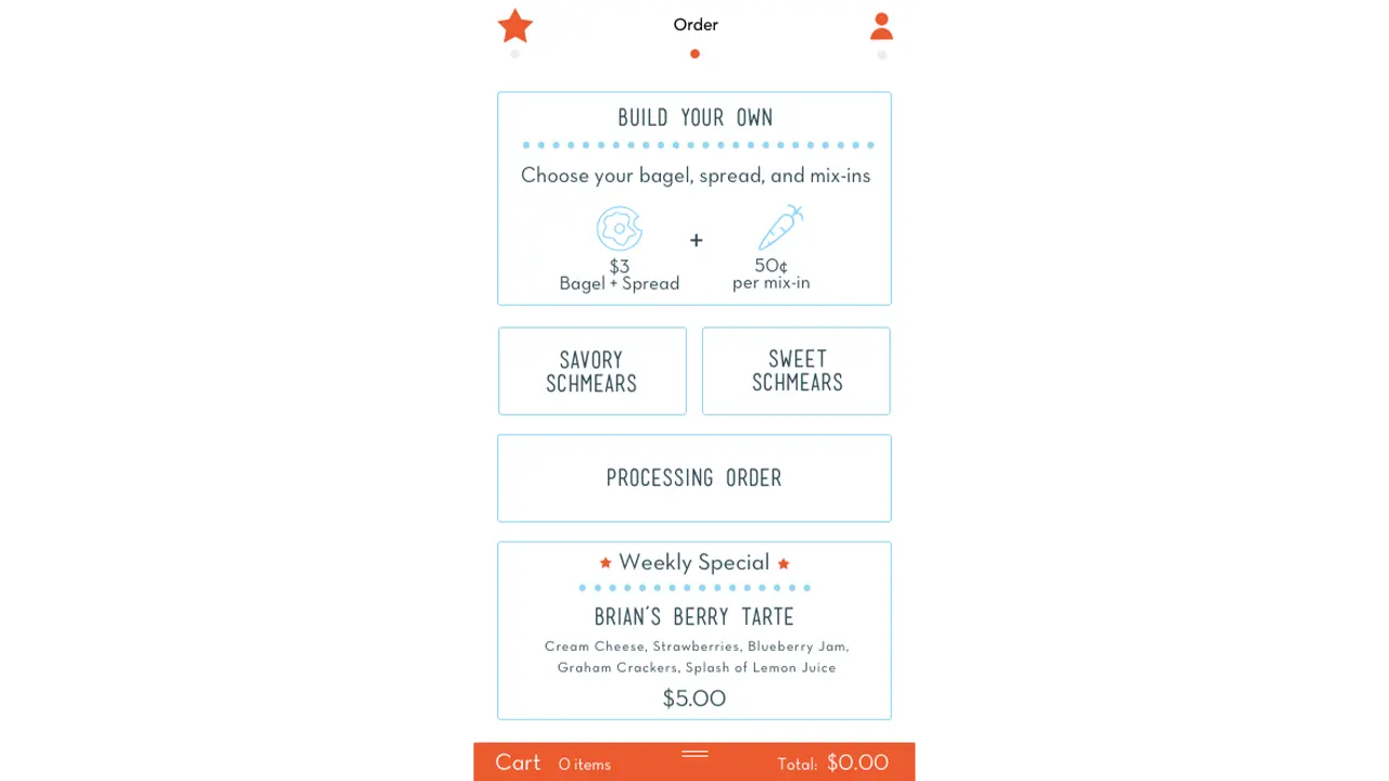
    The home screen allows the users to dive immediately into the menu and ordering process. A card-style cart is persistent at the bottom of the ordering section of the application. The location and account pages are positioned to the left and right respectively and can be navigated with a swipe left or right or by tapping the respective icon from the navigation bar.

    Homescreen on the Schmear It app.


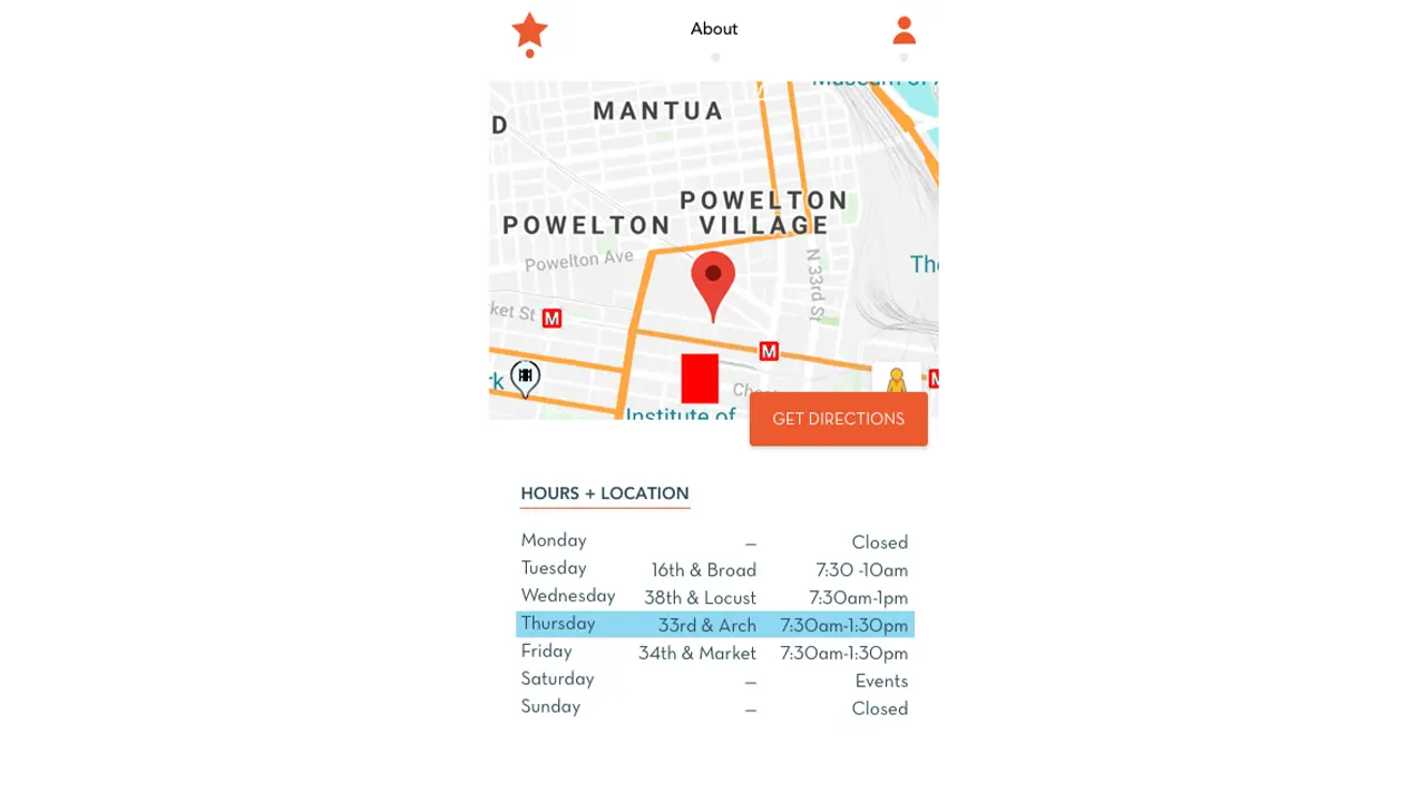
    The location and times of the truck are clearly displayed under the about section so users are aware it closes early and the location changes.

    Location and Times the shop open on the Schmear It app.

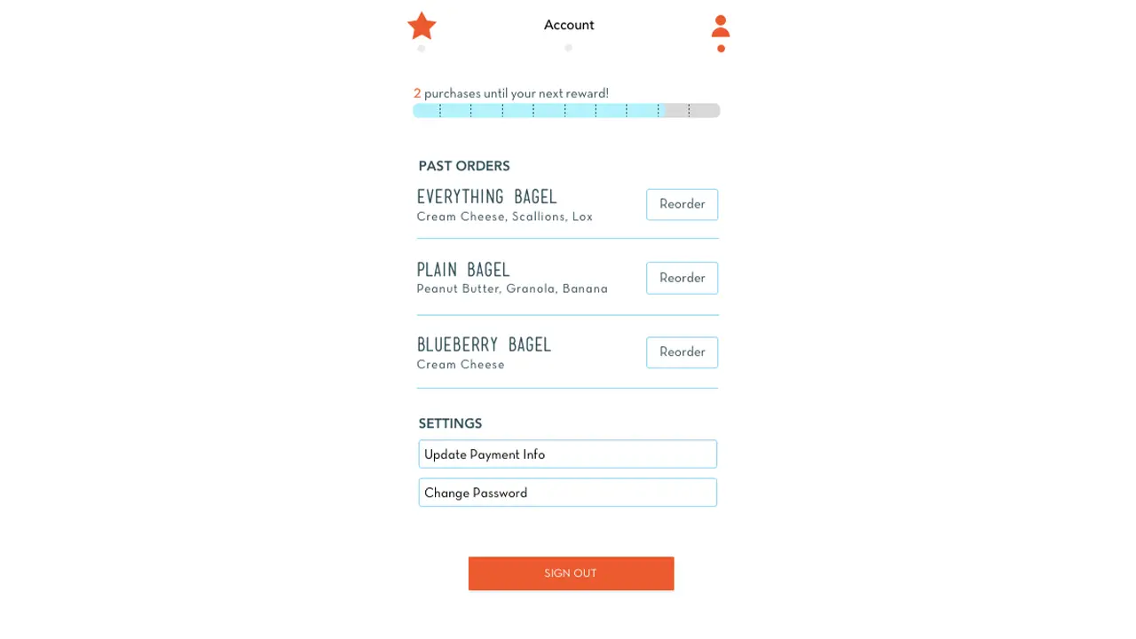
    Rewards status, past orders, and account settings are all under one screen thanks to user feedback and provide a general account overview.

    Account awards on the Schmear It app.

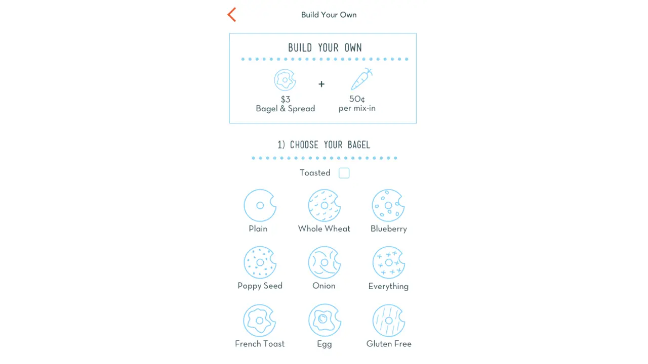
    Custom orders guide users through a step by step flow where they can select their bagel type, toasted option, base spread, and mix-ins. Each of the bagel icons were recreated in Schmear It’s graphic style.
    Build-your-own bagel screen on the Schmear It app.

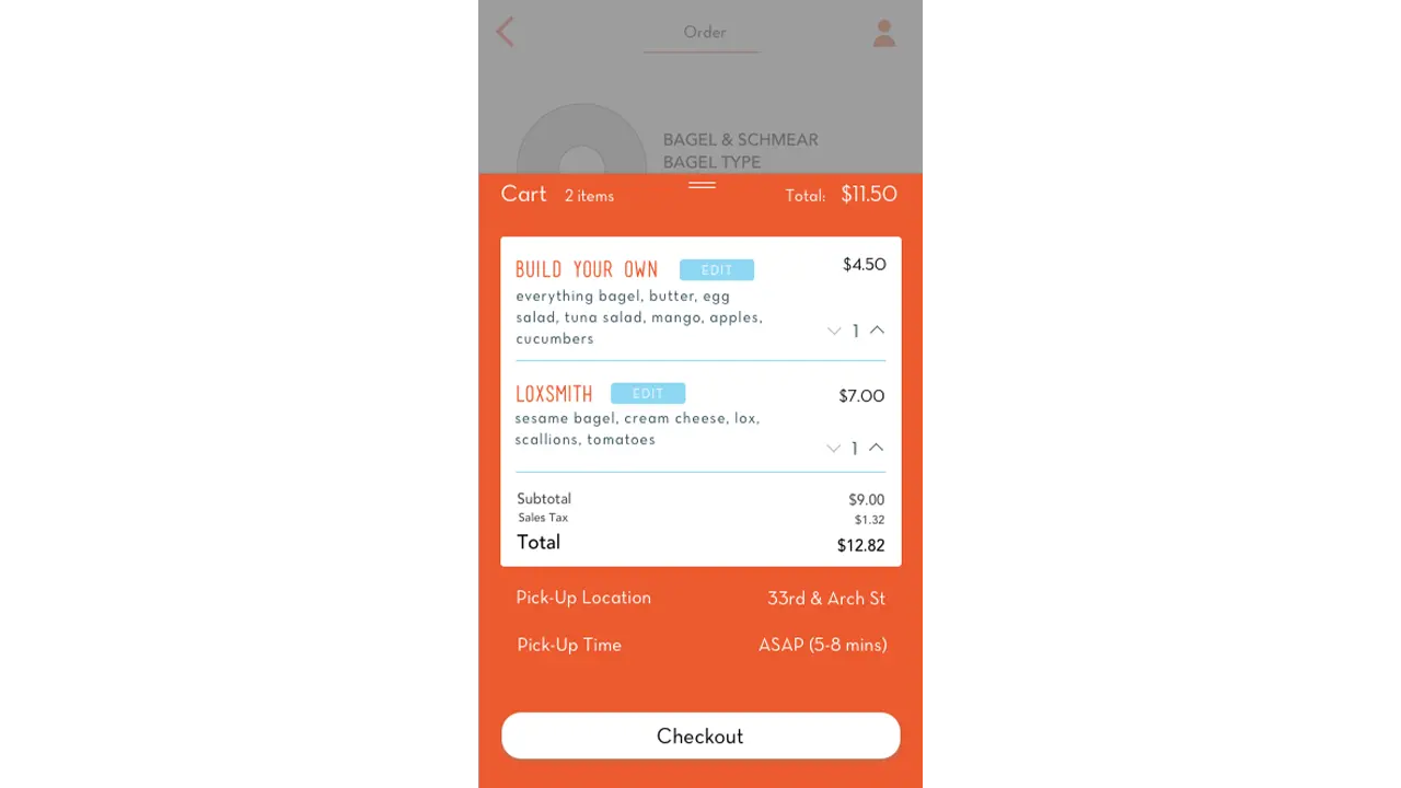
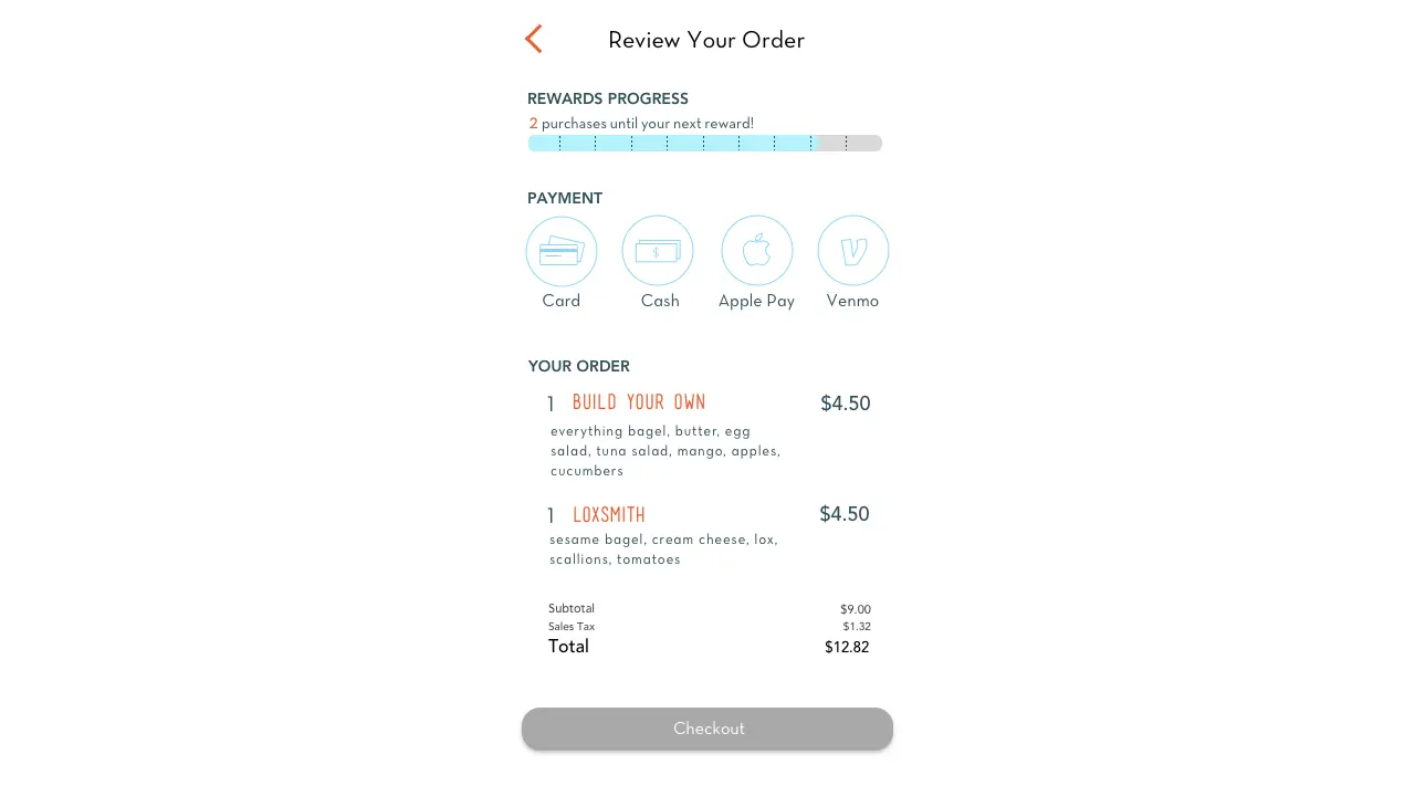
    The checkout process allows for setting a custom pickup time and location when ordering ahead.

    Cart screen on the Schmear It app.

    The payment info screen displays the user’s rewards status and alerts them if a reward is available before they complete the checkout. We also accept multiple forms of payment including Apple Pay for faster checkouts.

    Checkout screen on the Schmear It app.

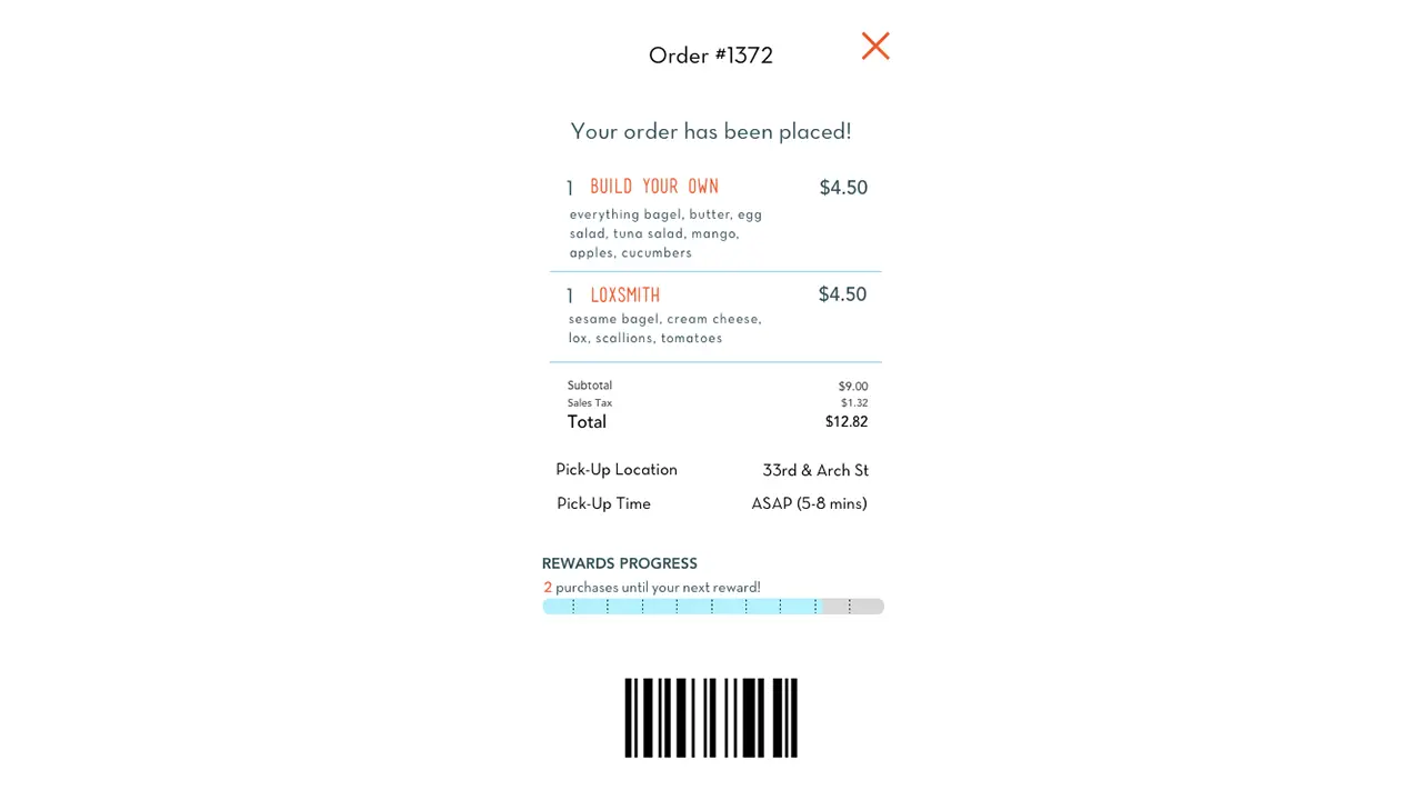
    The order confirmation screen clearly shows the location and estimated pickup time. It also has a barcode for the store to scan upon pickup.

    Receipt from the Schmear It app.

    Once an order is placed, a new order status button appears on the home screen.

    Results

    Overall we feel this project has been very successful due to the branding, ease of use, and feedback from users. We met all of the business’ criteria to promote custom orders. User feedback was tracked through quantitative user studies with users reporting increasing satisfaction week to week. The application itself is very straight forward with its ordering process and the lack of an initial sign up screen greatly decreases first time setup for new users.
    Creating a consistent meeting time really helped us stay on track even if one or two members weren’t able to make it that week. These meetings became less consistent as the project began wrapping up due to external conflicts from group members and affected the final product. In the future we would be stricter about these team meetings and at least one occurred a week outside of class. Sharing Sketch and Flinto files between the team also proved an obstacle as the team multiple versions for testing and the roles changed weekly.


  • PaperMill Ordering App

    Overview

    For the spring 2018 User Experience (UX) course, our team was asked to build a mobile application prototype for a local food truck over a timeline of 10 weeks. We selected a truck called “PaperMill”, which sells Vietnamese-Mexican fusion food on Market street, at the heart of Drexel University’s campus.

    Project Brief

    Why:

    • Bring more customers to the business
    • Provide business an additional channel option to gain more customers
    • Increase customer convenience and satisfaction

    What:

    • View menu options and order food remotely
    • Collect data on participating customers to build the best customer experience
    • Allow customer to create a profile that saves their past and favorite orders
    • Provide many options for mobile payment
    • Show the truck location and hours, as they are inconsistent throughout the week

    How:

    • Minimize in-person wait time in front of the truck
    • Simple and effective design to display menu, pricing, promotions, etc.
    • Display accurate information on the truck and keep it up to date
    • Prevent customer turn-over by catering to the customers across multiple platforms

    The Team:

    • Hannah Juraifani
    • Alyssa Klein
    • Meet Palan
    • Sanika Rann
    • Woo Young Song

    Introduction

    Using a mobile device to order food has increasingly become common-place. Food trucks are generally individual businesses and operate locally, so the majority do not have their own individual digital application. Many of these trucks utilize third party services like GrubHub to take advantage of digital customers without having to build or maintain an application. While PaperMill does not have a digital application, the food truck itself is rather new and has become popular on Drexel’s campus. The truck itself alternates location between University City and Rittenhouse Square during the week, and on the weekends, it is commonly found at catering events throughout the tri-state area. Due to their local success, their business was a perfect client for our mobile application design. By having an app for PaperMill, the wait time spent at the truck is minimized, while providing customers with a convenient way to order and pay for food. It also provides up-to-date information on the trucks current location for those who are not familiar with the trucks whereabouts.

    Background

    PaperMill was started in Sydney, Australia in 2016. It was initially a 10ft by 10ft tent at the Bondi Beach Farmers Market. As it grew in popularity, there was an opportunity to bring the fusion of South-East Asian and Australian style foods and favors to the United States, starting in Philadelphia. PaperMill throws a spin on the classic burrito by offering “spurritos” (a rice paper spring roll wrap around fresh ingredients), bowls for those not interested in the spurrito style, and Banh Mis (Vietnamese hoagies). Customers who prefer their food on the spicy side can add jalapenos or sriracha to their order, and the ever-popular option to add sliced avocado. The truck offers water bottles and LaCroix as their two beverage options.

    Objective

    The goal for this project is to increase the use of mobile ordering in order to reduce wait time spent in front of the truck. Our front-end development team consisted of 5 members: Hannah Juraifani, Alyssa Klein, Meet Palan, Sanika Rann, and Woo Young Song. We had similar responsibilities each week. Based on the results of several prototype testing sessions, we went through multiple refinement stages until we built a prototype that catered to our target audience best. Throughout the ten weeks, we were able to problem solve by using our increasing knowledge of user experience design.

    Process

    The process began listing our project’s strengths and weaknesses for analysis. As a team, we spend time each week on basic analyses via sticky notes. This allowed us to ideate on what features are most important to the app, the target audience, user pain points, and potential benefits. We began to compile wireframe sketches for possible iterations of the future application. We conducted primary research by doing observation sessions on-site. As a team, we took notes on the food truck’s interactions with customers, as well as constructing a journey map of the process of ordering food at the truck. This was recorded in the project canvas and business model documents. We also identified the components, characteristics, challenges, and characters of the necessary design. A project brief was created for our research on PaperMill’s competition, such as Chipotle, iPho, and Hawker, which are all within the same block on Drexel’s campus. The competitor analysis also included research on existing mobile food ordering applications, which we critiqued as a group to determine what should and should not be included in our design.

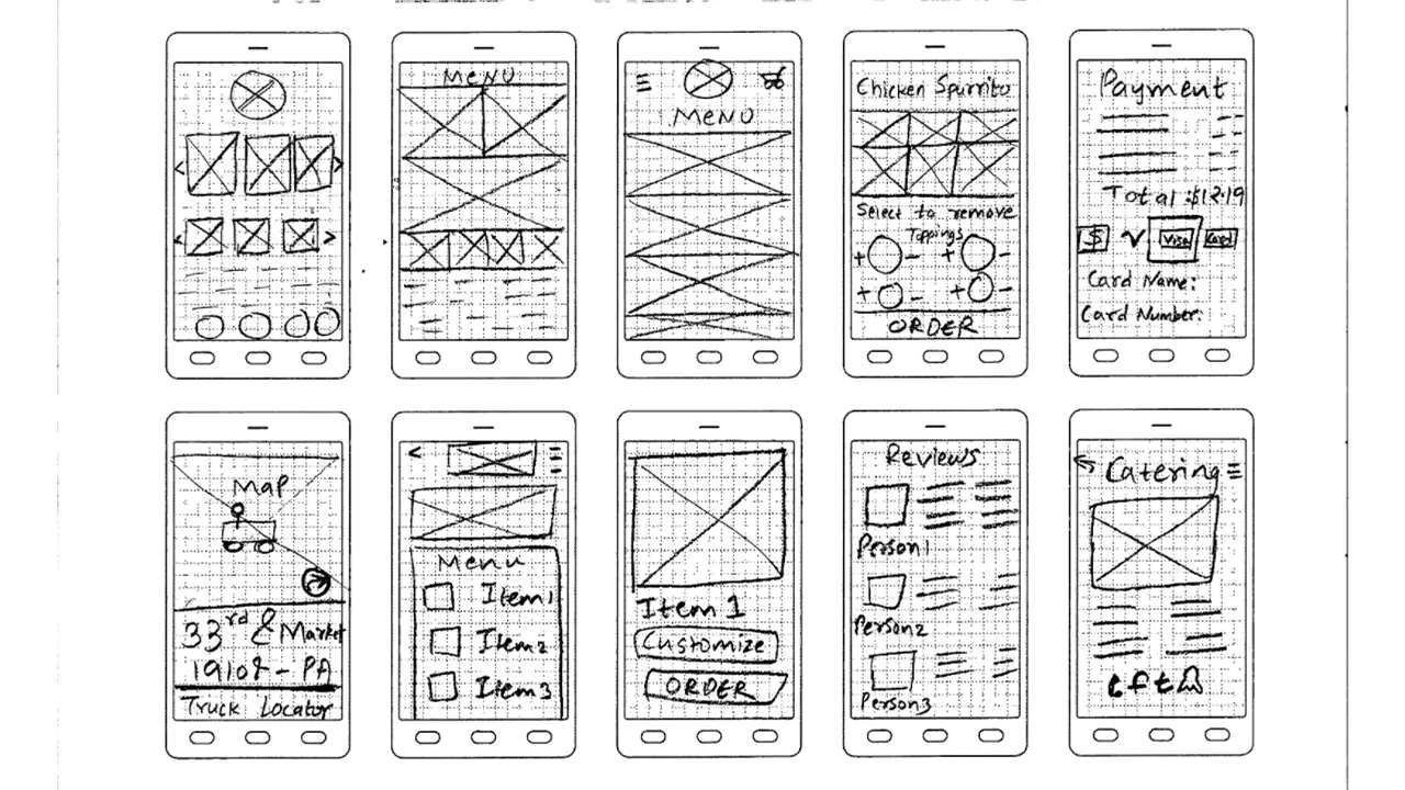
    Each team member created an individual mood board, and a team mood board was derived from the individual ones to define a general aesthetic and color palette. We created an affinity map, and each team member sketched 50 possible designs for the future prototype. We crafted user personas of the potential target audiences: Drexel students/staff, locals, Drexel gym goers, and vegans/vegetarians. This gave a better understanding of who the users are and how to empathize with them to inform an appropriate design. We created a journey map and task flow for the application as well. As we got closer to implementing the actual design of the app, we continued to sketch ideas out as wireframes and we selected the best sketches for the prototype. From there, we created paper prototypes and asked potential users what they thought about the prototype’s usability.

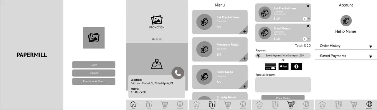
    After gathering feedback from the tests with potential users, we came up with ideas as to what features will be included in the actual prototype as well as the basic layout and how it should work. The low-fidelity prototype had no colors, images, or style, everything was still greyed out. Our mid-fidelity prototype included colors, graphics, and style.

    Research

    User Personas:

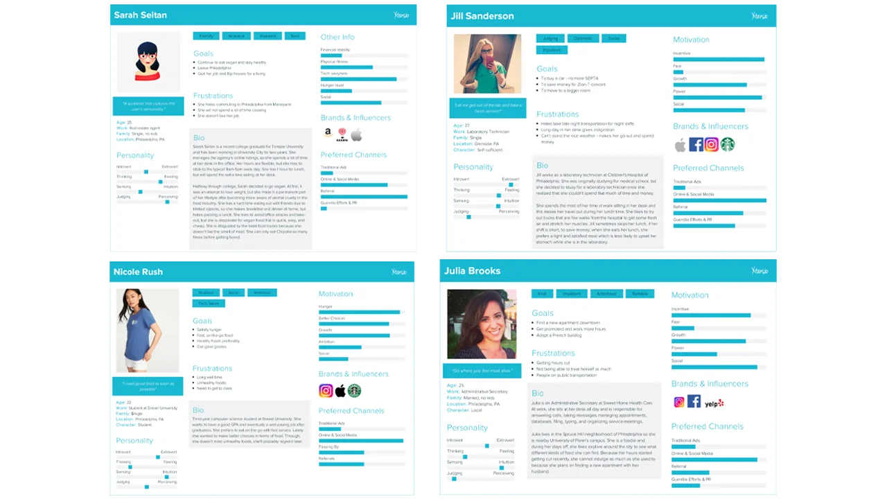
    Four user personas that represent the type of customers who would buy from PaperMill.

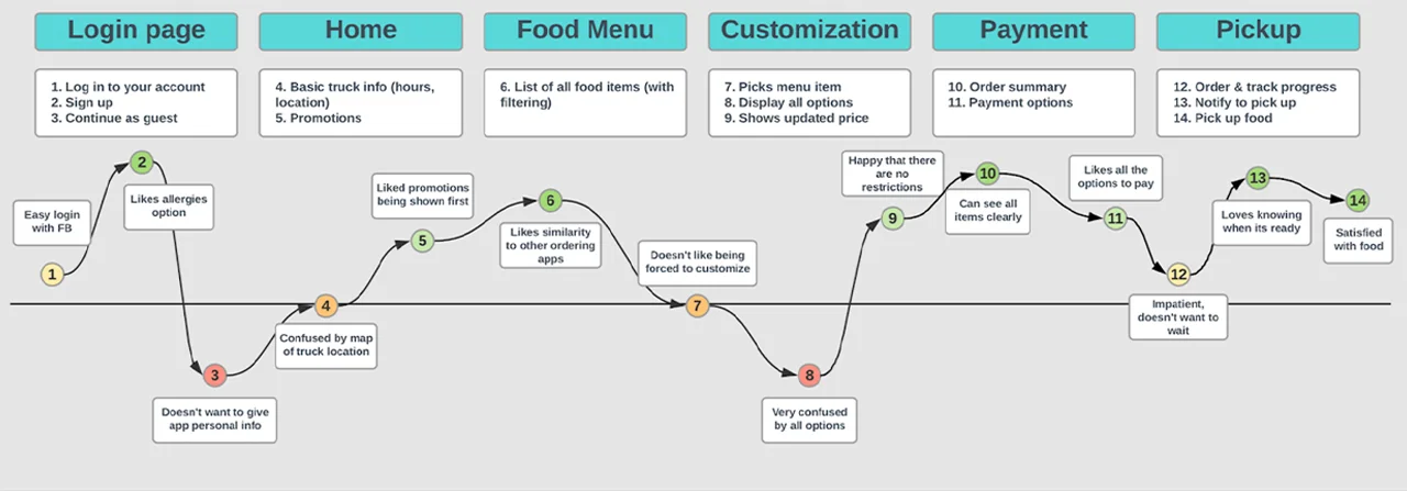
    User Journey Map:

    Feelings a customer who uses the app might go through at each step.

    Wireframe Sketches:

    Sketches for the layout of the PaperMill ordering app.

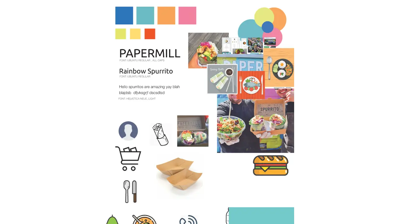
    Style Guide:

    Colors, fonts, images, and icons that represent how the PaperMill ordering app will be stylized.

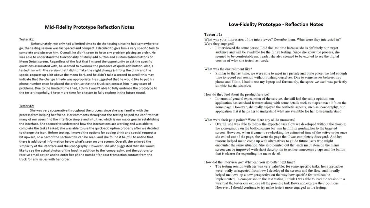
    Low + Mid-Fidelity Prototypes:

    Low-fidelity prototype of the PaperMill ordering app, focusing on placement of each element.

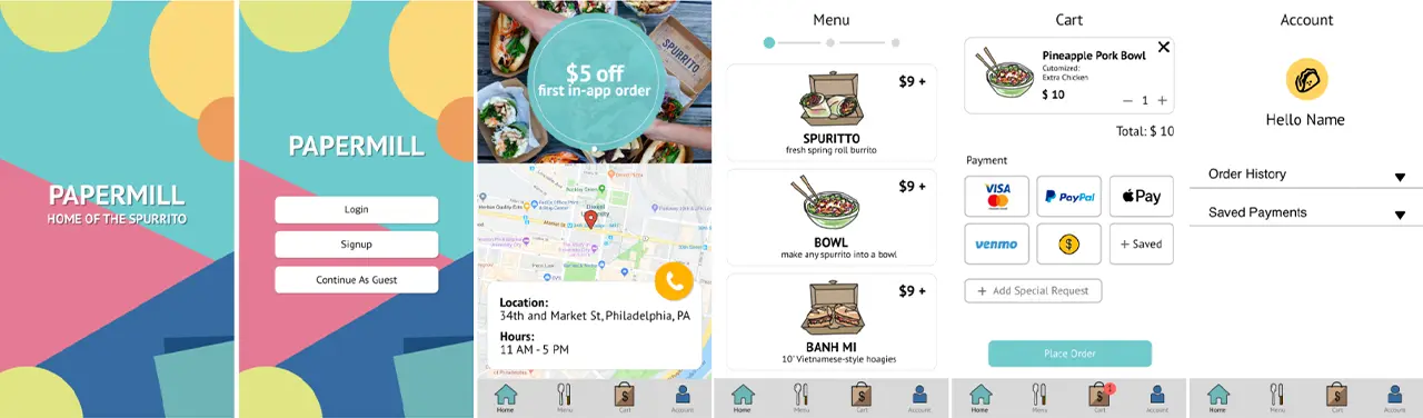
    Mid-fidelity prototype of the PaperMill ordering app, adding color to the previous prototype.

    Reflection Notes:

    Notes from user testing of the low-fidelity and mid-fidelity prototypes.

    Solution

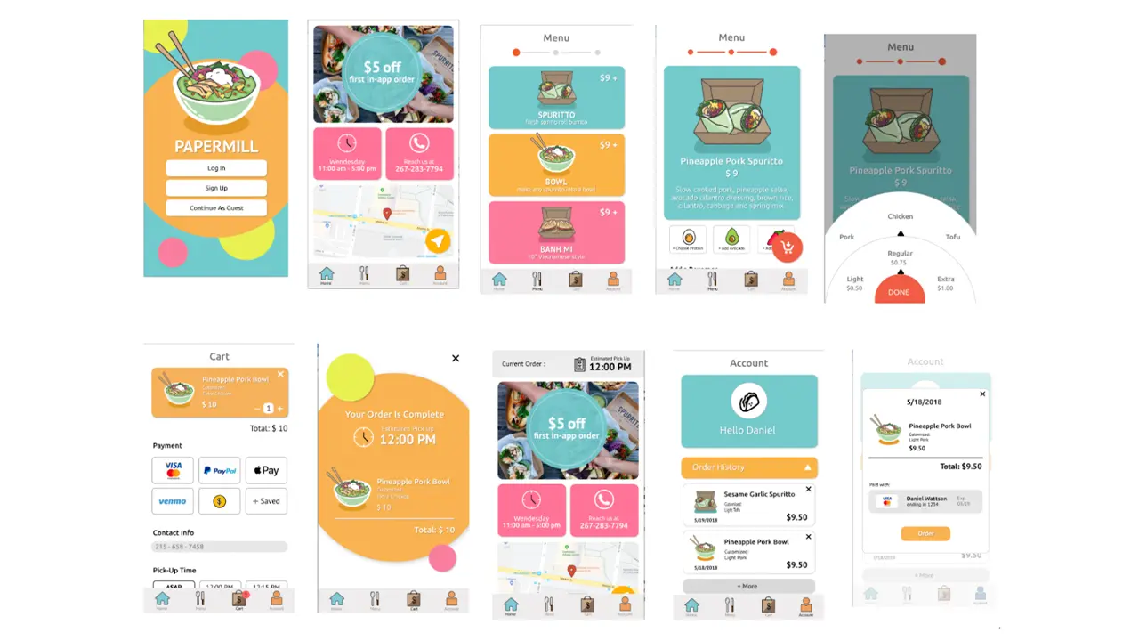
    Final screens of the PaperMill ordering app, featuring a login screen, menu, cart, and account.

    We added a splash page so that the user can get a feel for the app on its first time. The vibe we were aiming for is fun. We allow the log in and sign up to have connections with Facebook and Google because the user may prefer to have a different way to log in. For the home screen, there is a promotion so that users can know the promotions that the truck is having. There is also a map because the truck changes locations depending on the day of the week. We also showed the hours of the truck on the home page so that users can know the hours for that day. Lastly on the home screen, there is a way to call the truck in case the user needs to contact the truck directly. In the menu, there are only three different food items the user can choose so we created icons for the food and added a splash of color to continue the vibe we have in the splash page. In the individual food item menu, we kept the color scheme from the main menu to show consistency. Since the item is customizable, the user have the options to choose protein, add avocado, or add spices to their order along with a beverage item if they choose so. When you click on the customization options, you will get a wheel where you can choose the amount or protein you want on the order in a fun way. For the payment page, we added multiple different ways to pay for the order because each user is different in how they want to pay for their order. Carrying over from the splash page, the confirmation page keeps the vibe of the app while giving important information such as the total price and when the order will be ready. The user will then be taken to the home screen again, but this time, there is a tab on the top of the screen that shows the time that the order will be ready at. The profile page shows the user their order history and saved payments to show the user their history with the app and how they are paying. Within the order history, the user can reorder their previous order. We decided this was a good idea because users who order the same thing all the time can just order without going through the customization part again.

    Results

    In the end, we do think that we delivered a solid final product and it is definitely a success. After conducting usability testings as we progressed, we learned that designers mental models’ not always match users’ conceptual models. At times, users had problems understanding some of the things that we thought (as designers) would be great for users. This is where multiple usability testings helped us a lot as we kept on making changes as per the users’ needs. We divided our whole UX process into three main categories namely strategy, research and design (paired with testing). In the future, we would definitely follow this process in order to deliver a final product that is easier for the users to use.


  • Side of the Road Jerk Chicken Ordering App

    The Overview

    When assigned the project of creating a mobile food-ordering application, our team knew exactly who we wanted to ask. Side of the Road Jerk Chicken is an authentic Jamaican kitchen and food truck based in North Philadelphia. The owner, James Legget, is a passionate and inspiring man who connects with each and every one of his customers. We strived to create an app that speaks to the familiarity of his brand while streamlining the ordering process.

    The Team

    • Claudia Bonitatibus
    • Sarah Bray
    • Hannah Sayer
    • Caroline Scheinfeld

    The Context & Challenge

    Side of the Road Jerk Chicken takes pride in their strong sense of community and because of this, has a very dedicated consumer-base. The goal of our mobile app is to bring this warm, friendly, community feel to a digital format — just because the customer may not be able to wait extended periods of time for food from their favorite Jerk Chicken Food Truck doesn’t mean they shouldn’t get #TheExperience, a phrase Mr. James coined to describe its magic.

    Our main challenge was making the app as personalized as possible while maintaining an efficient and intuitive ordering process.

    The Process and Insight

    Before beginning the process of designing or even structuring our app, it was important to get an authentic sense of what Side of the Road Jerk Chicken’s business model is and the needs of their clients. Mr. James is very dedicated to the quality and the authenticity of his product. Because of his business model and investment in both the quality of his product and the overall experience of his customers, Side of the Road Jerk Chicken’s fan-base is very loyal. The app was designed to target both new and returning customers.

    After seeing the onsite location of Side of the Road Jerk Chicken in Sherman Mills, we were able to fully immerse ourselves in analyzing both the business and the consumer-side of the product we’ve designed. This analytical stage included a SWOT analysis, the Four Cs and creating different proto-personas.

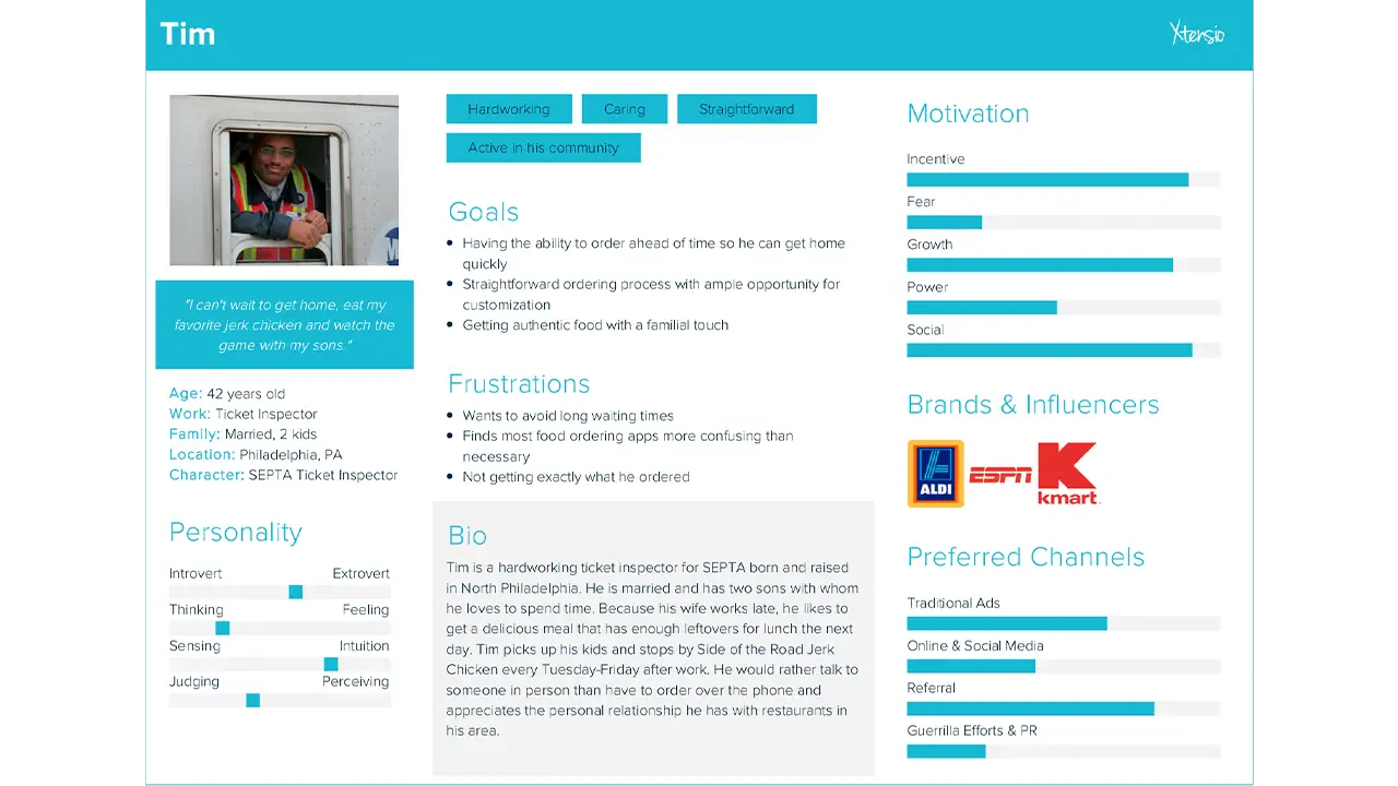
    User persona, listing the qualities of the type of people who would use the app.

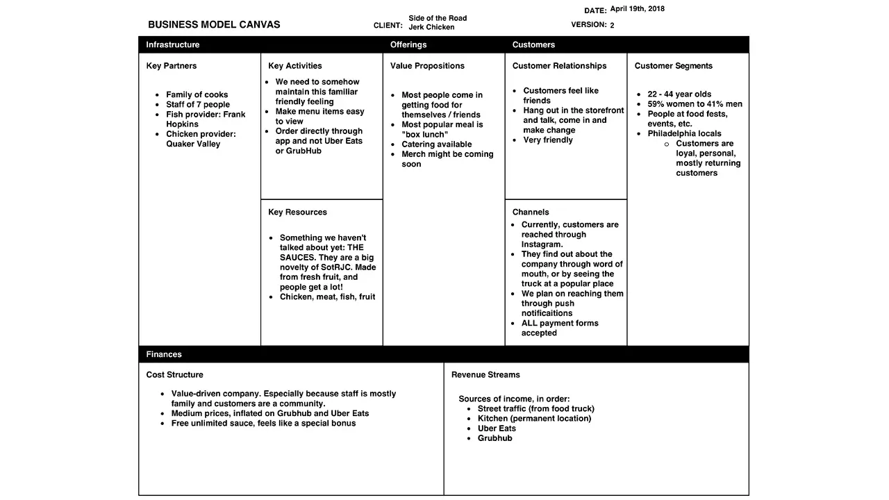
    Business model explaining the food truck's infrastructure.

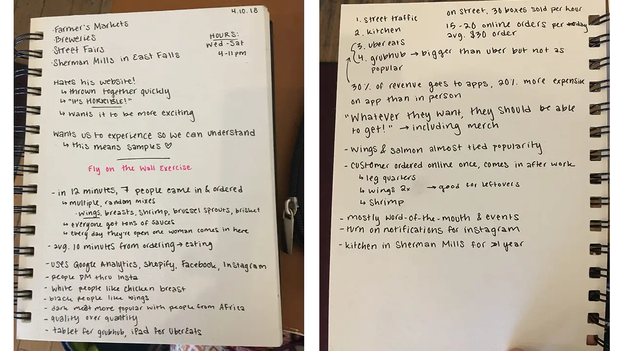
    Notes taken from talking with owner and observation exercises.

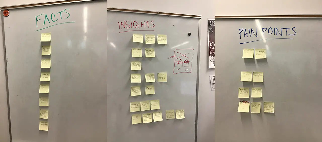
    After these exercises, we each conducted user interviews on which we shared detailed notes. This gave us a better sense of who our target users were and what real users would be looking for in a mobile food ordering app. Using the feedback and information we took away from these activities, we made a list of facts, pain points and insights to keep in mind while solving our main problem: how do we make our app meet the needs of the consumer and our client in a seamless, intuitive way while fully capturing the spirit of James’ business?

    Notes organized under three categories: facts, pain points, and insights.

    Information Architecture & User Experience Approach

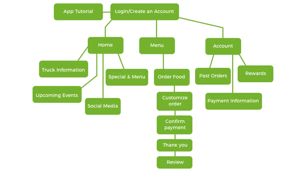
    The information on the app was organized in a way that reflects the needs of the users as well as our client. The main things that the user needs to know is the location of the truck, what’s on the menu and past payment information. Our product goes beyond simply clicking on a menu item and ordering it; we allow them to stay in touch with the truck by showing them how to easily located the truck and keep updated on its whereabouts. Other information such as a rewards-based loyalty system, meal combos, the option to customize  your meal with sauces and a previous orders section were added to embrace what helped drive the company’s identity.

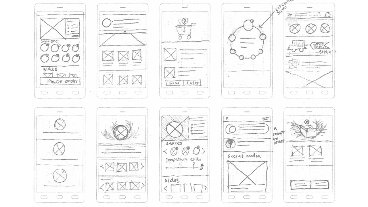
    Before building the wireframes digitally, we sketched out what we envisioned the main task flow of ordering a food item would look like and received input from users on how effective our method was.

    Sketches of wireframes and flow of the app.

    Clean and updated flowchart, depicting the steps users will go through when using the app.

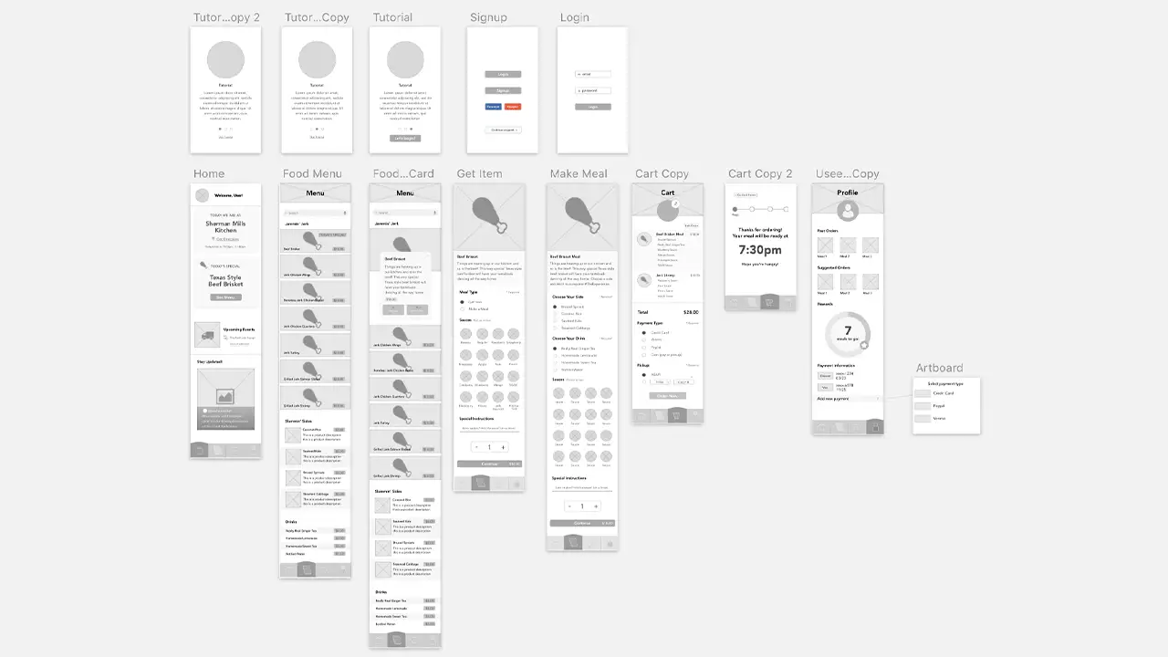
    From there, we were able to build a rough draft of the wireframes which we used to conduct two rounds of usability testing and made adjustment to the layout accordingly.

    Low-fidelity wireframes of the app made for testing.

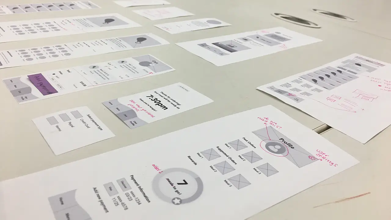
    After more testing, we revised and built a paper prototype. This allowed are users to actually “click” through the app and see how the ordering flow would work.

    Printed versions of the wireframes, tested by users to see how intuitive the layout and if the user flow matched the drafted version.

    Design and Branding

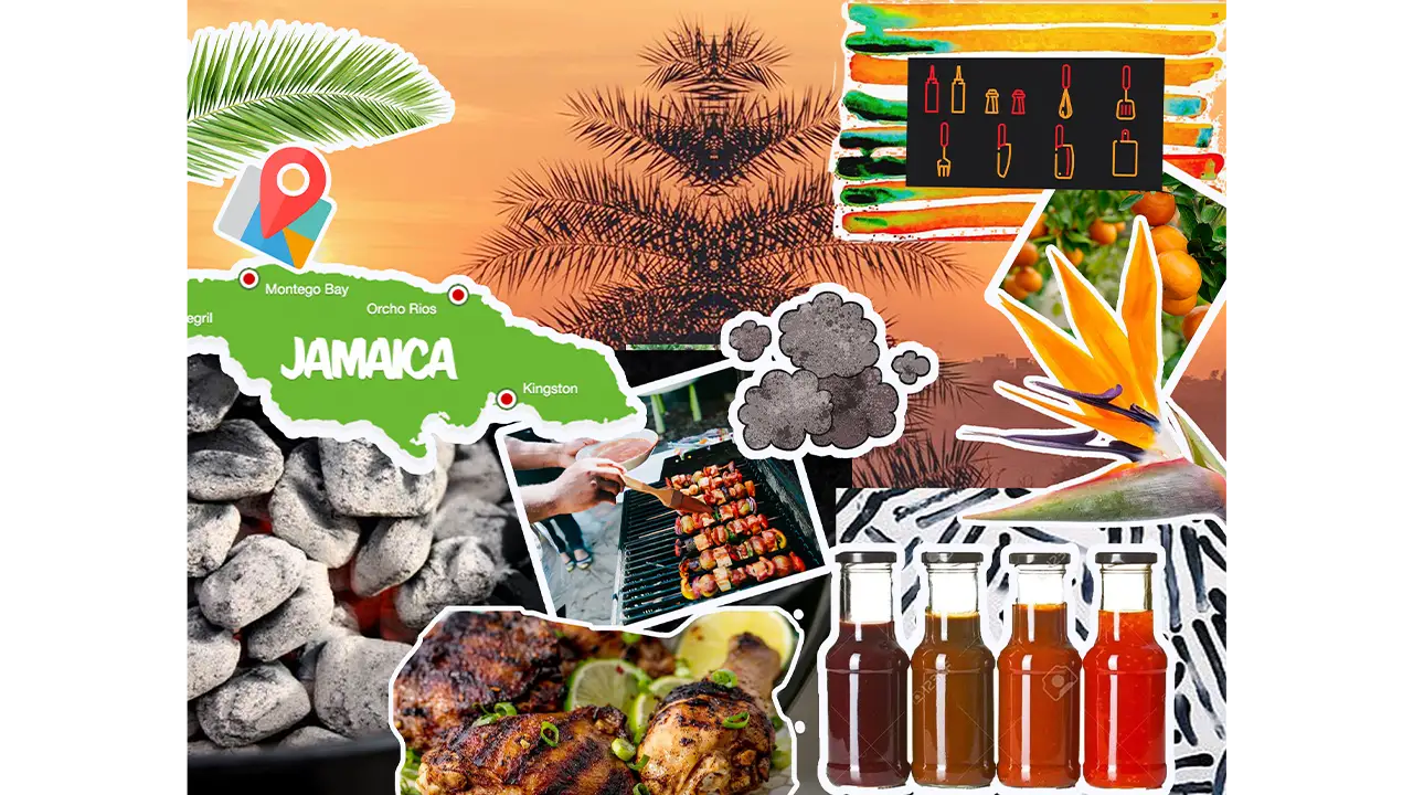
    The branding of our app was a challenge in itself because we had to find a way to bring a very rich feeling to a digital format which would breathe life into our product. What made this task demanding was the fact that we had to a lot of rebranding. This is because while Side of the Road Jerk Chicken has a website, James was not happy with the design of it in the slightest. We began tackling this process by creating individual mood boards and from there, agreed on a dark, chalkboard theme, green and yellow accents from the Jamaican flag and vibrant tropical flowers scattered about.

    Collage of images that inspired the aesthetic of the app.

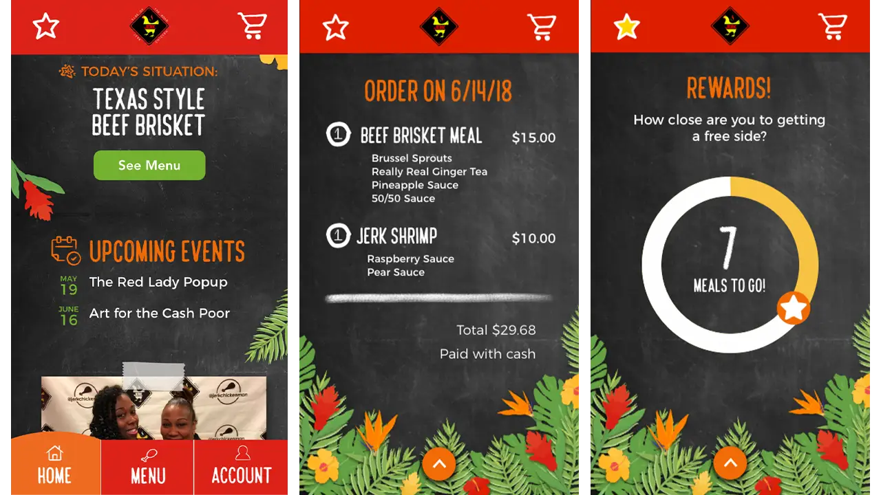
    From that point forward, we were making the vector graphics of the fruits and flowers to create that warm atmosphere we were striving for.  After we put the wireframes through two rounds of usability testing with we began the process of adding fonts and colors to the prototype. After adding the styling to our app we ran it through two more rounds of usability testing and continued to make minor changes to the layout. Our end product blends the vibrant colors of Jamaica with a hands-on chalkboard texture which gives a touch of James’ personal brand and business model to our food ordering process.

    Homescreen, cart screen, and rewards screen on new ordering app for Side of the Road Jerk Chicken.

    The Results

    From where we began to the final product, our team could not be more proud. After only ten weeks and losing a key member of our team, we encountered our fair share of challenges; however, in the end, you would have no idea. Our concept of an island-themed, user-friendly application that used common practices to solve the challenge of mobile food ordering was a success. It is a personalized, intuitive application that has ample opportunity for customization and stays true to our goals.

    We’ve learned so much about empathic research and user-centered design throughout this term. Our team can’t wait to share this prototype with the world!

  • Governors Ball

    IDM240: Interactive Graphics

    By Sanika Rann – 2018

  • GRIMES

    IDM240: Interactive Graphics

    By Sarah Bray – 2018

  • Sxmniak

    IDM240: Interactive Graphics

    By Robert Nashed – 2018

  • Folsom Street Fair

    *WARNING: Flashing Colors*

    IDM240: Interactive Graphics

    By Jordan Zagerman – 2018

  • Quote of the Day: Inspirational Words from Famous People on Their Birthdays

    IDM362: Interactive App Design II by Seamus Donaldson

    Background

    “Quote of the Day” is a concept I came up with for my Interactive App Design course. Since this was my first time experimenting with apples integrated development environment, Xcode, I knew I wanted to create something simple so that I could focus on learning the basics. The concept for Quote of the Day came to me after seeing an inspirational quote on Facebook; my idea was to show users inspirational quotes every day from influential people on their birthdays, thus Quote of the Day was created.

    Design

    Sitemap

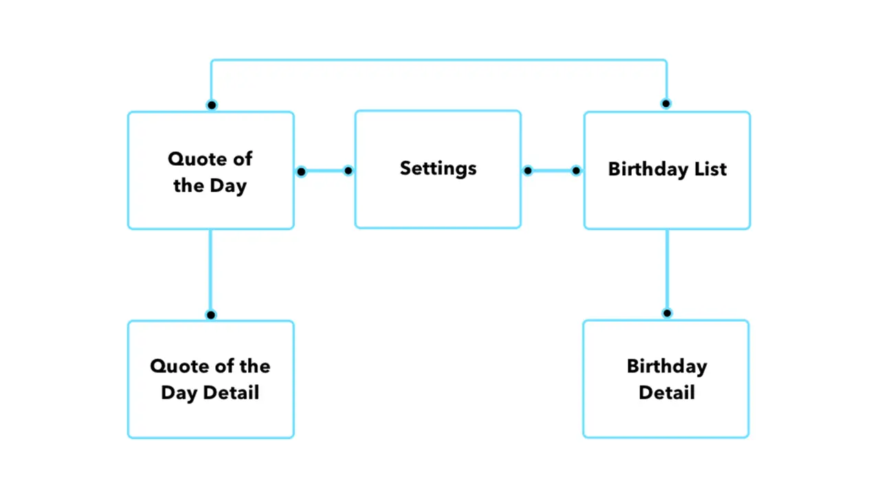
    Once I had the idea for my app I needed to organize the content I wanted to include in a way that would make things easily accessible and user friendly. By creating a sitemap, I was able to clearly understand how users would get through the flow of the app. My goal was to make all pages accessible with just two taps.

    Chart displaying how a user could travel through the Quote of the Day app.

    Sketches

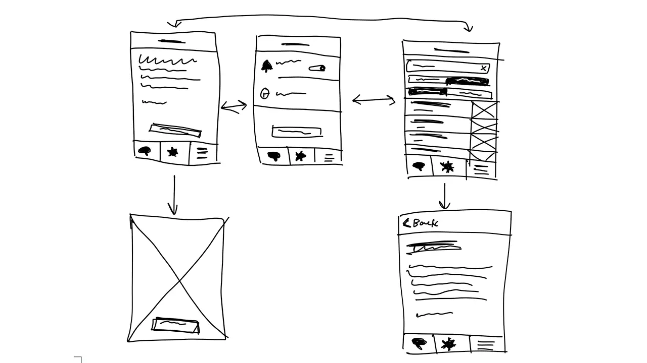
    Before I could start designing my screens in Xcode I had to come up with some sketches that I could refer back to throughout development. I wanted the screens to be clean and free of all unnecessary content so I made sure to only include functional elements.

    Sketches showing the placement of the elements on each screen.

    Quote of the Day

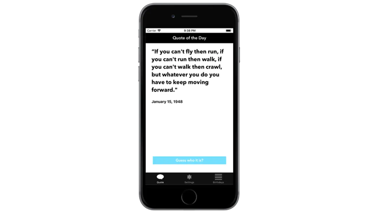
    The first page I wanted people to see when opening up the app was the ‘Quote of the Day’. This is the primary function of the app so it made sense to show people the relevant quote of the day first. To make it a little more interesting I left out the name and picture of the person who’s being quoted so users could guess. Once a user had an idea, or just wanted to know who the quote came from, they could simply click ‘Guess who it is’ and the page would flip, showing the full portrait of the person as well as their name.

    Screen from the Quote of the Day app, showing the quote for January 15th.

    Settings

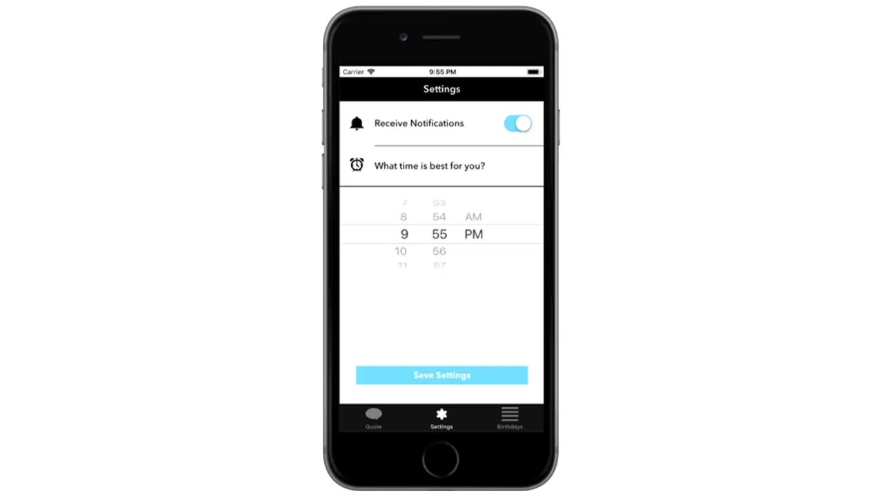
    The settings page isn’t very interesting but when you’re creating a native app that takes advantage of notifications, it’s important to provide users with options for when they want to receive them, if at all. By simply asking users if and when they want to receive the notification for the quote of the day, I was able to create a clean and easy to understand interface that took advantage of premade elements in Xcode.

    Screen from the Quote of the Day app, showing settings for if the user wishes to receive notifications for their daily quote and what time they want to receive it.

    Birthday List

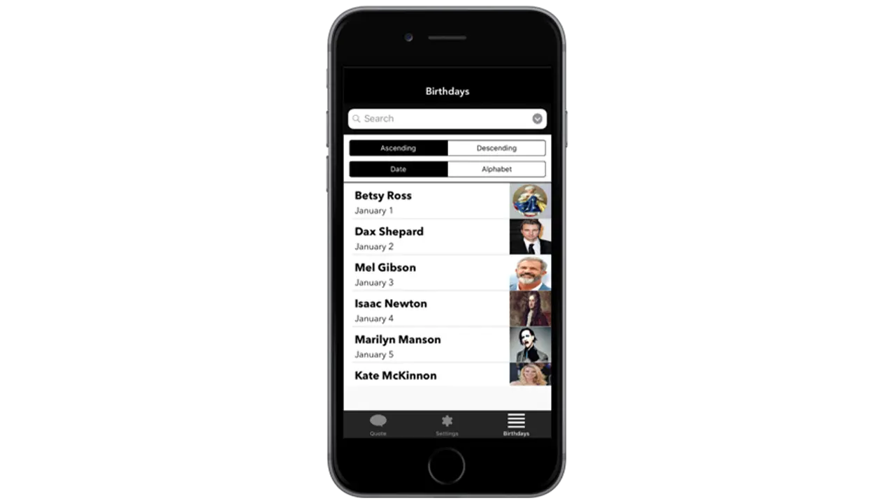
    The birthday listing page is the secondary function of the app which is why it’s not the first page you see. If a user is curious to see more quotes they can go to the birthday listing page to see who’s featured on the app, and if they’re interested in seeing that persons quote, they can simply tap on their cell block and go to a detailed page that shows their quote.

    Screen from the Quote of the Day app, showing the list of dates and which famous person the quote from that date comes from.

    Fonts and Colors

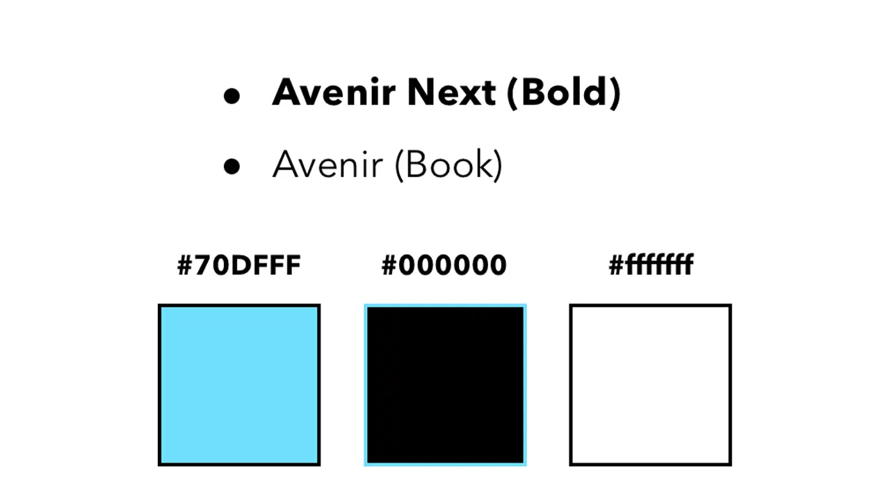
    I wanted the aesthetic of the app to feel modern and sleek which is why I chose a black and white color scheme complimented by blue to represent functional buttons. I used Avenir next and regular because they’re both sans serif fonts and are easily readable.

    Style guide featuring the colors and fonts used on the Quote of the Day app.

    Tools

    All assets were created using Illustrator and Sketch. This included custom icons used throughout the app as well as the app icon. All images featuring influential people were edited in Photoshop to share equal proportions. The app was styled using Xcodes premade elements and constraints, and was then made functional using Swift.

    Logos of tools used to create the Quote of the Day app, including Adobe Illustrator, Adobe Photoshop, Sketch, Xcode, and Swift.

    Conclusion

    To conclude, I’d first say, this was an awesome learning experience and definitely something I’d do again. Working in Xcode was not nearly as difficult as I thought it would be, and given that I’m very interested in app design, it’s a relief knowing I’ve got some experience under my belt. For the future, I’d try and get some more of my functionality down, but for now I am satisfied with what I’ve created.

  • CO2Black: Revealing the Truth of Climate Pollution

    OVERVIEW

    Carbon dioxide (CO2) is the single largest contributing factor to global climate change. If CO2 was black, together as a society, we would have taken strides to reduce it years ago.

    Our solution to this problem was to create a way for people to view the world around them as if CO2 was visible, and give people achievable tasks that would help reduce their carbon footprint. It is easy to believe that your actions as an individual have no impact, but we wanted to show users that even something as small as turning off the lights when you leave a room can make a huge impact over time.

    By repeating agile development sprints of research, prototyping, and testing over the course of IDM junior workshop, we achieved our goal of creating an AR app that raise awareness of the CO2 emissions in Philadelphia and ultimately made people more conscious of the impact of their carbon footprint.

    The Team:

    • Martina Calluori
    • Jacob Culp
    • Tri Do
    • Brendan Luu
    • Brendan Russo
    • Erin Wiegman

    PROCESS

    Our first task was research. We needed to get each team member familiarized with CO2 and its impact on the environment. As we gained fundamental knowledge of the issue, we identified it as good problem to solve with augmented reality, being that CO2 is everywhere in the environment around you. With a strict 6 month timeline we decided for the sake of scope to focus on Philadelphia because of the ability to make an impact within our city.

    With basic project scope outlined, we assigned general roles, Brendan Luu as team manager, Martina Calluori, Jacob Culp, Erin Wiegman, and Brendan Russo would focus on augmented reality development, and Tri Do would focus on design, with all team members helping out in different departments as needed.

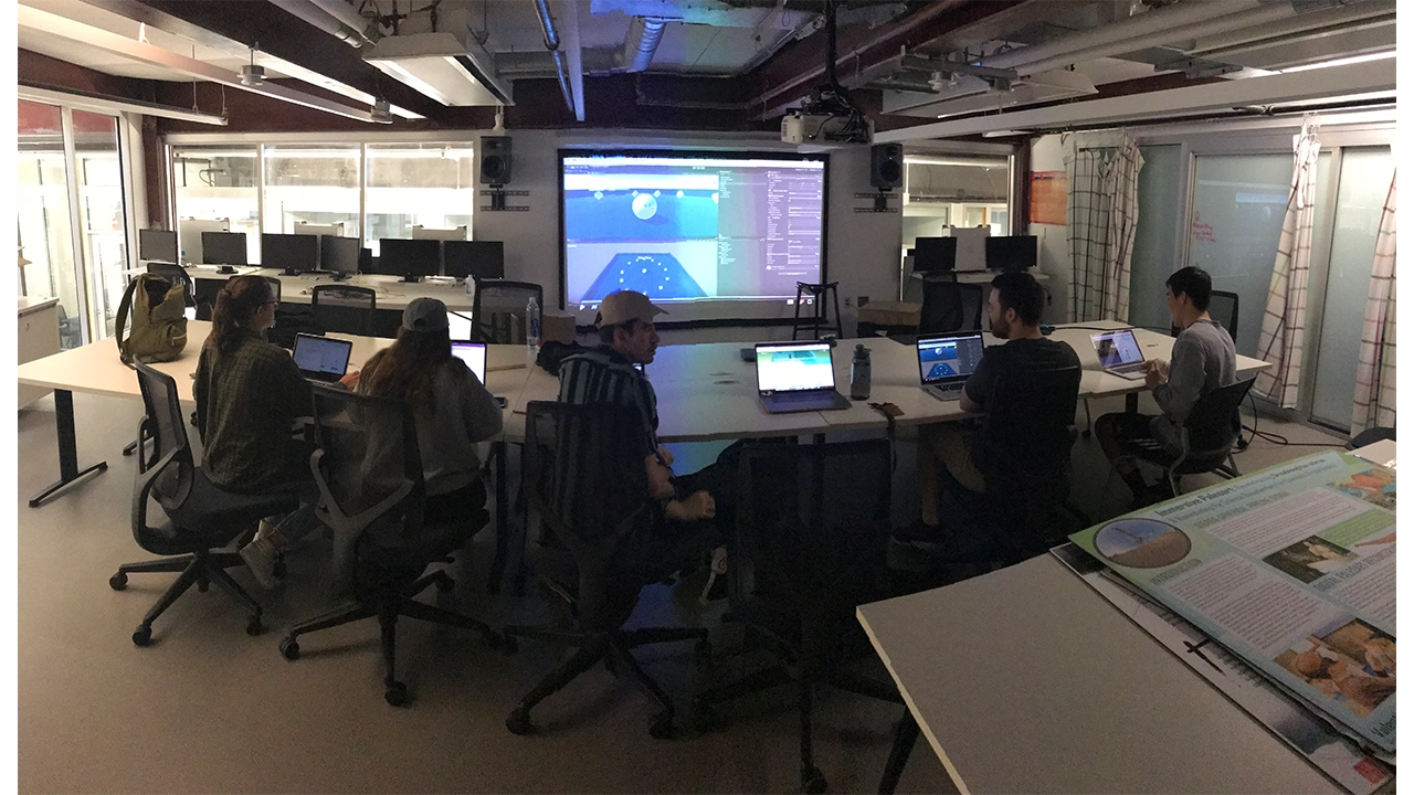
    Our final task before diving into our design sprints was getting familiar with Unity, a game engine that we were all using for the first time and also learning the pipeline of augmented reality development in Unity with Apple’s ARKit framework.

    CO2Black team testing tools used to create their project.

    LOW-FI

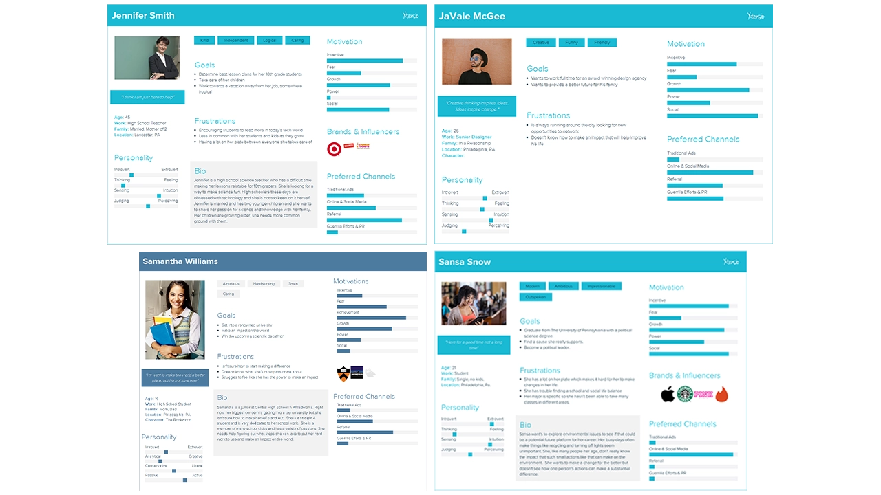
    Our first design sprint started by defining our target audience, students primarily in the high school and college age range (15-22). We identified this age range because students are typically the most open to change and learning, and their changes would have the largest impact over their lifetime. We created user persona’s based on interviews we had with students in Philadelphia that fit into our target audience so we could easily picture actual people using our app rather than a number representing an age range.

    User personas representing the audience CO2Black is aimed at.

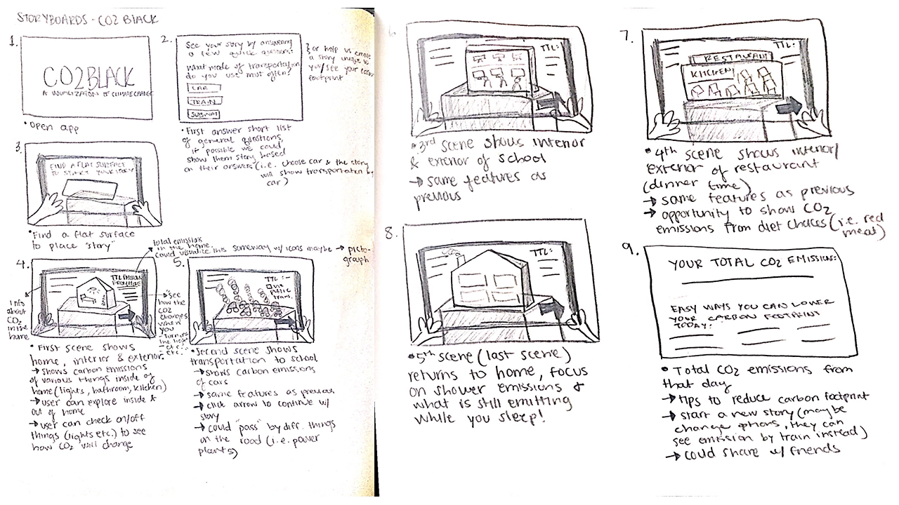
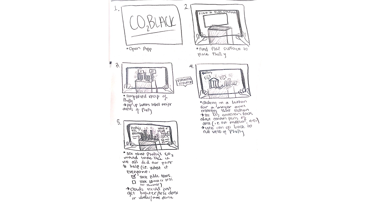
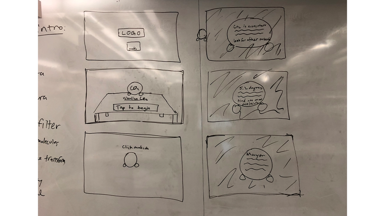
    We then conceptualized storyboards to outline our vision for the app. Our first iteration started off with people navigating through dark clouds that represented CO2 and reading facts off of 3D models of CO2 molecules that were scattered around them. The second half of the experience allowed the user visualize CO2 in a completely different way by showing a miniature 3D map of Philadelphia being filled to the top with the dark smoke to show the smoke on a larger scale. Before getting into development, we wanted to see how people would interact with this new environment.

    Storyboard of first part of the CO2Black experience.

    Storyboard of the second part of the CO2Black experience.

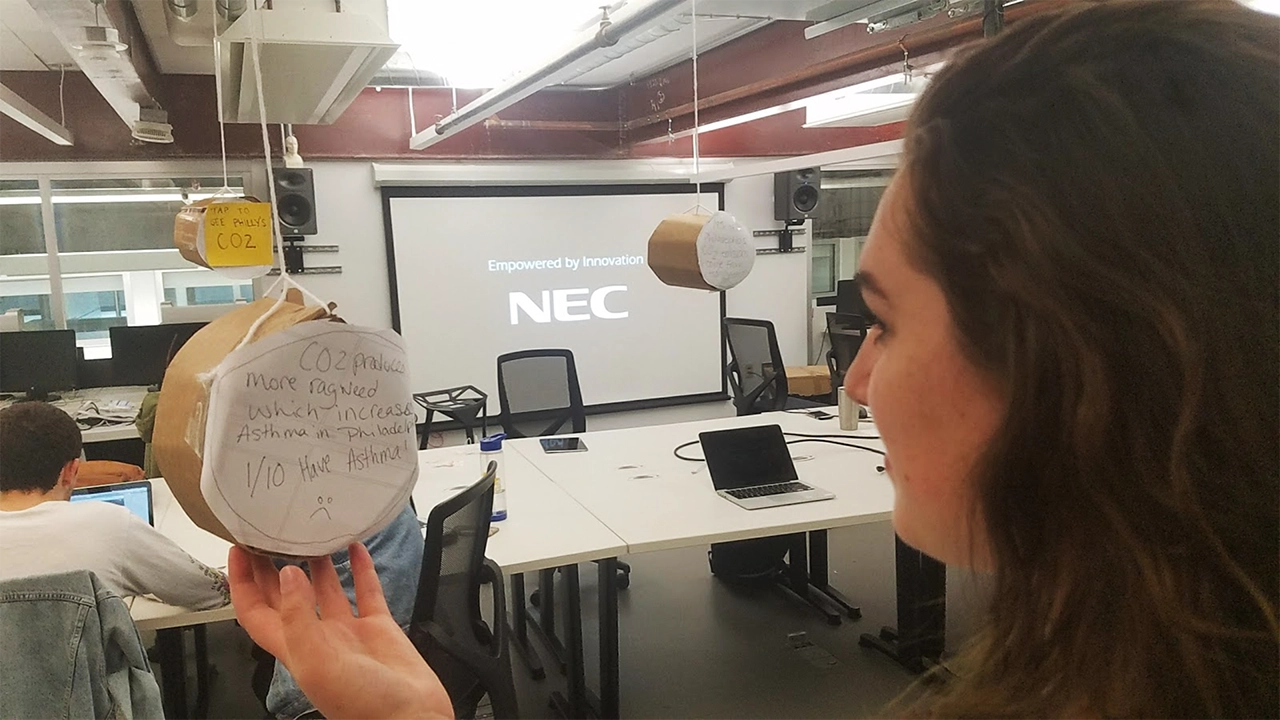
    To test this, we build all components of the storyboard with cardboard, tape, and paper and took photos of each step and put that into a clickable prototype and presented this prototype on a phone to users for usability testing. This new way of prototyping in for AR was a good idea, but was not entirely successful because users did not feel like this was representing augmented reality, and it felt just like clicking through photos. We realized that for future projects we would still build the prototype with cardboard, but instead of having users click through a prototype we would bring them into the room where the cardboard experience is being displayed and have them actually navigate around the room and see how they would interact with that.

    Paper prototype of the initial vision of the CO2Black app.

    Based on feedback from the cardboard usability testing, we went forward with creating a low fidelity prototype of this experience. We created the Carbon Dioxide molecules and displayed facts in a text format on them, but users struggled to read the text in AR, there were too many representations of CO2 which left users confused, and users didn’t know what to do with these facts and newly acquired information. We surveyed more people in our target audience and realized that we were approaching the problem all wrong, and shifted our focus to giving people achievable tasks, and making the data more geared towards the individual.


    MID-FI

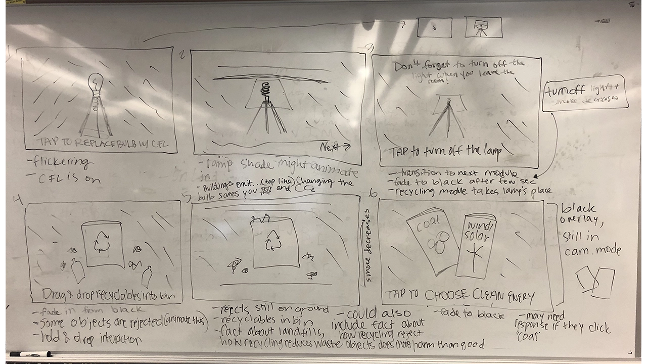
    With our failure and lessons learned from the first iteration of our app, we went back to the drawing board to create a more meaningful experience. For our next storyboards we focused on simple household tasks that have a big impact on individuals’ carbon footprints. We presented users with a 3D lamp in their environment surrounded by CO2 visualized by clouds of blackness. In the experience, users are prompted to switch from old light bulbs to energy efficient bulbs, and are informed that using the new bulbs for 1 year is equivalent to having removed as much greenhouse gas pollution as taking 2,000,000 cars off of the road. After, users are reminded that simply switching off the lights when you leave the room will also reduce their CO2 emissions. Each time a task is completed successfully, the clouds of CO2 would decrease. We built this in Unity and tested it with students around Drexel and found this new iteration to be extremely successful. Our success with this module confirmed our theory that people would enjoy a more kinesthetic learning experience. We decided to keep this idea for the rest of the app, and made the decision to break the app up into three “modules” or tasks for users to complete, all of which will help reduce their carbon footprint.

    Final storyboard for CO2Black, focusing more on the experience and imparting knowledge.

    Again, we went back to storyboarding and outlined a module that follows this lamp interaction but places an emphasis on recycling. We found from talking and surveying people in our target audience that not everyone recycles, and this is partly due to people not knowing what you can recycle or not. With this new module you are presented with a recycling bin with a mix of recyclables and trash scattered around. We wanted to gamify recycling, and created a trial and error game shows people what they can and cannot recycle while also encouraging people to think more about recycling an interactive experience. If a user attempts to recycle a piece of trash, it is rejected from the trash can and shown a message saying why the item was rejected. We used physics materials on the trash and recyclables to give a more realistic experience, so when the objects are thrown into the trash it mimics the way the objects would fall if not in an augmented reality experience. We wanted to use these physics materials and the accompanying animations to reinforce that this situation can be replicated in everyday life. This method was very effective, and through usability testing we realized that people did struggle with discerning what is recyclable versus what is not, so this became a very important module.

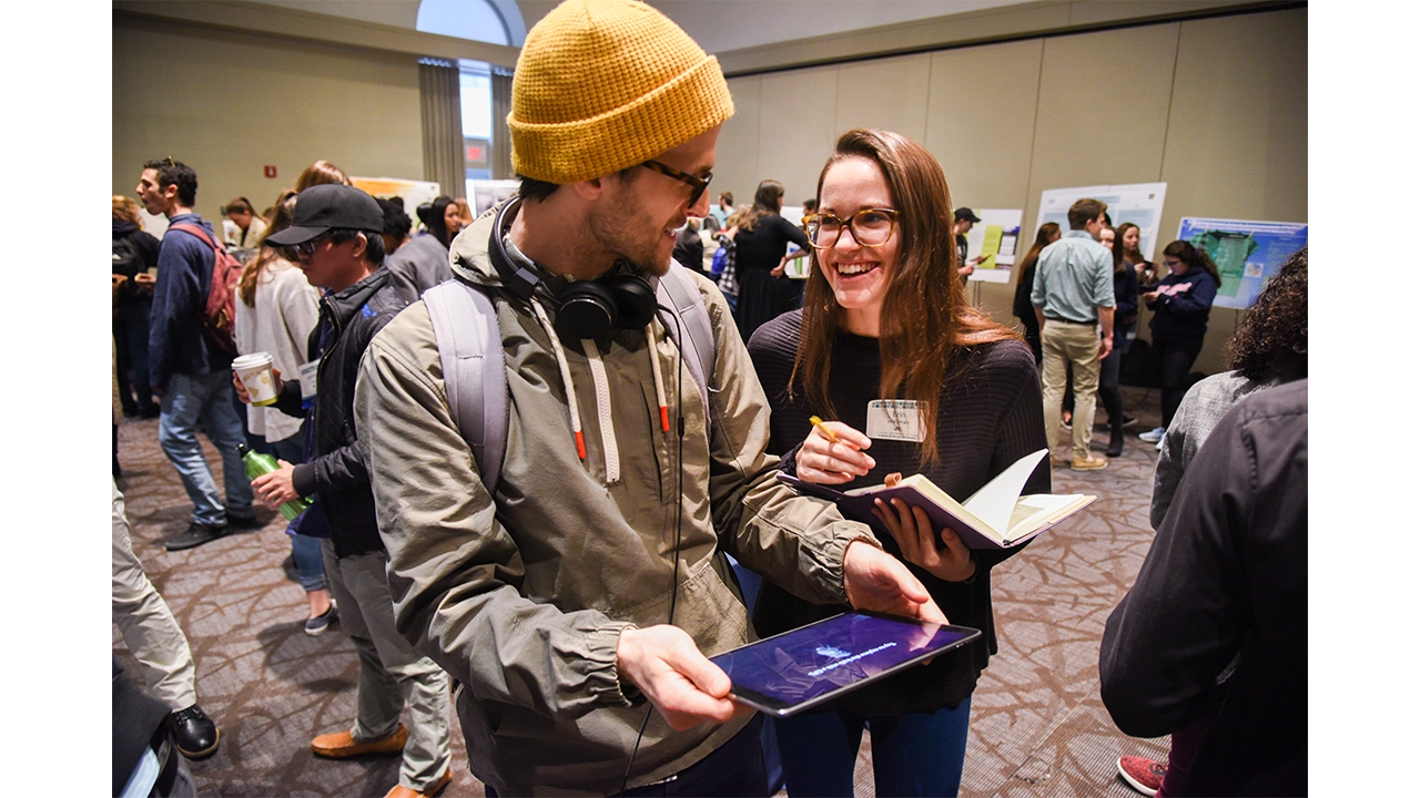
    User testing for the CO2Black app.

    The final module was intended to have users realize that they could change their energy to a cleaner source such as wind or solar in an easy and convenient way. After meeting with Drexel’s Institute for Energy and the Environment, we learned that one of the best things an individual can do to reduce their carbon footprint is change where they get their energy from. The original storyboard presented users with two pamphlets, one advertising coal and one advertising solar and wind powered energy. Users made their selection, and when they selected clean energy they were given more information on why switching reduces your CO2 emissions and how to switch. This module was very forgettable to users and was the least engaging.


    HI-FI

    Due to the fact that switching energy sources is one of the most effective ways to reduce your carbon footprint, we needed to fix this. We wanted to create a story for this module because energy consumption has changed so much over the past 200 years so for one last time, we revisited our story boards. At this point, users are shown 3D models of energy sources that society has relied on in the past starting with wood, and followed by gas, coal, and are finally presented with a solar panel and wind turbine. We wanted to show people that these nonrenewable energy sources are a thing of the past, and that clean energy is the future. Users are then prompted to select an energy source. When they select wood, gas, or coal they are shown a message that informs them that there is a cleaner energy source that has does not produce CO2 emissions. When they select wind and solar energy they are then shown how easy it is to switch your energy provider, and are presented with a novel AR laptop that gives a simplified demonstration of how easy it is to switch your energy from coal or gas to solar or wind without having to install anything into your home. After testing this new module, none of our users selected a nonrenewable energy, and were very surprised that switching your energy provider was really that easy.


    WHAT WE LEARNED

    Designing for AR has proven to be quite different from anything we have done so far because for the first time we are not designing for a screen, we are designing for the world. We have learned that the best AR UI is one that does not interfere with the experience itself unless it directly improved the current view. Interface is still a major factor in AR apps, despite how much it can get in the way, it is crucial to guide users through the app to avoid confusion. As AR is a new technology, most people do not have a mental model for this type interactive experience. A good interface was essential to our project as it will guide users through an experience they are currently uncomfortable with.

    For example, instruction text was extremely important. There needed to be readable text that told users where to look and what to tap. Without this instruction text, it is unlikely that users would even get the models placed in the scene. Instruction text occupies the top of the screen and is white with a dark shadow behind it. After testing, users never had a problem reading this text. If there is a major action to be completed, it is communicated at the top of the viewport.

    The shock factor of seeing CO2 visualized in your space is accompanied by text to inform users on relevant issues surrounding greenhouse gas emission. We decided to employ dialog boxes throughout the application to display this text. These dialogs are pushed to the bottom of the viewport and tapping anywhere on the screen, rather than just the dialog, progresses through the app. Contrast issues are much more complex in AR. We have no idea what these dialog boxes will be overlaid on. In order to combat this, the background of the dialog boxes are slightly transparent black boxes with white text inside of them. Based on user testing, this boxes are completely readable in all situations.

    Finishing a module of the main AR experience unlocks more information about the given topic. We communicated this information using what we call “Learning Layers”. These are large dialog boxes that summarize our scientific research and data surrounding the theme of the specific module. Learning Layers take up only 75% of the screen and use similar styling as the dialogs, they are semi-transparent. This way, users are never fully taken out of the immersion. In the 25% left at the top of the screen there are close and next buttons. The close button is red and accompanied by an X and functionally minimizes the Learning Layer. The next button is accompanied by and arrow and functionally progress through the Learning Layer and transitions to the next module.

    The last major interface element is the badges and guide. There are three distinct modules that, upon completion, award badges through the Learning Layer transitions. The badges then stay at the very top of the screen and give people a mental model of progression through the app. All three badges are grayed out until they are earned at the end of modules. The intention behind this was so users are aware of their progress in the app. It also adds a layer of gamification. There is a meaningful congratulatory achievement for completing each module.

    The only other instance of interface, besides the Learning Layer, taking up a significant amount of screen space is during the lamp scene where a silhouette of a new energy efficient bulb appears to guide users towards the proper action. This helps users understand they are replacing the old bulb on tap as well as leading users to aim the ray cast properly. This is a great example of development and design working symbiotically.

    RESULTS

    CO2Black is the result of 6 people, 6 months, and an entirely new realm of 3D application development that nobody had experience working with. We came together with the hope that when people used our app, they would walk away with the belief that their actions have a direct impact on the amount of carbon dioxide in the environment. We are unable to quantify success due to this, but our qualitative metric of success depended on how people felt after going through the app, and our users found the experience fun and engaging, and felt that the experience was much more interactive than just reading a pamphlet about carbon dioxide. With these aspects in mind, CO2Black is a success. One user said after experiencing when going throughout his day, when he would traditionally throw away his morning coffee he went out of his way to recycle it. This result is exactly what we were striving for. We broke CO2Black down into three modules that had everyday tasks in hopes of them influencing their everyday actions.

    The last six months was an incredible learning experience for our whole team. We learned that an agile approach is the best approach for this. This is a new technology that not many people have experience with, so it is a delicate balance between pushing the boundaries of the technology and defining interactions that people are comfortable using. We had the special task of not only trying to teach people about CO2 and the impact of their actions, but we also had to teach them how to use AR, usually for the first time. This was a particularly difficult task because we ourselves were learning how to design and develop using AR for the first time. Using AR for the sake of using AR is a lesson that we quickly learned was not the best idea. We wanted to use AR to enhance your experience, and we kept this mindset throughout the development of CO2Black. We found out through user testing that giving instant feedback, whether that is through animations, UI, color, or haptic feedback is very important to show the cause and effect of actions. Lastly, a solid team is one of the most important aspects of a successful project. We were able to depend and rely on each other and that sense of security allowed us to take risks in our ideas and development process.