Category: UXID

  • Happy Sunshine Ordering App

    Project Information

    We worked on creating a user-friendly and intuitive mobile ordering food app for the Happy Sunshine food truck. Our main goal is to solve the problem of waiting in line when getting food from Happy Sunshine. We also added more unique features such as a rewards system and an option to schedule a pickup to make the app be more alluring to customers who love the food from the truck but hate waiting in a line. (September 2021 – December 2021)

    The Team

    Christine, Han, Marte, Steven, Tushar

    Overview

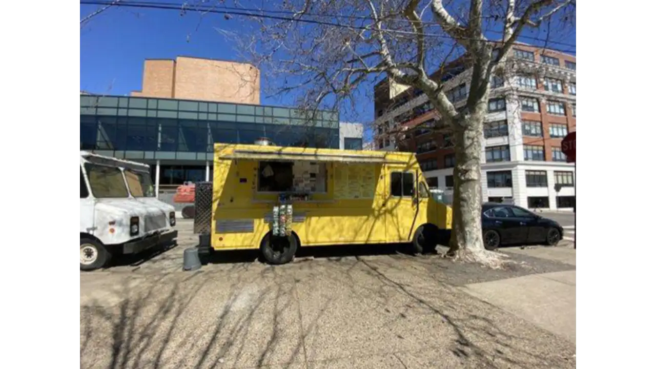
    When we were assigned a project to create a mobile food ordering application, our team knew exactly who we were going to choose. Happy Sunshine is a classic American breakfast food served by the volleyball court of Drexel University. Happy Sunshine has been labeled ‘The best food truck on Drexel’s campus’ by multiple local and university newspapers. The owners are one of the main reasons for the popularity of the truck as well. The bright yellow Happy Sunshine truck is owned by a sweet couple that greets every customer with a loving smile and hello. They work hard and make sure all their food is good quality and affordable to people who visit the truck. We wanted to create an app that reflected not only the quality and simplicity of getting something to eat at Happy Sunshine but also the sincerity and sweetness of its owners towards their customers.

    Context and Challenge

    We found that Happy Sunshine has a very strong and regular customer base, on top of that there are new fans of the truck every other day. With such growing popularity, good food, and such a sweet and friendly vibe, we wanted to convey all of this into our app so that more and more people could understand that Happy Sunshine is more than just a food truck and its food. It’s the sense of that sweetness, calm, and happiness that happy Sunshine really differs from other trucks. We wanted to design an app that keeps the ordering process as simple and personalized as possible while carrying the energy and positivity of Happy Sunshine.

    Constraints

    One of our constraints was the success of the Truck itself. Since the truck was so famous most people preferred getting food by physically going to the truck. One of the reasons people go to Happy Sunshine is also to greet the sweet truck owners. Since the app completely lacks the human aspect, we had to find ways so that customers happy Sunshine are also (if not equally) by the option of getting food through the food app than going to the truck in the process.

    Our Goals

    1. To make an app that makes the process of ordering through the Happy Sunshine Food Truck as intuitive as quick as possible.
    2. To try and implement the sweetness and the vibe of the truck into the design and feel of the app.
    3. To build features into the app that makes it attractive to customers, to order food online, who are so used and fond of ordering the food in person.

    Process

    Fly On the wall

    Happy Sunshine food truck.

    We began our process by the ‘Fly on the wall’ exercise where each team member individually went to the Happy Sunshine food truck to observe people’s workflow or what each user does step by step as they go through the process of walking to the truck up to order completion and the user receiving the food.


    Making the Business Canvas Model

    Business canvas model describing how Happy Sunshine's operations run.

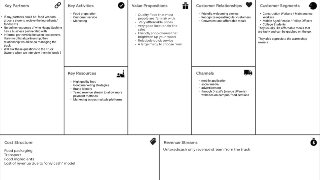
    We created a Business Canvas Model from all the details we observed and asked for other details from the food truck owners. With the help of our Business Model Canvas, we could have all our high-level strategic details in one place. This also helped us set some constraints on the project, which gave us a clearer scope of what we were going to build.


    Project Canvas

    Once we were able to put the Business Model Canvas together, we wanted to get a much clear picture of our project, its, assumptions, risk, scope, actions & deliverables, etc.

    Research

    User Research Interviews

    We wrote our first interview script and conducted user Research interviews about people’s experiences at different food trucks. The goal of these interviews was to get a basic idea of an overall idea of the experience of a regular customer, their needs, goals, pain points, and their specific motivations to go to the Happy Sunshine food truck or other food trucks in the area.

    Competitive Research & Other Mobile App Ordering Research

    While we were doing User Research Interviews, we also worked on doing competitive research about other food truck apps that are already in the market. We also did a deep dive in the Mobile Food ordering process to look at and find inspiration for some good examples of an intuitive and clean workflow.

    Ideation

    Design Sketches

    Sketches of possible designs for Happy Sunshine ordering app.

    Once we had all the basic details and workflow ideas, it was time for sketching! Each of your team members created tons of sketches on possible designs and user flows of the application.

    Mood Boarding

    Since each of us had a slightly different theme in mind, we decided to create an individual mood board for the look and feel of the application and merged them later to create a team mood board.

    Affinity Mapping

    Affinity map organizing the issues that pop up when getting food from Happy Sunshine.

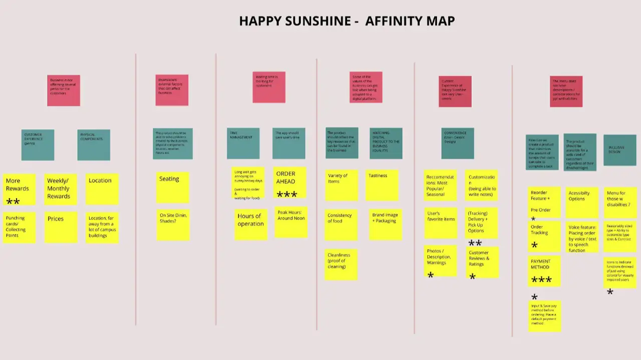
    After gathering all the insights from the User Research interviews, we all were ready to bring our insights together. For this process, we did an affinity mapping exercise. Through the exercise, we were able to narrow down key and common issues regarding different aspects of getting food from the food truck. Through these insights and our design sketches, we were able to form a basic idea of what kind of features and details we wanted to have in our app.
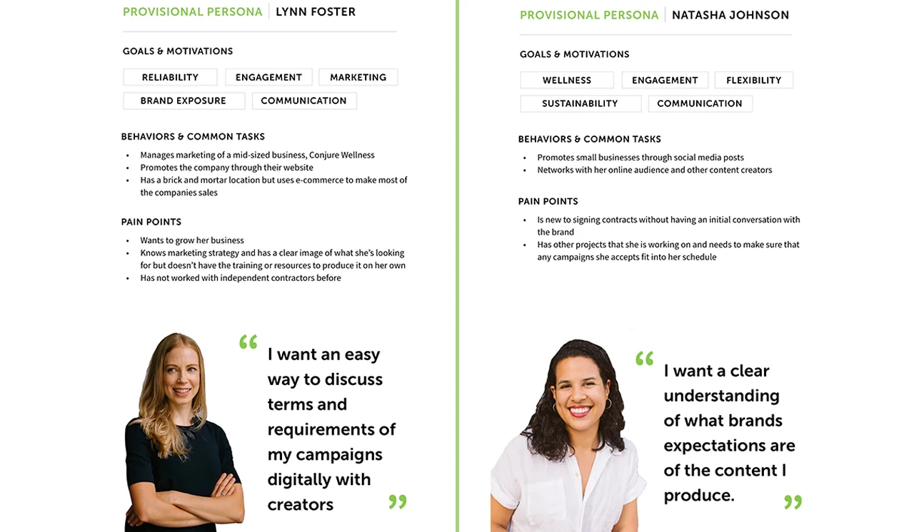
    Proto-Personas

    Two users personas to represent customers who might use the app.

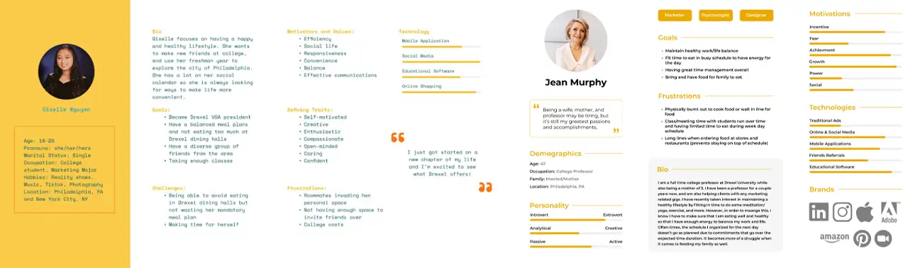
    With the insights of the interview, we were able to categorize the users of the app into three main archetypes: Student (Prospective & Current), Construction Workers, and Faculty Members.


    User Task Flows

    Chart explaining flow of tasks in app.

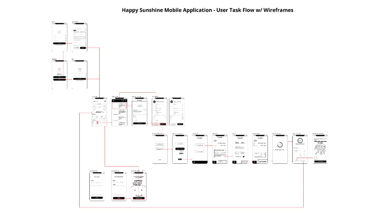
    During this time each team member reiterated and refined their design sketches and workflow. We all got together and combined the best parts of our flows to create a common user task flow.

    User Journey Mapping

    Journey map explaining what someone might feel when ordering through the Happy Sunshine app.

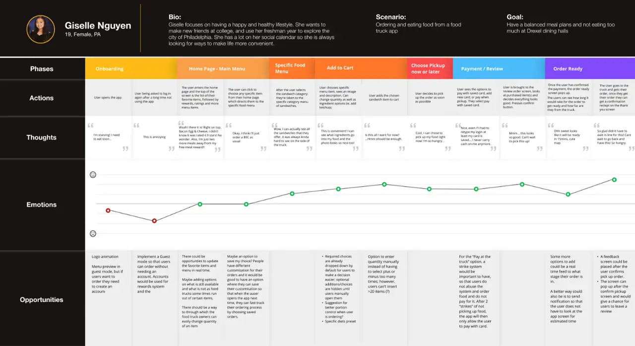
    After the task flow was done we created a journey map of a user going through the experience of ordering food through the User TaskFlow that we created. We noted down the highs & lows in the mood of the user to find any more opportunities to improve specific parts of the app.

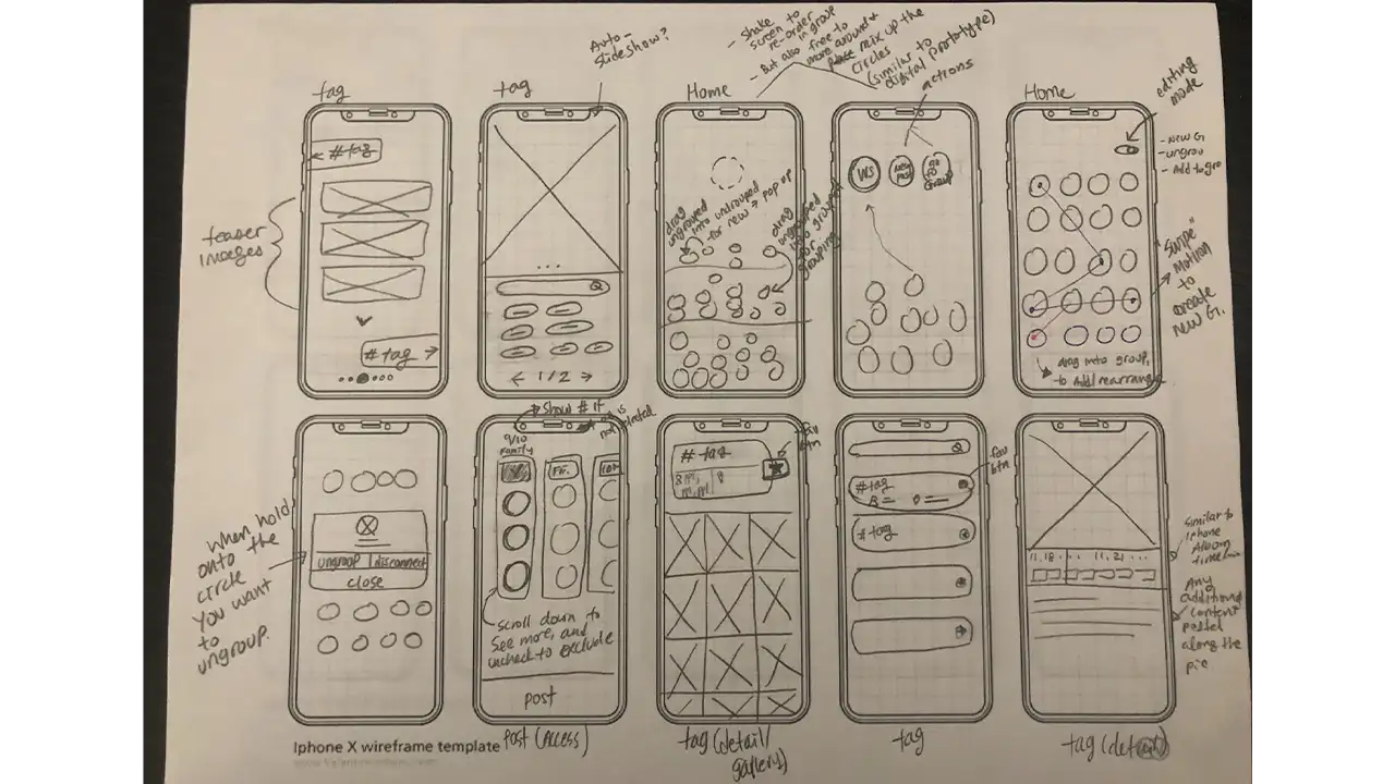
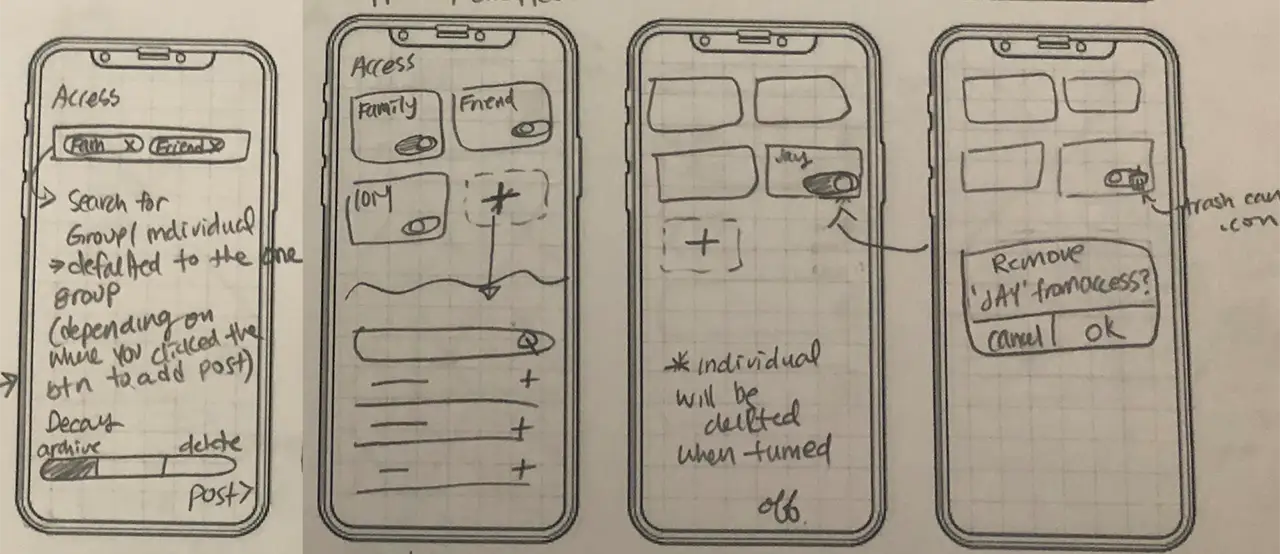
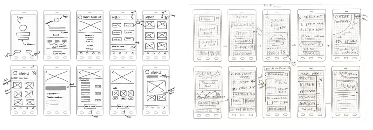
    Low Fidelity Wireframes

    Creating Skeletal Wireframes

    As our flow was ready we created the very basic skeletal wireframes that guided a user from logging in/signing up through payments to instructions to get their order.

    Usability Testing the paper prototypes

    We printed this flow on small sheets of paper and usability tested these screens as paper prototypes. We reflected on the results of the usability testing of the paper prototypes and made changes in the design as needed.

    Mid Fidelity Wireframes

    Creating Mid Fidelity Prototypes

    We used insights from testing our paper prototypes and Figma to create our first Mid-Fidelity wireframes/prototypes.

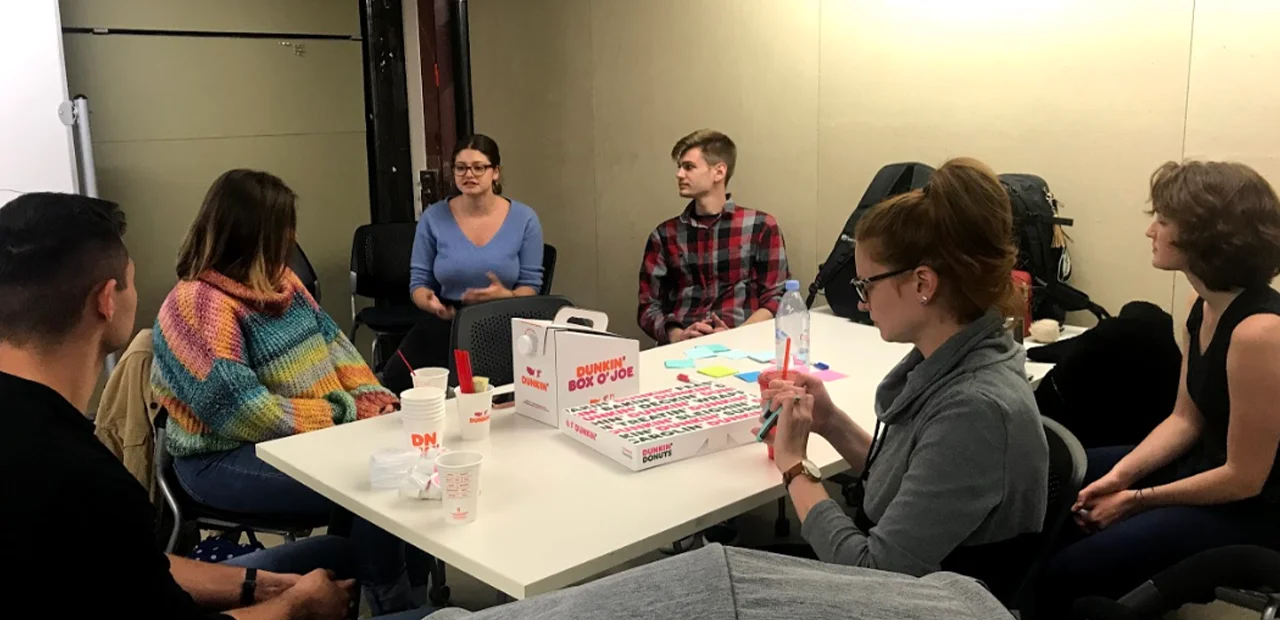
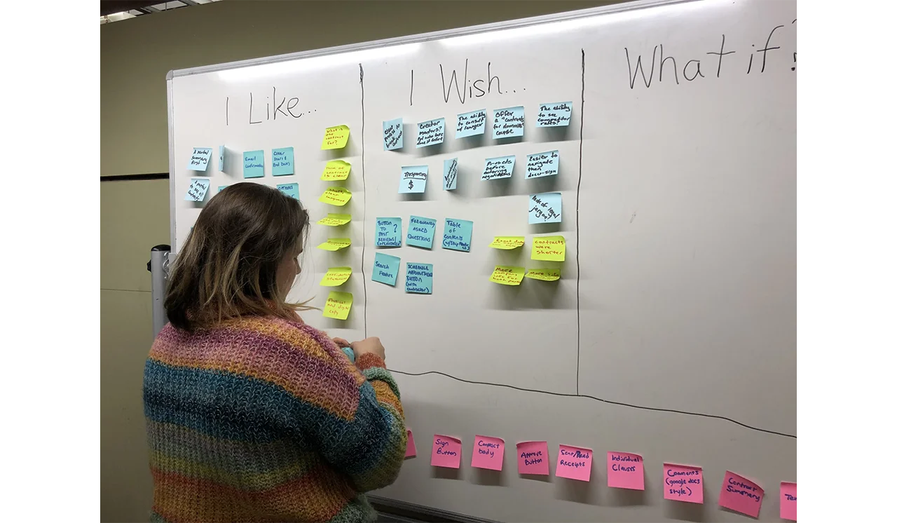
    Usability Testing the Mid-Fidelity Prototype

    We updated the Usability Test script to suit more to the changes made in the mid-fidelity prototypes. Each of us conducted two Usability Tests and reflected on the results again as a team. We tried to remove what the Users did not like and tried to enhance other features that the users wanted to see more. We also put some of the user suggestions on the backburner as we thought it could be a scope creep and might slow down the process of our project.
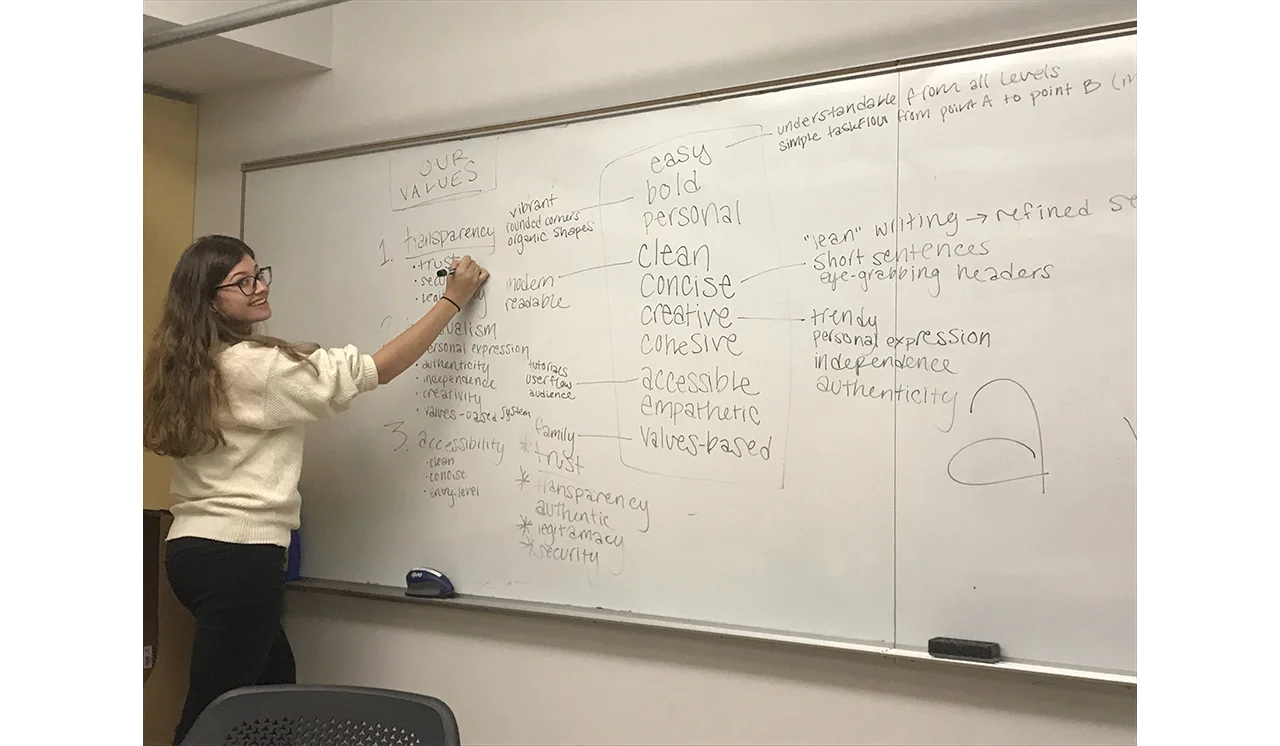
    Branding And Design

    Colors, fonts, and icons used for the Happy Sunshine app.

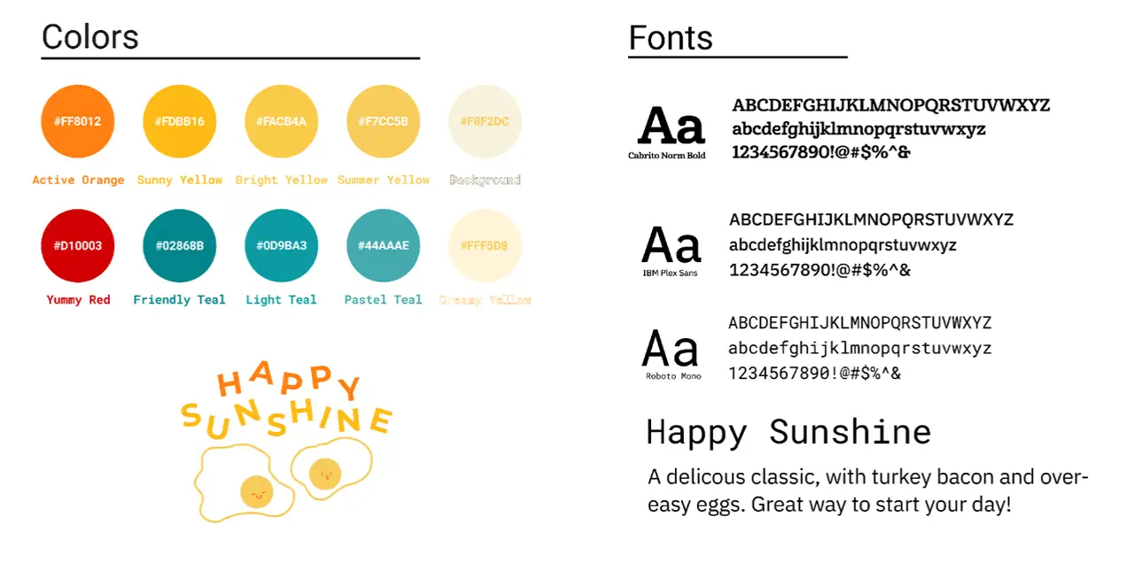
    A lot of our branding was influenced by the sweet, calm, warm radiance of the truck and the owners themselves. We wanted to infuse the spirit of Happy Sunshine in the flow of our app. We used the mood boards we created earlier as references for colors and tones. We also included a cartoon of an egg/cheese as a graphic in the app as Bacon, Egg, & Cheese was one of the favorite dishes from Happy Sunshine.

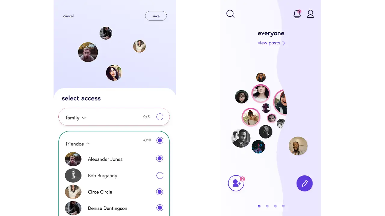
    High-Fidelity Prototype

    High-fidelity prototype of the Happy Sunshine ordering app.

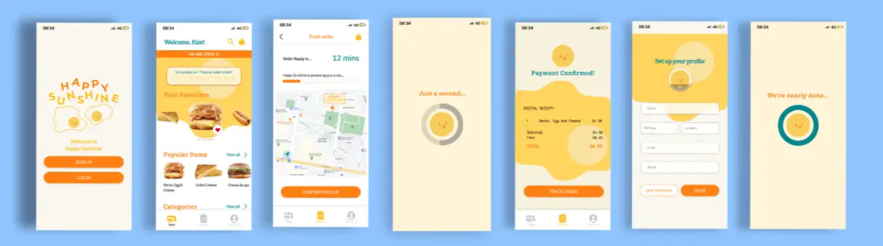
    Creating High Fidelity Prototypes

    With the help of insights we gathered with our Usability Testing of our Mid-Fidelity prototype and a final joint team analysis of these insights, we were able to create the final version of our prototype with all the graphics and full functionality of the main flow of the app.

    Usability Testing the High Fidelity Prototype

    We did another usability test on ourHigh-Fidelity Wireframes to find out any other small details that we could improve to make the user flow even better. The team gathered and analyzed the test results one more time to be sure everything is where it should be.

    Results

    At the end of our 10-week journey, we felt that our project was successful. Our final application included a complete task-flow of a would-be user, and our design and functionality were fully realized. We had received great feedback and our project truly evoked the feeling of the Happy Sunshine food truck. Throughout our progress, we all felt that we learned something. From completing the research, we learned about how to identify and potentially leverage the strengths of a pre-existing business. When designing our style sheets, we gained experience being able to utilize colors, typography, and images to elicit a mood or feeling. Throughout the early ideation phases, we gained the skills of interviewing real-world users in order to apply the feedback to create the foundations of a visual experience. Then, throughout the long prototyping phase, we became familiar with rotating interviews on top of making improvements and applying our designs. Once we completed our final high fidelity iteration, we had all seen what it took to see the project through. We had to work in a team and play off each other’s strengths. Not only did we create a complete app from our initial vision, but we also gained a plethora of knowledge of the UX/UI process.

  • 3D World Simulation

    IDM311: User Interface Design for Immersive Media

    By Allison Drake – 2021

  • Lonely Planet Travel Destinations

    IDM241: Microinteractions

    By Tynan Drake – 2021

  • Yelp Review Card

    IDM241: Microinteractions

    By Molyna Tep – 2021

  • The Ordinary Item Card

    IDM241: Microinteractions

    By Megan Lam – 2021

  • Proximity Measurer: Practicing Perfect Social Distancing with Technology

    IDM 382: Internet of Things by Chelsea James

    Overview

    In today’s world, COVID-19 is rampant and it is in our hands to stay safe and do our best to protect ourselves from it. The Proximity Measurer is a way to determine if you are too close to someone. This Proximity Measurer uses an ultrasonic sensor to determine the distance of a person by using sound waves. If you are within 6 feet (about 183 cm), the device with flash red and you will get a “Too close!” warning message that states your distance. If you are beyond 6 feet, the green light will flash, indicating that you are a safe distance away and you will get a “Safe!” message that has your distance in centimeters.

    Breadboard set up for the proximity detector, including the distance reader and lights.

    Goals

    • Track distance of a user
    • Flash red & green lights
    • Display warning messages
    • Allow the user to see light, warning message, and distance on the cloud

    Final Presentation

    Lesson Learned

    I was able to add the finishing touches to my project. I ran into many issues before getting to this point and I learned a lot about the process of troubleshooting. I did some experimenting with my project and I even tried it on an Arduino Uno which helped me figure out what my issue was. It took a lot of trial and error to find out what my issues were but once I got it working, it felt very rewarding.

    I have had issues with my project for weeks. I tried troubleshooting many different ways and I still couldn’t get it to work. I thought my project wouldn’t work at all and I was ready to use a backup project that I had done a few years ago. The issue that I found was that my ultrasonic sensor is an analog sensor and it did not work in the digital pins. Since it is analog it worked on the Marker 1010’s analog pins (A1, A2 etc.) I’m not entirely sure why it only works on analog pins because when I tested it on my Arduino Uno it worked on analog pins.


    Sample Code

        
            #include "thingProperties.h"
    
            // sensor
            int cm = 0;
            int distance = 0;
    
            long readUltrasonicDistance(int triggerPin, int echoPin)
            {
            pinMode(triggerPin, OUTPUT);  
            digitalWrite(triggerPin, LOW);
            delayMicroseconds(2);
            // Sets the trigger pin to HIGH state for 10 microseconds
            digitalWrite(triggerPin, HIGH);
            delayMicroseconds(10);
            digitalWrite(triggerPin, LOW);
            pinMode(echoPin, INPUT);
            // Reads the echo pin, and returns the sound wave travel time 
               in microseconds
            return pulseIn(echoPin, HIGH);
            }
    
            //CUSTOM TIMERS
            long lastMessageTime = 0;
            long messagedDelay = 3000;
    
            String lastMessageTimeStr = "";
    
            void setup() {
            // Initialize serial and wait for port to open:
            Serial.begin(9600);
            // This delay gives the chance to wait for a Serial Monitor without 
               blocking if none is found
            delay(1500); 
            pinMode(5, OUTPUT);
            // pinMode(6, OUTPUT);
            pinMode(7, OUTPUT);
            // Defined in thingProperties.h
            initProperties();
            // Connect to Arduino IoT Cloud
            ArduinoCloud.begin(ArduinoIoTPreferredConnection);
            /*
                The following function allows you to obtain more information
                related to the state of network and IoT Cloud connection and errors
                the higher number the more granular information you’ll get.
                The default is 0 (only errors).
                Maximum is 4
            */
            setDebugMessageLevel(2);
            ArduinoCloud.printDebugInfo();
            }
    
            void loop() {
            ArduinoCloud.update();
            // Your code here 
            {
                cm = 0.01723 * readUltrasonicDistance( A1, A2);
                Serial.print(cm);
                Serial.println(" cm");
                // if the distance is further than 350 turn LED off
                //350cm = 11.5 feet
                if (cm > 350) {
                    digitalWrite(5, HIGH);
                    digitalWrite(6, LOW);
                    digitalWrite(7, LOW);
                }
                // GREEN ON = SAFE
                //250cm= 8.2 ft
                if (cm <= 350 && cm > 183) {
                    digitalWrite(5, HIGH);
                    digitalWrite(6, LOW);
                    digitalWrite(7, LOW);
                }
                //RED ON= NOT SAFE
                //6 feet= 182.88 cm
                if (cm <= 183 && cm > 0) {
                    digitalWrite(5, LOW);
                    digitalWrite(6, LOW);
                    digitalWrite(7, HIGH);
                }
                // RED ON= REALLY NOT SAFE
                if (cm <= 0) {
                    digitalWrite(5, LOW);
                    digitalWrite(6, LOW);
                    digitalWrite(7, HIGH);
                }
                }
    
            //RED light switch
            if (cm <= 183 && cm > 0) {
            lightswitch = false;
            measurer =  lastMessageTimeStr +"Too close!! Your distance is " + cm + "cm!";
            messagedDelay;
            } else {
            lightswitch = true;
            measurer =  lastMessageTimeStr +"Safe! Your distance is " + cm + "cm!";
            messagedDelay;
            }
            }
            //END LOOP
    
            void onMeasurerChange() {
            // Do something
            }
            void onLightswitchChange() {
            // Do something
            }
        
  • Lyft

    IDM216: User Experience Design II

    By Jervo Jawns – 2020

  • Prime Video App

    IDM216: User Experience Design II

    By Victoria, Anna, Mikayla, Reid, Leanna, Dolma – 2020

  • Pluto: A Social Media App for Meaningful Connections

    Goal

    Pluto is an experimental social network that focuses on fostering meaningful connections. This raises two fundamental questions: What is a meaningful connection, and how can we foster them? For this reason, Pluto must identify what features will best accomplish this goal and ultimately create an engaging platform for our users.


    Summary

    Pluto redefines social media by putting an emphasis on meaningful relationships. It’s an app for close friends only, with extra layers of privacy that other social media platforms lack. Nobody can find your profile unless you send them an invite, and your posts are only shown to the people you choose. The same goes for viewing posts. Say you want to separate the happenings of your family members and your college friends- Pluto allows you to organize your connections into multiple feeds.


    Roles & Responsibilities

    Sarah Bray Project Manager – Lead project, managed research and design initiatives
    Mike Carbone Backend Developer – Built the pluto backend API and pluto site
    Rob Nashed UI Designer – Created the color scheme and final screen designs
    Woo Song Design Technologist – Prototyped and designed the app via react native
    Clay Tercek Frontend Developer – Led the react native development
    Veronica Lin UX Researcher – Administered usability testing and user interviews

    Defining the Problem

    When forming a team, a sentiment shared among all members was that people do not feel as though modern social media networks value their privacy. Current leading social media platforms are all about sharing everything with everyone- therefore, our goal is to create an app that is fundamentally focused on creating a private sharing space.

    How can we foster meaningful connections in an online space?

    The first three months would be dedicated to better defining a need, and seeing how a new social media application could help with the following:

    1. Foster and maintain meaningful connections
    2. Maintain a sense of privacy when using the network

    Research

    We followed a data driven approach based on various collections of user centered feedback and individualized research. We had a claim, and we needed to back it with comparative research and data surrounding how user’s feel when using social media.

    The first phase in research consisted of independent research- following processes such as comparative analysis, gathering research on pre-existing studies, and conducting various inquiry interviews and surveys to get a better grasp on the user perspective.

    From the comparative analysis data we were able to better identify a gap in ‘meaningful connections online’ and what current social media sites are providing:

    • encourage users to create large networks
    • high barrier for posting “quality content”
    • content driven by trends and hashtags
    • space for business, ads, fake accounts, and bots
    • intimate connections
    • one-on-one interactions with your network
    • space that is both private and secure
    • lower barrier for creating and sharing new content.

    Users & Audience

    Our target market is for all genders 16-80, who live in English-speaking countries, and like to easily share personal content to those that are close to them. For this research, however, we’ll be targeting potential users aged 18-25 on the presumption that young users are crucial to a platform’s success.

    Screener Survey

    The screener survey consisted of 15 questions surrounding the participant’s social media usage habits. We also used this opportunity to validate early assumptions, asking high-level questions about users’ perceptions regarding privacy and their social media connections’ meaningfulness.

    Lasting four days, the survey garnered 250 responses with some notable results:

    • 80% use social media to connect with close friends and family
    • 57% of people feel their connections on social media aren’t meaningful
    • 70% feel having a social media account makes you ‘public’
    • 65% feel current networks don’t value their privacy

    I Like, I Want, What If

    Next step in the research was to have a discussion with our users. ‘I like, I want, What if’ exercise allowed us to open a discussion with our users about what they value and what they wish from social media platforms. Here are our main takeaways:

    • Content is KING: Most participants’ favorite aspects of social media derives from the content they see and how they see it
    • Communities Count: Many participants are drawn to platforms by being apart of communities
    • Smart Moderation: Participants value free speech, but want content to be more heavily moderated
    • Connections Matter: Participants wish many certain platforms made it easier for them to connect with others

    User Interviews

    User interviews also helped us tremendously in understanding our users more. With over 200 minutes recorded and over 33,000 words transcribed, we used the method of inductive coding to find common concepts throughout all of the interviews. These commonalities guided us in defining our features. The most important concept that we found was that most meaningful online connections are formed around repeated engagement through anything that most closely resembles face-to-face interaction.

    Our Solution

    Through our research, we found that the main obstacle getting in the way of meaningful interactions was a lack of privacy on current popular social media platforms. Our solution was to make privacythe foundation of our app’s design, rather than make it an option in the settings like most other social media. Here’s how we went about doing this.

    Visualizing Connections

    One of our first challenges was designing a home screen that allowed the user to easily organize and view their connections. We decided to use ‘groups’ as a way to filter content. Here are some of the various iterations we went through before landing on our home screen:

    Prototypes exploring different ways to create and organize groups:

    Sketches showing how to sort connections in the Pluto app.

    A Focus on Privacy

    Since we wanted to create a place where people could post privately, audience control became our design’s central focus. We decided that a way to simply control who can see your posts would be to organize your connections into groups. Every time the user makes a post, they can choose precisely who can see it. They can select one or multiple groups, and even individual friends. This ensures that the user knows exactly who can see their content, ensuring that they can post with a sense of security.

    Early prototypes showing ways to control post access:

    Sketches showing how people can control post access in the Pluto app.

    Low-fidelity prototypes showing sorting mechanism in Pluto app.

    High-fidelity prototype on post access screen:

    Design

    Designing for Pluto was a highly iterative process, factoring in things such as color theory and associative psychology when developing the brand.

    When dealing with a social media interface, it’s important to try and maintain a clean, blank slate- instead of trying to create a kind of perception with the interface, allow for the user driven content to speak for itself.

    Our design incorporates all these ideas into one, by creating an interface that is both stylish and interplanetary as well as a blank slate to best feature user’s content.

    Color studies, including mock-ups of how the colors will look in an app.

    First few iterations on colors and typography

    Different iterations of the chosen color palette and sample of app components.

    Microinteractions

    Our home screen features a fun way to play with your connections and navigate from group to group. We wanted to incorporate that same feeling of delight throughout our app. So, we accompanied an animation with the ability to ‘heart’ a post unlimited times.

    Backend

    Written in Node.js with a Mongo database, Pluto is working off of 39 separate endpoints, each controlling a different action in a very specific way. We developed a few unique concepts to help us in making sure we can push features quickly while also making sure the code is high-quality. With a privacy focus, the server also ensures each piece of data sent with every request is secure and private.

    One example of our privacy-first design is our commenting system. If you’re not friends with someone, we don’t want their name visible at all on the platform. So what happens when a stranger comments on your friends’ post? The backend now must prepare each comment section, ensuring that if a comment was posted by someone you’re not friends with, that poster’s name is changed to a pseudonym. We want that pseudonym to be the same if they comment multiple times, but also want it to change on different posts. So, we introduce dynamic name changing each time comments are loaded and sent from the server, to ensure each user’s privacy.

    Frontend

    Our frontend is built in react native, which allows us to share code between iOS and android instead of writing, updating, and maintaining two totally separate codebases. It also gives us the performance and hardware access of a native app, like the camera and push notifications, but with the convenience of writing in a language we’re all familiar with.

    Conclusion

    Our original intent when embarking on this project was to not only design and develop a professional quality mobile app packed with fun interactions and deploy it publicly, but also to assess whether creating a virtual environment where users have more control over their privacy would make it easier to strengthen and maintain virtual relationships.

    Pluto has since accumulated over 150 active users during our beta testing, many of which have remarked that they feel more comfortable sharing personal content in Pluto than any currently existing platform. We feel this proves the potential for more intimate relationships online, which are only becoming more relevant and desired in our current state of physical isolation.


    Senior Showcase Presentation

  • Boldly: Connecting Brands and Creators for Perfect Collaboration

    Overview

    Boldly is a unique marketing platform that connects like-minded creators and brands. Social media marketing is one of the most promising and profitable new forms of advertising, yet the industry often lacks accessibility and sincerity. Rather than focusing on high budgets or follower counts, Boldly runs on a personalized matching algorithm based on mutual values and interests.

    The Team

    IDM

    • Mel Gross
    • Caroline Scheinfeld
    • Claudia Bonitatibus
    • Ryan Van DOngen

    CCI

    • Antigone Bellanich
    • Chris Forsythe
    • Miles Kelly
    • Nataline Kolbe
    • Kediel Morales
    • Sam Platek
    • Kevin Tayah

    Advisors

    • Troy Finamore
    • Robert Lloyd
    • Jeff Savage

    Context and Challenge

    Visualization of how a majority of consumers choose products based on company's values.

    Contrary to traditional marketing techniques, social media marketing allows brands to target specific audiences and gain their trust through relevance and reliability. In 2018, 87% of U.S. consumers purchased a product because a company advocated for an issue they cared about. As consumers become more conscious in their shopping habits, marketing campaigns are shifting focus. Now more than ever, care is our greatest currency.​ 

    Research

    In order to best understand which problems we wanted to solve, we conducted in-depth research on the ins and outs of social media marketing. This began by identifying our target audience and potential users. After speaking with content creators, brand managers and legal professionals from a variety of backgrounds, we were able to form a well-rounded understanding of what success looks like in this market. We found that Boldly competitors have a high barrier of entry – therefore ignoring a large population that can benefit from having a strong presence on social platforms.

    Coming into the year with an existing product was beneficial, but this meant that we had some gaps to fill. Thus, our focus for this year was to dive deep into research for our collaborative contract feature. Our intention is to bring more transparency and communication to the processes surrounding contracts, specifically in the influencer industry.

    Our research shows that:

    Visualization of how some users are not proficient in dealing with contracts.

    Our Process

    Boldly came into fruition through collaborative meetings, copious research and many iterations of usability testing. Our design process followed an agile workflow, which means our process was iterative and showcased a human-centered design — not only within our app, but also within the structure of our team. By following this process, we have created a platform that is transparent, accessible, and familiar.​

    Boldly team brainstorming the necessary aspects needed for their app.

    We started this project in September 2018 for our Interactive Digital Media Junior Workshop. We created a front-end prototype that showcased our user-centered design and won two awards!​ After six months, we still saw many opportunities for growth and refinement. So, we teamed up with our talented external team and restructured to bring Boldly into the senior project.

    Boldly team meeting.

    Boldly prototype review.

    User personas representing Boldly's possible users.

    In order to create a seamless experience for our users, we put a heavy emphasis on qualitative and quantitative research. This consisted of investigation into the social media marketing industry and existing tools. ​In the fall term, the four of us took a deeper look into usability surrounding legal agreements. Our findings validated our initial goals and introduced us to some pertinent information that helped guide further research throughout the year.​

    Much like our general workflow, our research followed a cyclical process. Each major feature began with user interviews to give us insights, which helped us identify the problems to address and understand how potential Boldly users behave. Using our new understanding of our audience, we moved onto whiteboarding possible designs solutions and after getting our initial ideas down we would conduct exercises with users to find out what features they would like to see in our app.​ For our team, design is a collaborative process filled with whiteboarding exercises, detailed sketches and post-its galore. Based on these work sessions, we figured out how to incorporate user’s input into our product before moving onto the more polished design stages of creating an interactive prototype showing how our app functions.​

    As we developed the prototype, we conducted usability testing sessions to ensure that the flow of our app was natural. When key themes were identified, we went back to the drawing board and continued testing until all issues were resolved. It was, for example, through conversations with our potential users that we found the perfect length, order, and format for the onboarding survey. Once elements were finalized, we documented them in a design system for handoff to the development team.​

    Throughout the year, the development team was in constant communication with us, hard at work on documenting and developing our designs. ​After researching and comparing our options for development tools, we decided on using Amazon Web Services to host our servers, PostgreSQL to build our relational database, the Phoenix elixir framework for our back end code, and we decided on a React Native front end for flexible multi-platform development on iOS and Android.​

    Programs and tools Boldly team used to create the Boldly app.

    The team also made use of many tools made for working collaboratively. For organizing tasks and tickets, we used Clickup. For version control and organizing development, we used Github. For shared document storage. We used Google Drive, and for designing the prototype together, we used Sketch and Figma. For team communication, we used a Slack workspace throughout our process.​

    Outcomes and Lessons

    The opportunity to continue a group project over two academic years brought us many lessons.​ For example, working across two colleges had its challenges. Each team had different processes and vocabulary, so establishing clear communication and efficient management systems that worked for the full team was very important.​

    We always try to stay on top of the curve and make realistic plans, but inevitably we had to deal with hard decisions such as scope cuts and unexpected changes — like a global pandemic. The experience of working on a project for two years taught us invaluable lessons about project management, multidisciplinary teamwork, and above all, perseverance. ​

    We finished this process with an award winning Android build and user-experience design. We are proud to announce that this past Tuesday, Boldly took first place in the Corporate category and third place overall in the CCI Senior Design competition.​ Regardless of your level of experience, Boldly allows you to connect with authentic people who are dedicated to the same cause.