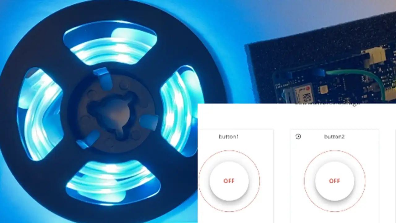
Over the past 11 weeks, I worked on developing a device using the Internet of Things to be able to control a series of NeoPixel lights using a web browser in order to promote the use of technology to better the fundamental developmental growth of early childhood education. Through this project, I not only learned about the educational benefits that colors bring to a child’s education but also the process of understanding how to wire breadboards and work with Arduino without short-circuiting any equipment. I learned how to use a variety of different tools to reach my goal of working on my device online and how to adapt my code to each program.
Goals
Allow online access from online dashboard to control LED lights
Debug problem with sticky buttons
Debug problem where clicking onto one button
Final Presentation
Future Plans
Seeing if it is possible to attach a projector to the Arduino
Developing an interactive story book projector that reacts to the buttons that are pressed using IoT
Sample Code
void loop() {
    ArduinoCloud.update();
    // Your code here
    //Serial.println("looping");

    for(int i=0;i<NUMPIXELS;i++){

      // pixels.Color takes RGB values, from 0,0,0 up to 255,255,255
      pixels.setPixelColor(i, pixels.Color(redColor, greenColor, blueColor));
      // Moderately bright green color.

      pixels.show(); // This sends the updated pixel color to the hardware.

      delay(delayval); // Delay for a period of time (in milliseconds).

      // Serial.println(i);

    }

  } // END LOOP


  void onLEDbuttonChange() {
    // Do something
  }

  void onButton1Change() {
    // Do something

    Serial.println("virtual button click");

    lEDbutton = "Button Color 1 Pushed";

      noColor();

  } // End Here

  void onButton2Change() {
    // Do something

    lEDbutton = "Button Color 2 Pushed";

    setColor();

  } // End Here


  void onButton3Change() {
    // Do something

    lEDbutton = "Button Color 3 Pushed";

    setColor2();
  }

  void noColor() {
    redColor = 0;
    greenColor = 0;
    blueColor = 0;
  };


  void setColor(){
    redColor = 0;
    greenColor = 255;
    blueColor = 255;
    Serial.print("red: ");
    Serial.print("green: ");
    Serial.print("blue: ");

  };

  void setColor2() {
    redColor = 255;
    greenColor = 0;
    blueColor = 255;
};
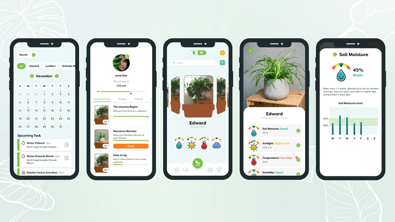
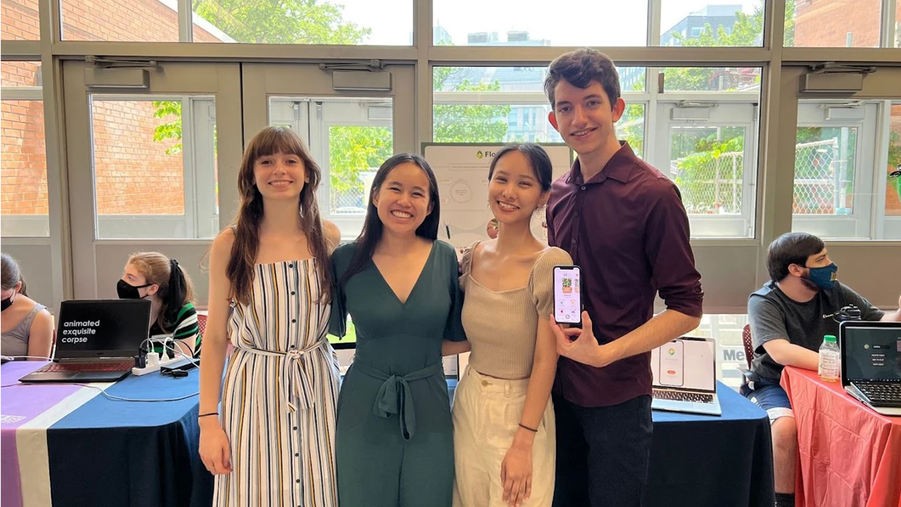
Flourish is a multimedia design concept that helps manage and care for your plants. Plant enthusiasts need guidance through tips and reminders throughout their plant care journey to feel confident and supported in providing the best care for their plants. The purpose of this project was to research, design, and develop a solution that would give plant owners a convenient method to care for their plants and provide them with the most accurate information and tools to keep their plants healthy. Our team look to collaborate our interdisciplinary skills, backgrounds, and experiences to address plant owners pain points and desires.
Flourish Team:
Gabrielle Hoover (UX Designer and Product Designer)
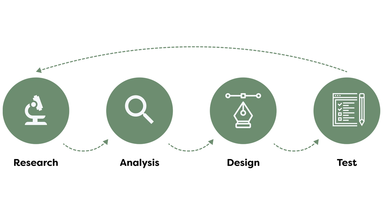
We started our project with honing in on what our problem statement is. Our guiding problem statement was how might we bring about an innovative, positive, and effortless experience with plant care? We approached this project through a user-centric design thinking process where our team focused heavily on emphasizing with our users (plant owners) and user research to drive our design decisions. What we wanted to discover included ways to create a convenient method for plant owners to care for their plants while receiving accurate information and task management tools to keep track of their plants’ health and happiness over time. As a team, we wanted to step outside of our comfort zone and explore new and immersive technologies/experiences which led us to identifying opportunities in the Internet of Things (IOT) market. The end goal was to truly provide engagement, involvement, and connection with our multimedia solution.
Preliminary Research
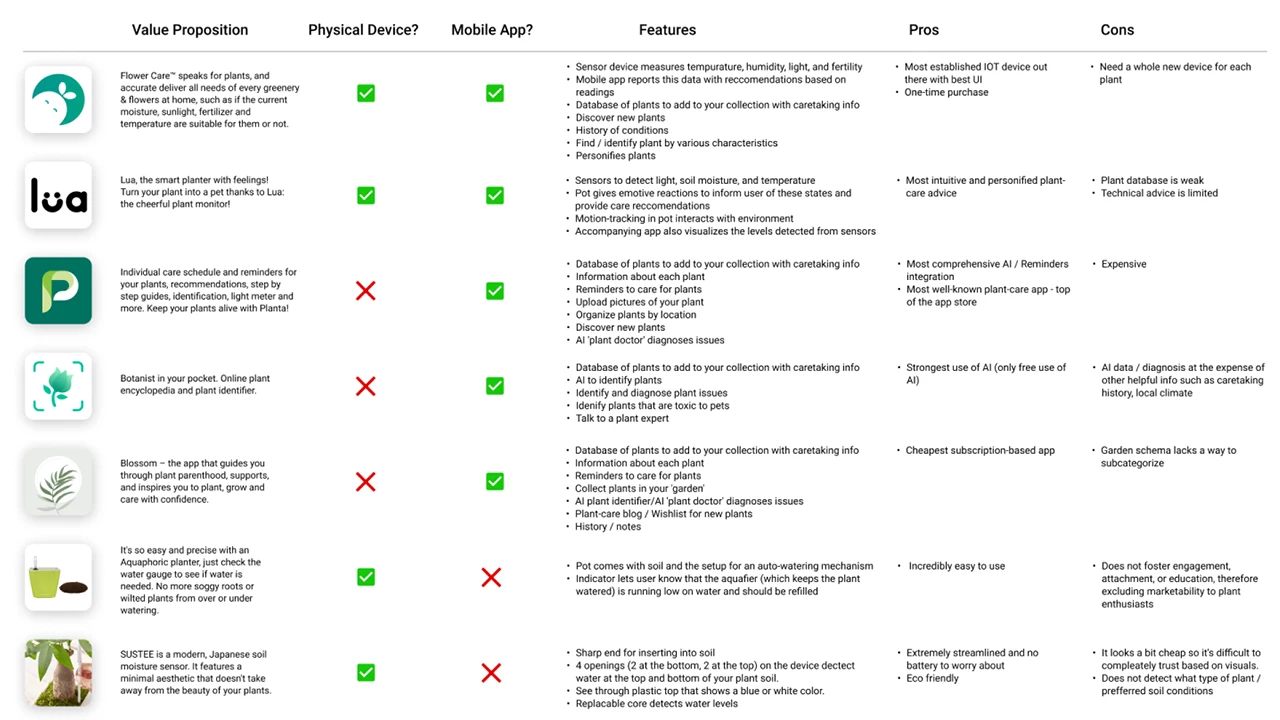
Prior to doing our primary research, we did a few preliminary steps to analyze the current market trends. Since this space of plant care tracking and reminders are saturated, our team wanted to explore what was currently successful, could be improved, and how our product could stand out from the rest in the existing market. With that, we performed a competitive analysis to evaluate the strengths and weaknesses of our competitors.
Once we finished with our competitive analysis, we pushed to create a matrix to prioritize features and develop an early product roadmap so that the design and development teams can discuss levels of feasibility and set realistic deadlines to meet.
Research
Our goal for research was to ensure that we would make data-driven design decisions throughout our entire process. The goal was to put ourselves in the users’ shoes and understand their pain points as well as be able to defend our design solutions using the research and data we accumulated over the first phase of this project.
For our research, it consisted of first understanding who the users were through stakeholder interviews, contextual inquiries, guerilla interviews, and screener surveys. We understood we had a large demographic so we needed to cater to a specific group and get a better understanding of the problem. Our users for this project were targeted to beginner and intermediate level plant owners who are technologically driven and enabled.
User Surveys
Even though we spent over 10+ hours listening to users speak about their plant care journey, we had still set out to launch a quantitative survey through Qualtrics to quickly gain data to understand the context, motivation, and cause of certain elements within plant care ownership. It allowed us to generate a large enough sample of respondents to truly be representative of our target demographic. The goal was to understand plant owners’ experiences and relationships with houseplants. We were able to branch questions based on key differential factors such as how many plants the respondent currently owned and how they rated their expertise. We focused on finding online forums and groups of plant owners and enthusiasts, as well as those that focused on college students local to Philadelphia. Our survey gained a total momentum of 302 respondents, over half of which responded ‘yes’ to conducting further research.
User Interviews
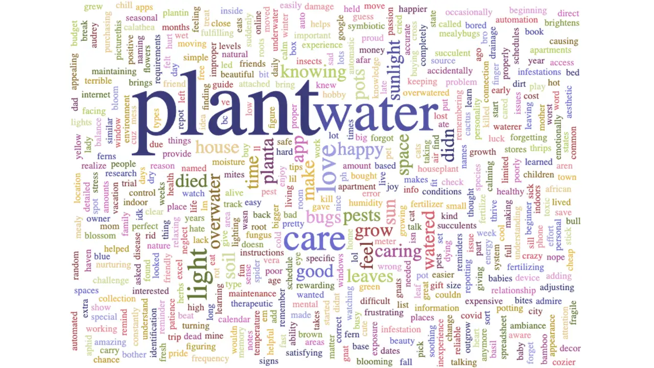
Our team conducted approximately eight user interviews. The goal of these interviews was to explore people’s experiences and relationships with plant care. We interviewed plant owners who considered themselves to have beginner or intermediate plant care expertise. We transcribed all eight interviews and created a word cloud to visualize common themes, and also generated a list of the ten most frequent words.
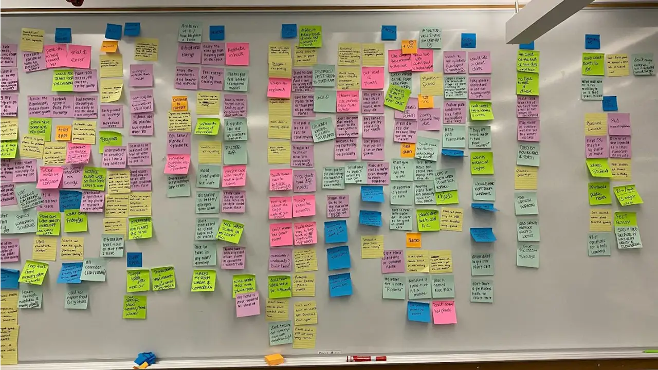
One interesting insight from this exercise was that water was the second most common word, whereas other variables that our sensor detects, such as humidity and temperature, were not as common. Another key insight was the overall sentiment of many of the top words such as care, feel, home, good, and pretty have a positive, nurturing connotation. We also got together and coded each interview, creating an affinity map from our insights.
Overall, most of the people we interviewed were busy working professionals with a lot on their plates and a need for convenience. We learned about a variety of different routines and methods for plant care, and a trend that stuck out was people with a higher skill level and more expertise were more resistant to the idea of using a system that would require them to water their plants or do other tasks on a strict schedule; they had a feel for what each unique plant needs, and as a result their schedules were looser and more intuitive.
People also used a variety of resources for advice and help, but a common complaint was the lack of a unified source for this information. We see this as an area of opportunity for our app.
Participatory Design
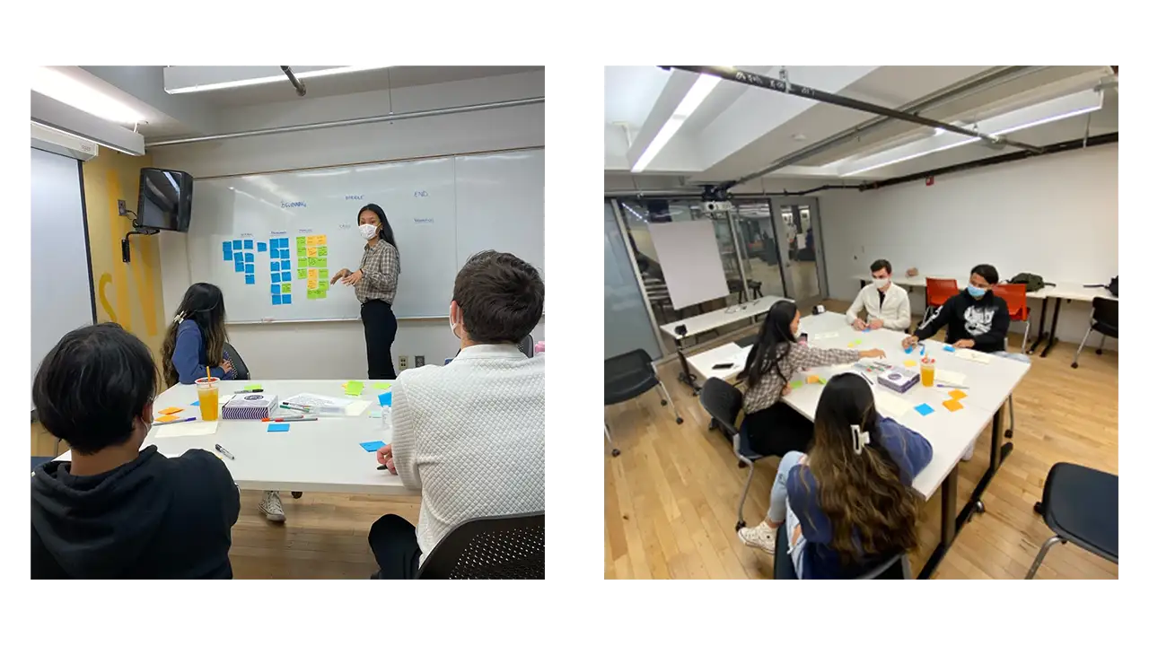
We brought our target users in. Once we have gathered an intensive amount of rich user data, we felt confident enough to start the ideation stage. But even for the ideation stage, we started with involving the user first in a participatory design workshop. We conducted this session by uniting users together and working as a team to generate ideas for a user scenario and learn the underlying needs and motive for each idea. It was a great hour and a half long session where we got a lot of insight into who the potential user of this app would be, what issues would arise, and what sort of solutional ideas would be helpful to combat those issues.
Takeaways
Our major takeaways and recommendations included:
People value convenience
People form attachments to their plants
Watering correctly is key
Caring for multiple plants is challenging
Our Solution
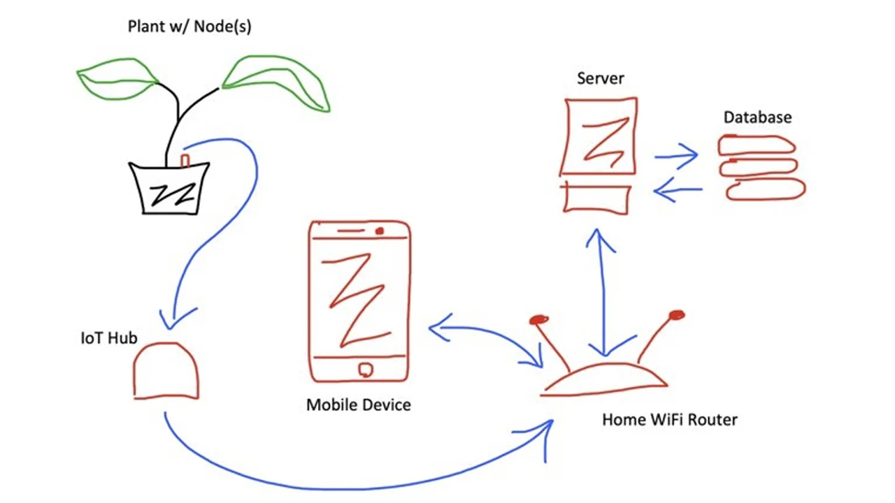
Through our research, our solution is an app that provides care recommendations about your plants and is paired with a sensor that detects soil moisture, sunlight, temperature, and humidity.
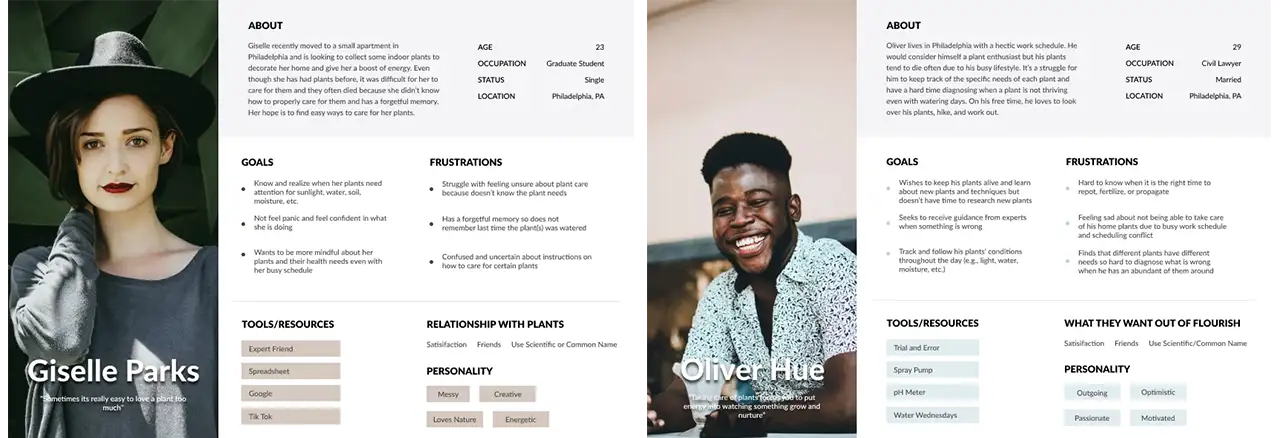
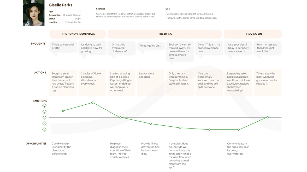
Based on these findings, we created user personas to help guide our design process. We realized from our research that we should primarily target plant owners with beginner or intermediate knowledge levels, as they were the groups that needed the highest levels of support. We created user personas and journey maps of this target audience.
Design
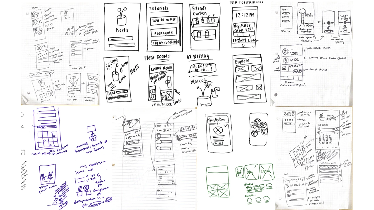
We started the design process by sketching our ideas for the sensor and app in order to quickly communicate our ideas.
Low Fidelity
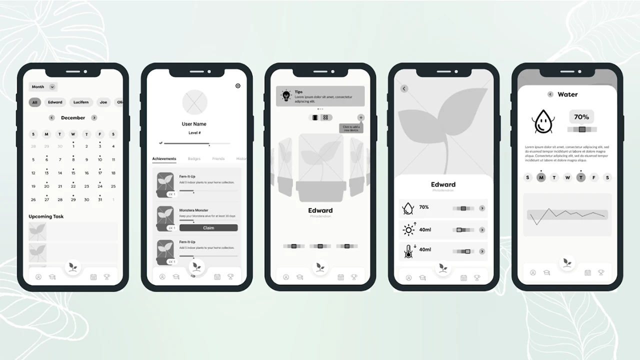
Next, we moved on to a clickable grayscale prototype for our low-fidelity prototype. We avoided adding color at this phase to keep the focus of our testing on the basic structure of the app.
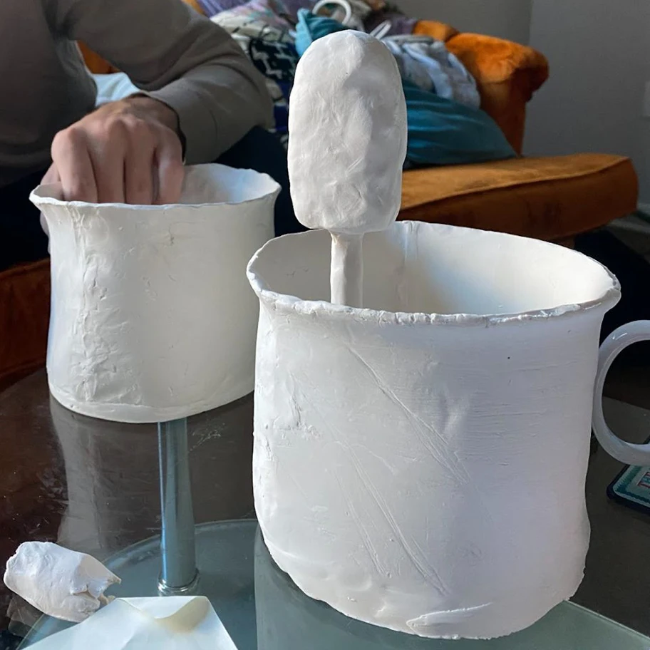
We also created clay prototypes of sensor devices to test various ideas with members of our target demographic, as well as conducting focus groups to understand what product features they would prefer to see.
Mid Fidelity
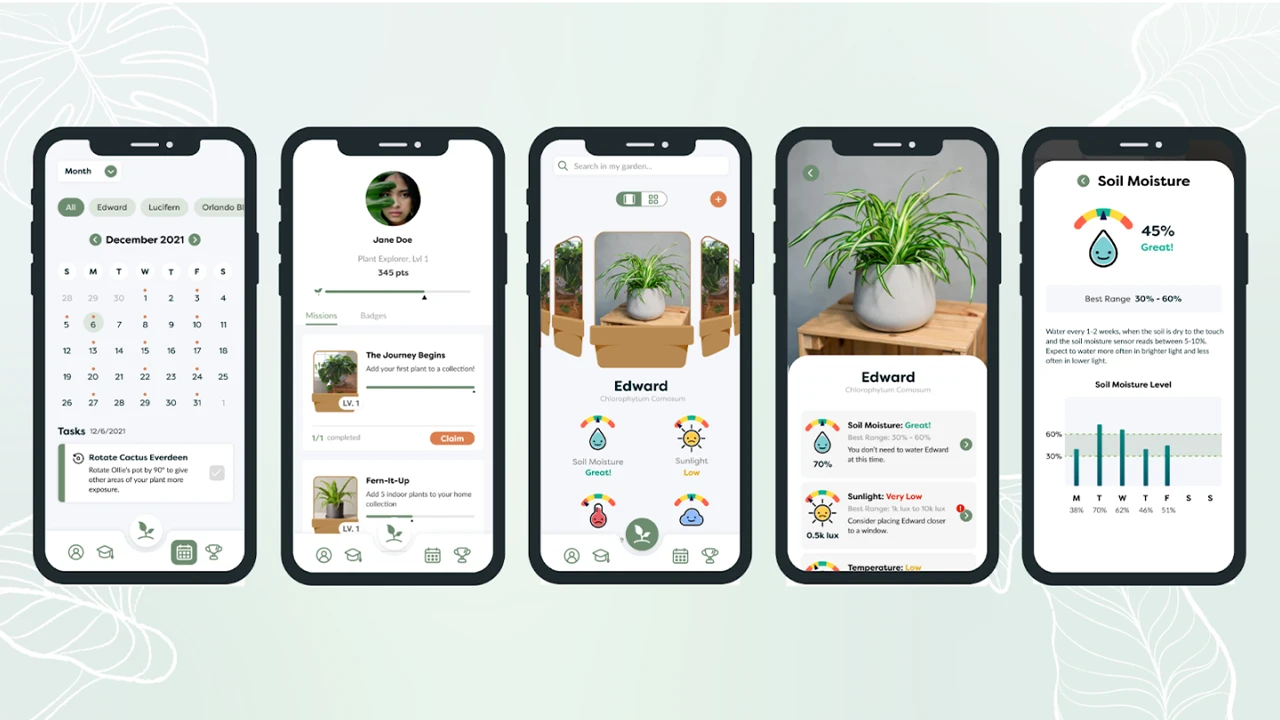
After testing our low-fidelity app design with users, we made revisions based off of their feedback. We also added color, text, and real images so that we could begin to test the content of the app as well.
Based on user feedback, we also narrowed our sensor ideas down to devices that could be stuck into a pot. We designed various iterations of the sensor based on the needs of users, such as being small in size and not taking away from the appearance of the plant.
High Fidelity
After further testing, we created our high-fidelity prototype.
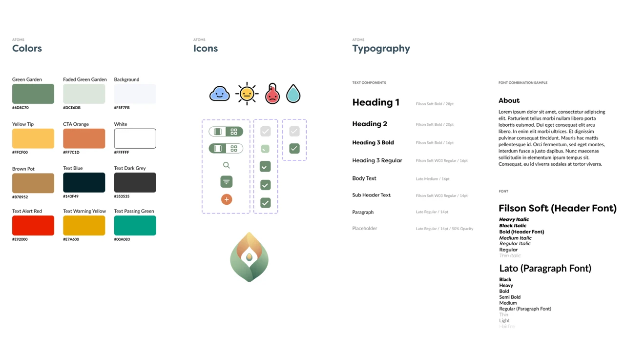
At this point, our style guide was fully finalized. We used the atomic method to create a modular and consistent design system that made development easier.
Microinteractions
To fully bring the app to life, we also designed and implemented microinteractions for the interface.
A central theme of our app throughout all iterations was personifying plants to create a greater sense of emotional connection. With this in mind, we animated transitions for the icons that delivered information about how each plant was doing.
We also added an animation for the bluetooth connection loading while users connected the sensor to the app. This feedback was intended to mitigate user frustration while waiting for the process to be completed.
Finally, we created a confetti animation for users who won badges to add more cheer to the experience.
Final Design
Our final solution was a high-fidelity prototype and IOT device design concept.
App Development
App Development was done in an Agile method with UX. We started with the core functionality we knew we would always need and could be styled and made pretty later on. With each design phase or ‘fidelity’ provided by our UI designers, more features were added into the app, tested, and improved in further fidelity. That was the development cycle for 9 months.
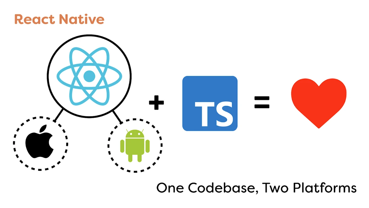
To make the app, we went with React Native, a framework that allows us to code for both iOS and Android and only need to maintain one code base. It also includes many handy built-in functionalities that minimized development time.
Since there was only one dedicated app developer who was proficient in JavaScript, we decided to code the app in Typescript which is a very strict version of JavaScript, acting as a second eye while coding, pointing out technical flaws and anti-patterns, solving bugs before they even existed.
Conclusion
Prior to this project, our goal was to collaborate on an interdisciplinary team, using technology to solve people’s plant-care problems.
Our final design was navigable by 100% of users it was tested with, and the majority of users reported that they would like to use the product if it were to go into production. This project will be continued next year by another team at Drexel, and we are excited to see what else will be achieved!
Orbital, a COVID-safe interactive art installation allowing for the collaboration of visitors to manipulate and create a one-of-a-kind galaxy in real time.
Our vision for the Drexel Westphal 2021-22 senior project is to create a COVID-safe interactive art installation allowing for the collaboration of visitors to manipulate and create a one-of-a-kind experience in real time. Over a timeline of 9 months our team ideated, designed, tested, developed, and deployed a galaxy themed interactive art installation for visitors from all over Drexel to take part in.
The Team Members
Charles Wolloch: Project Manager, UX/UI
Melissa Gabriele: UX/UI, Dev
Reid Dumont: UX/UI, Project Manager
James Zangari: Dev, UX/UI
The Project Summary
Our main goal is to design and develop an interface for visitors to make their own custom planet and add it to our galaxy that is being projected in real time, while also creating interactions that excite, intrigue, and are memorable. Our minimal viable product will consist of the planet customizer application, the galaxy canvas for the planets to be added to, and a statistics dashboard that will show off fun metrics collected from the event, live.
Although we present ourselves with this galaxy theme today, we weren’t always centered around this concept of building a galaxy together from scratch. We always knew we wanted to enable visitors to collaborate to create a piece of art together through their individual efforts but our original intent was to allow for anything to be displayed.
Our original plans were for visitors to have a free range of drawing tools and visuals so they can create their own individual art piece which, upon saving, would be collaged with the rest of the submitted works. Over time this would create a giant collage of the work of everyone who took part and ideally would appear as a magnificent mural representing all of the collaboration that occurred.
After receiving feedback that our original idea was too broad, we quickly pivoted into the galaxy creation theme. It offered a unique niche for us to explore and an experience to build while also working off of the themes we initially wanted to capture.
The Challenge
The basis for our project is centered around us solving this challenge statement:
How can we create an interactive art experience that excites, engages, and is memorable for our users?
To solve this challenge we took our 9 month timeline and split it into 3 phases:
Research, Design & Development, and Execution.
Each phase lasted 3 months (a single term’s length) and our project ended with the senior showcase presentation.
The Solution
Research
In order for us to succeed we started by spending 1 term researching and ideating. We conducted interviews, user workshops, met with industry professionals, and conducted other user research methodologies to gain insight into what makes engaging, memorable, and fun interactive art.
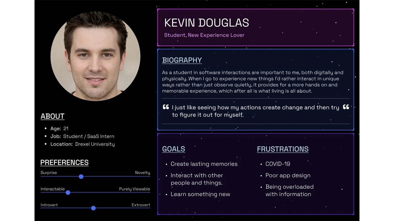
It was also at this time that we identified our target audience as being the Drexel student population, since we were limited due to COVID restrictions. We then created a user persona representing our target audience.
After identifying our target audience, we began forming our User experience, interface, and interaction designs. We tested our prototypes with real users based on our target audience and used those insights to refine our approach and ideas.
Design
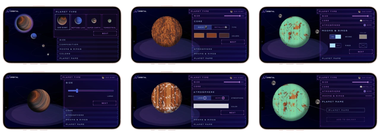
Once we had chosen the solar system concept, it was time to begin focusing on the planet creation design. We knew we wanted users to create unique planets which would be added to our collaborative solar system. Our first round of design allowed users to select one of NASA’s 4 planet types and customize size, surface, orbiting elements, etc.
Feedback obtained from users showed us that they did not notice the bottom scroll menu or enjoy using it. We explained too much with text and not enough with visuals. The feedback from this round of user testing helped influence a completely new design for the flow that users understood and enjoyed using more.
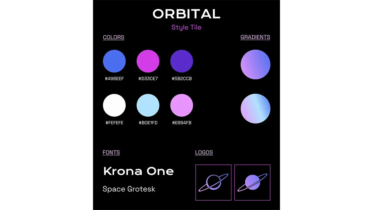
We also focused on branding, creating a logo, name, and graphics, and selecting colors that fit with the sci-fi/space atmosphere we wanted at the event.
This new design was much less text heavy, showing rather than explaining. We had a lot of facts in the app which were removed in this round of edits. We decided to place the facts on the walls in our installation so visitors could learn about the planets they were creating. The new design uses tabs to guide the user through the flow and includes the planet type selection as one of the tabs so users can easily edit their planet type if desired. As the user makes choices, the tabs show each selected option and they will see their planet update with those choices.
The final update focused on smaller changes now that we had a finalized format that users understood and enjoyed. Confusion from users about color choice correlation led us to incorporate it into the atmosphere and core tabs instead of having its own tab. The main focus of this UI update was to create a UI style that fit with the planet building experience and the ambience we were trying to create at our event.
The final product was a streamlined process that took around a minute to complete with enough variability that each visitor could create a unique planet. Our goal was to create a process that was quick and easy for everyone to use and understand.
Development
The Orbital web app is built with Next.js, a React framework, and uses an additional set of packages to help improve and enhance the user experience. The core technology behind this application is react-three-fiber (R3F), a React renderer for three.js (3D javascript library). Using R3F combined with lamina, a layer based shader material, allows for multiple images and colors to be combined and layered onto a 3d object, which in our case was a sphere representing a planet. The planet creation flow uses key features of React such as the “useState” hook, which allows the user’s selection to be stored as a variable. When the user submits their planet to our solar system, these variables are then passed to the database as a JSON object where the data can then be manipulated for each unique planet that is created. We were able to achieve real-time updates for our web app on exhibit day using SWR, a React Hooks library for data fetching. This allowed us to set a refresh interval on the pages where the web app would refresh every 60 milliseconds checking for updates in our database. Additionally, Tailwind was added to reduce the amount of CSS files included in our application.
The essentials: planet creation flow, solar system, and mission control, were finalized early enough where we had some resources to devote to other interactions. This led us to incorporate the joystick station. We used the Logitech Extreme 3D Pro Joystick and connected it to our planet database to cycle through the planets.
We did this by using JavaScript to connect to the USB port to detect inputs. This input was then split so we could read a roll to the left or right. A roll left would pull the previous array entry, and a roll right would pull the next entry.
Execution
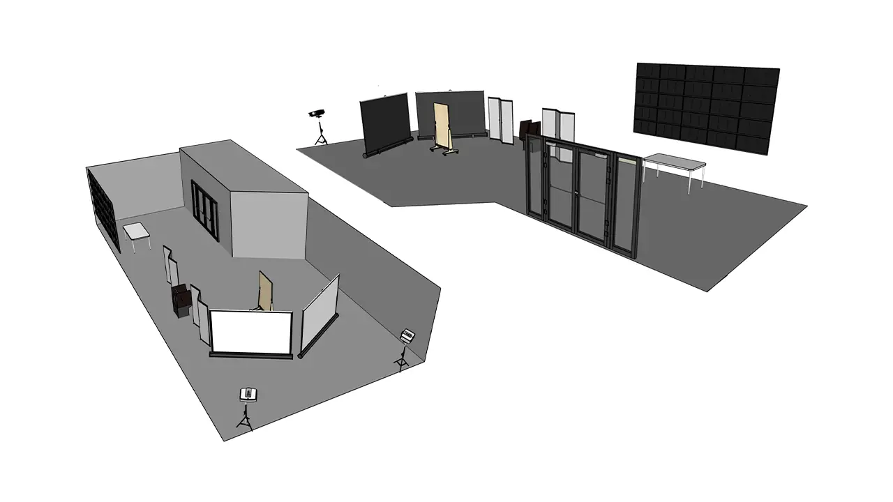
The event was held in the Westphal lobby of Drexel. We created a floor plan that optimized the darkness of our given space while allowing visitors to progress safely through the installation. The large mission control screen, shown on Westphal’s big multi-screen display, grabbed the attention of visitors as they walked through the front door. Visitors then could approach our information table that displayed facts about each planet type along with a scale model of the planets presented with stickers and treats. QR codes and informational flyers about each interaction and the exhibit were placed around the entire room. The large screens each displayed a different rear projected view of the solar system. This was done so visitors could get as close to the screens as they wanted without obstructing the view. We placed QR codes to create planets, more facts about the planet types, and information about the exhibit for visitors to read as they progressed through on the walls surrounding our exhibit. The joystick station, where visitors enjoyed scrolling through the database of planets, sat between the screens and the information table. This set-up was something we researched by referencing our space and other installations. We tested our equipment in multiple sessions, and updated our planned setup based on research and application throughout the final term.
The Results
Final UI demo
Promotional video highlighting our event
The Conclusion
Our goal was to create an interactive art exhibit that excites, intrigues, and is memorable while also offering a COVID safe experience for our visitors.
We know we succeeded when we saw high user interest and engagement within our exhibit. Additionally, we saw our backend database filled with all of the data provided from users coming in and making their own custom planet. This serves as a great metric for us because we saw a significant amount of user input into our database.
Our main goal was to create a collaborative piece that allowed each person to contribute something unique as an expression of themselves. Based on the unique planets that populate our database, and the diverse solar system it creates, it is clear that this was successful.
Dioramas of the Future (DotF) is a collaboration between Drexel University and The Academy of Natural Sciences to develop a web-based application used to bring diorama stories to life through an interactive virtual reality experience. This project allows for more exploration and a deeper engagement with dioramas and their affiliation with the museum. Through interactive points of interest in virtual environments, an element of play is involved. Users can unlock virtual animals and specimens to add to their ‘Collection’ within the web app, available to them at any time. The final deliverable for this project is a Figma prototype and WebVR experience. We are not designing for today, we are designing for museums of the future.
The Team
Chelsea James, UX Research
Devin Taylor, UX Research
CONTEXT & CHALLENGE
BACKGROUND
At the beginning of last year, the Academy of Natural Sciences offered Westphal an opportunity they call the “Museum Innovation Fund.” This is a grant program that supports the conception and rapid prototyping of innovative approaches to all forms of museum learning and engagement. Faculty from the User Experience & Interaction, Product Design, and VR & Immersive Media programs collaborated to create this idea called Dioramas of the Future, which augments museum dioramas using virtual reality. After receiving approval from the museum to move forward with the project idea, Chelsea and I were approached to perform UX research. Our goal in this role was to understand how we could transform the current visitor experience from traditional to exceptional.
THE PROBLEM
Our team began working with the Academy at the beginning of the fall term, and quickly became aware of the problems they were facing. These problems included visitor rates falling dramatically since the start of the pandemic, a low budget restricting any renovations from happening, and outdated content being displayed to visitors throughout the building. In order to address these problems and create sustainable solutions, we honed-in on the goals that the Academy wanted to achieve through our work. One of the Academy’s goals from the start was to increase visitor-ship to the museum. They wanted their building to be lively again, which would also help with their problem of a low budget. The more visitors that walk through their doors, the more money they receive to put towards updating their space and content. Another one of the goals they hoped to address through the DotF project was modernizing the museum experience. Specifically, they wanted to “bring the dioramas to life” through technology. Luckily, our team had experience creating a life-like pet application prior to this project, so we felt confident in our ability to satisfy this goal. Along with this modernization aspect, the employees at the ANS wanted to enhance the educational experience that they provide. A lot of the visitors to the museum are students on field trips, or people looking to learn about different animals and wildlife. Since the content currently displayed to visitors hasn’t been updated in a while, our team placed a lot of importance on this goal and wanted to deliver a learning experience that would be fun and informative to visitors of all age ranges.
Problem
Visitor rates falling since start of pandemic
Little to no budget to allocate to renovations/updates
Outdated content/experience being delivered to visitors
Goals
Increase visitor-ship to the museum
Modernize the museum visit
Bring dioramas to life through technology
Enhance the educational learning experience
OBJECTIVES & DELIVERABLES
After having discussions with the Academy of Natural Sciences, we listed out their goals for the museum space. These goals are reflected through the high-fidelity prototype we have created based on user testing and research we have conducted throughout the span of this project. The team also created project deliverables to meet these goals mentioned by the academy. The deliverables identified are:
Figma prototype and WebVR experience focused on driving visitor-ship to museum
Interactive points of interest in digital diorama environment delivering a fun and educational learning experience
Element of play differentiating ANS from other museums
These deliverables were also communicated with the ANS to make sure we were on the same page before starting research, design, and development for this project.
PROCESS & INSIGHT
RESEARCH
We started our initial research by conducting interviews with the faculty involved in the project. These interviews ranged from thirty minutes to an hour, where we were able to have an open discussion and learn about each faculty member’s hopes for the project. We got many different ideas from each interviewee, which added a layer of difficulty when trying to pinpoint how we should perform our research and design work.
We also sent out surveys to collect data from people outside of the project. Our surveys helped us get a better idea of what users wanted to see in museums and what could be possible features within our project. Our first qualitative survey included questions that referred to interactivity within museum environments. Our second survey was a desirability study, where we presented participants with two images relating to a museum visit and had them choose their preferred experience.
Based on our survey data, we found that:
85% of participants seek interactive media exhibits when looking for a fun activity.
72% of participants are moderately to extremely familiar with VR.
57% of participants strongly agree that the use of technology enhances a museum visit.
42% of participants visit museums to stimulate creativity, escape, or recharge.
We also sat through project pitches in Product Design classes to better understand the ideas they had for museum spaces. These pitches helped us by providing concepts and visuals of what could be brought into the design portion of this project, since we were initially only focused on research. Staff from the ANS also attended these project pitches and decided on a final concept that they thought would work best for the museum.
Because we were designing for the museum, many of our design decisions were based off our client criteria. For example, this project idea pivoted a few times due to technology costs expending the money within our budget. The reason we chose to create a web app opposed to a native app for the Academy also had to do with client technical restraints. Though a native app typically has more feature availability, our team ultimately chose to create a web app due to its easy maintenance and opportunity for quick content updates. In this situation, our client did not have a development team capable of updating the native app whenever they wanted to add a new diorama or edit user content. A web app is much more accessible for beginners to update and does not require visitors to download an app from the App Store every time they visit the museum. Instead, they will navigate to our web app through the ANS website and can enjoy the experience within their browser window. Lastly, we wanted to make sure our final deliverable reflected the goals the museum hoped for with this project, as well as represent the Academy culture through our content and user experience. To fulfill this objective, our team followed the ANS brand guidelines and content language on each screen of our web app.
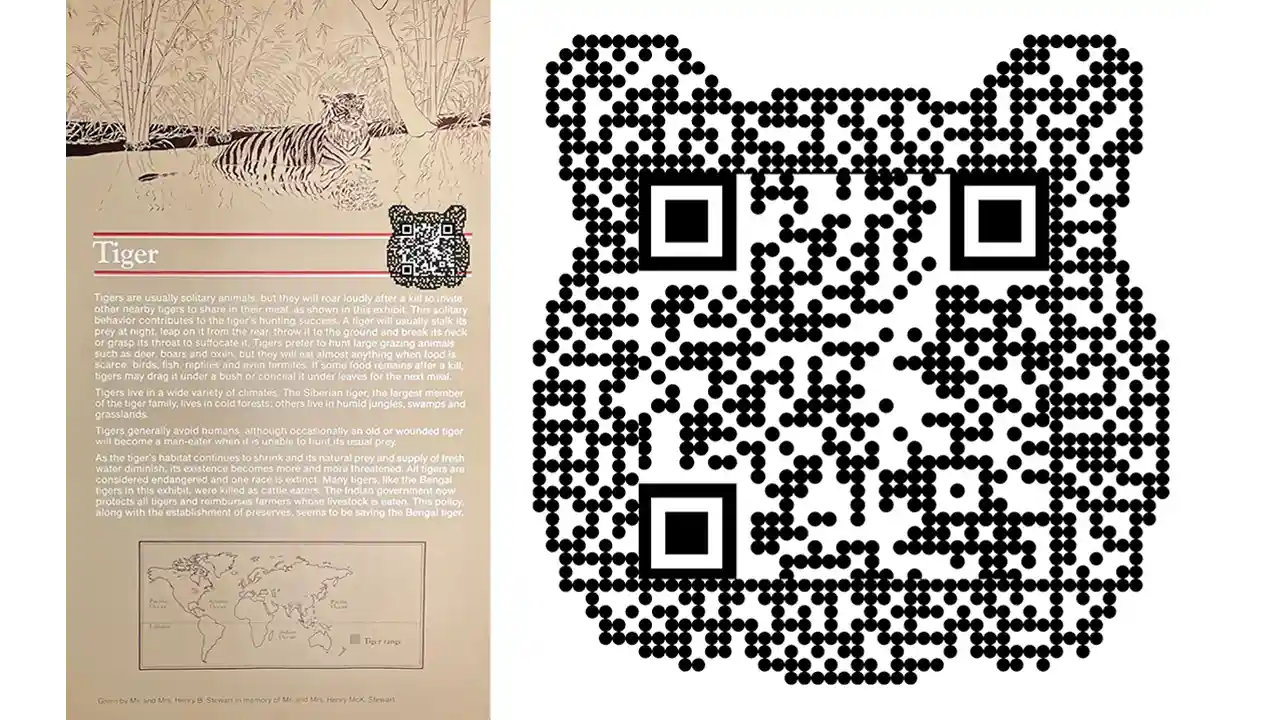
QR Codes
In this project, we implement the use of QR codes. They’ll be placed around the museum, and we’re specifically focusing on placing them next to dioramas. It is completely up to the user if they want to scan the code or not when they’re at the museum. However, these QR codes contain special features and information related to each diorama providing an educational opportunity for visitors. We have designed the QR codes to look like the animal in the diorama. This is so we can break up the repetitiveness of similar looking codes all around the diorama floors.
Remote v. On Location Experience
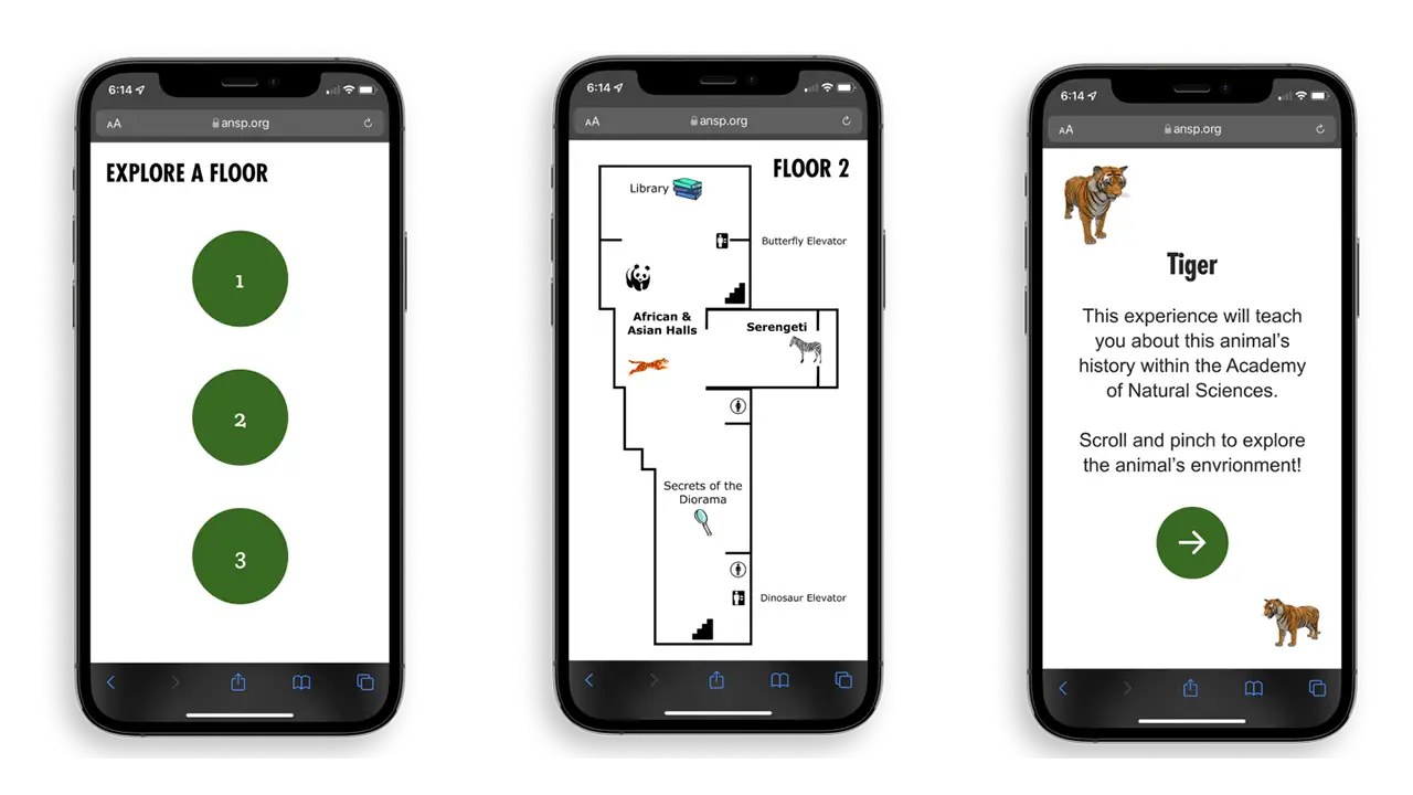
To make our web app as accessible as possible, we created two different flows for users to choose from. To explore our web app, choose from our Remote Experience or our On-Location Experience.
The Remote Experience of the web app is used anywhere outside of the museum. With this selection, certain interaction points will be locked in the virtual experience. The only way to unlock all of the interaction points is to visit the museum in person. Our On-Location experience is what users see when they’re at the museum (or when they scan a QR Code). When at the museum, users can interact with all of the buttons on the web app interface. Based on a user’s location, the amount of interaction points changes, which encourages visitor-ship to the museum.
WebVR
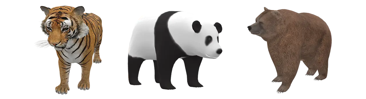
We also implement WebVR within the web app. WebVR allows users to ‘step inside’ the diorama, making the experience more immersive. We want the virtual experience to be just as engaging as the physical diorama, so we mimic the diorama’s animal, background, and specimens. Users can interact with animals in WebVR to see them from every angle and understand their natural surroundings.
Developing WebVR was quite difficult since our team didn’t have much experience with utilizing JavaScript three.js modules. We worked using old projects that we have created in the past as well as frequently referring to three.js online documentation. The goal for the WebVR portion of this project was to have it look almost identical to the prototype we created.
Museum Education
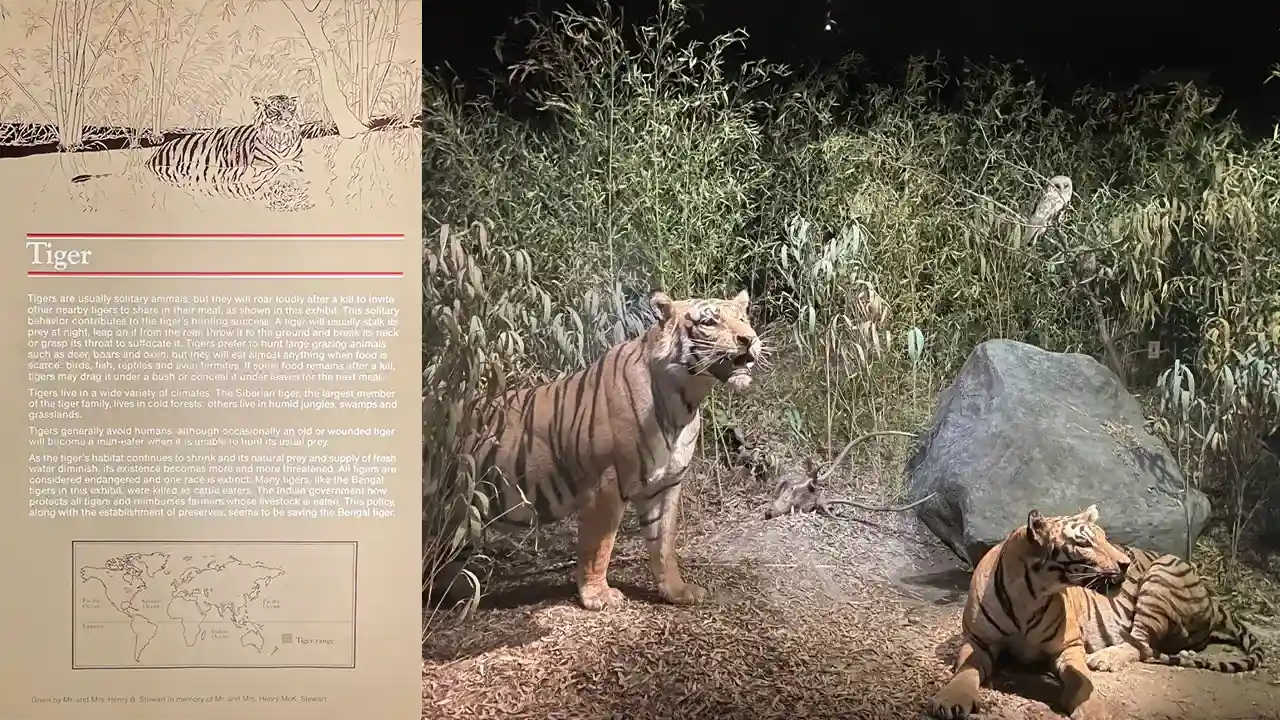
When addressing the educational experience within our web app, we outsourced some knowledge and talent from Allison Wright, a design research graduate student with a professional background in museum education. We held weekly meetings with Allison for the final term of this project to perfect our text content and understand how we could best deliver our information to users through the interface. The content we included came from Academy Archives at the ANS, which is the documentation that supports each animal’s specific diorama information and history with the museum. Our team was able to contact the Academy and access these archives for the tiger diorama in this project, which was extremely interesting for us to have the opportunity to learn about. Including content from these archives in our web app allowed us the opportunity to deliver the educational experience we wanted to – yet makes it specific to the ANS which sets this experience apart from any other museum visit.
Collectibles
Since it is a goal of the Academy’s to get visitors more engaged with the dioramas, we introduced a Collectible feature within our web app. After interacting with all buttons in a virtual diorama, a user has unlocked a ‘Collectible.’ Once unlocked, this 3D virtual avatar lives in a user’s ‘Collection’ page, where they can view all the animals they’ve collected on one screen. A user can interact with their unlocked avatars at any time. These ‘Collectibles’ can serve as a memory of a specific museum visit, or even a digital souvenir that motivates a user to revisit and grow their collection.
USER TESTING
For our user testing, we performed observations at the Academy and conducted prototype tests for our ‘Museum Environment’ flow, and ‘Remote Environment’ flow. We took all our responses from each test and wrote them out in a FigJam file. From the data we collected, we formed categories based on user likes, dislikes, wants, any points of confusion, and ‘other’.
Analyzing the responses in each category allowed our team to create actionable insights based on user preferences. These insights were the basis of our work sessions to make sure we were able to provide our users with the best possible experience on our web app. See our User Test Notes here.
SOLUTION
Dioramas of the Future was created to bring diorama stories to life through an interactive virtual reality experience. Each design choice was supported through our user testing methods, hoping to provide museum visitors with the best possible experience on this web app. DotF takes a typical museum visit and transports it into the future, engaging users through modern technology capabilities. Updating the content that is presented to users allowed our team to teach important lessons about the history of the diorama and the importance of its ecosystem in a more mentally stimulating way. The choice to include our social ‘Collectible’ feature within the web app entices users to revisit the museum more frequently not only to expand their knowledge, but to receive the feeling of personal achievement when being rewarded for exploring the different dioramas. This feature also accomplishes the goal of ‘bringing the diorama animals to life’ through our interactive, exploratory interface. We believe the features included in our web app satisfy the hopes and goals of the Academy of Natural Sciences while demonstrating what an innovative approach to visiting a museum environment looks like. Please explore our web app Figma prototype here.You can also view our WebVR build here.
RESULTS
Delivering the most realistic experience possible through a mobile device is what we hope to achieve with this project. Based on all the testing we have done, these are the major takeaways that came from our participants:
The web app is easily accessible through the ANS website.
The 3D models bring dioramas to life.
The web app transforms older museum elements through technology.
Our collectible feature fulfills an element of play.
These points justify that users can enjoy the virtual experience just as much as the in-person experience.
While working on this project, of course there were ups and downs, as well as things that we could have done differently. If we had the chance, one of the things we would have done differently is plan out our project a bit more in the beginning. In our case, we were working with multiple different teams of people, so communication should have been stronger. With that being said, we believe overall this project was a success.
Since the Dioramas of the Future work we completed is part of a bigger renovation project, the idea of continuing this project is not out of the picture. We have all the documentation for a potential handoff if the Academy of Natural Sciences chooses to implement this project into their museum. We hope they do