IDM222: Web Development II
By Preeti Shenoy – 2022
IDM222: Web Development II
By Preeti Shenoy – 2022
IDM222: Web Development II
By Durando Angiulo – 2022
IDM222: Web Development II
By Alexis Raya – 2022
Flourish is a multimedia design concept that helps manage and care for your plants. Plant enthusiasts need guidance through tips and reminders throughout their plant care journey to feel confident and supported in providing the best care for their plants. The purpose of this project was to research, design, and develop a solution that would give plant owners a convenient method to care for their plants and provide them with the most accurate information and tools to keep their plants healthy. Our team look to collaborate our interdisciplinary skills, backgrounds, and experiences to address plant owners pain points and desires.
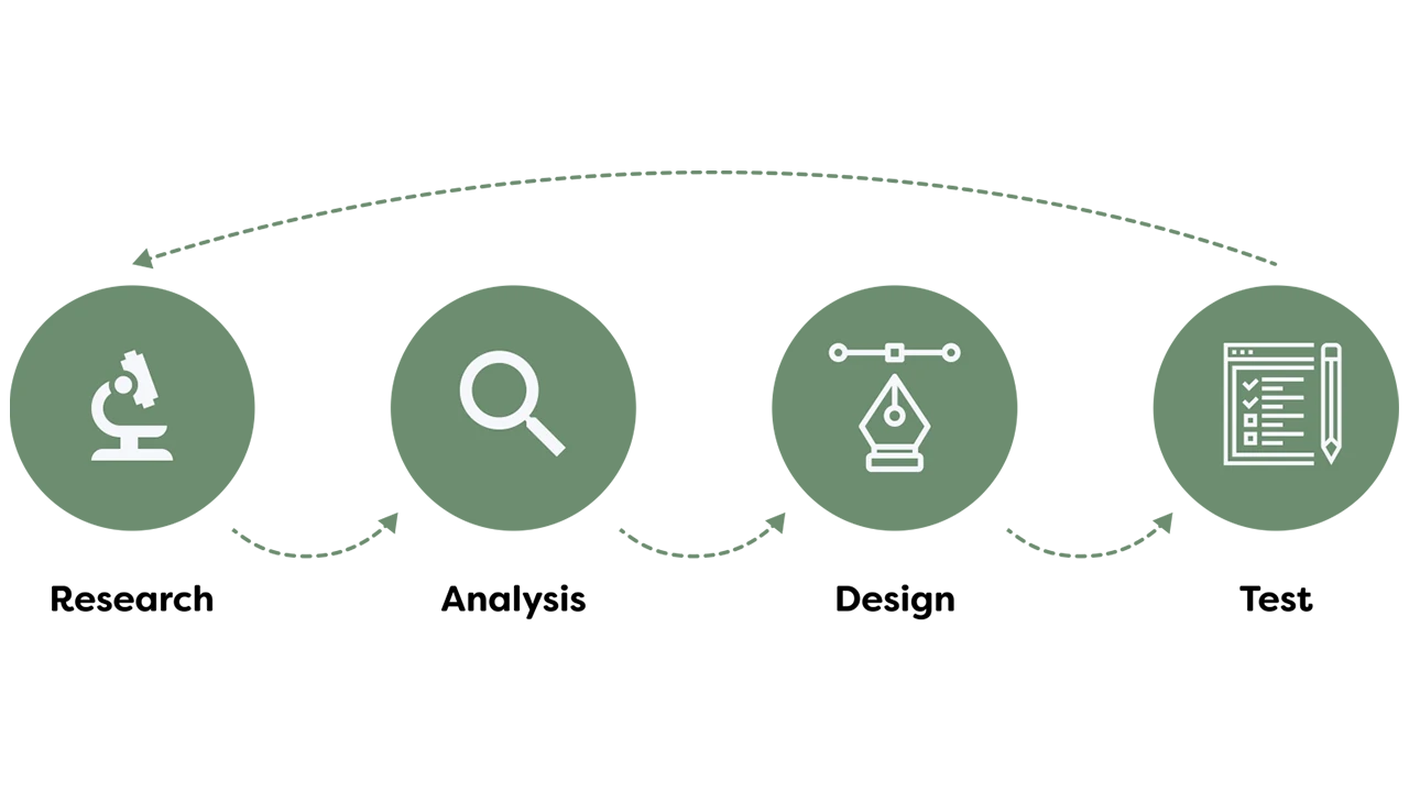
We started our project with honing in on what our problem statement is. Our guiding problem statement was how might we bring about an innovative, positive, and effortless experience with plant care? We approached this project through a user-centric design thinking process where our team focused heavily on emphasizing with our users (plant owners) and user research to drive our design decisions. What we wanted to discover included ways to create a convenient method for plant owners to care for their plants while receiving accurate information and task management tools to keep track of their plants’ health and happiness over time. As a team, we wanted to step outside of our comfort zone and explore new and immersive technologies/experiences which led us to identifying opportunities in the Internet of Things (IOT) market. The end goal was to truly provide engagement, involvement, and connection with our multimedia solution.
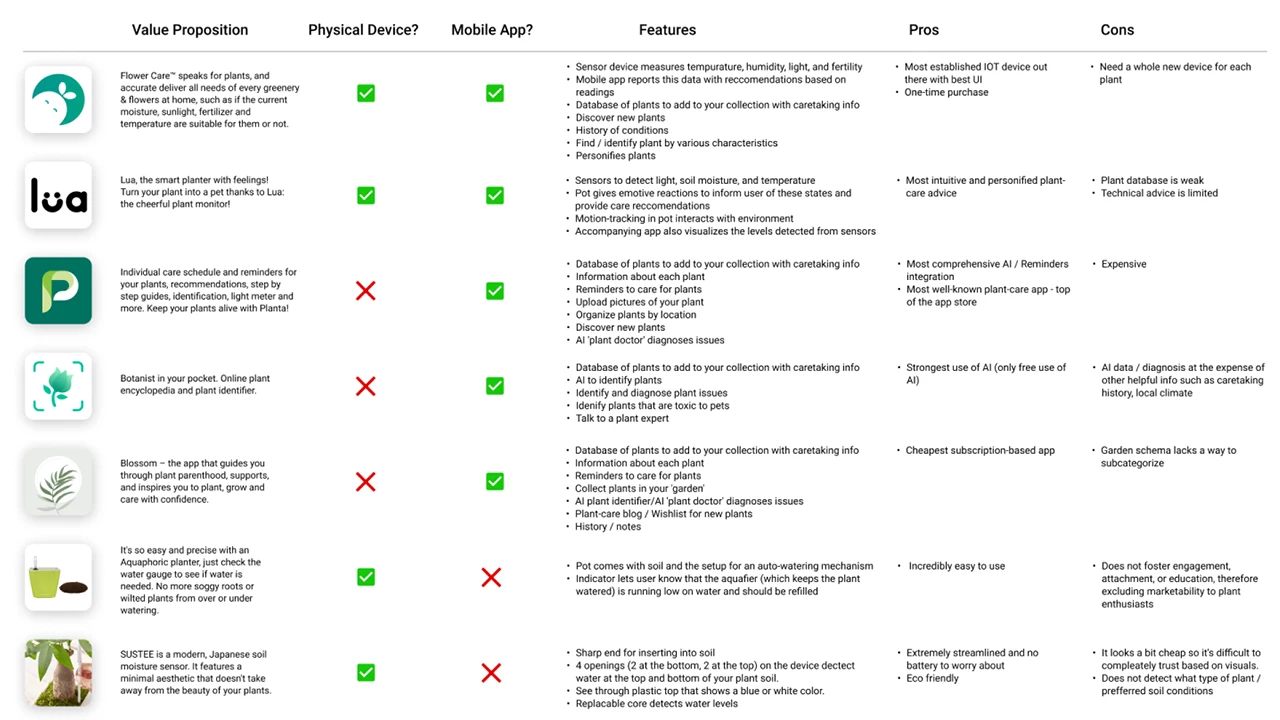
Prior to doing our primary research, we did a few preliminary steps to analyze the current market trends. Since this space of plant care tracking and reminders are saturated, our team wanted to explore what was currently successful, could be improved, and how our product could stand out from the rest in the existing market. With that, we performed a competitive analysis to evaluate the strengths and weaknesses of our competitors.
Once we finished with our competitive analysis, we pushed to create a matrix to prioritize features and develop an early product roadmap so that the design and development teams can discuss levels of feasibility and set realistic deadlines to meet.
Our goal for research was to ensure that we would make data-driven design decisions throughout our entire process. The goal was to put ourselves in the users’ shoes and understand their pain points as well as be able to defend our design solutions using the research and data we accumulated over the first phase of this project.
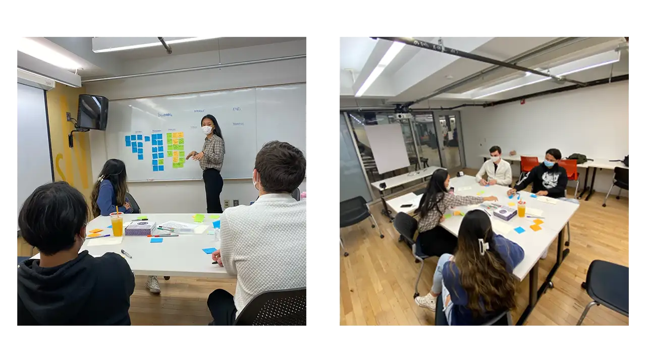
For our research, it consisted of first understanding who the users were through stakeholder interviews, contextual inquiries, guerilla interviews, and screener surveys. We understood we had a large demographic so we needed to cater to a specific group and get a better understanding of the problem. Our users for this project were targeted to beginner and intermediate level plant owners who are technologically driven and enabled.
Even though we spent over 10+ hours listening to users speak about their plant care journey, we had still set out to launch a quantitative survey through Qualtrics to quickly gain data to understand the context, motivation, and cause of certain elements within plant care ownership. It allowed us to generate a large enough sample of respondents to truly be representative of our target demographic. The goal was to understand plant owners’ experiences and relationships with houseplants. We were able to branch questions based on key differential factors such as how many plants the respondent currently owned and how they rated their expertise. We focused on finding online forums and groups of plant owners and enthusiasts, as well as those that focused on college students local to Philadelphia. Our survey gained a total momentum of 302 respondents, over half of which responded ‘yes’ to conducting further research.
Our team conducted approximately eight user interviews. The goal of these interviews was to explore people’s experiences and relationships with plant care. We interviewed plant owners who considered themselves to have beginner or intermediate plant care expertise. We transcribed all eight interviews and created a word cloud to visualize common themes, and also generated a list of the ten most frequent words.
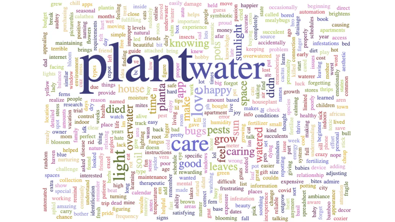
One interesting insight from this exercise was that water was the second most common word, whereas other variables that our sensor detects, such as humidity and temperature, were not as common. Another key insight was the overall sentiment of many of the top words such as care, feel, home, good, and pretty have a positive, nurturing connotation. We also got together and coded each interview, creating an affinity map from our insights.
Overall, most of the people we interviewed were busy working professionals with a lot on their plates and a need for convenience. We learned about a variety of different routines and methods for plant care, and a trend that stuck out was people with a higher skill level and more expertise were more resistant to the idea of using a system that would require them to water their plants or do other tasks on a strict schedule; they had a feel for what each unique plant needs, and as a result their schedules were looser and more intuitive.
People also used a variety of resources for advice and help, but a common complaint was the lack of a unified source for this information. We see this as an area of opportunity for our app.
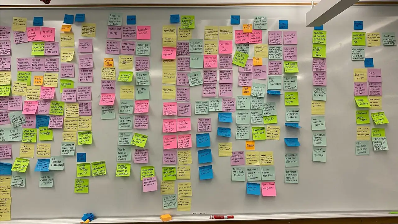
We brought our target users in. Once we have gathered an intensive amount of rich user data, we felt confident enough to start the ideation stage. But even for the ideation stage, we started with involving the user first in a participatory design workshop. We conducted this session by uniting users together and working as a team to generate ideas for a user scenario and learn the underlying needs and motive for each idea. It was a great hour and a half long session where we got a lot of insight into who the potential user of this app would be, what issues would arise, and what sort of solutional ideas would be helpful to combat those issues.
Our major takeaways and recommendations included:
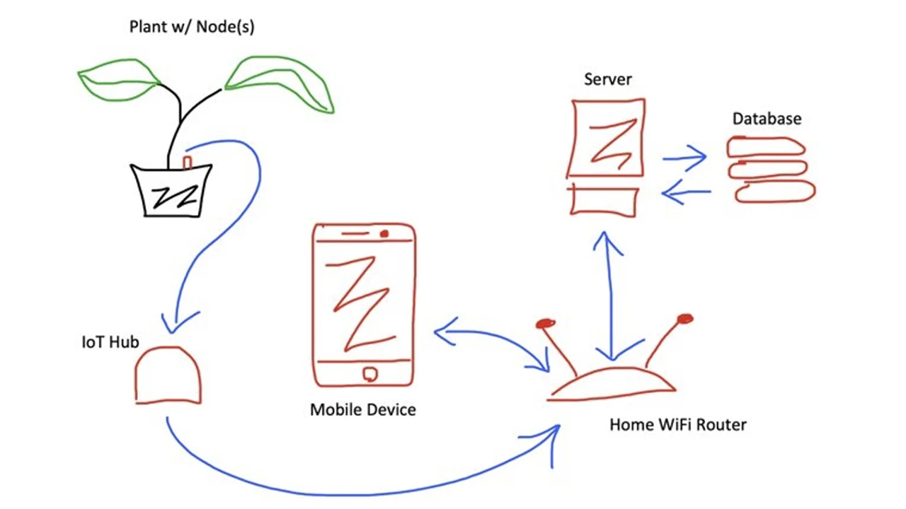
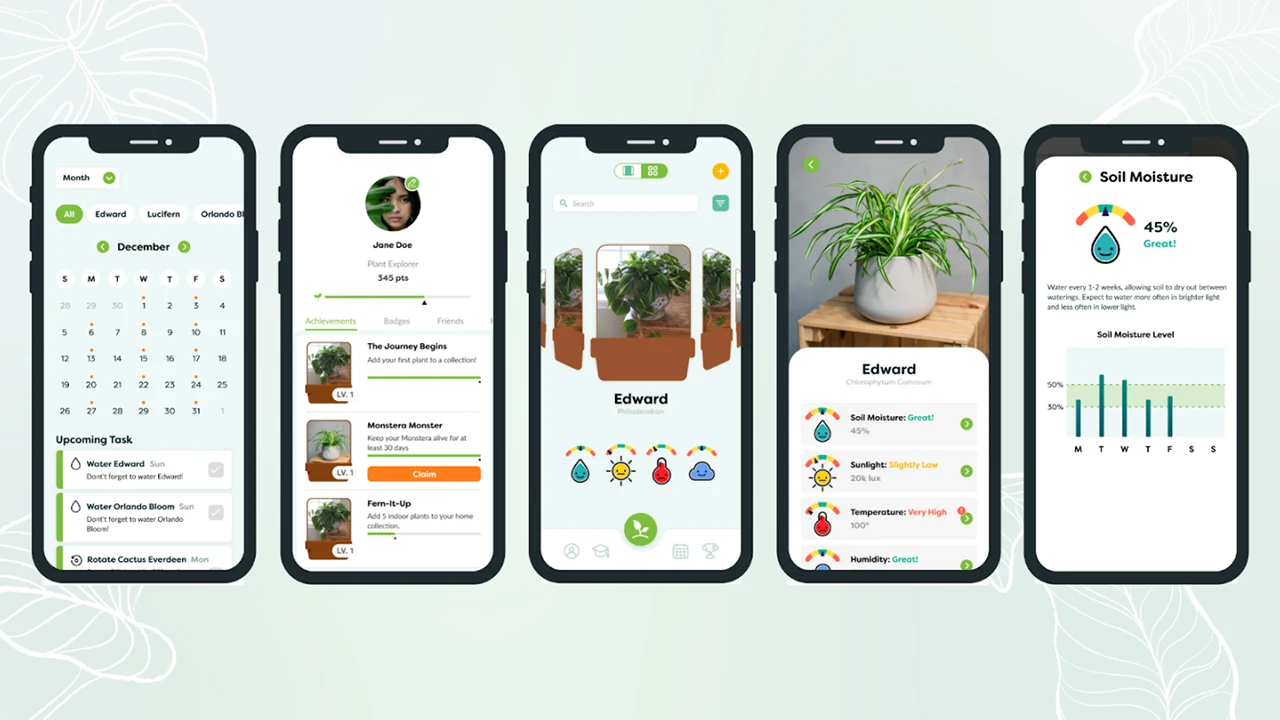
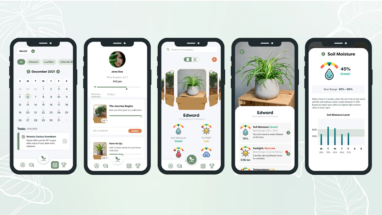
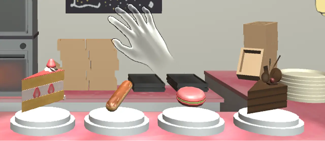
Through our research, our solution is an app that provides care recommendations about your plants and is paired with a sensor that detects soil moisture, sunlight, temperature, and humidity.
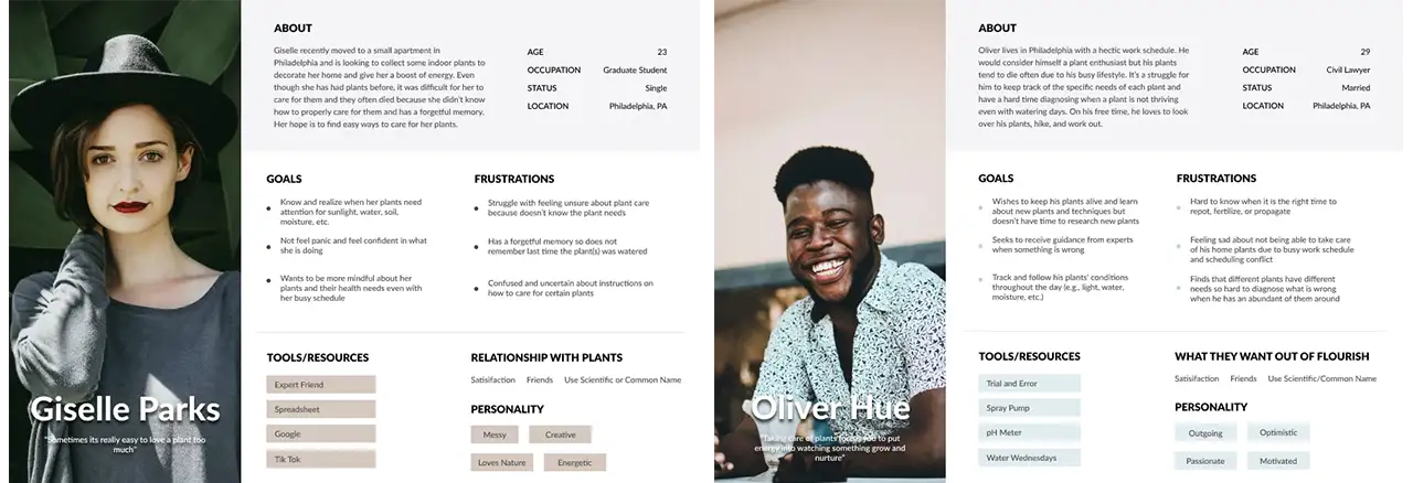
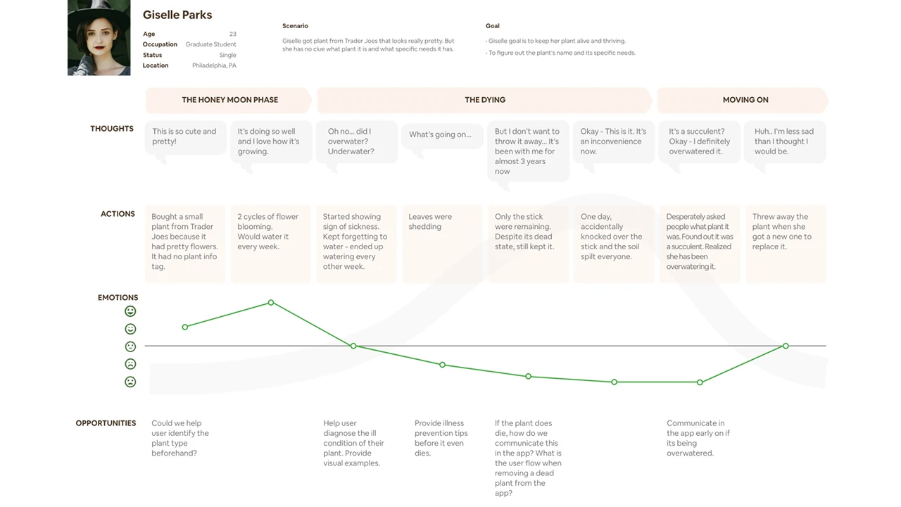
Based on these findings, we created user personas to help guide our design process. We realized from our research that we should primarily target plant owners with beginner or intermediate knowledge levels, as they were the groups that needed the highest levels of support. We created user personas and journey maps of this target audience.
We started the design process by sketching our ideas for the sensor and app in order to quickly communicate our ideas.
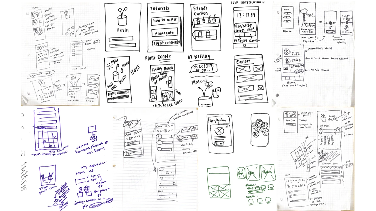
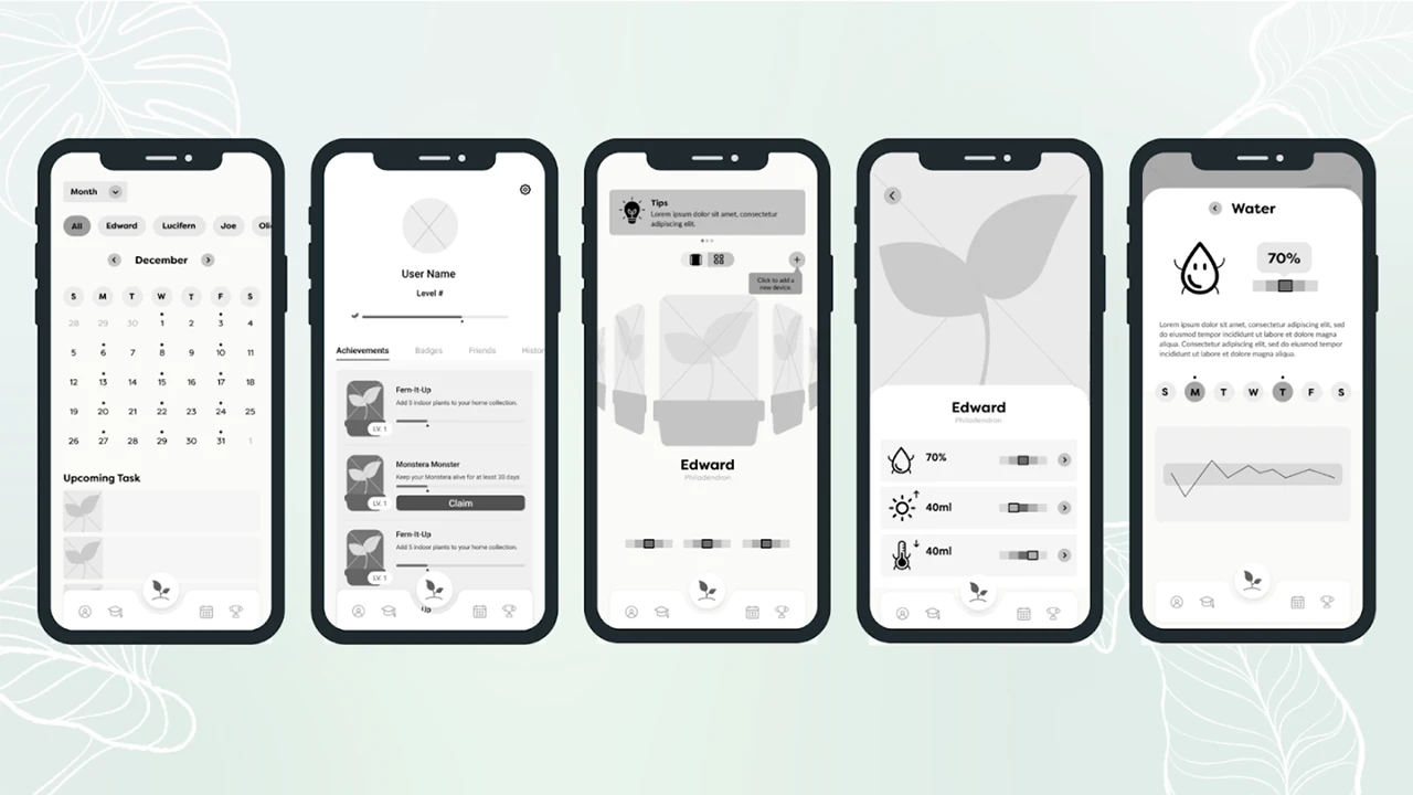
Next, we moved on to a clickable grayscale prototype for our low-fidelity prototype. We avoided adding color at this phase to keep the focus of our testing on the basic structure of the app.
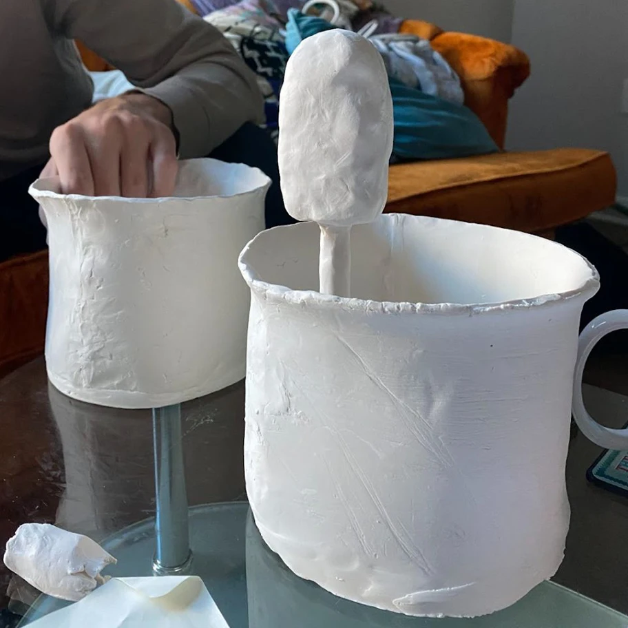
We also created clay prototypes of sensor devices to test various ideas with members of our target demographic, as well as conducting focus groups to understand what product features they would prefer to see.
After testing our low-fidelity app design with users, we made revisions based off of their feedback. We also added color, text, and real images so that we could begin to test the content of the app as well.
Based on user feedback, we also narrowed our sensor ideas down to devices that could be stuck into a pot. We designed various iterations of the sensor based on the needs of users, such as being small in size and not taking away from the appearance of the plant.
After further testing, we created our high-fidelity prototype.
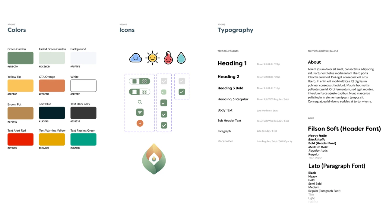
At this point, our style guide was fully finalized. We used the atomic method to create a modular and consistent design system that made development easier.
To fully bring the app to life, we also designed and implemented microinteractions for the interface.
A central theme of our app throughout all iterations was personifying plants to create a greater sense of emotional connection. With this in mind, we animated transitions for the icons that delivered information about how each plant was doing.
We also added an animation for the bluetooth connection loading while users connected the sensor to the app. This feedback was intended to mitigate user frustration while waiting for the process to be completed.
Finally, we created a confetti animation for users who won badges to add more cheer to the experience.
Our final solution was a high-fidelity prototype and IOT device design concept.
App Development was done in an Agile method with UX. We started with the core functionality we knew we would always need and could be styled and made pretty later on. With each design phase or ‘fidelity’ provided by our UI designers, more features were added into the app, tested, and improved in further fidelity. That was the development cycle for 9 months.
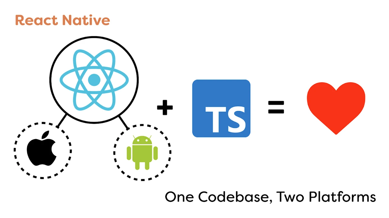
To make the app, we went with React Native, a framework that allows us to code for both iOS and Android and only need to maintain one code base. It also includes many handy built-in functionalities that minimized development time.
Since there was only one dedicated app developer who was proficient in JavaScript, we decided to code the app in Typescript which is a very strict version of JavaScript, acting as a second eye while coding, pointing out technical flaws and anti-patterns, solving bugs before they even existed.
Prior to this project, our goal was to collaborate on an interdisciplinary team, using technology to solve people’s plant-care problems.
Our final design was navigable by 100% of users it was tested with, and the majority of users reported that they would like to use the product if it were to go into production. This project will be continued next year by another team at Drexel, and we are excited to see what else will be achieved!
Orbital, a COVID-safe interactive art installation allowing for the collaboration of visitors to manipulate and create a one-of-a-kind galaxy in real time.
Our vision for the Drexel Westphal 2021-22 senior project is to create a COVID-safe interactive art installation allowing for the collaboration of visitors to manipulate and create a one-of-a-kind experience in real time. Over a timeline of 9 months our team ideated, designed, tested, developed, and deployed a galaxy themed interactive art installation for visitors from all over Drexel to take part in.
Our main goal is to design and develop an interface for visitors to make their own custom planet and add it to our galaxy that is being projected in real time, while also creating interactions that excite, intrigue, and are memorable. Our minimal viable product will consist of the planet customizer application, the galaxy canvas for the planets to be added to, and a statistics dashboard that will show off fun metrics collected from the event, live.
Although we present ourselves with this galaxy theme today, we weren’t always centered around this concept of building a galaxy together from scratch. We always knew we wanted to enable visitors to collaborate to create a piece of art together through their individual efforts but our original intent was to allow for anything to be displayed.
Our original plans were for visitors to have a free range of drawing tools and visuals so they can create their own individual art piece which, upon saving, would be collaged with the rest of the submitted works. Over time this would create a giant collage of the work of everyone who took part and ideally would appear as a magnificent mural representing all of the collaboration that occurred.
After receiving feedback that our original idea was too broad, we quickly pivoted into the galaxy creation theme. It offered a unique niche for us to explore and an experience to build while also working off of the themes we initially wanted to capture.
The basis for our project is centered around us solving this challenge statement:
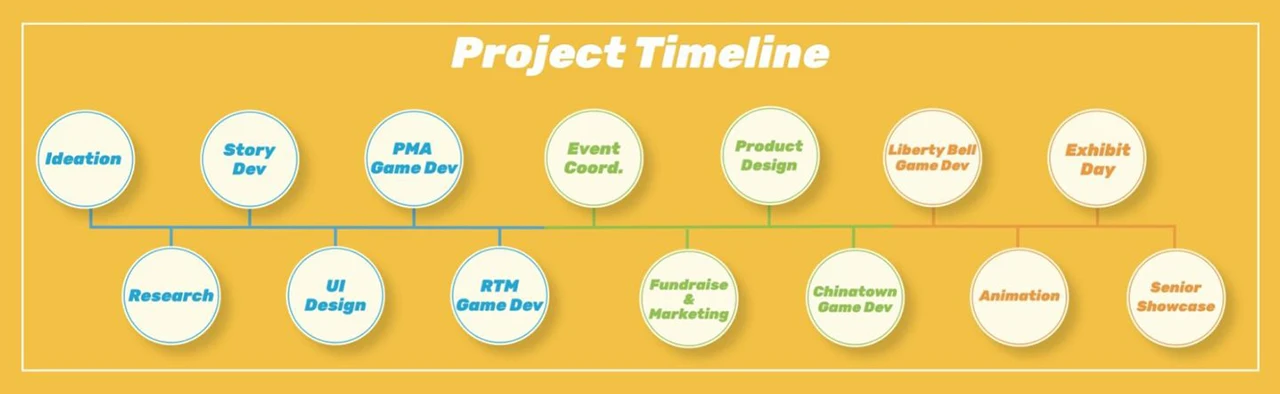
To solve this challenge we took our 9 month timeline and split it into 3 phases:
Each phase lasted 3 months (a single term’s length) and our project ended with the senior showcase presentation.
In order for us to succeed we started by spending 1 term researching and ideating. We conducted interviews, user workshops, met with industry professionals, and conducted other user research methodologies to gain insight into what makes engaging, memorable, and fun interactive art.
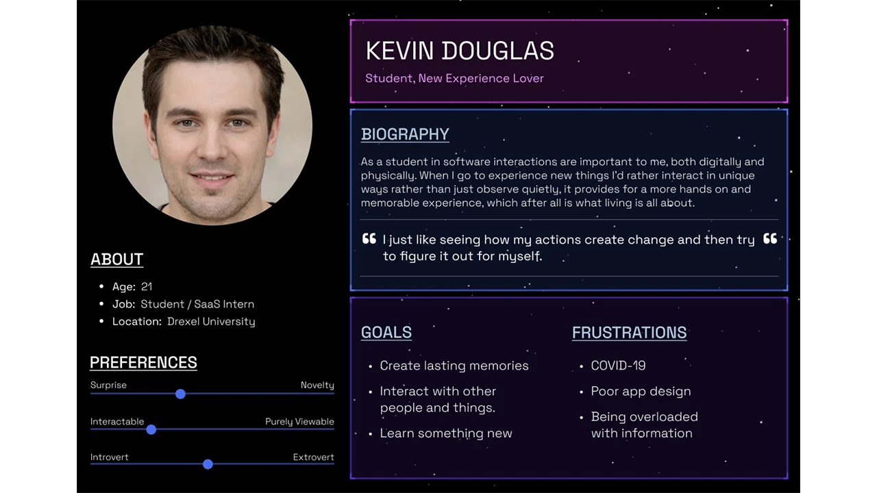
It was also at this time that we identified our target audience as being the Drexel student population, since we were limited due to COVID restrictions. We then created a user persona representing our target audience.
After identifying our target audience, we began forming our User experience, interface, and interaction designs. We tested our prototypes with real users based on our target audience and used those insights to refine our approach and ideas.
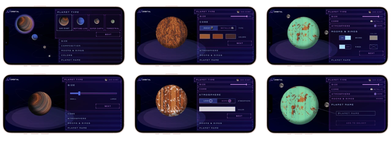
Once we had chosen the solar system concept, it was time to begin focusing on the planet creation design. We knew we wanted users to create unique planets which would be added to our collaborative solar system. Our first round of design allowed users to select one of NASA’s 4 planet types and customize size, surface, orbiting elements, etc.
Feedback obtained from users showed us that they did not notice the bottom scroll menu or enjoy using it. We explained too much with text and not enough with visuals. The feedback from this round of user testing helped influence a completely new design for the flow that users understood and enjoyed using more.
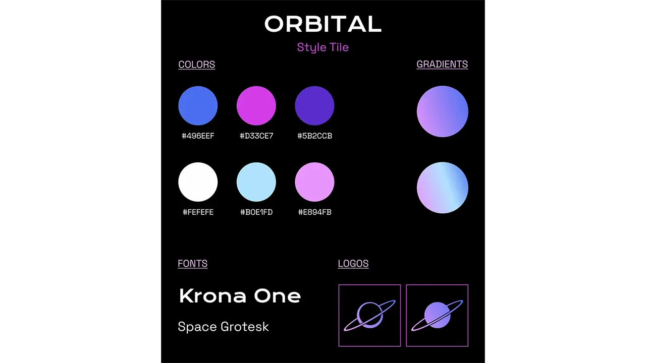
We also focused on branding, creating a logo, name, and graphics, and selecting colors that fit with the sci-fi/space atmosphere we wanted at the event.
This new design was much less text heavy, showing rather than explaining. We had a lot of facts in the app which were removed in this round of edits. We decided to place the facts on the walls in our installation so visitors could learn about the planets they were creating. The new design uses tabs to guide the user through the flow and includes the planet type selection as one of the tabs so users can easily edit their planet type if desired. As the user makes choices, the tabs show each selected option and they will see their planet update with those choices.
The final update focused on smaller changes now that we had a finalized format that users understood and enjoyed. Confusion from users about color choice correlation led us to incorporate it into the atmosphere and core tabs instead of having its own tab. The main focus of this UI update was to create a UI style that fit with the planet building experience and the ambience we were trying to create at our event.
The final product was a streamlined process that took around a minute to complete with enough variability that each visitor could create a unique planet. Our goal was to create a process that was quick and easy for everyone to use and understand.
The Orbital web app is built with Next.js, a React framework, and uses an additional set of packages to help improve and enhance the user experience. The core technology behind this application is react-three-fiber (R3F), a React renderer for three.js (3D javascript library). Using R3F combined with lamina, a layer based shader material, allows for multiple images and colors to be combined and layered onto a 3d object, which in our case was a sphere representing a planet. The planet creation flow uses key features of React such as the “useState” hook, which allows the user’s selection to be stored as a variable. When the user submits their planet to our solar system, these variables are then passed to the database as a JSON object where the data can then be manipulated for each unique planet that is created. We were able to achieve real-time updates for our web app on exhibit day using SWR, a React Hooks library for data fetching. This allowed us to set a refresh interval on the pages where the web app would refresh every 60 milliseconds checking for updates in our database. Additionally, Tailwind was added to reduce the amount of CSS files included in our application.
The essentials: planet creation flow, solar system, and mission control, were finalized early enough where we had some resources to devote to other interactions. This led us to incorporate the joystick station. We used the Logitech Extreme 3D Pro Joystick and connected it to our planet database to cycle through the planets.
We did this by using JavaScript to connect to the USB port to detect inputs. This input was then split so we could read a roll to the left or right. A roll left would pull the previous array entry, and a roll right would pull the next entry.
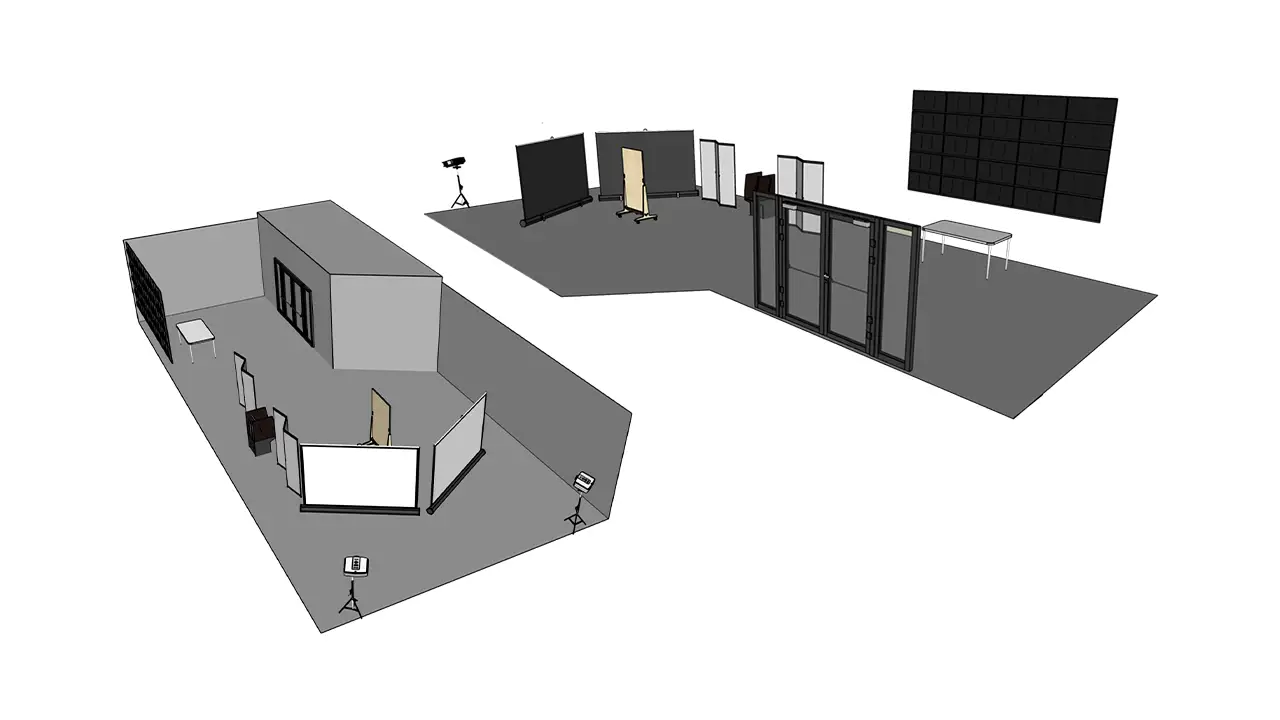
The event was held in the Westphal lobby of Drexel. We created a floor plan that optimized the darkness of our given space while allowing visitors to progress safely through the installation. The large mission control screen, shown on Westphal’s big multi-screen display, grabbed the attention of visitors as they walked through the front door. Visitors then could approach our information table that displayed facts about each planet type along with a scale model of the planets presented with stickers and treats. QR codes and informational flyers about each interaction and the exhibit were placed around the entire room. The large screens each displayed a different rear projected view of the solar system. This was done so visitors could get as close to the screens as they wanted without obstructing the view. We placed QR codes to create planets, more facts about the planet types, and information about the exhibit for visitors to read as they progressed through on the walls surrounding our exhibit. The joystick station, where visitors enjoyed scrolling through the database of planets, sat between the screens and the information table. This set-up was something we researched by referencing our space and other installations. We tested our equipment in multiple sessions, and updated our planned setup based on research and application throughout the final term.
Our goal was to create an interactive art exhibit that excites, intrigues, and is memorable while also offering a COVID safe experience for our visitors.
We know we succeeded when we saw high user interest and engagement within our exhibit. Additionally, we saw our backend database filled with all of the data provided from users coming in and making their own custom planet. This serves as a great metric for us because we saw a significant amount of user input into our database.
Our main goal was to create a collaborative piece that allowed each person to contribute something unique as an expression of themselves. Based on the unique planets that populate our database, and the diverse solar system it creates, it is clear that this was successful.
Dioramas of the Future (DotF) is a collaboration between Drexel University and The Academy of Natural Sciences to develop a web-based application used to bring diorama stories to life through an interactive virtual reality experience. This project allows for more exploration and a deeper engagement with dioramas and their affiliation with the museum. Through interactive points of interest in virtual environments, an element of play is involved. Users can unlock virtual animals and specimens to add to their ‘Collection’ within the web app, available to them at any time. The final deliverable for this project is a Figma prototype and WebVR experience. We are not designing for today, we are designing for museums of the future.
At the beginning of last year, the Academy of Natural Sciences offered Westphal an opportunity they call the “Museum Innovation Fund.” This is a grant program that supports the conception and rapid prototyping of innovative approaches to all forms of museum learning and engagement. Faculty from the User Experience & Interaction, Product Design, and VR & Immersive Media programs collaborated to create this idea called Dioramas of the Future, which augments museum dioramas using virtual reality. After receiving approval from the museum to move forward with the project idea, Chelsea and I were approached to perform UX research. Our goal in this role was to understand how we could transform the current visitor experience from traditional to exceptional.
Our team began working with the Academy at the beginning of the fall term, and quickly became aware of the problems they were facing. These problems included visitor rates falling dramatically since the start of the pandemic, a low budget restricting any renovations from happening, and outdated content being displayed to visitors throughout the building. In order to address these problems and create sustainable solutions, we honed-in on the goals that the Academy wanted to achieve through our work. One of the Academy’s goals from the start was to increase visitor-ship to the museum. They wanted their building to be lively again, which would also help with their problem of a low budget. The more visitors that walk through their doors, the more money they receive to put towards updating their space and content. Another one of the goals they hoped to address through the DotF project was modernizing the museum experience. Specifically, they wanted to “bring the dioramas to life” through technology. Luckily, our team had experience creating a life-like pet application prior to this project, so we felt confident in our ability to satisfy this goal. Along with this modernization aspect, the employees at the ANS wanted to enhance the educational experience that they provide. A lot of the visitors to the museum are students on field trips, or people looking to learn about different animals and wildlife. Since the content currently displayed to visitors hasn’t been updated in a while, our team placed a lot of importance on this goal and wanted to deliver a learning experience that would be fun and informative to visitors of all age ranges.
After having discussions with the Academy of Natural Sciences, we listed out their goals for the museum space. These goals are reflected through the high-fidelity prototype we have created based on user testing and research we have conducted throughout the span of this project. The team also created project deliverables to meet these goals mentioned by the academy. The deliverables identified are:
These deliverables were also communicated with the ANS to make sure we were on the same page before starting research, design, and development for this project.
We started our initial research by conducting interviews with the faculty involved in the project. These interviews ranged from thirty minutes to an hour, where we were able to have an open discussion and learn about each faculty member’s hopes for the project. We got many different ideas from each interviewee, which added a layer of difficulty when trying to pinpoint how we should perform our research and design work.
We also sent out surveys to collect data from people outside of the project. Our surveys helped us get a better idea of what users wanted to see in museums and what could be possible features within our project. Our first qualitative survey included questions that referred to interactivity within museum environments. Our second survey was a desirability study, where we presented participants with two images relating to a museum visit and had them choose their preferred experience.
Based on our survey data, we found that:
We also sat through project pitches in Product Design classes to better understand the ideas they had for museum spaces. These pitches helped us by providing concepts and visuals of what could be brought into the design portion of this project, since we were initially only focused on research. Staff from the ANS also attended these project pitches and decided on a final concept that they thought would work best for the museum.
These initial research processes provided us with data to analyze our users’ needs and wants. See our Interview Data Analyzation here.
Because we were designing for the museum, many of our design decisions were based off our client criteria. For example, this project idea pivoted a few times due to technology costs expending the money within our budget. The reason we chose to create a web app opposed to a native app for the Academy also had to do with client technical restraints. Though a native app typically has more feature availability, our team ultimately chose to create a web app due to its easy maintenance and opportunity for quick content updates. In this situation, our client did not have a development team capable of updating the native app whenever they wanted to add a new diorama or edit user content. A web app is much more accessible for beginners to update and does not require visitors to download an app from the App Store every time they visit the museum. Instead, they will navigate to our web app through the ANS website and can enjoy the experience within their browser window. Lastly, we wanted to make sure our final deliverable reflected the goals the museum hoped for with this project, as well as represent the Academy culture through our content and user experience. To fulfill this objective, our team followed the ANS brand guidelines and content language on each screen of our web app.
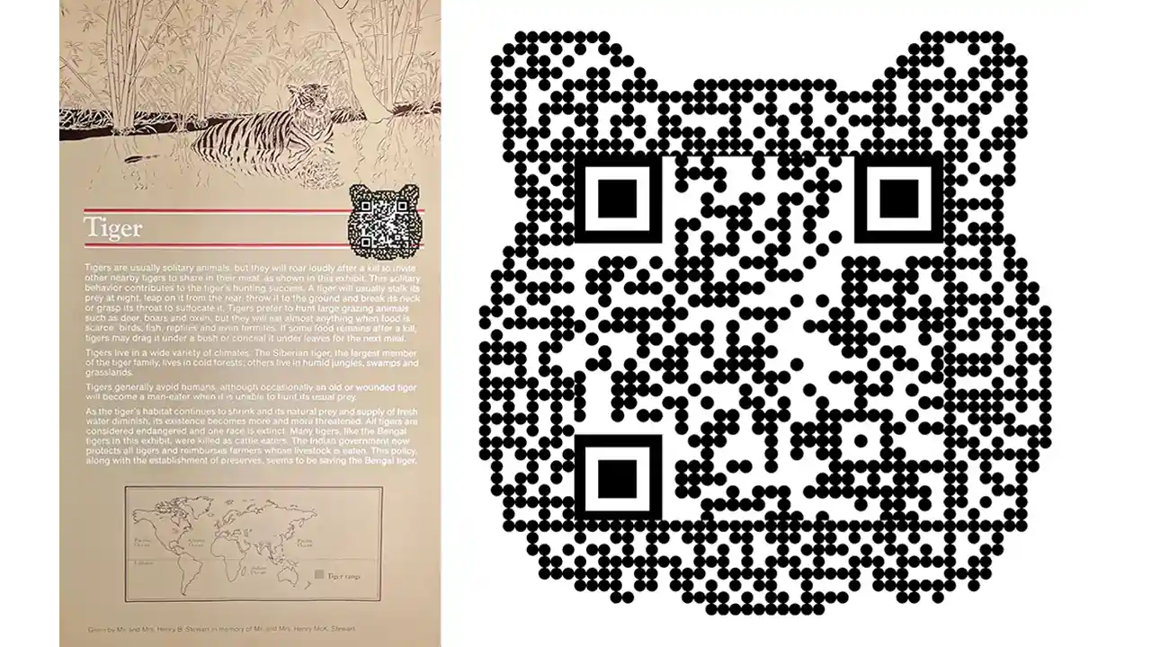
In this project, we implement the use of QR codes. They’ll be placed around the museum, and we’re specifically focusing on placing them next to dioramas. It is completely up to the user if they want to scan the code or not when they’re at the museum. However, these QR codes contain special features and information related to each diorama providing an educational opportunity for visitors. We have designed the QR codes to look like the animal in the diorama. This is so we can break up the repetitiveness of similar looking codes all around the diorama floors.
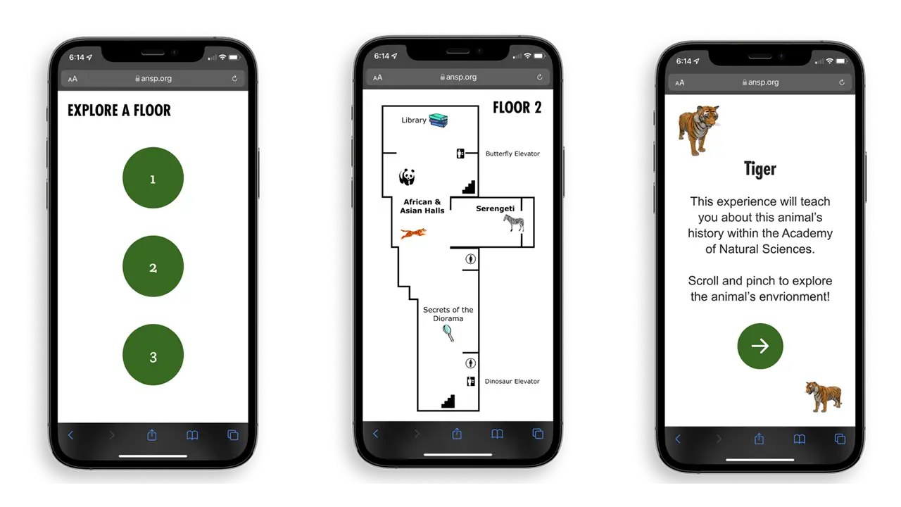
To make our web app as accessible as possible, we created two different flows for users to choose from. To explore our web app, choose from our Remote Experience or our On-Location Experience.
The Remote Experience of the web app is used anywhere outside of the museum. With this selection, certain interaction points will be locked in the virtual experience. The only way to unlock all of the interaction points is to visit the museum in person. Our On-Location experience is what users see when they’re at the museum (or when they scan a QR Code). When at the museum, users can interact with all of the buttons on the web app interface. Based on a user’s location, the amount of interaction points changes, which encourages visitor-ship to the museum.
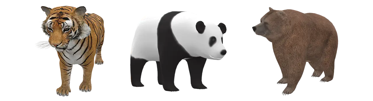
We also implement WebVR within the web app. WebVR allows users to ‘step inside’ the diorama, making the experience more immersive. We want the virtual experience to be just as engaging as the physical diorama, so we mimic the diorama’s animal, background, and specimens. Users can interact with animals in WebVR to see them from every angle and understand their natural surroundings.
Developing WebVR was quite difficult since our team didn’t have much experience with utilizing JavaScript three.js modules. We worked using old projects that we have created in the past as well as frequently referring to three.js online documentation. The goal for the WebVR portion of this project was to have it look almost identical to the prototype we created.
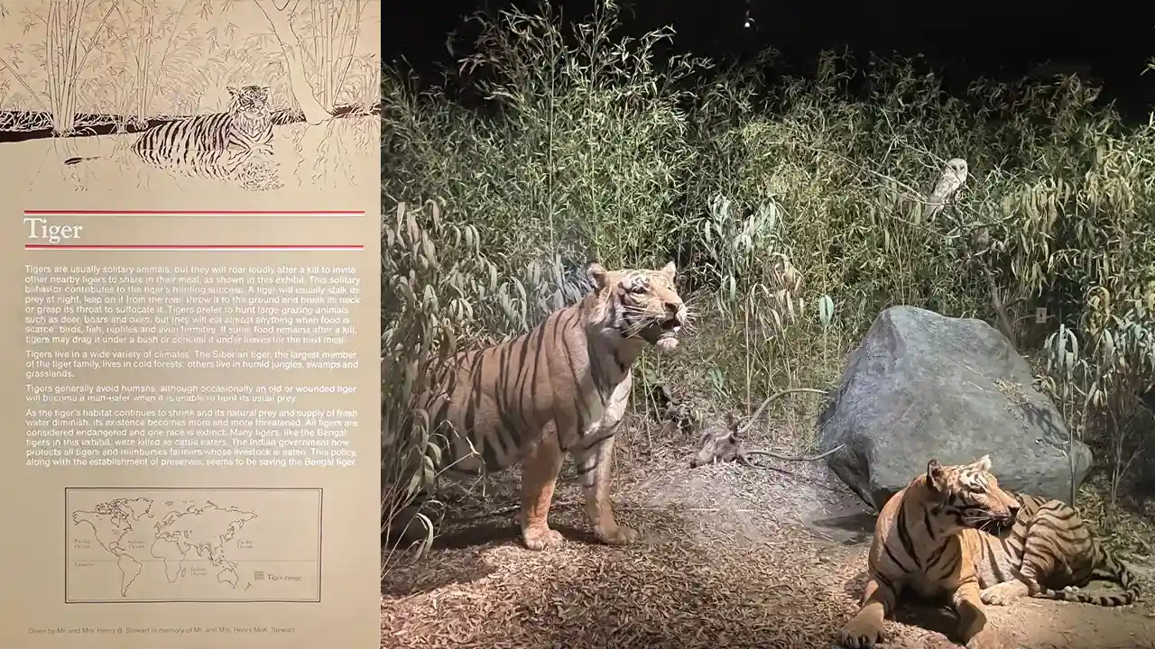
When addressing the educational experience within our web app, we outsourced some knowledge and talent from Allison Wright, a design research graduate student with a professional background in museum education. We held weekly meetings with Allison for the final term of this project to perfect our text content and understand how we could best deliver our information to users through the interface. The content we included came from Academy Archives at the ANS, which is the documentation that supports each animal’s specific diorama information and history with the museum. Our team was able to contact the Academy and access these archives for the tiger diorama in this project, which was extremely interesting for us to have the opportunity to learn about. Including content from these archives in our web app allowed us the opportunity to deliver the educational experience we wanted to – yet makes it specific to the ANS which sets this experience apart from any other museum visit.
Since it is a goal of the Academy’s to get visitors more engaged with the dioramas, we introduced a Collectible feature within our web app. After interacting with all buttons in a virtual diorama, a user has unlocked a ‘Collectible.’ Once unlocked, this 3D virtual avatar lives in a user’s ‘Collection’ page, where they can view all the animals they’ve collected on one screen. A user can interact with their unlocked avatars at any time. These ‘Collectibles’ can serve as a memory of a specific museum visit, or even a digital souvenir that motivates a user to revisit and grow their collection.
For our user testing, we performed observations at the Academy and conducted prototype tests for our ‘Museum Environment’ flow, and ‘Remote Environment’ flow. We took all our responses from each test and wrote them out in a FigJam file. From the data we collected, we formed categories based on user likes, dislikes, wants, any points of confusion, and ‘other’.
Analyzing the responses in each category allowed our team to create actionable insights based on user preferences. These insights were the basis of our work sessions to make sure we were able to provide our users with the best possible experience on our web app. See our User Test Notes here.
Dioramas of the Future was created to bring diorama stories to life through an interactive virtual reality experience. Each design choice was supported through our user testing methods, hoping to provide museum visitors with the best possible experience on this web app. DotF takes a typical museum visit and transports it into the future, engaging users through modern technology capabilities. Updating the content that is presented to users allowed our team to teach important lessons about the history of the diorama and the importance of its ecosystem in a more mentally stimulating way. The choice to include our social ‘Collectible’ feature within the web app entices users to revisit the museum more frequently not only to expand their knowledge, but to receive the feeling of personal achievement when being rewarded for exploring the different dioramas. This feature also accomplishes the goal of ‘bringing the diorama animals to life’ through our interactive, exploratory interface. We believe the features included in our web app satisfy the hopes and goals of the Academy of Natural Sciences while demonstrating what an innovative approach to visiting a museum environment looks like. Please explore our web app Figma prototype here.You can also view our WebVR build here.
Delivering the most realistic experience possible through a mobile device is what we hope to achieve with this project. Based on all the testing we have done, these are the major takeaways that came from our participants:
These points justify that users can enjoy the virtual experience just as much as the in-person experience.
While working on this project, of course there were ups and downs, as well as things that we could have done differently. If we had the chance, one of the things we would have done differently is plan out our project a bit more in the beginning. In our case, we were working with multiple different teams of people, so communication should have been stronger. With that being said, we believe overall this project was a success.
Since the Dioramas of the Future work we completed is part of a bigger renovation project, the idea of continuing this project is not out of the picture. We have all the documentation for a potential handoff if the Academy of Natural Sciences chooses to implement this project into their museum. We hope they do
The city of Philadelphia is rich with history and culture. Unfortunately, many of the ways to experience the city are not designed for children.
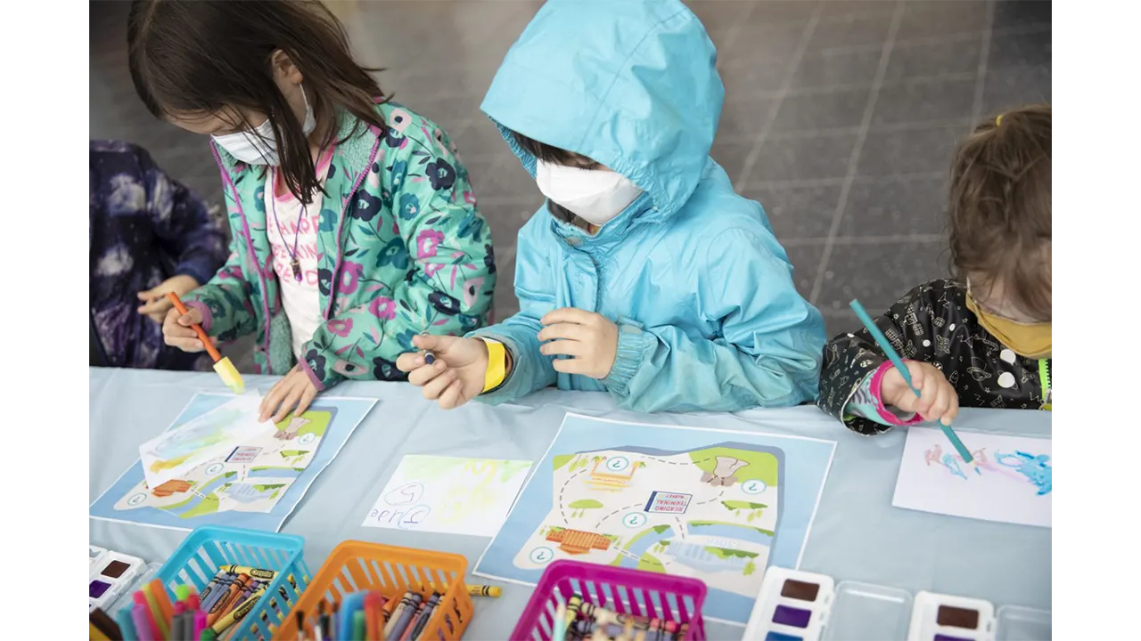
With our interactive exhibit, Next Stop, Philadelphia, we gave children a tour of Philadelphia that was designed just for them! At our exhibit, kids engaged with educational games, crafts, and activities that let them experience the culture and history of the city in an age-appropriate, exciting way.
There were no scopes or constraints to the project, as long as we are developing anything that relates to the realm of Digital Media. However, because the project consists of User Experience & Interaction Design (UXID), Game Design & Production (GMAP), and Computer Science (CS) students, the project must include aspects of game design and development. The UXID students are focusing on the Storyline, User Interface of the digital components, UX Research, and Physical Production of the exhibition space. The GMAP students will be working on the digital game designs and building the assets needed for each game that is developed. The CS students will be working on testing different sensors, and programs, and developing our ideas into physical games that can be played throughout the exhibit.
We started the project in August 2021 and it was completed by June 2022.
The first step of our research process was to send out a user survey. We gathered anecdotal data and recruited highly qualified teachers for our user interviews. Here are some insightful quotes from the survey:
Tell us about a memorable field trip. What makes it stick out to you?
“Annapolis… The students had a guide to take them through an experience, which kept them engaged in the lesson”
“The Glencairn Cathedral and Castle… They used different medieval characters who told their stories and hosted activities for the students in different rooms of the castle. It really brought the history to life and kept students engaged.”
What books do your students engage with?
“As teachers, we try to read books from a variety of genres and levels”
What resources can you recommend to us as we create an exhibit and story for children to interact with?
“Know the elements of plot. The importance of the relationship between an inciting incident, conflict and climax. Look at Freytag’s Pyramid for narrative text structure.”
“Kindergarten kids often enjoy books with colorful illustrations, repetitive text, and humor.”
Our next step was to conduct User Interviews. We met with teachers who had over 20 years of experience teaching grades K-8, and a tour guide who had 3 years of experience at the Constitutional Walking Tour of Philadelphia. Below are some of the questions we asked:
Special thanks to Anna Leong, who assisted with the User Interviews.
After conducting our interviews, we spent time sorting through our transcripts. We looked for patterns in what we were told and took note of valuable quotes. Here are some of our key findings:
First, we learned that establishing learning objectives for our stations would be foundational to our process. We had multiple interviewees speak to this point. Start with the goal of the station, and reverse engineer the activity from there.
“It’s that reverse engineering. What is your goal… what do you want (kids) to get, and then you walk it back.”
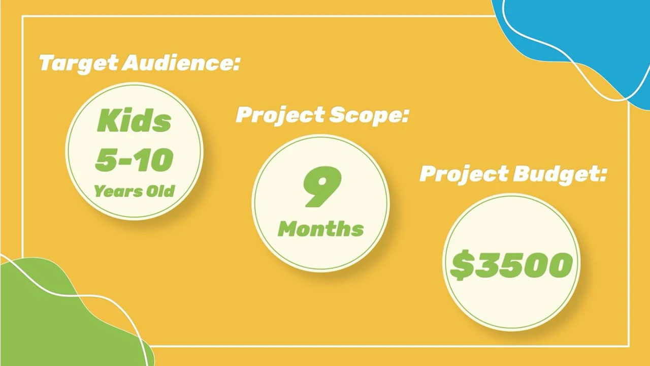
In our interviews, we learned that there’s a lot of variety in the needs of elementary-aged children. At our exhibit, we needed to accommodate a broad spectrum of ages, learning levels, and personalities. We also learned that teachers had an equal preference for digital and hands-on activities. With this, we decided that for each of our 4 stations, we would design a digital game and a hands-on activity, or craft. Giving kids choice helped to maintain their engagement throughout the whole experience.
“I try to use as many modalities as we can because we think that different things will reach different kids and that way you get more of a chance in reaching all of them.”
A key idea that developed from our User Interviews was to write a story for our exhibit. A story helped make our stations more cohesive, and motivated visitors to move through the whole exhibit.
In our research, we learned the best approach when writing for our target audience. We learned about Freytag’s Pyramid, which maps out a basic story structure, highlighting the importance of using conflict to engage the reader. We were also told about Lexile Scores. To accommodate kids ages 5-10, we should “Shoot for the middle,” and write for a 3rd grade Lexile level. Finally, we got advice for writing the instructions in our exhibit. We were told to create engaging, simple, and clear instructions. The faster kids were able to pick things up and start engaging, the less likely we were to lose them.
“What’s going to engage the kids is the conflict, the problem.”
“I think if you are going to balance between kindergarten and fifth grade you’d shoot for the middle. And we would shoot for third grade.”
The first step when starting out this project was finding research on how to develop an exhibit specifically for children. The first thing we did was go to the best source possible on how Philadelphia is being presented to children: The Library. We found as many books as possible that were about Philadelphia that were specifically geared towards the ages of 6 to 11.
By researching children’s books, we were able to see how to tailor our language to our audience and learn what landmarks in Philadelphia are most prominently taught in books for younger ages and also see what landmarks are not being as well-represented as they should be.
We also researched what type of characters are generally in children’s shows. “Are these characters humans, people, objects, etc.?” We learned about anthropomorphism where objects or animals are given human traits to provide some emotional disconnect to the audiences, while also being able to connect enough to provide them with lessons.
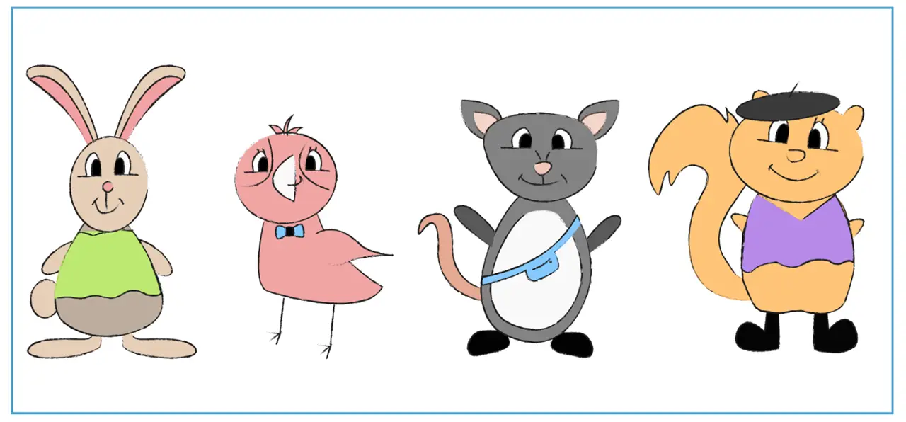
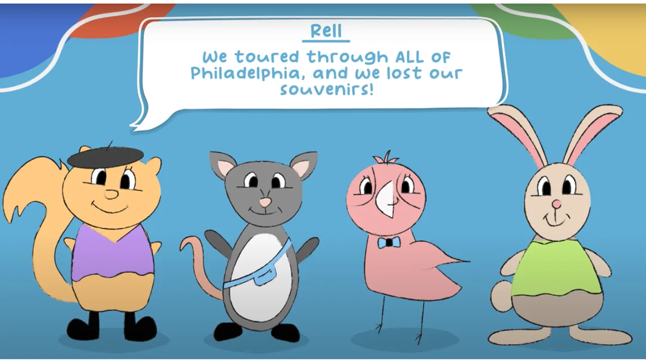
After many different iterations of animals, we designed animals that were native to Philadelphia. Those animals were then drawn using Procreate to create sketch-like illustrations of our characters: an opossum, squirrel, pigeon, and rabbit.
The story had gone under several different revisions ever since the first concept. Initially, the exhibition was to have different landmarks of Philadelphia where children engaged with games associated with each station. Through many discussions, we began to develop a more cohesive storyline that was able to better guide children through the exhibit using a narrative and incentives to retrieve each station.
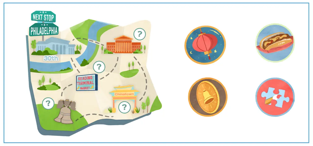
Our final story allows visitors to help our 4 characters find their missing souvenirs in Philadelphia, guiding them through our physical exhibit by meeting each of the corresponding characters at specific stations.
When planning and organizing our event, we found our exhibit location, made reservations and managed our project budget. We coordinated with each other and the Digital Media Department to identify the most ideal event date. Then, we worked with Drexel Event Services Coordinator, Nate Grossi, to ensure that all event requirements, like children’s clearances and COVID restrictions, were met, and secured a reservation at the Drexel Bossone Lobby.
For this project, our team had a budget of $3,500. We used a GoFundMe Campaign to raise $2600, and were awarded $1,000 from the Drexel Swift Fund.
We used a spreadsheet to work out a budget for our project. We used the information from Drexel Event Services to estimate the cost of our exhibit space rental, estimated the cost of our supplies list, and kept track of every order, receipt, and expense that occurred in the months leading up to our exhibit.
Take a closer look at how we organized and managed our Project Budget.
After sketching some ideas, we developed 3D model scenes of each of our stations. We used Maya to construct the 3D models and rendered the scene out to communicate our vision for each station. This helped us understand the scaling of each element that went into the experiences and see what we needed to be prepared for.
We also created a 3D map of the final exhibition layout using the floor plan that we have received from the event service. We used this map to give the visitor an overview of the space as well as for the team to plan the position and rotation of staff on exhibit day.
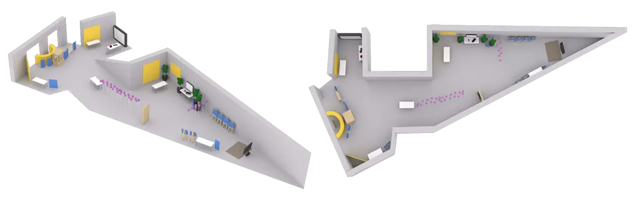
Our product design team brought our exhibit to life! We combined our physical and digital design skills to create a space that was 100% original. We built installations, painted murals, and designed every piece of our exhibit with our branding in mind. Later, we’ll explain how we designed each station to be unique, but for now, let’s see how we worked to design a cohesive experience.
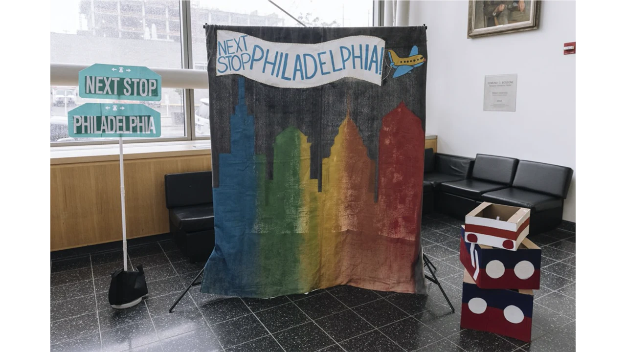
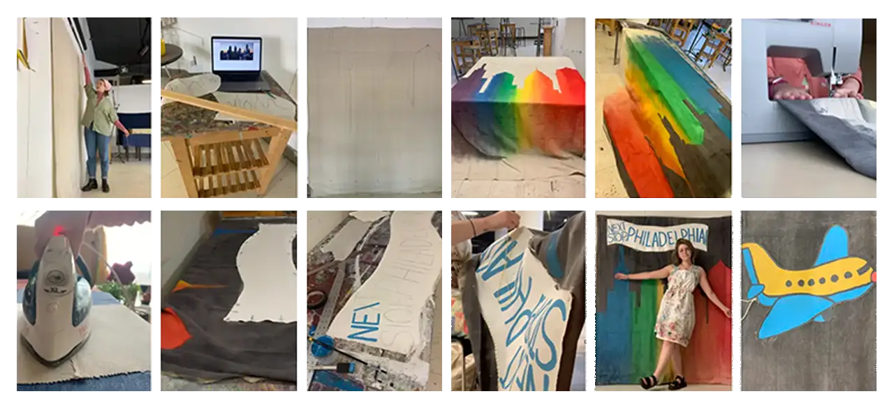
For our exhibit exit, we painted a mural of the Philadelphia City Skyline. This mural served as a photo-op station in our exhibit. Visitors could pose in front of it and take polaroids and personal photos.
This 6’x4′ mural was painted with acrylic paint on canvas. The Next Stop, Philadelphia banner was created separately – a canvas that was cut, gessoed, painted, and then hand-stitched onto the mural. The canvas was originally 9′ tall, so we hemmed it to be about 6′ and gave it a curtain rod pocket.
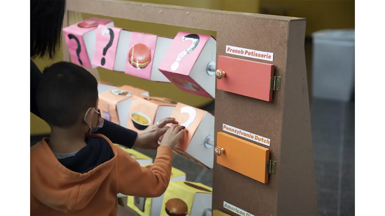
The Reading Terminal Market activity was inspired by the spinning tic tac toe boards at playgrounds.
At Reading Terminal Market, we wanted visitors to discover the many cultures of Philadelphia through their food. This playground-style game was a matching game that challenged visitors to match the foods that were in the game with the correct cultural categories.
This installation was constructed with wood, PVC pipe, Styrofoam, and paper. First, we built the wooden base frame. Then, we strung the blocks onto the PVC pipe and inserted the three rows of blocks into the frame. Next, we built and attached the outer frame and doors on hinges. The last steps consisted of painting the doors, attaching the handles, and adding the finishing touches, like pictures and category names.
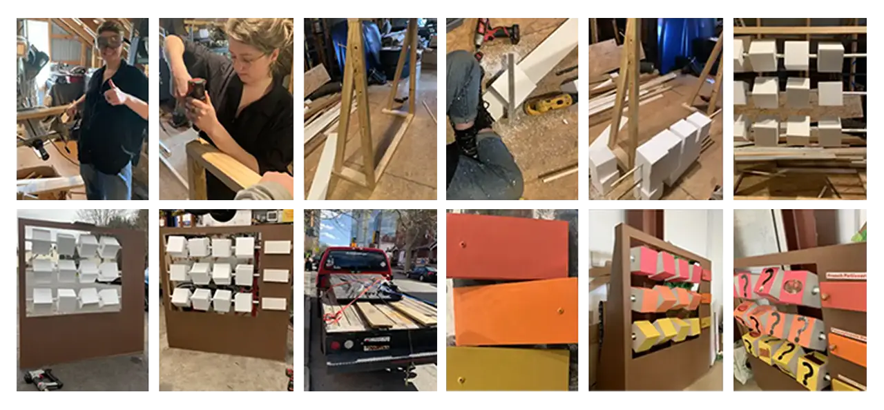
The controller for the Terminal Reading Market station was the simplest out of all the three. For this station, we decided to use arcade buttons as the main controllers for the station. With these buttons, the player would be able to select which store they would like to visit.
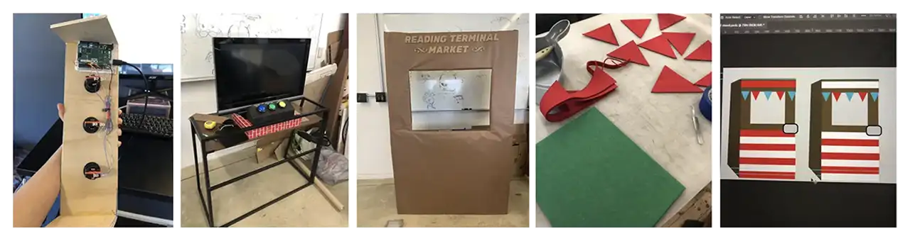
We used Arduino Leonard Board as our hardware for the store switcher controller. Three buttons were used, one being assigned to each store in the game. These buttons were then placed on the surface of a food stall that we constructed in the wood workshop.
The biggest problem that we faced for this station was building the food stall. With limited time and resources, we were not able to build it at the scale that we were hoping for and had to settle for a simpler version. Originally, all we had for the stall was just a table. We then constructed a cardboard structure around it and we then used felt fabric to cover and decorate the surface. We also built a wooden box for where the buttons would go on.
In order to maintain consistency throughout the exhibit, we developed a consistent design amongst the exhibit whether they were showcasing instructions for crafts or signs that directed people where to stand for a game. We used the same font and colors throughout the exhibit for any products that were to be printed onto physical media.
We designed the overall UI of our exhibit to stay consistent throughout our station games as well as our physical assets and activities. Our goal was targeted towards designing a fun and educational environment that made children feel welcomed when they entered our exhibit. Because our exhibit includes diverse elements from different cultures that are covered in our station learning objectives, we made sure our overall design would be inclusive of everything that contributes to the educational importance of Philadelphia. Our overall event design includes a very vivid and bright color palette as well as painted brushstroke visuals. We felt the overall aesthetic would connect with our younger audience and engage them to learn more about Philadelphia.
Our animations were designed to guide our users throughout the exhibit and let them know when they were reaching their learning objectives while interacting with our games. Our 30th street station animation was targeted toward getting children to understand how to navigate the exhibit and teaching them the importance of going to each station to complete the map. Our animation introduces a few characters (Rell, Po, Pidge, & Nia), who have lost their souvenirs while exploring Philadelphia. They ask the user to help them find the lost souvenirs which are scattered throughout all 4 stations on the map. The characters direct the user to go to each station in order to collect all souvenirs and complete the map. Our 30th street station storyline engages our users to interact with our exhibit by giving them a sense of heroism for helping our characters on their journey throughout Philadelphia while fulfilling their learning objectives.
Next Stop, Philadelphia! Intro Video
Our game tutorials and station animations were designed with the same purpose to lead our users to complete each game while following the storyline. The game tutorials were designed with the intent to get the user to understand how to play the games. Our station introduction animations use elements from the map that make the player aware of the station they are currently interacting with when referring to the map. Depending on the user’s progress after playing the game, if they fulfill their learning objectives, the user will be presented with a win screen that displays the lost souvenir they have collected for that station. If the user does not complete the game, the user will instead be presented with a screen that shows they did not collect the lost souvenir, and that they must try again in order to continue.
For the digital game at the Reading Terminal Market station, we wanted to design a game that used leap motion technology.
It took us a while to decide how we wanted our game to be designed. We were going for a painterly and kid-friendly art style, for both the textures and the 3D models. When researching similar games, we looked into shopping games and games that had a painterly art style. One of the most inspiring games was Alba — the art style of this game is exactly what we were trying to go for, so we used screenshots of the game as references in our Art Design Document.
As for the 3D art, we started designing and making our models first. We picked a variety of foods found at the Reading Terminal Market and started 3D modeling:
Then we started adding the textures based on our overall art style:
During this process, we presented our station concepts to our class and advisors. Feedback made us realize that a Juice Stand does not represent the Reading Terminal Market very well, especially when considering the learning objective of this station: to help the kids learn about different cultures through their food.
Therefore, we decided to scratch the idea and changed it to a Dutch Kitchen stand. After researching and looking at the menus of the food courts at Reading Terminal Market, we picked the four most representative foods of this stand and developed 3D models:
Then we added the new textures:
We also redesigned the stand to look more like the ones at the Reading Terminal Market:
We added more objects to the background so all the stands look more realistic:
Based on the feedback we got from the presentation, we noticed that a lot of the players didn’t recognize the names of the dishes while playing. To solve this issue, we made a pop-up UI at the top right which showed up when the players hovered their hands over the objects:
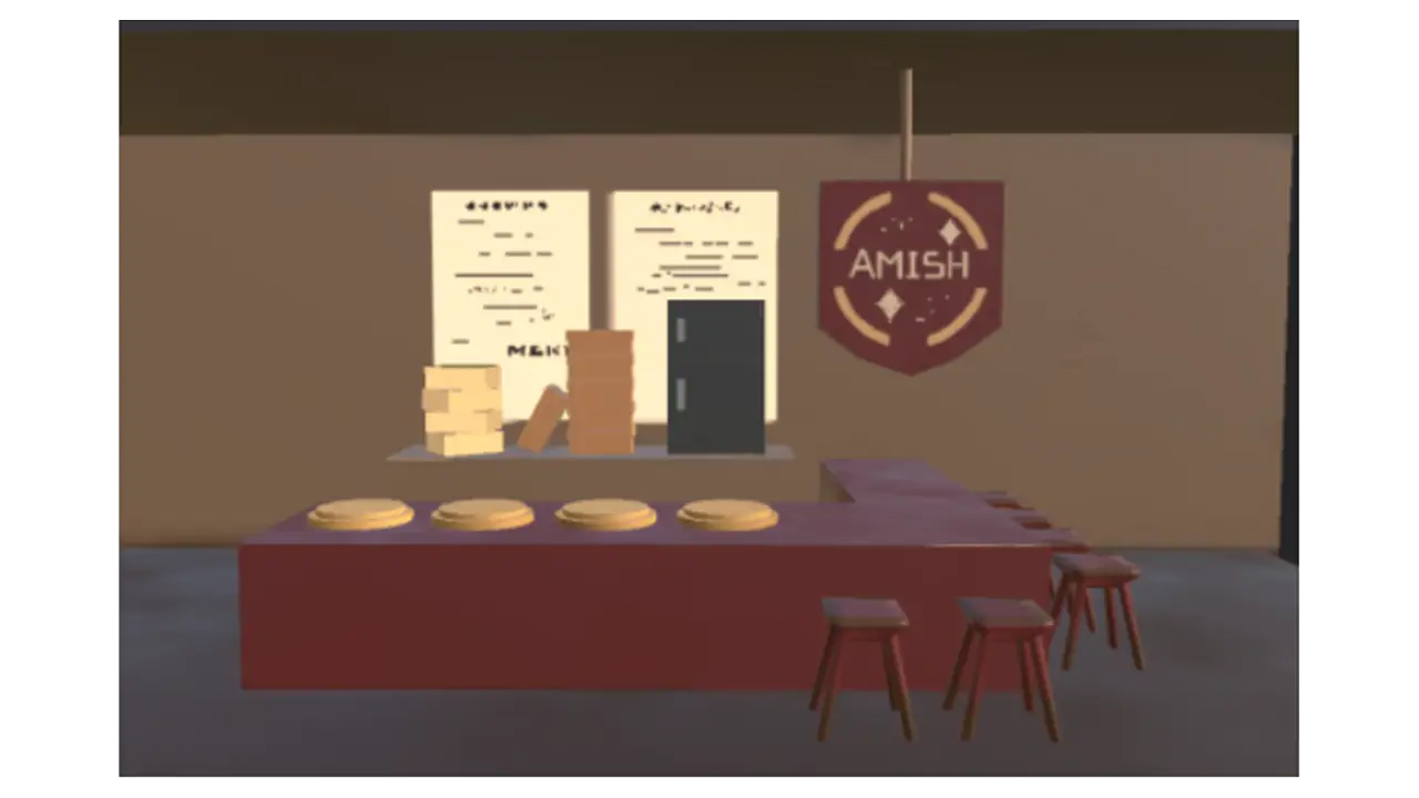
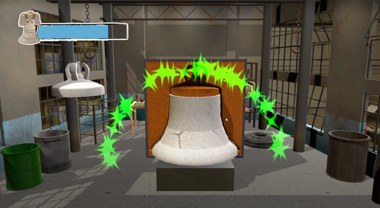
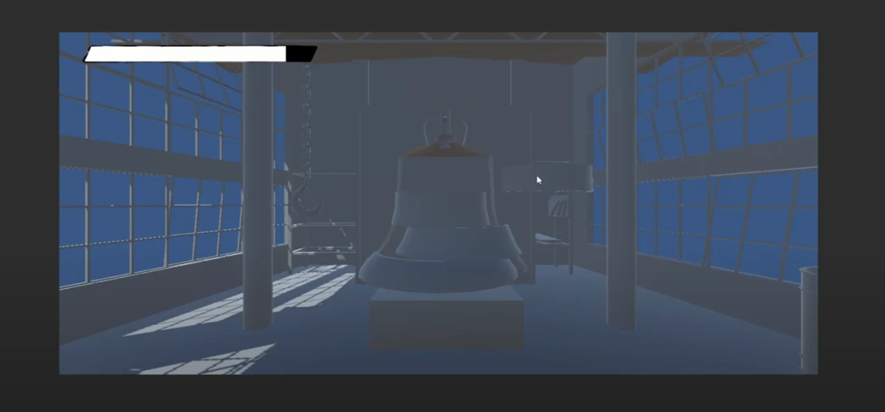
For this station, we wanted to show the process of how the Liberty Bell was recast. To show this process clearly, we broke the game into two mini games: stacking the mold and melting the metal. The art team came up with the full asset list, and did research to get a sense of how to design the setting of the game. We found images of 18th Century factories for reference.
With our reference images, we started to design and texture our 3D models for the environment:
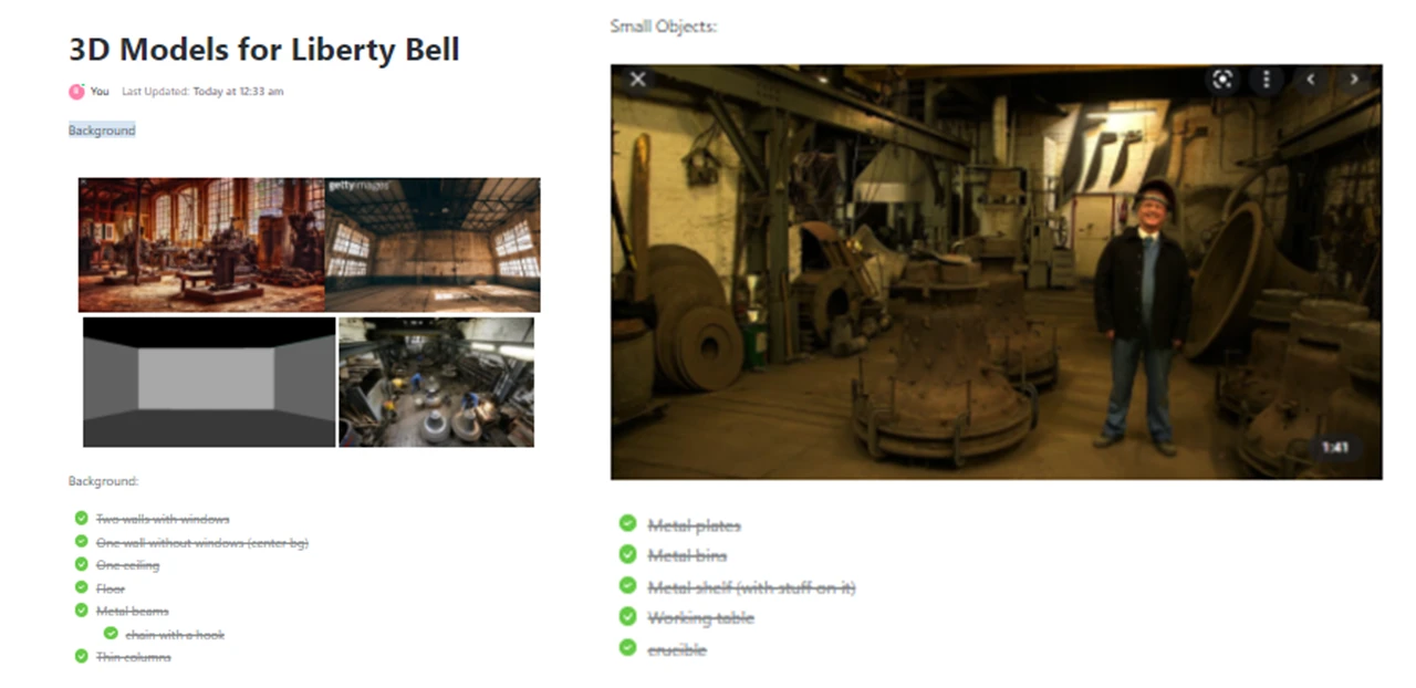
The art team also created major models, for example, the bell and the furnace, as well as the particle effects for both mini-games.
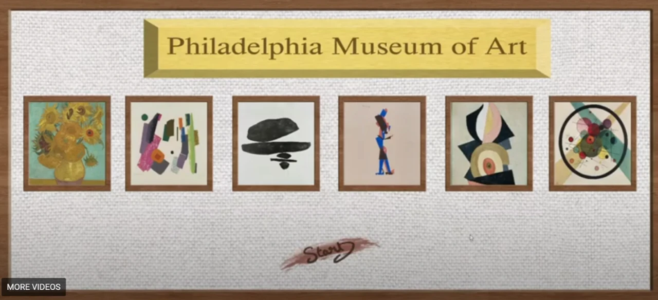
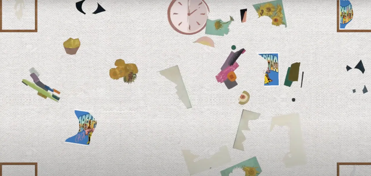
At the Philadelphia Museum of Art (PMA) station, visitors learned about the principles of art: shapes, colors, and patterns.
The puzzle pieces to each painting in the Philadelphia Museum of Art game are separated by abstract shapes and scattered throughout the middle of the canvas space using Adobe Photoshop. The idea of having a canvas-styled space was designed to mimic the experience of viewing artwork in a museum since this is a museum-based game.
As the players work to match each painting, they are presented with a clock that visually shows the players the limited amount of time they are given to match each painting. We decided since this game focuses on visuals, we did not want to take attention away from the game by displaying a numerical timer. We instead implemented the clock to show the player visually how much time they have left by having the clock disappear clockwise. When the player completes the game, they are displayed with a gallery of paintings that the player can touch and learn more about each artwork. This gives the player some historical context to each painting and allows them to learn more about colors and mediums.
For our Philadelphia Museum of Art Station, we also created 2D assets for the game. Our UI and assets are painterly to match the aesthetic of our 3D games. We made some hand-written assets for the game along with some made in Photoshop (background, frames, etc.):
We decided that the PMA sign was too serious and looked weird with the shadows. We also changed the colors of the Start sign to make it more legible.
We thought the hand-written font we used was a bit difficult to read, especially for children, thus we opted for a computer-generated font.
Github link: https://github.com/jsg339/NextStopPhilly/tree/New
The digital game for the Philadelphia Museum of Art is a puzzle game where a set of paintings are separated by shape and spread throughout the playing field. Each of these paintings was edited using Adobe Photoshop so that they would be easy to separate and put back together. These pieces are randomized so that every time the player loads the game, a different set of paintings will appear.
The goal of the game is to move the art pieces via touch, to the correct canvas on the edge of the screen. When the piece hits the canvas, it will appear as the real-life version of the painting. Finally, once all of the pieces are on the canvas, a digital gallery will appear so the player can view all of the paintings in the game and read information about each painting. This game is played on the ViewSonic touch screen TV, which allows for multiple players to play at once which really enhances the fun of the game.
In order to make this game, we used Unity Engine. Unity helped build the overall foundation of the game since it has a very intuitive framework as well as many helpful tools for use. We used C# in order to code the various gameplay elements we have in the game, such as the physics of the pieces, the game object interactions, and the scene transitions.
Finally, we used TouchScript, which is a free open source extension that can be installed into unity in order to handle both touch input and multi-touch input.
There were minimal problems we ran into for this game. The main issue was working with the view sonic tv since we had never worked with this device previously. The main issue was using the different inputs that the game would need to handle, which ended up being a bigger problem than we anticipated.
We went through many different solutions, first, we tried to build an android application directly to the TV, however, that proved unaffected since we weren’t able to build the android OS onto the TV. Then we tried to create a webpage that would host the game build since the TV can hook up to the computer running the game and play the game via that webpage. Finally, we settled on using the TouchScript extension which would handle all of the multi-touch input as long as we create the correct gesture. This ended up working great and was the main savior of the product as a whole.
The digital game started as quite a simple game, as seen in this demo. We initially had a tech demo where we laid out all of the art pieces in a unity scene and moved the pieces to the square that it corresponds to. We also started the gallery out by simply laying out all of the pieces in the game along with the information simply displayed on the screen.
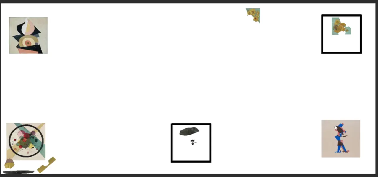
Next, we focused on making the game more visually interesting and actually interacting with the UI. We added a timer which would help add tension and a lose state to the game. If the player is unable to rebuild all of the art pieces in time then they would get sent to the lose screen and need to restart the game. We also changed it so that there are only four canvases on the screen at a time since. Not only is it easier to understand (one painting in each corner), but we also wanted to add one more painting since it would correspond to the story of the station.
At this station, the characters lost their postcard and the player will need to rebuild it along with the rest of the paintings in the game. This was also when we wanted to test the web build version of the game since we needed to experiment with the multi-touch features of the view sonic tv.
View our second iteration of the PMA game demo here!
Now that the flow and all of the main gameplay elements have been defined moved towards the development of the UI and refining the look of the game. We also changed the gallery so instead of swiping between each of the paintings, we would simply click on the painting in order to learn more about them. Finally, we had a UI overall on everything, from the background to the main menu screen you see at the beginning, to even the end and lose screen. This was also when we were testing an android build for the game since we wanted to try building the game to the TV’s os
The new iteration can all be seen in this demo here on the android build!
Finally, we had many rounds of user testing which affected the final product in a great way. We changed the timer since we found that the streak of paint was very confusing for players. Also, we changed the physics of the game so that it was more consistent and easy to understand since a lot of players got confused when playing the game. We wanted to standardize all of the UI assets for our games since we wanted it all to feel like it belongs together and comes from the same developer. This helps bring our stations together and make them feel like they belong together.
All of these assets are videos that are played until the user presses the corresponding button or when the video is finished playing since these are all animations exported to an mp4. Finally, we added music to the game, which was made by our music producer.
Look here and watch the final Game Demo for the PMA!
At the PMA station, we designed and hand-screen printed postcards with questions such as “What did you learn today” and “What did you learn at the PMA station” to help reinforce our learning objectives for the PMA and other stations at the exhibit.
During the exhibit, visitors were able to answer the question and decorate their postcards with a variety of different mediums such as crayons, watercolor paints, markers, and acrylic paints.
At the Liberty Bell stations, visitors learned about how the historical Liberty Bell was broken and rebuilt.
Our Liberty Bell game is an interactive experience that takes players through the process of making the Liberty Bell. In the first half of the game, the player must mold the bell by matching the moving parts of the bell within the mold. If the player successfully fits the bell part within the mold, green confetti will surround the screen letting the player know they succeeded. The hp bar in the top left corner is also an indicator of the player’s progress throughout the molding process. If the player does not align the bell part within the boundaries of the mold, red confetti will surround the screen letting the player know they did not match the bell parts correctly within the mold. This will also be reflected in the player’s hp bar, as they will lose a portion of their hp bar. The bell icon on the hp bar is also a visual representation of their progress. If the player starts to lose hp points, the bell icon will start to visually crack. The color of the hp bar will also start to change based on the number of mistakes the player makes. The blue color lets the player know they are making perfect progress; the green color lets the player know they are still making good progress but have made a few mistakes; the red color lets the player know that their progress is critical and that they are close to losing the game. The combination of both the bell icon and colors in the hp bar gives the player an accurate representation of the progress they are making and visually shows the repercussions of making a mistake, which motivates the player to make better progress.
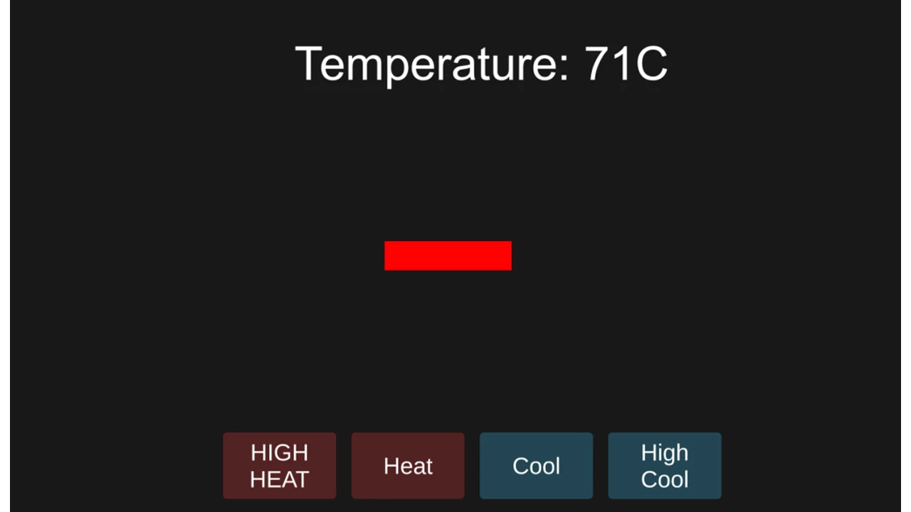
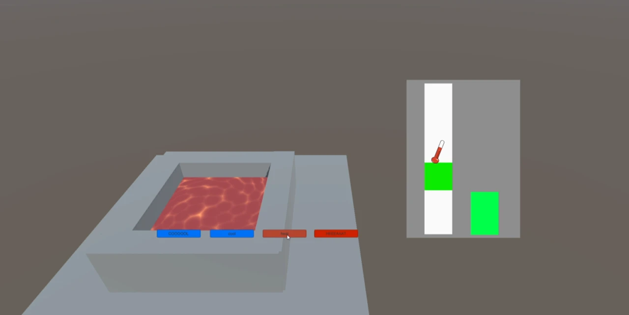
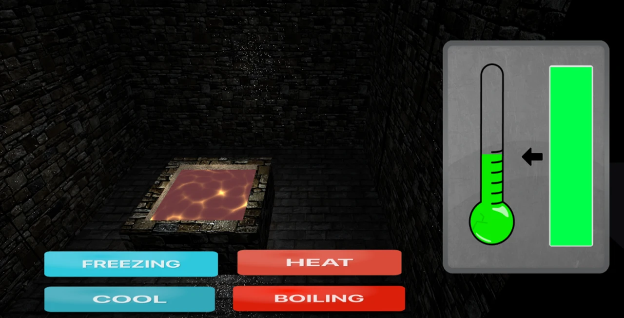
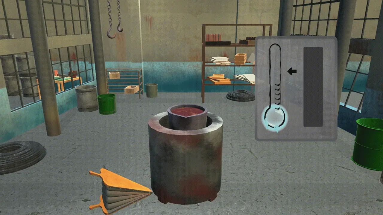
The second part of the Liberty Bell game takes the player through the melting and cooling process while forming the Liberty Bell. The player is presented with both a thermostat and meter on the right side of the screen. The player must control the temperature within the range of the arrow. The arrow is an indicator where the player must control the temperature on the thermostat. There are three different thermostat states. The frozen icicles on the thermostat show the player that the temperature is cool, the regular thermostat shows that the temperature is moderate, and the thermostat which projects flames shows that the temperature is hot. The meter to the right of the thermostat shows the amount of progress the player is making. Once the meter reaches the top, the player will have successfully melted the metal used to create the Liberty Bell. This accurately measures the player’s progress as they learn to control the temperature within the limits of the arrow.
Github Link: https://github.com/Aman-Kartha/BellGame
This game is the first part of the Liberty Bell digital game, it is a stacking game in which the player would need to create the mold of the bell bit by bit. Players will need to accurately stack five pieces of the bell together so that they all fit in the correct shape. When the player stacks incorrectly, the bell will lose health and “crack”. Once the player loses all of their health, then the game would send them to the lose screen and they would need to try again.
Take a look at the stacking game here!
This game was created via the Unity Engine in order to build the scene and handle all of the models in the game. We used Unity’s built-in C# in order to create the physics and interactions of all the models and parts in this game. Finally, we used Arduinos as the controllers for controlling when to stop each piece.
Most of the problems we faced were figuring out how we initially wanted to play this game. Initially, we were thinking about creating a game where there was no actual lose state. The players would need to stack the pieces of the bell, if they missed or misplaced a piece of the bell it would fall off and stay where they were. This would cause the bells to vary in shape and size but led to many technical questions about how to move forward with the game. We ultimately decided it was best to have the pieces be sent to their correct position and give missing pieces a crack since this was on theme with the Liberty Bell.
We started with a scene that was representative of an old Philadelphia workshop. This would allow the players to feel like they are stepping into Old City and become immersed in the station. We then separated a bell model into five separate entities and moved these entities across the screen. If the player hits the button, then the piece currently moving will stop in its place. If the piece is in the incorrect spot, the player would lose some life depending on how wrong the placement was. This can all be seen in this demo!
After we got this piece of the game working, it was time to make the game more visually interesting. We added textures to all of the models and gave the UI some life and theming. We implemented the system where if the player was wrong in the position of the piece then that piece would crack similar to the liberty bell. Finally, we added dynamic colors to the health bar, where it starts as a soft blue, but moves to an alerting red in order to show that the player has only a few more mistakes left before starting over again. Check out the new iteration here!
Finally, we added a particle system which would be another indication of the player’s successful and unsuccessful placements. If the player succeeds in placing the bell piece in the correct spot, then the particles will be green. However, if the player is unsuccessful, then the particles will be red and the screen will shake. This provides an indication that the player was not supposed to do that and they need to try to place the piece in the correct position. Later when we combined all of the scenes of the liberty bell digital game together, we added various menus and screens to the game as well as music.
View the stacking game here!!
Github Link: https://github.com/Aman-Kartha/BellGame
We wanted to have the Bell game split into two mini-games, with the second game being a balancing game.
The initial demo of the second game was a simple balancing game where the player clicked on these four buttons to increase or decrease the temperature to keep it at a certain level.
This evolved into a 3D game where a pool of molten metal adapts and changes depending on the temperature. The gauges on the right were inspired by the fishing mini-game from “Stardew Valley” through game research. The thermometer showed the current temperature, while the green square showed the goal. The player pressed a button to increase the temperature and would slowly cool down overtime when the player stopped pressing the button. A progress bar fills up while the thermometer is on top of the green square.
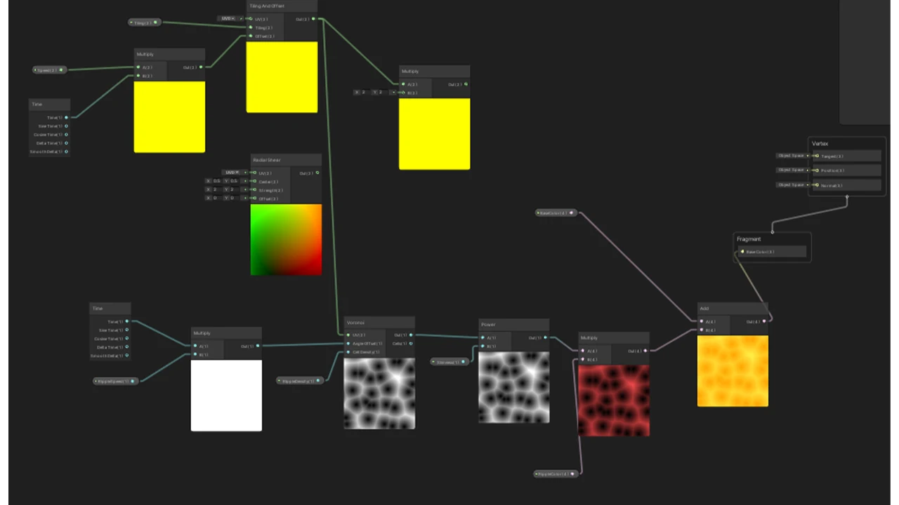
Next, we experimented and learned how to use shaders in Unity. The molten lava in the center was linked to the numerical values of the current temperature which would change the speed and color of the shader.
The final round of changes was to animate the 3D objects to show how the two mini-games relate. Firstly was to animate the bellow to move similarly to the custom controller we made.
Then we created a pouring animation using scripts that would trigger certain parts: first to move the furnace and bellow, then to tilt the bucket and pour the metal into a mold. To create the pouring animation, a 3D model of the pour was created and made invisible, only to appear when the bucket is tilted. Then the shader was shifted so that the y-axis would move instead of the X which makes it look like a liquid is moving from the top to the bottom.
The controllers that we have created for the Liberty bell station were inspired by the main process of how bells were constructed – creating mold and melting the metal.
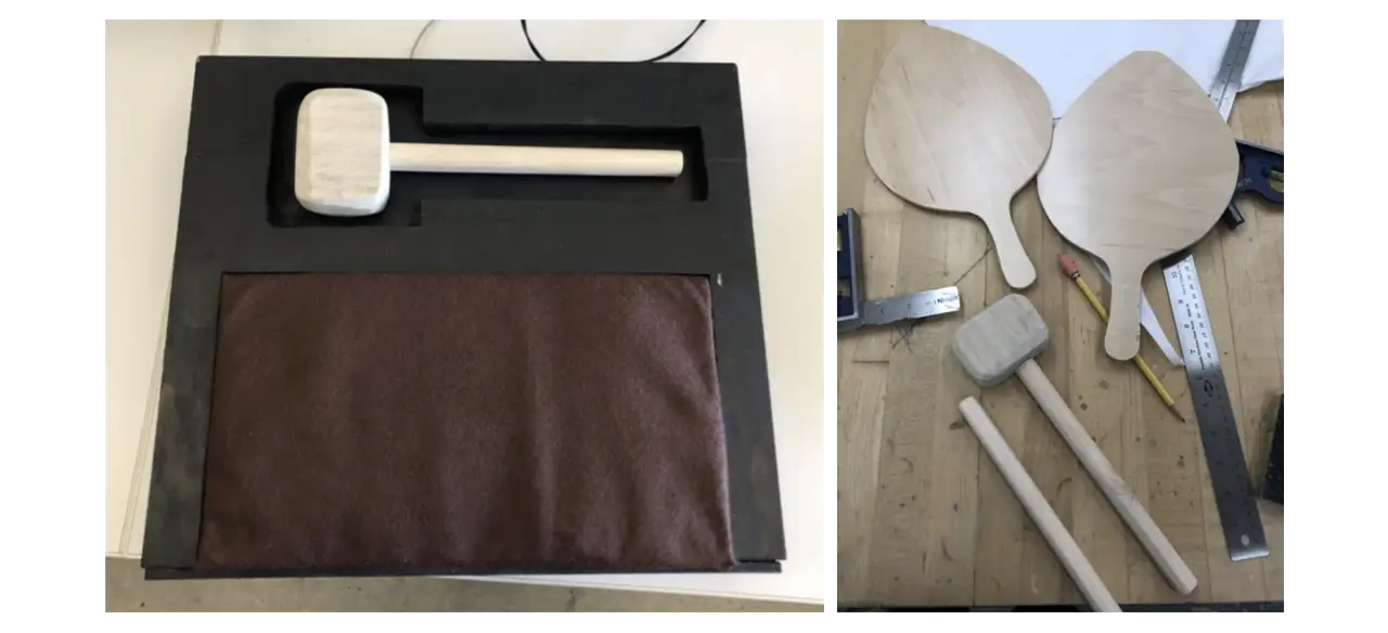
Because these two processes in real life can be very risky and unsafe for kids, we wanted to create a kid-friendly version of the experience. We decided to build two controllers for each step. The first is the molding process, here we created a hammer controller where the player can control the position of the molding piece. For the melting of the metal process, we created a bellow shape controller which the player can use to control the temperature of the melting pot.
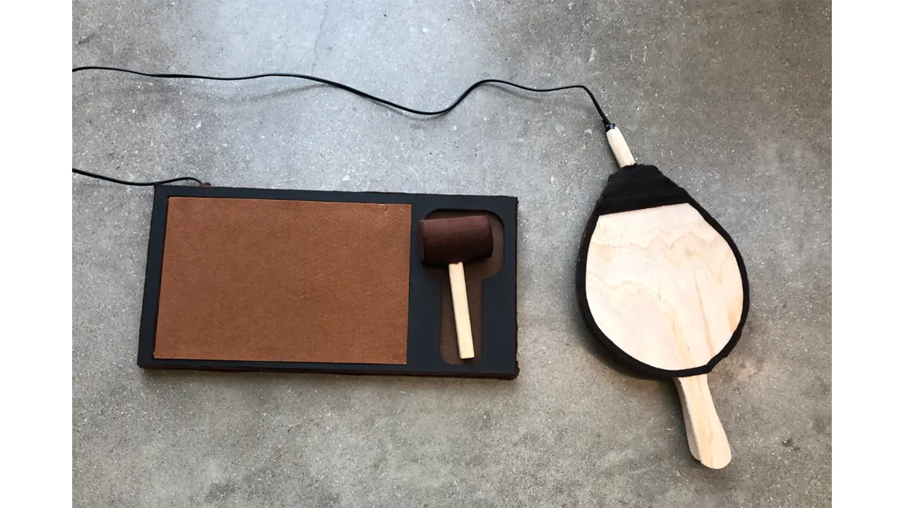
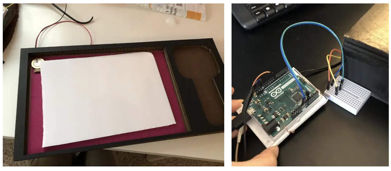
We used the Arduino Leonard Board as our main hardware for the two controllers. Both controllers are connected to one board. We used a Piezo vibration sensor for the hammer and conductive tape to detect contact inside the bellow. The hammer sensor was connected to an analog pin while the bellow sensor was connected to a regular pin. We used light wood to create the handle of the hammer and felt fabric wrapped around a cylinder of hard paper to form the head. The board on which the hammer sat was constructed using laser-cut cardboard that we have designed specifically for this experience. Lastly for the bellow, we used pine wood as the main material. After drafting the shapes and sizes, we cut them out using a bandsaw. We then installed wire and conductive tape to the wood, gluing the felt to two handles as a final touch. The wires that we used for both controllers were recycled from an old electronic cable. With its strong outer rubber tube, it was perfect for our controllers since we wanted to make sure that it would not get disconnected when young kids were interacting with them.
Since the Piezo sensor was cheap, we had to replace it a couple of times. Another thing that we noticed was that when the sensor was being placed on flat surfaces, the sensor would not detect the hit properly. With this, we created a curved platform for the sensor to sit on so that no matter how hard the player was hitting, it would detect vibrations.
Originally all parts were constructed using real wood. But after multiple rounds of play testing and feedback about the realness of our controllers, we have decided to use different materials to make it more kid-friendly. Since some of our target users may not be in full control of their mobility and ability to use force, we wanted to eliminate any chances of them getting hurt or hurting anyone by accident.
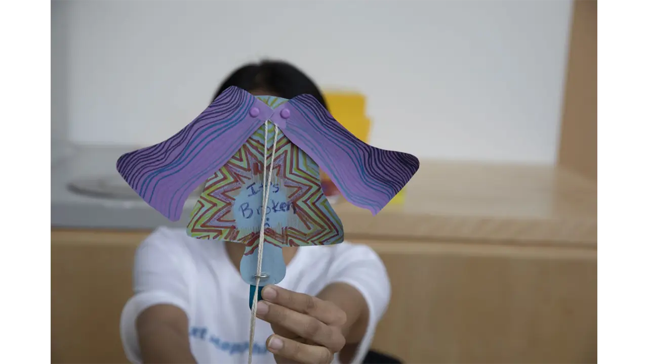
The Liberty Bell’s activity was inspired by a craft that we found when researching in-person events in Philadelphia. The initial activity that we based the craft on was a moving horse using just printouts, paper fasteners, and string. We used these similar mechanics and developed a craft that showed the bell breaking.
The product design team printed and cut out the paper pieces, and assembled the string and popsicle sticks so that day, visitors only had to assemble 2 pieces together and focus more on the decorating portion.
At Reading Terminal Market, we wanted visitors to explore the many cultures in Philadelphia through their food.
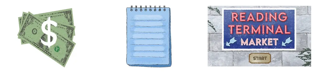
Our Reading Terminal game is an interactive experience that takes players through the Reading Terminal Market to look for food items. The player is given a randomized list that details what food items the player must collect in order to complete the game. The idea of having a shopping list gives the player the incentive that they are shopping for these food items. As the player navigates Reading Terminal Market with their list, they must make sure they are obtaining the right items, or else they will lose one of the three coins displayed in the top left corner. These coins represent the number of tries the player has throughout the game. Since the game takes the player through a shopping experience, it felt accurate to have currency representing the number of tries the player has instead of implementing hearts or other visual elements that represent a player’s lifeline.
Github link: https://github.com/Aman-Kartha/TerminalGame
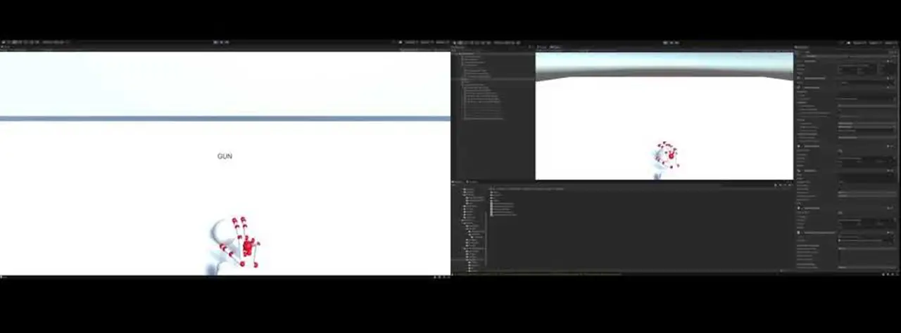
The first step for making the Reading Terminal Market game was to learn how to use the Unity modules that LeapMotion provides us. We had to play around with all the assets provided to get a good idea of how to use it. Detecting what the hands were doing was a matter of proximity, direction and which fingers were extended. For example, if you wanted to check if the user’s hands were clapping, you would first need to check that all fingers are extended on both hands, then check the proximity of each hand to each other, and finally check and see if the two palms are facing each other. A simple Boolean can add them all up. There were a few hitches here and there mainly to do with tweaking sensitivity and then trying to find a sweet spot to set the camera in. A big one was that sometimes the camera wouldn’t be able to pick up certain fingers since they were blocked (The index mainly). Interaction was a little more complicated, like trying to juggle.
At the start, we had the idea of incorporating cooking into the Reading Terminal Market game. This concept was scrapped after realizing that since Reading Terminal Market itself didn’t have any cooking, the idea would stray away from the concept of our project, and the station’s learning objective.
For the first game demo we developed, we focused on camera movement controlled by the leap motion user. The original idea was to make the camera move or pan towards the next stall when the user pressed a button (using their hands) but we couldn’t get it smooth enough, so we opted to use a technique where we placed two sensors at the opposite ends of the camera that would constantly scan its proximity for the hands and then turn when activated. We had to center the player and place the stalls all around, and limit turns to be 90 degrees at a time.
Next we made the food items look more appealing. For this we were inspired by the art style of Cooking Mama. We made the objects float and rotate on their own axis, and made them slightly shine and expand. This was quite easy but took a little time to get the fine-tuning right so that there were no clipping issues. We also programmed physics so that when a hand got near the food, they would either spin faster or get knocked away. This was challenging because we couldn’t find a way to control the amount of force the hands put on the food items. Our solution was to limit movement on the axis, and only allow food to rotate.
Above is the first iteration of what one stall would look like. This shows the problem with attaching camera movement to the model hands. This iteration also revealed that using interaction between the hands to place the items into a basket would cause too many issues in future development.
Below is the updated version of the stands that minimized the issues of our first iteration.
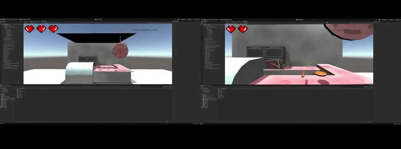
We moved on to adding UI and art elements, testing to see which approach was best. The hearts were replaced with the cash icons, the game now showed a start screen in the beginning and the list has the notepad as its background. The font was changed as well. We started adjusting the background of the scene as well to make it feel fuller. We experimented with new walls, more stalls and adding humanoid figures to it.
We noticed during our tests that the difficulty of grabbing items varied. This was due to how the collision boxes rotated with the object. Our solution was to change all the collision boxes so that they had a uniform size. To do this we moved around all the positions of the food items so that they were evenly placed and adjusted model sizes to be smaller than the actual collision boxes. This created a trick where we could place the Leap Motion projected hands much further back than usual and not have to worry about the z-axis of the camera, whose range was quite limited.
Next was to clean up and polish our design.
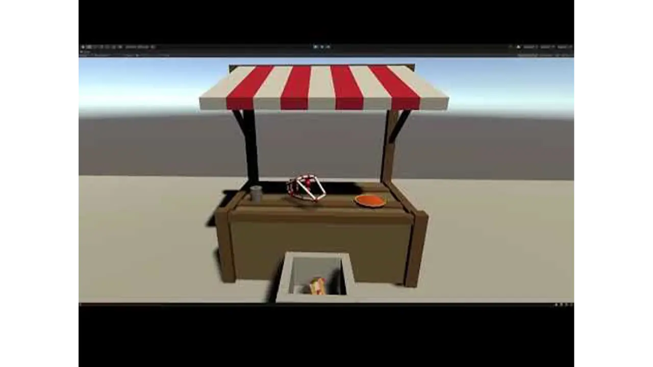
Multiple objects were added to the scenes to make them more complete. Each stall had a design theme to indicate which culture they represented. All food items hovered over plates to make sure the user knew which objects were interactive. The notebook UI had been updated to scratch out the items picked up. We swapped to Text Mesh Pro so that the text would automatically adjust its size depending on the length of the text.
Luckily Leap Motion provided methods to change the look of the projected hands. We opted for the “ghost hands” as they were transparent allowing the player to see what they are grabbing. In order to handle transitioning between the stalls, we used custom physical buttons similar to those found in arcades that were mapped to specific keyboard keys such as “w” and “q”.
At this point we were ready to playtest this station. User feedback showed issues with transitioning where the game would rubber band while trying to move between stalls. This was fixed by disabling the ability to take inputs while the camera was moving to a new stall. There were also issues with grabbing the items. We found that at certain angles the Leap Motion controller would not be able to “see” the index figure. The fix was to disable the need for the index finger to be extended. We programmed a grab to happen when the middle, ring and pinky finger were folded.
The Reading Terminal Market (RTM) activity was inspired by the spinning tic tac toe boards at playgrounds. At RTM, we wanted visitors to discover the many cultures of Philadelphia through their food. This playground-style game was a matching game that challenged visitors to match the foods that were in the game with the correct cultural categories.
This installation was constructed with wood, PVC pipe, Styrofoam, and paper. First, the wooden base frame was built. Then, the blocks were strung onto the PVC pipe and inserted the three rows of blocks into the frame. Next, the outer frame was built and attached to the doors on the hinges. The last steps consisted of painting the doors, attaching the handles, and adding the finishing touches, like pictures and category names.
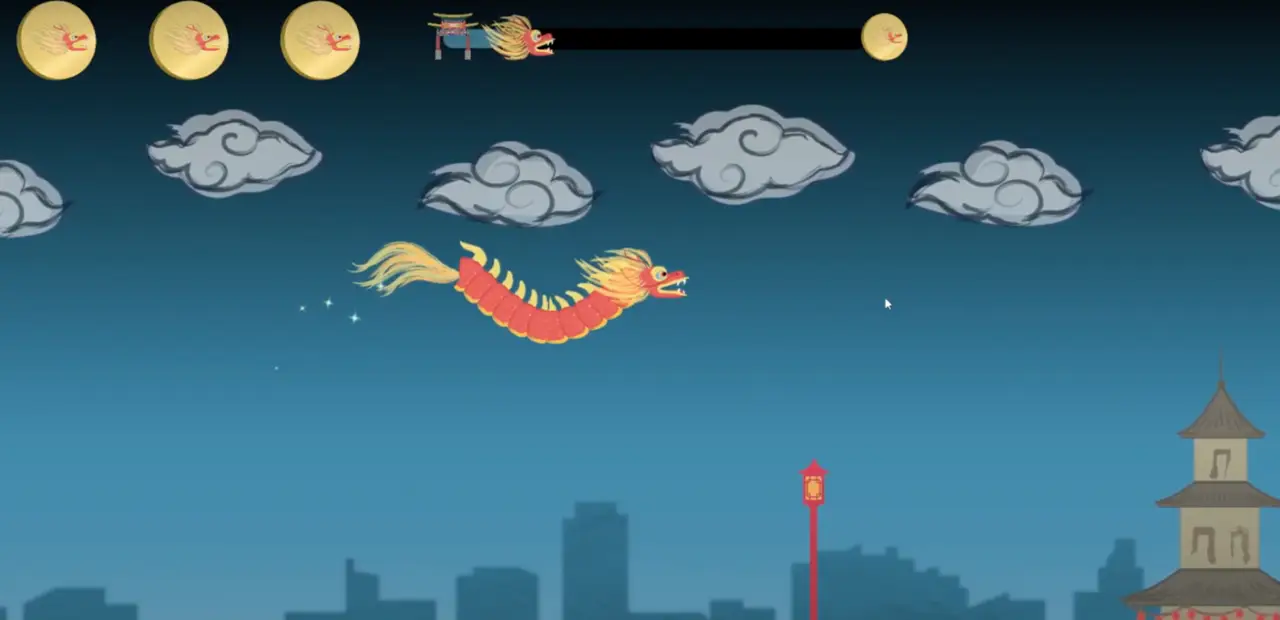
At the Chinatown Station, we wanted children to learn about the story behind the ancient Chinese Lantern Festival that is celebrated annually in our city of Philadelphia.
Our Chinatown game is an interactive game that takes players through the Chinese lantern festival. This game works similar to old iPhone game, Flappy Bird, except two players will control the head and tail of the dragon. Players must work together to guide the dragon throughout Chinatown without hitting the lanterns and buildings. The game UI is designed to replicate the culture and style of Chinatown by using both traditional and modern Chinese buildings and overall art style. The progress bar at the top shows the player a live view of where they are at in the game and how much they have left to navigate before collecting their souvenir. The Chinatown archway icon shows the starting point of the game since that is where the game starts, the dragon head symbolizes the player, and the dragon coin symbolizes their token of victory as they reach the end. As the player progresses through the game, the dragon head will move along the progress, giving the player a visual representation of how much they have left to complete. The dragon coin is also shown in the top left-hand corner. The three dragon coins represent how many tries the player has throughout the game. Hitting an obstacle will result in the player losing one of these dragon coins. Since the dragon coin is the player’s symbol of victory, having the dragon coins shown as the number of tries the player has emphasizes the importance of the player holding onto their dragon coins.
Github link: https://github.com/jsg339/NextStopPhilly/tree/New
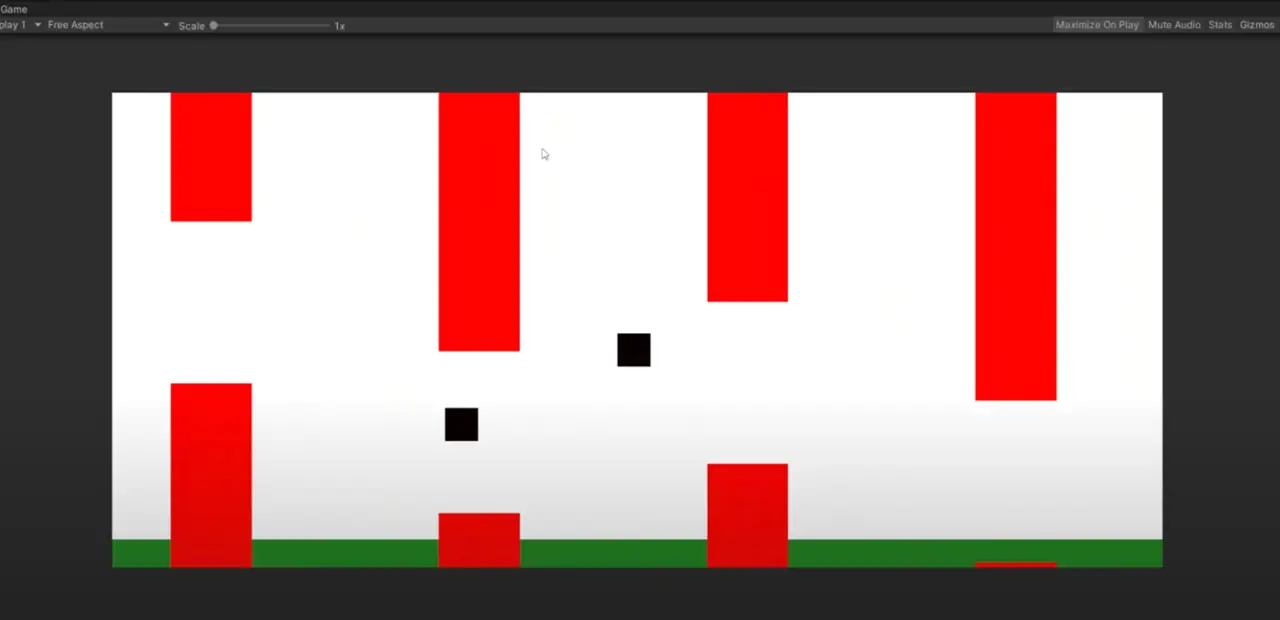
The game for the Chinatown Station is a two-player game where each player controls a different part of a dragon. One player controls the head, while the other player controls the tail. The goal of the game is to survive an obstacle course that resembles Chinatown and retrieve the lantern at the end of the game. The physics in this game was inspired by “Flappy Bird” in which the players are constantly battling gravity in order to move throughout the screen space and avoid the obstacles. If the player gets hit three times by a thing on the field, then both players will need to restart the game.
As for the development of this game, we used Unity as the engine in order to develop the game. We also used Unity’s C# in order to program the game and control all of the physics and interactions. Other than that, we used three controllers that were created via Arduino technology to control the head and the tail of the dragon.
The biggest issue that we noticed was that it was difficult to play. We had to have a multitude of user testing to get to its final state since many players were not able to complete the game. We had to adjust both the physics of the game, as well as the number of lives the player got since the game ended up being that difficult. Thankfully, we ended up in a pretty great state on the day of the exhibit since it was pretty challenging but fair.
The game started off quite simple. The first thing that we worked on was creating a foundation for the two-player flappy bird aspect, as well as the physics we would use for the game. We created a landscape that would coastally change and differ in size, that way we can test the physics of the game as well as the logistics of playing with another person. It ended up being pretty fun, and we really liked the two-player aspect of the game, it added a lot to the experience.
Check out the first demo here!
Next, we wanted to make the player feel more like a “dragon”, so the two players would need to seem connected. The main problem is that the player is constantly moving, so whatever the body would be would need to be dynamic and stretch around the screen. Luckily we ended up figuring out a very cool algorithm that would be constantly updating the scale and rotation of the body based on the midpoint and distance of the two players. This can be demonstrated in the following demo here!
Now that we have our foundation, it was time to actually make the game itself. We replaced all of the empty boxes that are in the game with actual sprites for the final game. This would include the various buildings, the dragon, and the sky. We used lanterns as the upper obstacles and the buildings as the lower obstacles, we then spread them out throughout the screen with increasing difficulty in order to fit the challenge of the game. We also decided to add a curve to the body of the dragon, since it would seem more natural and “dragon-like”. This was a little harder than expected, but with Unity’s “Spline” objects we were able to make a spine for the two players that would move dynamically to where the positions of the players were. This gave it a more polished and realistic feel to the game which you can see here!
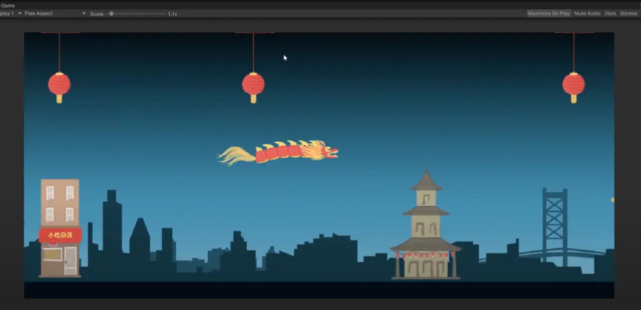
After this update, we had a very long playtesting session where many people played the game. We really noticed the difficulty in the game since none of the play testers were able to finish the game in a reasonable amount of time. We ended up creating many quality-of-life changes to the game. We added a life system where the player would be able to take three hits from the obstacles before having to restart the game. We also added a tracking system into the game so the players would be able to know where they are on the map and how much longer they need to play in order to beat the game. Finally, we changed the order of the obstacles so that it was more forgiving and easier for the players to get through everything.
View our next iteration of the game here!
This ended up having great responses and the game was in a very good place. So the final updates that we made to the game were fixing all of the UI elements as well as adding a proper title, lose, and win screen into the game. These screens were similar to all of our screens for the final versions of our games since we wanted everything to feel like they belonged together. We also added music by our music producer, which added much atmosphere to the game. Overall, we are very proud of this game and it had a ton of great reception from the visitors at the exhibit.
View our Final Chinatown game here!
The controllers that we have created for Chinatown’s station were designed to give the players a glimpse of what it is like to be a part of the Chinese Lantern Festival. Since the main character of the game is the Chinese dragon, we have looked into other elements that come with the experience. Chinese dragon performances were traditionally accompanied by traditional Chinese musical instruments, the main being drums, and cymbals, incorporating the two instruments as our main controllers.
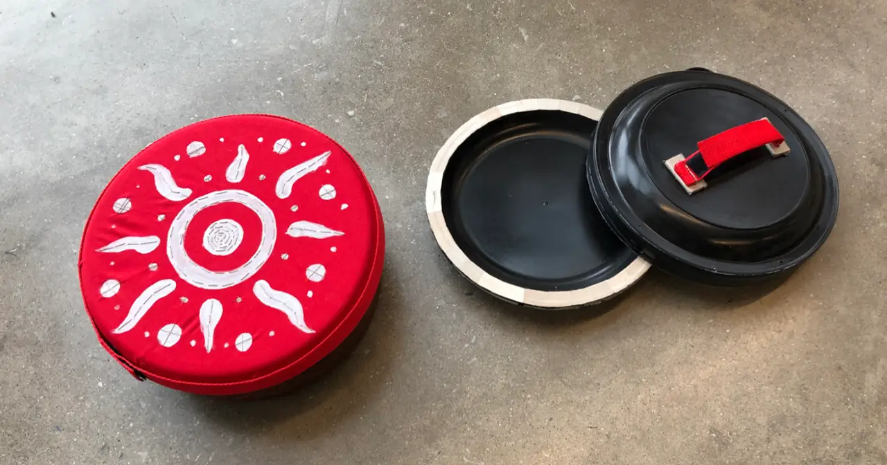
Both controllers’ main component was the Arduino Feather Board ESP32, which allowed them to be connected to the computer wirelessly via Bluetooth. The Feather Board ESP32 also came with Capacitive Touch Sensor which allowed the boards to recognize the user’s skin contact as input. We decided to use capacitive touch as our main user input because it provided the player with a more hands-on experience with the controllers compared to vibration sensors. We wanted to challenge ourselves and experiment with its uniqueness due to the capacitive touch’s newness in the industry. Additionally, with the vibration sensors, anything could activate that input but with capacitive touch, only skin contact would send the signal.
We used conductive tape and tread to make the vision of creating a hand-on and textile experience possible. Conductive thread was sewed into the felt fabric onto the area where the player would place one hand on the controller. The thread was then connected to the ground pin on the Feather board while a signal from another hand would be connected to the Touch pin. The moment when both hands are in contact with the ground pin and the touch pin wiring, the board would then send a signal to the computer that the user was giving an input. The board will then send an output to the computer as “key pressed down” where in this case we were sending the key S and W for each controller.
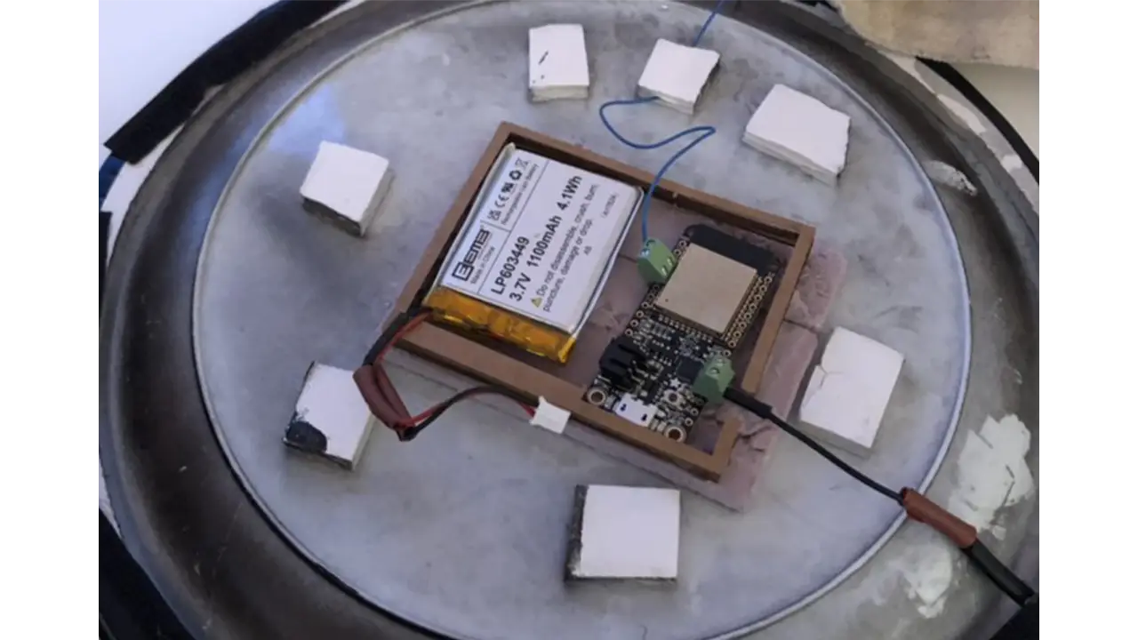
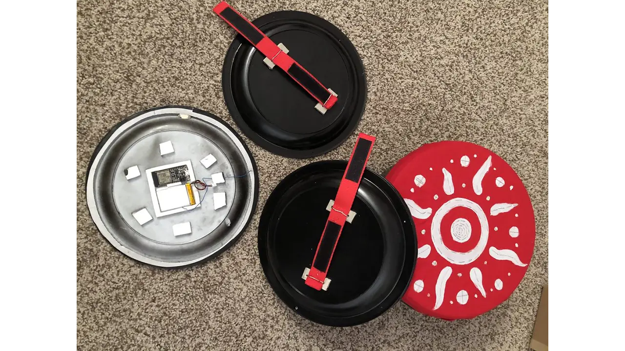
The body of the controllers we constructed with plastic plates and containers. We used these materials because of their affordable cost and easy access to replacement parts. Due to the materials being lightweight, they were perfect to make kids-friendly controllers. With the main body originally being plastic plates and containers, we sanded down the outside of the object and sprayed black matte to give it a clean look. In addition to forming the controllers, we also used felt fabric and nylon straps to build a secure holder area for the controllers.
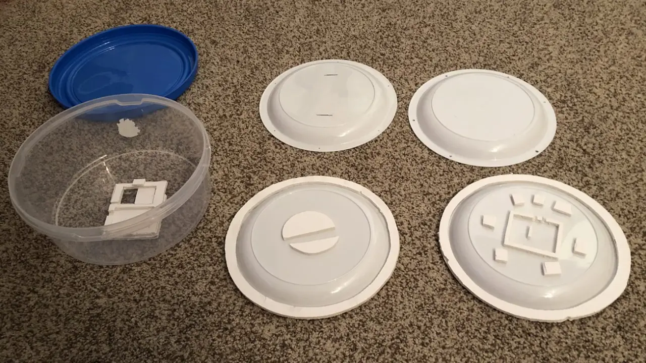
There were three main problems that came with this unique set of controllers. The first thing was that the lithium batteries that we ordered were manufactured in a way that the polarities were wired reversely. This caused the board to be non-functional and parts to short circuit. We spent a lot of time trying to understand what we did wrong, diagnosing our codes and our setups, but we completely ignored the possibility that it was the manufacturer’s fault. It took us about 3 weeks of debugging to realize that it was the battery wiring, but once we confirmed the source of the issue, we cut the end wires of the batteries and swapped the ground with the pin. With capacitive touch still being pretty new, there was a lot of fine-tuning of the sensitivity to get the controllers to send out signals properly when different users were using it. We noticed that age and gender would affect how much signal the board was detecting. For example, the controller was more sensitive to some male playtesters than female playtesters. Without their hand making direct contact with the controllers, the capacitive touch would detect the electrons. And in some cases, the controllers would not detect touch at all which we hypothesized that it could be caused by the dryness/thickness of the player’s skin. Lastly, with the nature of the dynamic of the game and the physical impact that our controllers were getting, hitting the drum and the cymbals, parts of the controllers would get loose and wires would get disconnected. This required us to reconnect parts and troubleshoot disconnections regularly.
Over time our controllers evolved. In the beginning, the prototype of the controllers was tested using an Arduino Leonard board and foil paper to test out the connection and dynamic. After we were confident that the dynamics of the controllers fit with this station, we then constructed it and tested the materials – plastic plates and containers. At this stage, the controllers were still wired directly to the computer and it was clear that the controllers were household objects. After multiple rounds of playtesting, we then moved on to construct the final version of the prototype. We replaced all the materials with newer ones, sanded and repainted the body, as well as built support for the hardware. Lastly, we replaced some of the wires with thicker ones so that they could withhold more force. Because we were aware of the unexpectedness of our controllers, we constructed a simple backup controller in case the original controllers malfunctioned. We used simple arcade buttons along with Arduino Leonard.
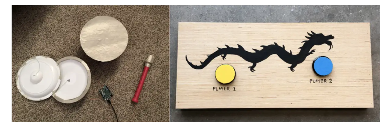
We were very happy to hear that the playtesters were very excited by the uniqueness of our controllers. Many of them loved the musical element that the controllers were providing and the textile feeling that the material had. The positive feedback pushed us to continue to develop the controllers and fine-tune them so that they would remain to be the main part of the station’s experience.
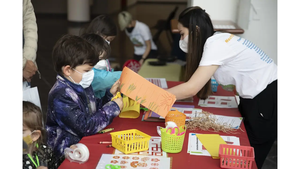
The craft for the Chinatown Station was to have visitors create their very own Chinese lanterns. This is a craft that many elementary school children learn to do in school when learning about Chinese culture, making it a familiar craft that is both fun and easy to assemble, while also teaching about the culture.
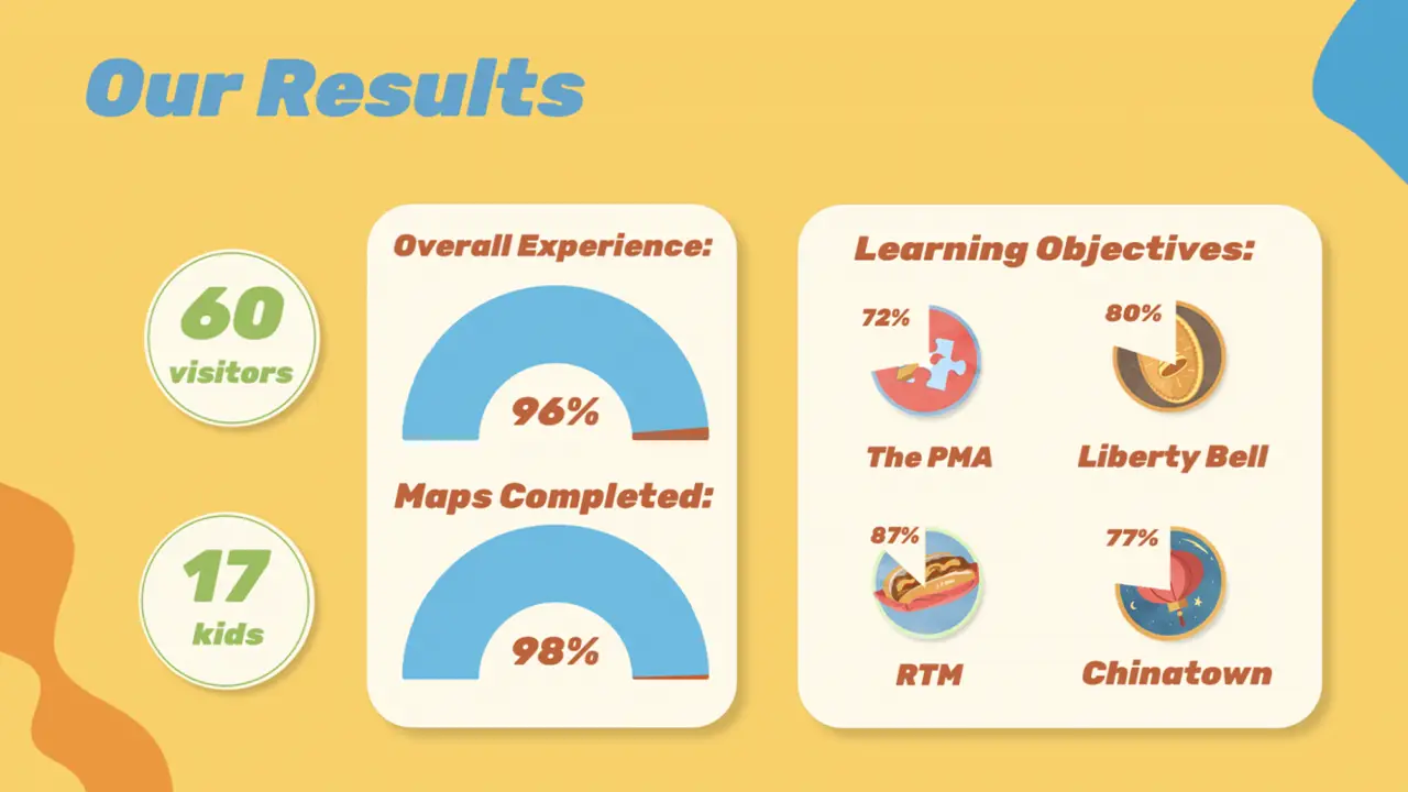
In the end, on May 7th, 2022, the exhibit was quite successful!
We had 60 visitors, with 98% working through the entire exhibit and completing their map. Our Learning Objectives were met with above-average scores, ranging from 72% to 87% and we had a visitor satisfaction rating of 4.8/5.
We are pleased to say that we achieved our goal of immersing our visitors in the history and culture of our city at this fun-filled exhibit, Next Stop, Philadelphia!
This project focuses on designing and developing a high-fidelity prototype food ordering app for a food truck of our choice. In a 10week time frame, we researched, designed, user-tested, and developed a high fidelity prototype application for a food truck called El Toro Serrano. The final product is a prototype, which has 4-5 tasks that can be completed by walking through the app.
The main objective of this app is to deliver a fast and effective way to order food for the general population of Drexel’s campus. We derived our UI design from the food truck’s visual identity and an array of inspiration we gathered from already established app successes. Overall, this was a very successful project which can be used as a baseline to develop an actual food ordering application for El Toro Serrano.
Aaron Monro, Kyle Dolphin, Andrew Lenehan, Sylar Li
We were given 10 weeks total to do research, design, interview users, and prototype our food ordering app. The purpose of this project was to create an app that is easy and intuitive to use and allows users to order food from a food truck.
We were seeking to solve the issue of overcrowding on sidewalks near food trucks, as well as make ordering food ahead of time possible in order to relieve stress from students and faculty alike. Overcrowding on sidewalks tends to happen because there are noways to order ahead, so giving this option to users would hopefully fix this issue.
Our process started with our team defining our goals and objectives for this project. Once we had them set, we focused on looking at other food apps to gain an understanding of the functionality that users have come to expect from a food ordering app.
After we had decided what functionality we wanted in our app, we had to gain an understanding of the physical ordering process that users went through at our food truck. We realized that the ordering process needed to be similar enough to order in-person so that people wouldn’t be confused, but concise enough that it would be more efficient to order on the app. To do this, we needed more research, which is displayed in more detail below.
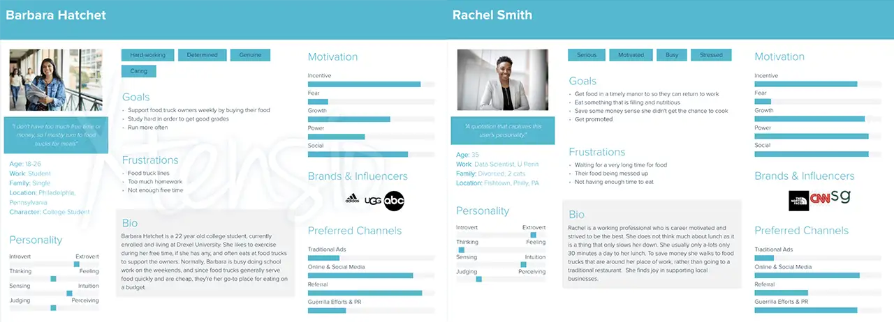
Starting off our research, we first had to figure out what type of users specifically would be interested in our project – our target audience. We started off our research with the “fly off the wall” observation. To do this, we stood out in front of the food truck and observed customers browsing the menu, ordering, waiting, and finally getting their food. Based on the observation, our team held a discussion and determined that our main target users would-be college students, locals, and faculty/working professionals. Below are a couple of our user personas, which reflect our target users.
Now that we have our target users figured out, it was time to discuss what our user journeys would look like. Using the information we had accumulated from the “fly on the wall” exercise, we created a journey map to explain the average ordering process for our food truck, which is posted below.
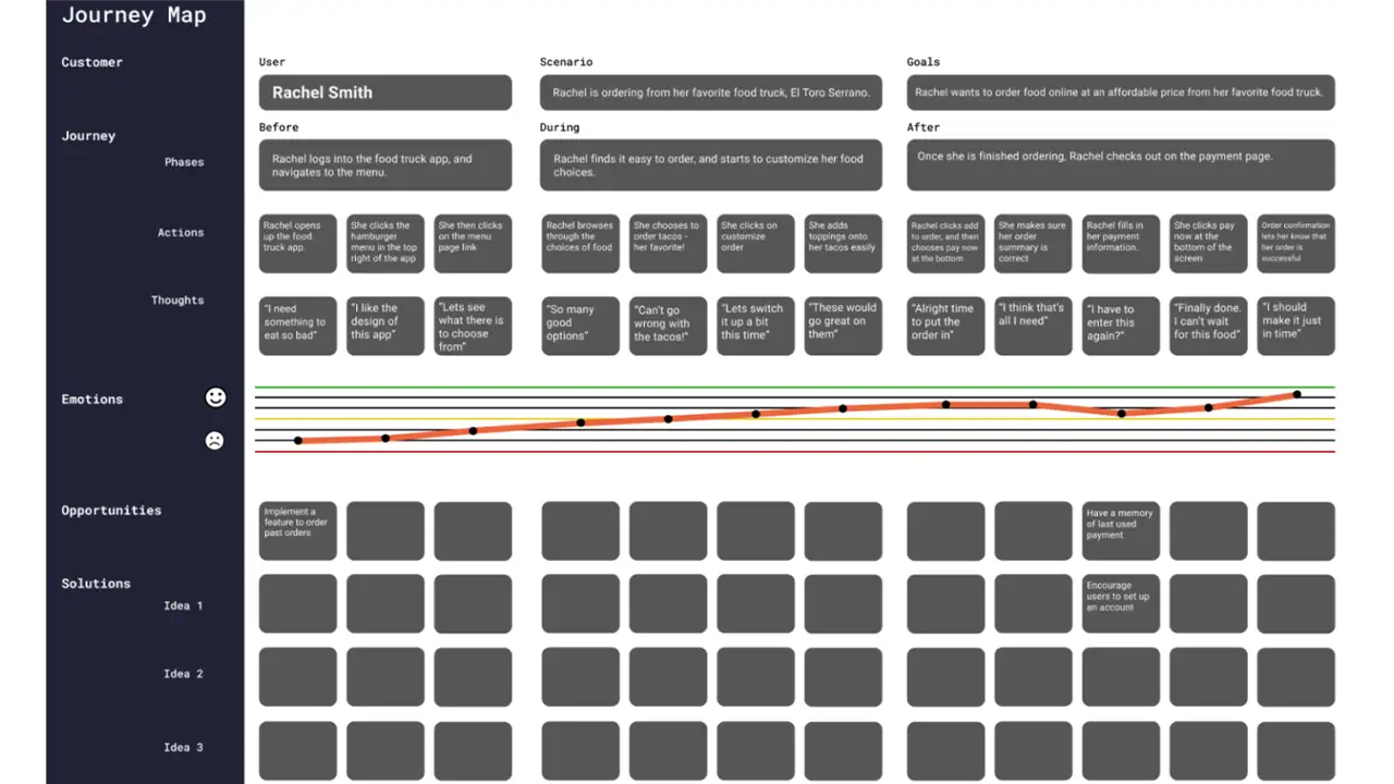
We also assigned one of our team members to do a competitive analysis to get a better picture of what our competitors are doing. We also created a competitor app research to get a good picture of what the usual practices are for food ordering apps, what worked for them, and what did not.
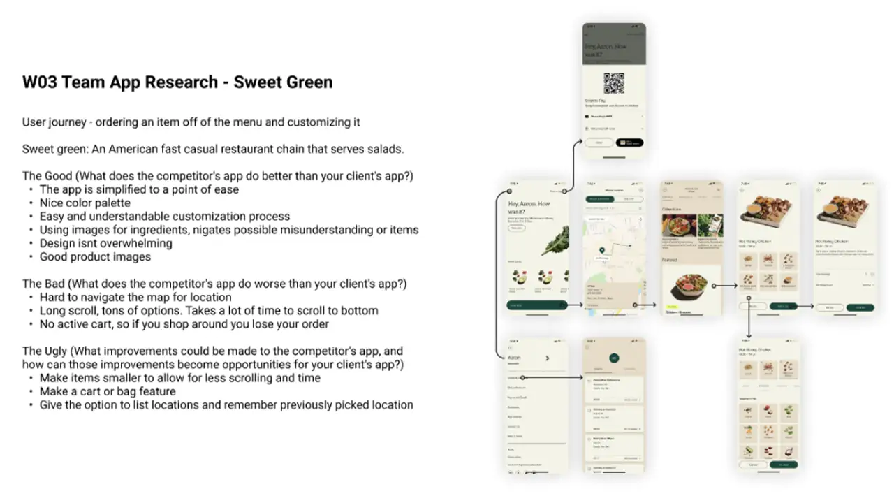
As a team, we first decided what we wanted the feel of the app to be. We then created an initial paper prototype and conducted user interviews to collect feedback as well as observe how the users interacted with our prototype.
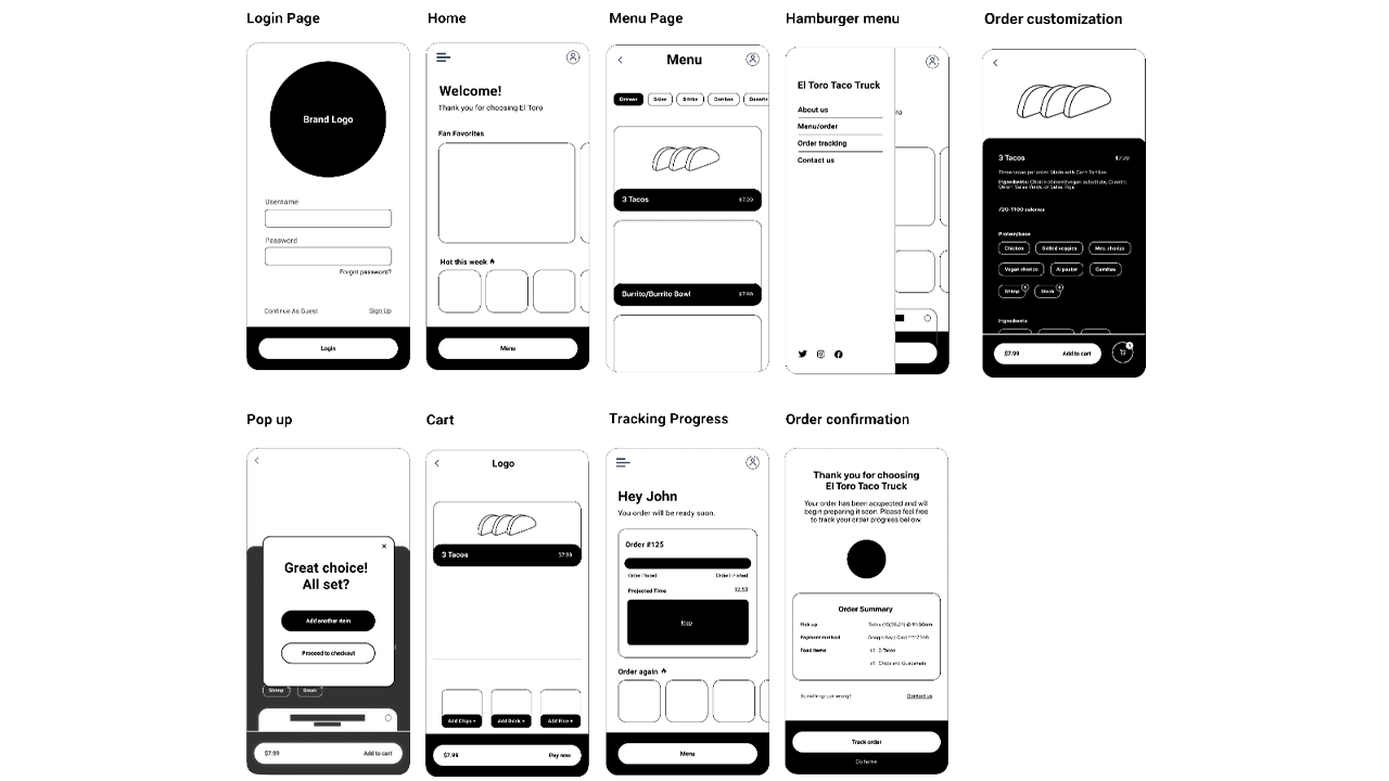
We then went on to create low, mid, and high fidelity prototypes and gained feedback from each of their respective interview sessions. After each set of interviews, we reconvened and tweaked the design and functionality of the app to increase the visual appeal and make it a smoother experience.
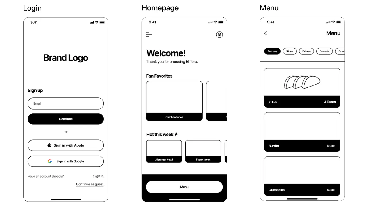
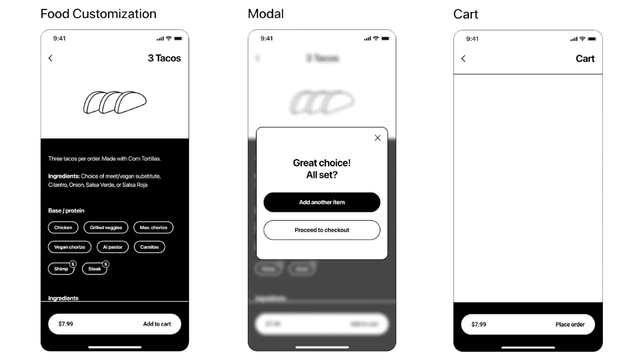
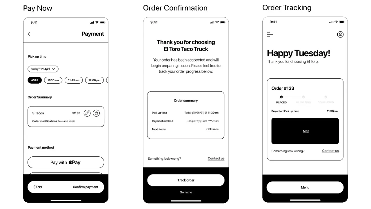
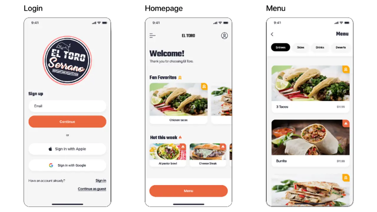
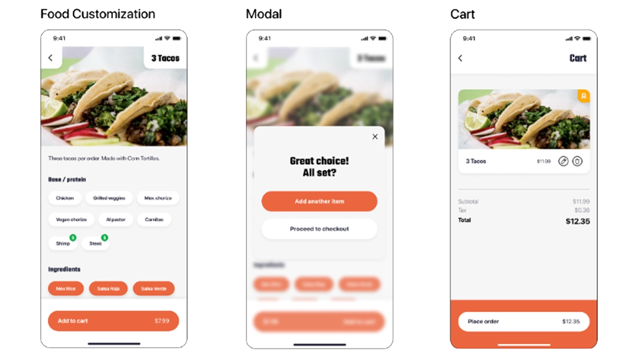
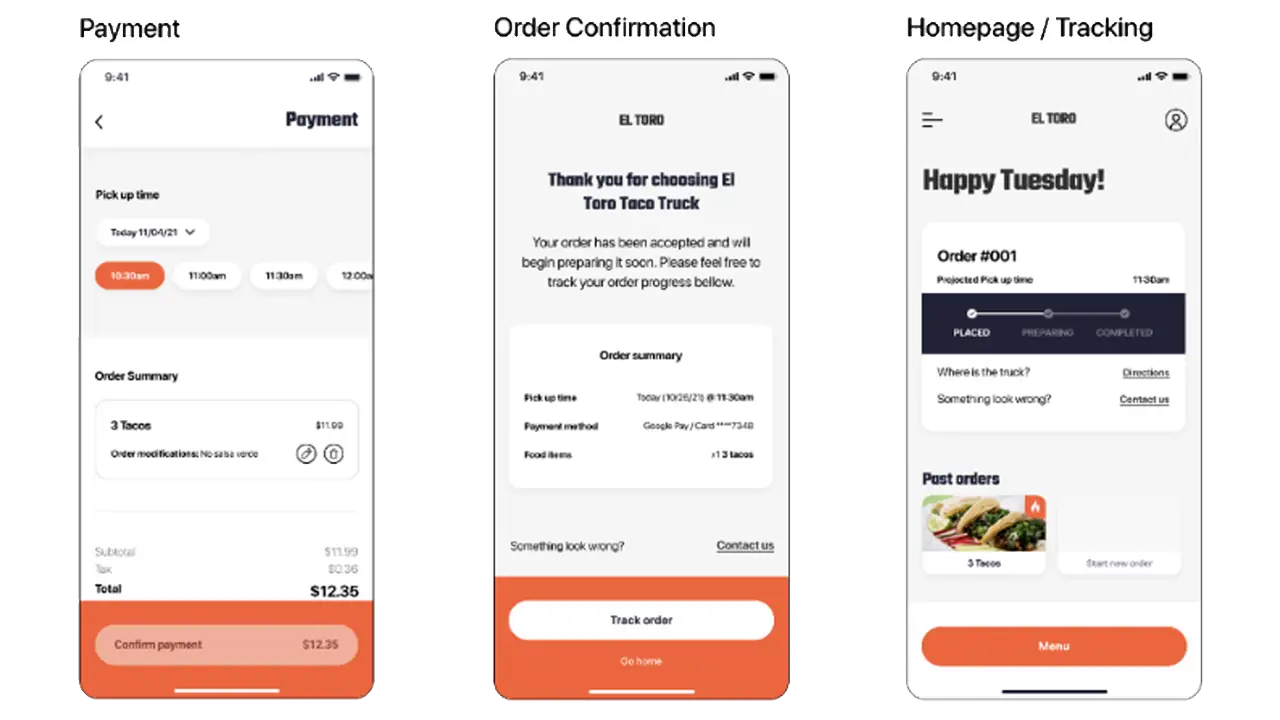
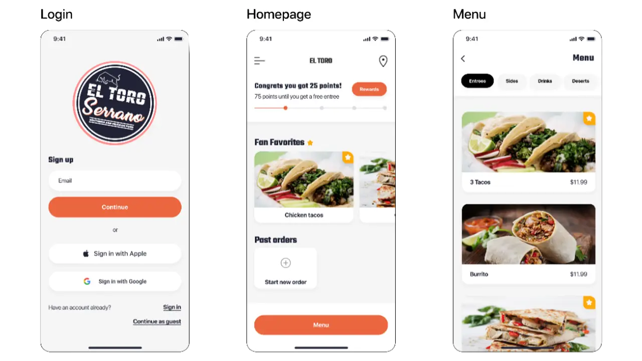
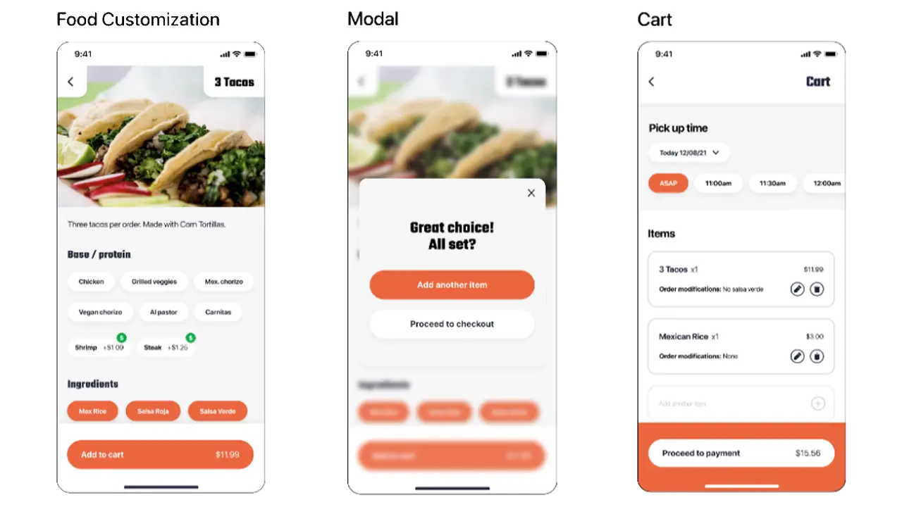
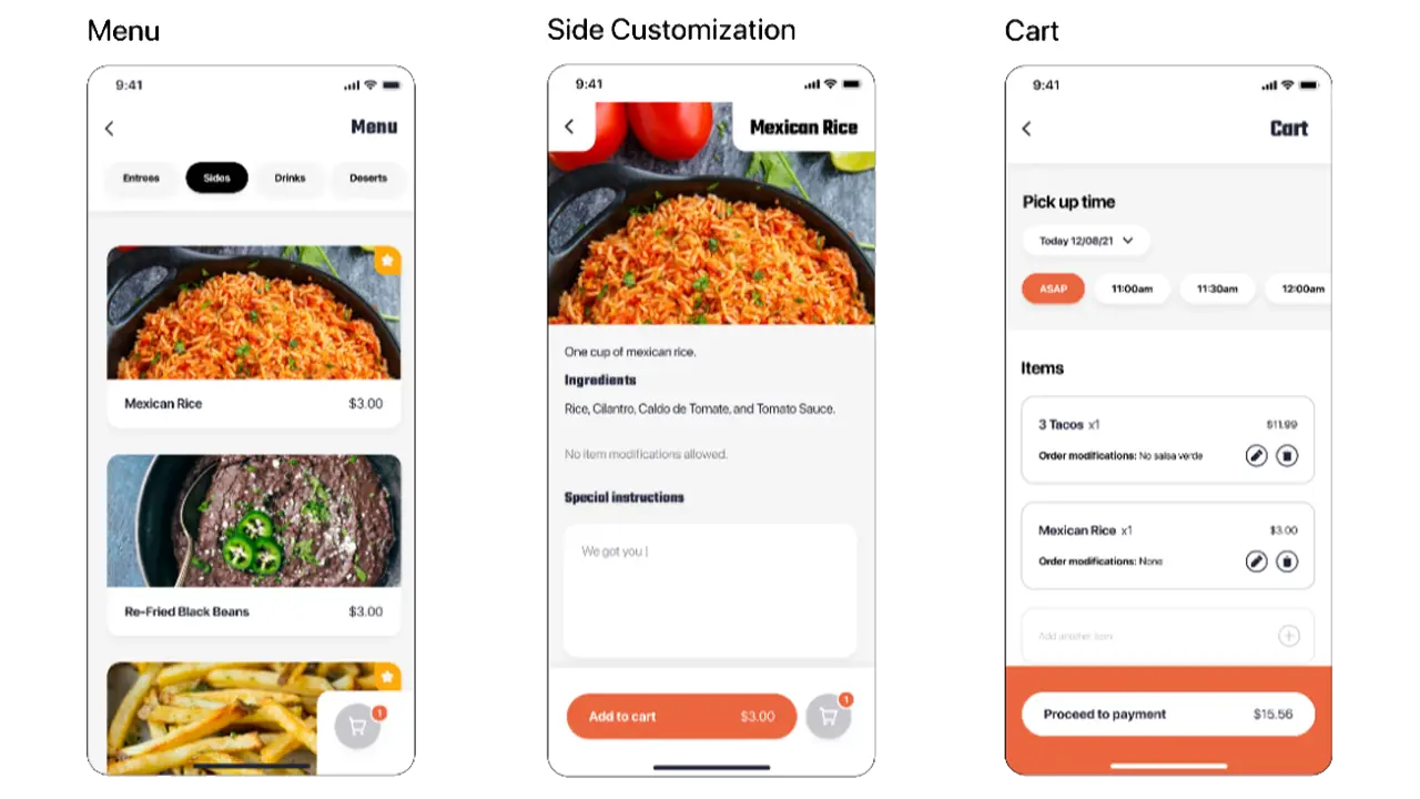
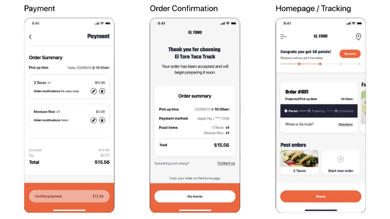
At the end of our process, we finally had a finished high-fidelity prototype. This prototype was the culmination of 2 1/2 months of feedback from various possible users, across multiple differently designed prototypes.
After a few weeks of research and user testing, we have our solution. We created a high-fidelity prototype of our designs, which acts as a real app would act if it were fully developed. Included are multiple task flows, the first of which consists of choosing a food item, customizing it, and adding it to your cart. The second task is to go back to the menu to add another food item to your cart, while the third task is to go to your cart and check out. The fourth task is to go to the homepage to track your order, while the final task is to go and view the rewards page. Below are pictures, as well as text, that goes into more detail about our overall designs.
In our design, we included a universal button fixed to the bottom of every screen. This gives users a natural way to progress through the app, where the bottom button will lead them to the next task.
The use of the star icon over any other as a fan favorite is a conscious decision. The use of a star is widely used throughout many apps so the users will know what it means.
A unique mobile attribute we added was this modal that appears after adding something to the cart. This prompts users to add another item by using the same formatting as the main button but doesn’t penalize them for not choosing it.
The cart icon at the bottom right of the screen floats where the user’s thumbs usually rest (the “sweet spot”), allowing for an easy click. If the cart were at the top of the screen, there could be issues with comfort depending on the size of the phone being used.
The project as a whole was very successful. We were able to create a high-fidelity prototype centering around critiques from possible users. The design that we created allows users to customize and place their orders efficiently, as well as give users the option to order ahead which would alleviate sidewalk crowding. We learned that a very efficient way of getting feedback was to go directly to our target audience and ask them specifically what their thoughts were on the current build of our project.
We worked on creating a user-friendly and intuitive mobile ordering food app for the Happy Sunshine food truck. Our main goal is to solve the problem of waiting in line when getting food from Happy Sunshine. We also added more unique features such as a rewards system and an option to schedule a pickup to make the app be more alluring to customers who love the food from the truck but hate waiting in a line. (September 2021 – December 2021)
Christine, Han, Marte, Steven, Tushar
When we were assigned a project to create a mobile food ordering application, our team knew exactly who we were going to choose. Happy Sunshine is a classic American breakfast food served by the volleyball court of Drexel University. Happy Sunshine has been labeled ‘The best food truck on Drexel’s campus’ by multiple local and university newspapers. The owners are one of the main reasons for the popularity of the truck as well. The bright yellow Happy Sunshine truck is owned by a sweet couple that greets every customer with a loving smile and hello. They work hard and make sure all their food is good quality and affordable to people who visit the truck. We wanted to create an app that reflected not only the quality and simplicity of getting something to eat at Happy Sunshine but also the sincerity and sweetness of its owners towards their customers.
We found that Happy Sunshine has a very strong and regular customer base, on top of that there are new fans of the truck every other day. With such growing popularity, good food, and such a sweet and friendly vibe, we wanted to convey all of this into our app so that more and more people could understand that Happy Sunshine is more than just a food truck and its food. It’s the sense of that sweetness, calm, and happiness that happy Sunshine really differs from other trucks. We wanted to design an app that keeps the ordering process as simple and personalized as possible while carrying the energy and positivity of Happy Sunshine.
One of our constraints was the success of the Truck itself. Since the truck was so famous most people preferred getting food by physically going to the truck. One of the reasons people go to Happy Sunshine is also to greet the sweet truck owners. Since the app completely lacks the human aspect, we had to find ways so that customers happy Sunshine are also (if not equally) by the option of getting food through the food app than going to the truck in the process.
Fly On the wall
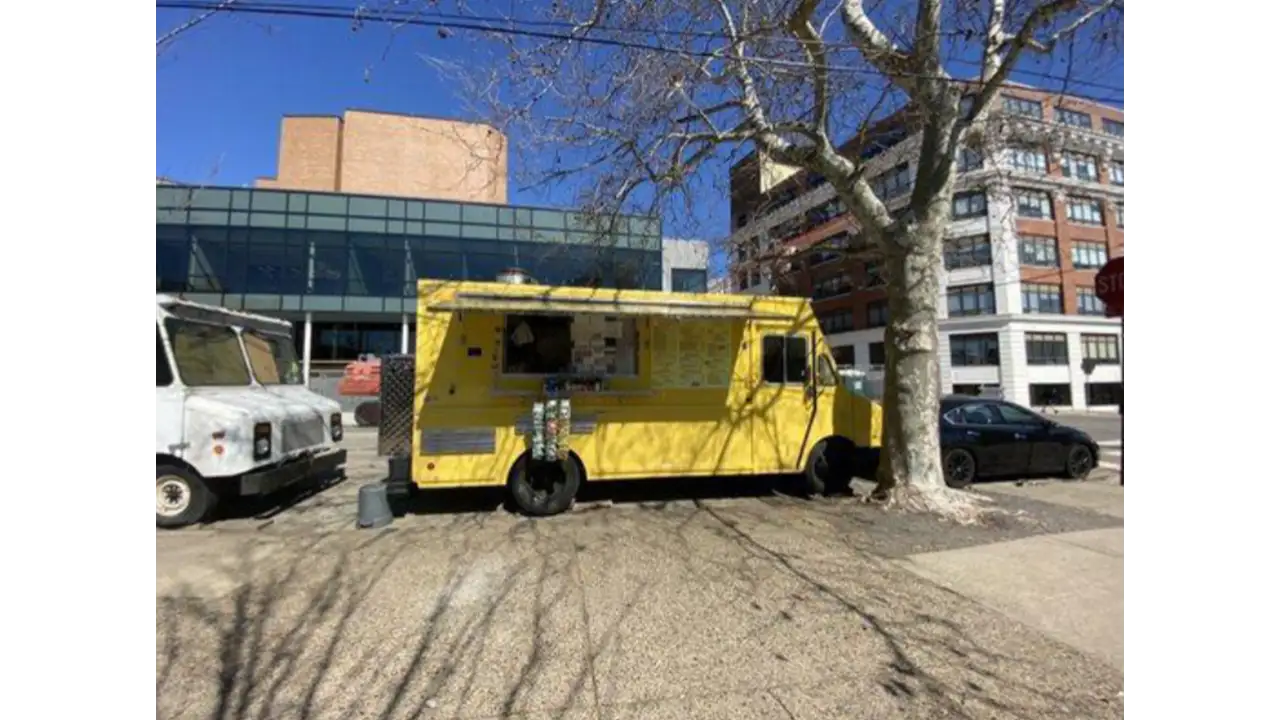
We began our process by the ‘Fly on the wall’ exercise where each team member individually went to the Happy Sunshine food truck to observe people’s workflow or what each user does step by step as they go through the process of walking to the truck up to order completion and the user receiving the food.
Making the Business Canvas Model
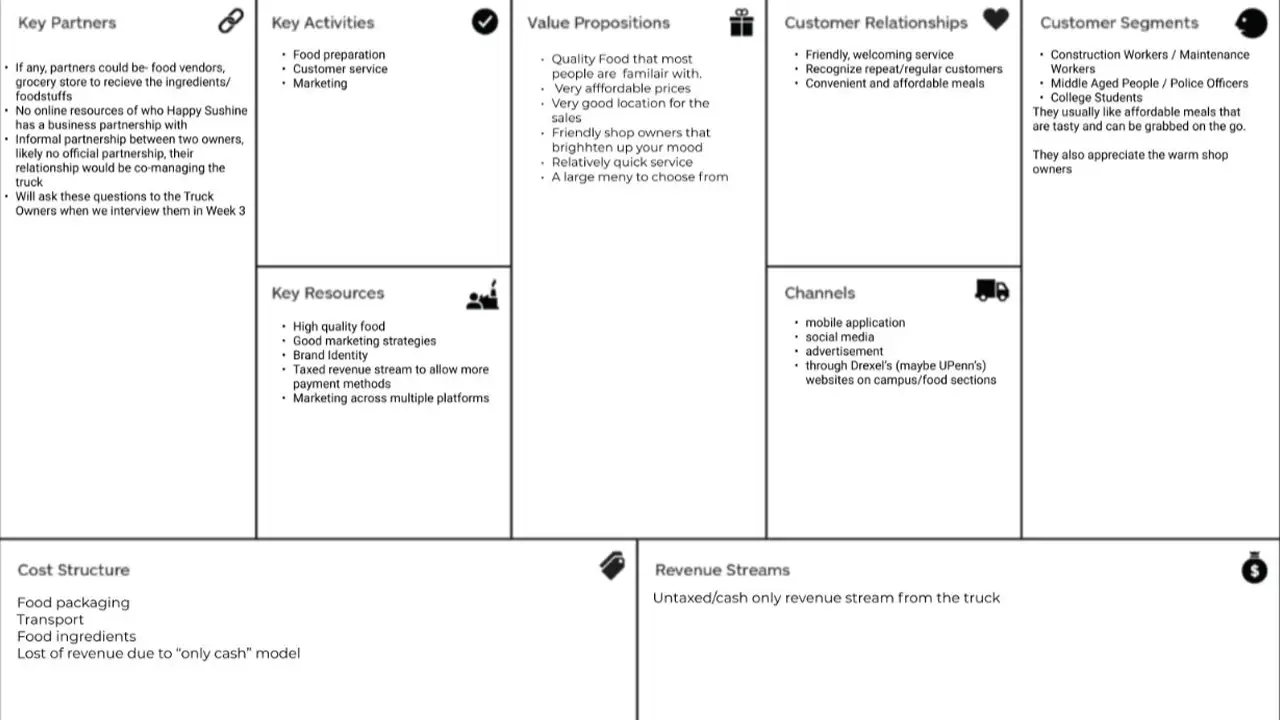
We created a Business Canvas Model from all the details we observed and asked for other details from the food truck owners. With the help of our Business Model Canvas, we could have all our high-level strategic details in one place. This also helped us set some constraints on the project, which gave us a clearer scope of what we were going to build.
Project Canvas
Once we were able to put the Business Model Canvas together, we wanted to get a much clear picture of our project, its, assumptions, risk, scope, actions & deliverables, etc.
User Research Interviews
We wrote our first interview script and conducted user Research interviews about people’s experiences at different food trucks. The goal of these interviews was to get a basic idea of an overall idea of the experience of a regular customer, their needs, goals, pain points, and their specific motivations to go to the Happy Sunshine food truck or other food trucks in the area.
Competitive Research & Other Mobile App Ordering Research
While we were doing User Research Interviews, we also worked on doing competitive research about other food truck apps that are already in the market. We also did a deep dive in the Mobile Food ordering process to look at and find inspiration for some good examples of an intuitive and clean workflow.
Design Sketches
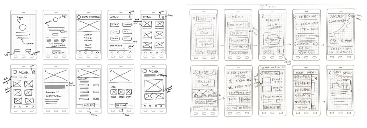
Once we had all the basic details and workflow ideas, it was time for sketching! Each of your team members created tons of sketches on possible designs and user flows of the application.
Mood Boarding
Since each of us had a slightly different theme in mind, we decided to create an individual mood board for the look and feel of the application and merged them later to create a team mood board.
Affinity Mapping
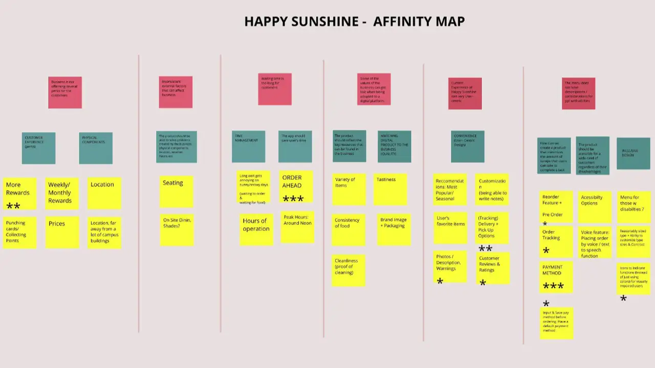
After gathering all the insights from the User Research interviews, we all were ready to bring our insights together. For this process, we did an affinity mapping exercise. Through the exercise, we were able to narrow down key and common issues regarding different aspects of getting food from the food truck. Through these insights and our design sketches, we were able to form a basic idea of what kind of features and details we wanted to have in our app.
Proto-Personas
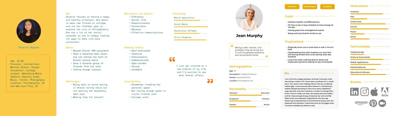
With the insights of the interview, we were able to categorize the users of the app into three main archetypes: Student (Prospective & Current), Construction Workers, and Faculty Members.
User Task Flows
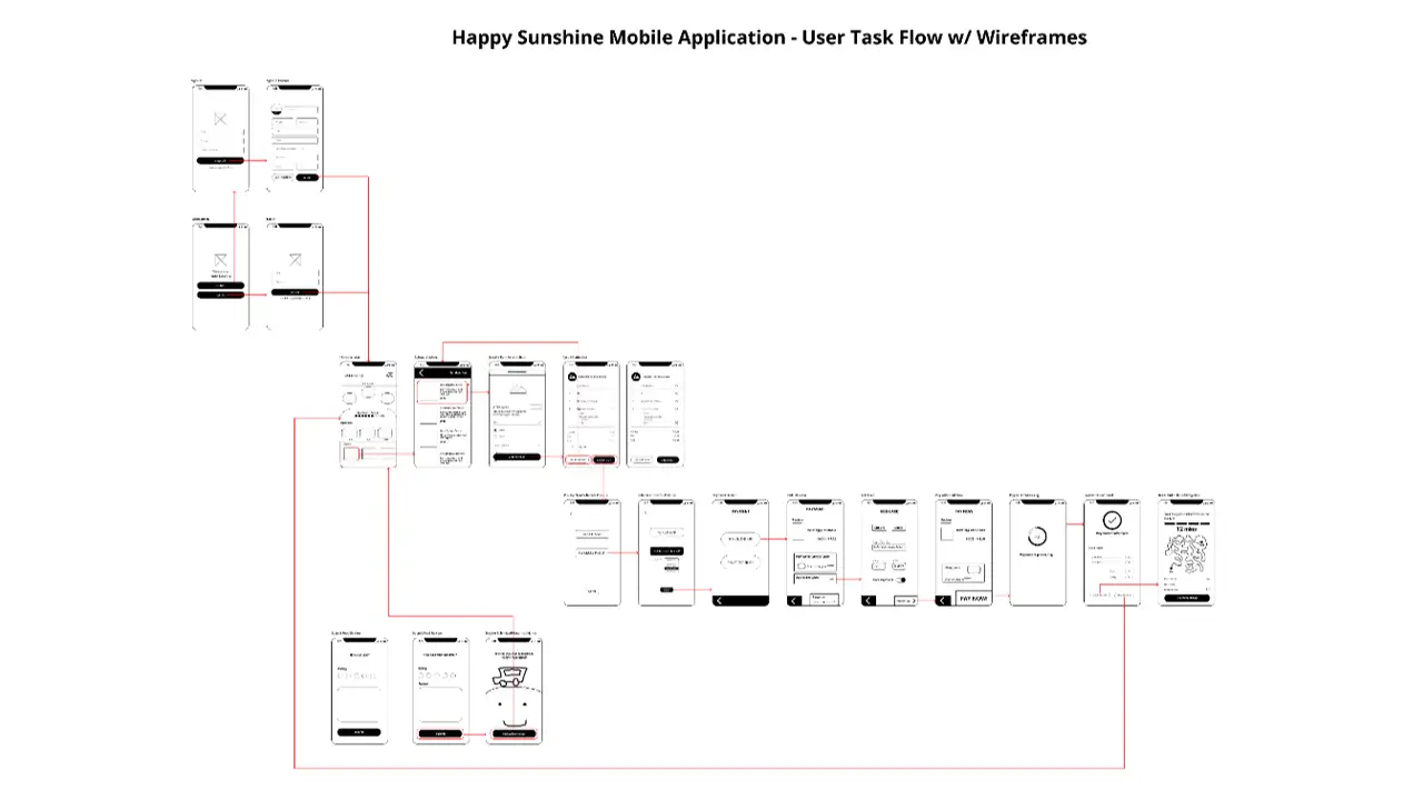
During this time each team member reiterated and refined their design sketches and workflow. We all got together and combined the best parts of our flows to create a common user task flow.
User Journey Mapping
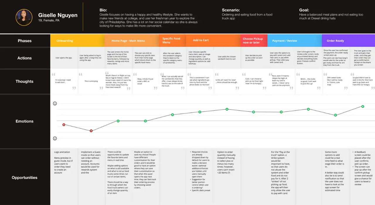
After the task flow was done we created a journey map of a user going through the experience of ordering food through the User TaskFlow that we created. We noted down the highs & lows in the mood of the user to find any more opportunities to improve specific parts of the app.
Creating Skeletal Wireframes
As our flow was ready we created the very basic skeletal wireframes that guided a user from logging in/signing up through payments to instructions to get their order.
Usability Testing the paper prototypes
We printed this flow on small sheets of paper and usability tested these screens as paper prototypes. We reflected on the results of the usability testing of the paper prototypes and made changes in the design as needed.
Creating Mid Fidelity Prototypes
We used insights from testing our paper prototypes and Figma to create our first Mid-Fidelity wireframes/prototypes.
Usability Testing the Mid-Fidelity Prototype
We updated the Usability Test script to suit more to the changes made in the mid-fidelity prototypes. Each of us conducted two Usability Tests and reflected on the results again as a team. We tried to remove what the Users did not like and tried to enhance other features that the users wanted to see more. We also put some of the user suggestions on the backburner as we thought it could be a scope creep and might slow down the process of our project.
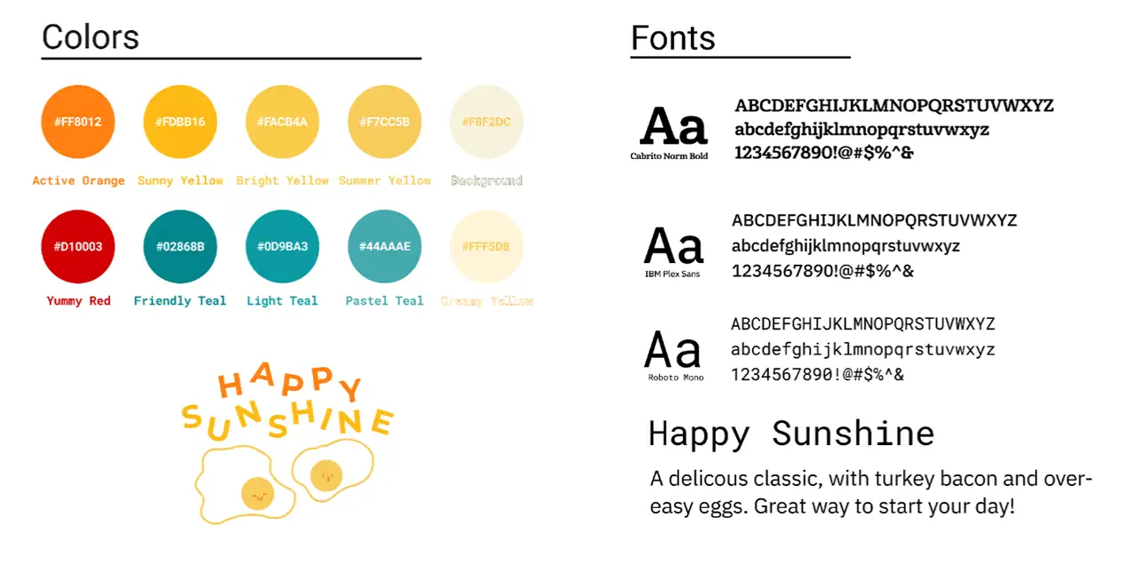
A lot of our branding was influenced by the sweet, calm, warm radiance of the truck and the owners themselves. We wanted to infuse the spirit of Happy Sunshine in the flow of our app. We used the mood boards we created earlier as references for colors and tones. We also included a cartoon of an egg/cheese as a graphic in the app as Bacon, Egg, & Cheese was one of the favorite dishes from Happy Sunshine.
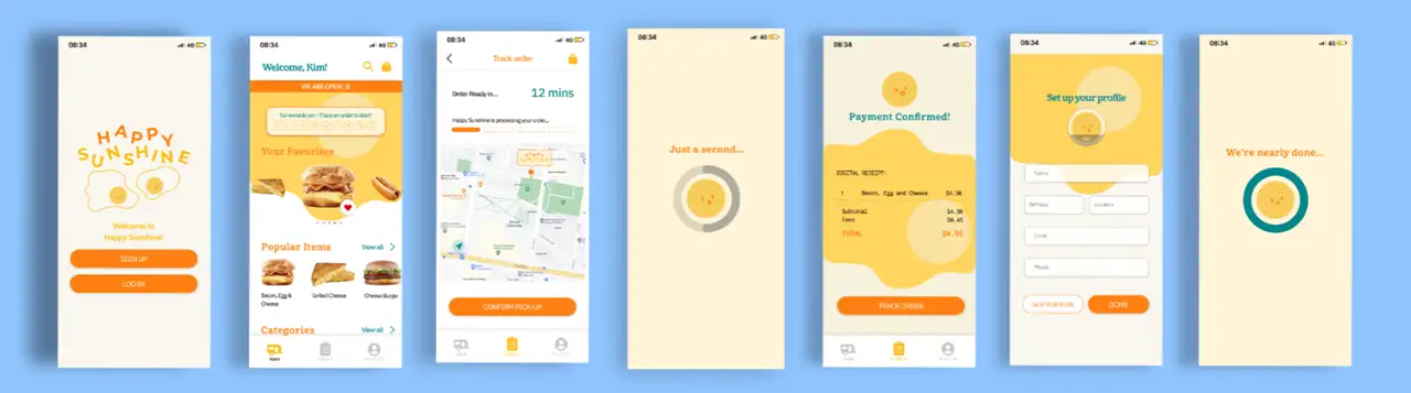
Creating High Fidelity Prototypes
With the help of insights we gathered with our Usability Testing of our Mid-Fidelity prototype and a final joint team analysis of these insights, we were able to create the final version of our prototype with all the graphics and full functionality of the main flow of the app.
Usability Testing the High Fidelity Prototype
We did another usability test on ourHigh-Fidelity Wireframes to find out any other small details that we could improve to make the user flow even better. The team gathered and analyzed the test results one more time to be sure everything is where it should be.
At the end of our 10-week journey, we felt that our project was successful. Our final application included a complete task-flow of a would-be user, and our design and functionality were fully realized. We had received great feedback and our project truly evoked the feeling of the Happy Sunshine food truck. Throughout our progress, we all felt that we learned something. From completing the research, we learned about how to identify and potentially leverage the strengths of a pre-existing business. When designing our style sheets, we gained experience being able to utilize colors, typography, and images to elicit a mood or feeling. Throughout the early ideation phases, we gained the skills of interviewing real-world users in order to apply the feedback to create the foundations of a visual experience. Then, throughout the long prototyping phase, we became familiar with rotating interviews on top of making improvements and applying our designs. Once we completed our final high fidelity iteration, we had all seen what it took to see the project through. We had to work in a team and play off each other’s strengths. Not only did we create a complete app from our initial vision, but we also gained a plethora of knowledge of the UX/UI process.
IDM311: User Interface Design for Immersive Media
By Allison Drake – 2021