IDM222: Web Development II
By Clay Tercek – 2018
IDM222: Web Development II
By Clay Tercek – 2018
IDM212: User Interface Design II
By Wooyoung Song – 2018
IDM212: User Interface Design II
By Sarah Bray – 2018
IDM212: User Interface Design II
By Robert Nashed – 2018
IDM212: User Interface Design II
By Maria deCamargoGross – 2018
IDM212: User Interface Design II
By Clay Tercek – 2018
IDM212: User Interface Design II
By Alyssa Klein – 2018
The Voyage of the Red Dragon is an interactive web project showcasing the journey of The Red Dragon, 16th-century pirate ship piloted by Thomas Hood. Historical researchers from across the country have been working together to reveal secrets laden within his journal, which gives us both a deeper look into the history and politics of Trans-Atlantic privateering as well as the path of the Red Dragon itself. This was a Drexel University collaboration between the creative talents of the Westphal College of Media Arts and Design’s Interactive Digital Media department, and the exhaustive research of Professor Gabriel Avilez de Rocha of the College of Arts and Sciences. Thus, the tale of the Red Dragon began its voyage from paper to the digital screen.
This was a project for IDM 371/2: Junior Workshop 1 & 2, a two-quarter long class for third-year students of the Interactive Digital Media major. This class highlights the skills we have learned over the past two years of our Drexel experience in order to create a large team-based project. There were two choices for what projects we could choose: a pre-selected client, or our own idea. We all pitched our own ideas during the second week of the course, and then chose between the list of available ideas.
Professor Gabriel Avilez de Rocha was the only client from the list who came in and presented his work to us. Our team not only wanted the opportunity to work with a client to build that skill before we enter the professional world, but we were captivated by the interesting and passionate research he was doing. Learning about the research was as much a draw for us as the opportunity to build an interesting project. Here is what some of our team had to say about why they chose the project:
“The web offers so much for the presentation of information. Research is so often locked behind a wall that the average person is usually intimidated out of learning. This kind of easy distribution of research is great for allowing learning institutions to present information cheaply to a mass audience.” – Steve
“I have always been interested in the intersection of our new digital world and the humanities. As he was sharing his research to our class, my mind was filled with ideas of how we could contextualize his research in a new and novel way, and from that point onwards I was hooked.“ – Axel
Digitalize Prof. Rocha’s research and create an experience where students and researchers can learn more about the red dragon.
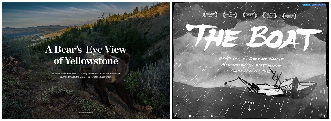
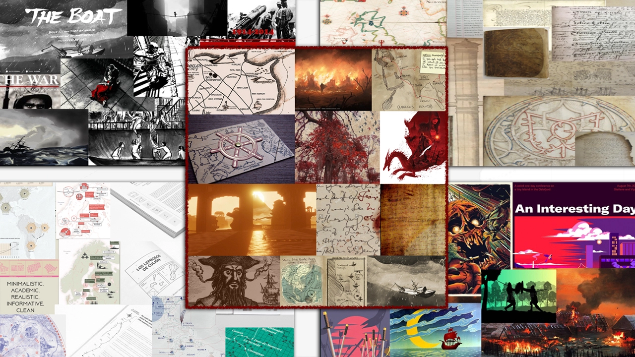
Once we had formed a team, we immediately sought out to generate ideas that we could share with our new client. We knew that Professor Rocha was just as open to ideas as we were; his primary goal was simply to teach people about the research he was doing, and to embrace the new digital medium. We sought far and wide to find interactive web sites which visualize and display historical data or events in a creative way. Our team found inspiration in interactive storytelling, specifically of sites that used scroll-based interactivity to tell a story through controlled animations. In other words, where the user can literally push the story forward with the scroll wheel or trackpad. Here are two examples: A Bear’s Eye View of Yellowstone and The Boat.
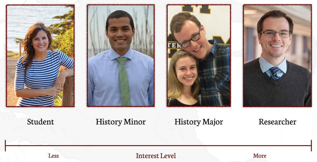
We started by working with Professor Rocha to define the target audience for this project. We believed that this would help Professor Rocha and our team come to stronger conclusions on what our project should be and try to achieve. Who did he want to use this website? What did he want the project to say about his research?
Through this, we were able to more precisely define our problem statement. Professor Rocha wanted this project to be able to:
We made it a point to make sure that each part of the project could appeal to all of the spectrum, but would have a specific target member in mind.
Create an interactive storytelling experience to educate students about the research, along with an archive to provide for further insight and collaboration with interested students and colleagues.
We created a two-part digital experience for the research of the Red Dragon journey. Part one is the Voyage, a interactive visualization and storytelling experience of the journey. The second part is the archived trove of research, including a scanned transcription of the personal journal of Thomas Hood. The Voyage of the Red Dragon serves two goals; the journey will allow new users to be able to jump right into the history of the voyage and the archive will allow users to do their own research on the project.
Our plan followed a fairly typical Research -> Ideate -> Design -> Develop approach, with each phase overlapping slightly with the others. For example, we would redesign features while in the Develop phase. While the project was officially due on March 14th, 2018, our team needed to have a beta ready for a conference Professor Rocha was presenting at UCLA on February 16th, 2018. He wanted to demonstrate a version of a project to share with fellow researchers working on the project.
Before anything else, we wanted to verify that our ideas for the Voyage section of the website were in congruence with what our target users desired. To confirm this, we spent the first week of our project quickly interviewing potential users and showing them different examples of projects that combined digital interactivity with historical learning. Our theories about the interactive storytelling websites, where users can interact with the narrative by scrolling, were confirmed as users seemed most engaged by those websites.
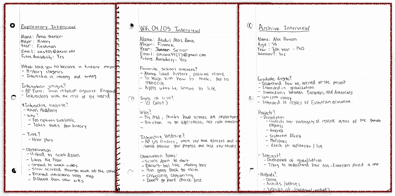
USER INTERVIEWS
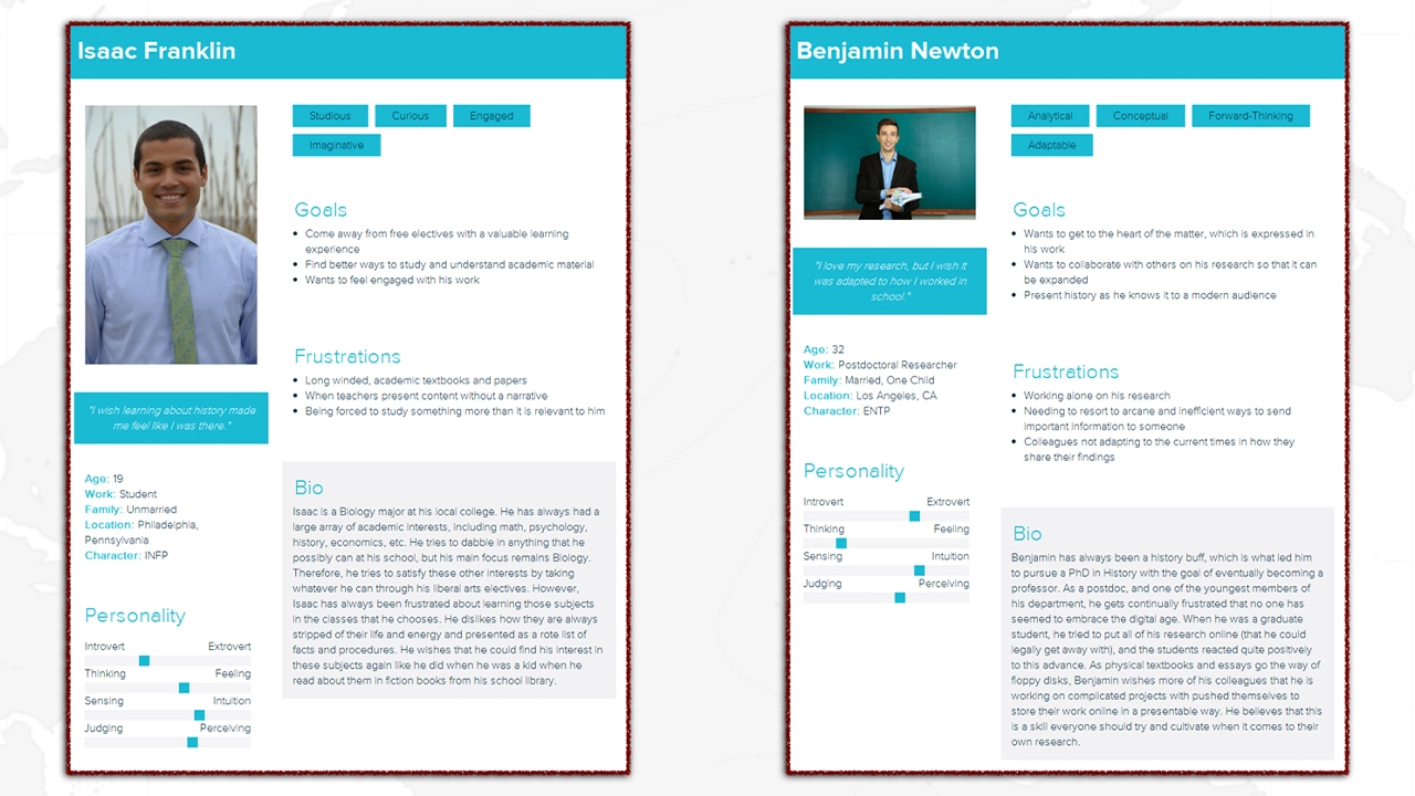
As previously stated, we had a spectrum of target users that we based our design around. That consisted of General High School and College Students, History Elective or Minor Students, History Majors, and Researchers and Professors. We hammered out our user personas by performing qualitative interviews with people who fit our target audiences. Not only did we perform guerilla interviews with students, but we scheduled appointments with historical researchers at Drexel University and the University of Pennsylvania.
We found that it’s not difficult to find a spark of enthusiasm about research in almost anybody. Even interviewees who reported having a low interest for history as an academic subject could share an example with us of a moment or teacher from middle or high school which engaged them or changed their understanding of how the world worked. We hoped that presenting Professor Rocha’s research through a familiar digital interface could accomplish the same.
INSPIRATION & COMPETITIVE ANALYSIS
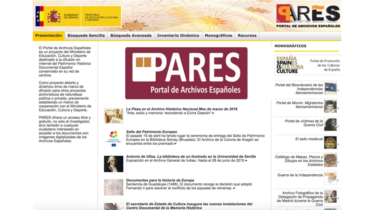
In our competitive analysis, we searched for other websites or apps that visualized historical events and data. We found that the large majority of these websites had the major problem of being primarily developed in the teams of history academics and professionals; so while the sites had interesting content, they were not always displayed in an engaging way. Here is an example of a site which has a visualization of population movement on a map, but suffers from a stale design and a lack of interaction.
One of the great parts of working on a project containing academic research is that the end goal isn’t to beat out similar websites; it’s to collectively enhance the historical knowledge of the general audience. Therefore, we felt more comfortable with pulling ideas and taking inspiration from other websites. As you can see, the idea for our map came partly from the National Geographic website which visualized the journey of a bear through the park, and the parallax animations used to enhance the storytelling from the award-winning digital story The Boat.
TESTING METHODOLOGY
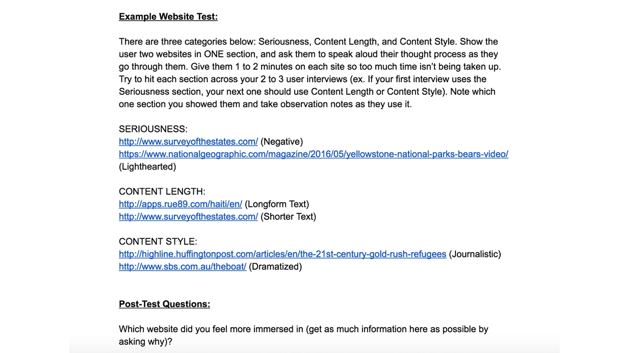
Ideally, we would have been able to perform user research based on prototypes of our actual product to determine our design decisions. However, the original conception of our website was complicated and difficult to translate to a prototype this early on, where we could only make low fidelity wireframes. On top of this, prototyping a website such as ours on paper, or on a service like Invision, would be unable to communicate the flow of our website. The idea of using a toilet paper roll to simulate the scrolling was even discussed amongst our team.
In the end, we decided on a different type of research methodology which involved showing users two similar websites that differed by one or two core features. For example, we could show the user two scroll-based narrative websites, where one had a progress bar and one didn’t. We would then question the user on how they felt comparatively, such as if they felt lost on one site compared to the other. This helped us determine design decisions for our own project without having to prototype them upfront.
JOURNEY FINDINGS
ARCHIVE FINDINGS
Most of digital archives online today are direct-to-web solutions to get images and scans of their materials online, and were foreign to most students. This gives us an opportunity to instill new mental models into our users, but has the reverse effect of making research more difficult. Much of the research here came from those who were already familiar with digital archives. For example, we interviewed with one University of Pennsylvania researcher who had extensive experience using digital archives, as well as performed a card sort with a student who did a co-op with Professor Rocha and had the responsibility of creating an organizational system for the research.
IDEATION
As some of our initial research solidified, we immediately started making sketches of ideas we had for the project. For the voyage, we knew from our research that visualizing the journey in an engaging way was an important aspect we needed to capture; this expressed itself as an interactive map, a virtual 3D journal, etc. For the Archive, we knew that we had the opposite problem of making sure the information was clear and well organized, rather than simply engaging.
In our interviews, we found that displaying the progress of the trip on a digital map was not only visually engaging, but functions as a fantastic storytelling device. Visualization provides the overall context, from which then we can fill in the gaps with information that researchers like Professor Rocha have spent countless hours pursuing.
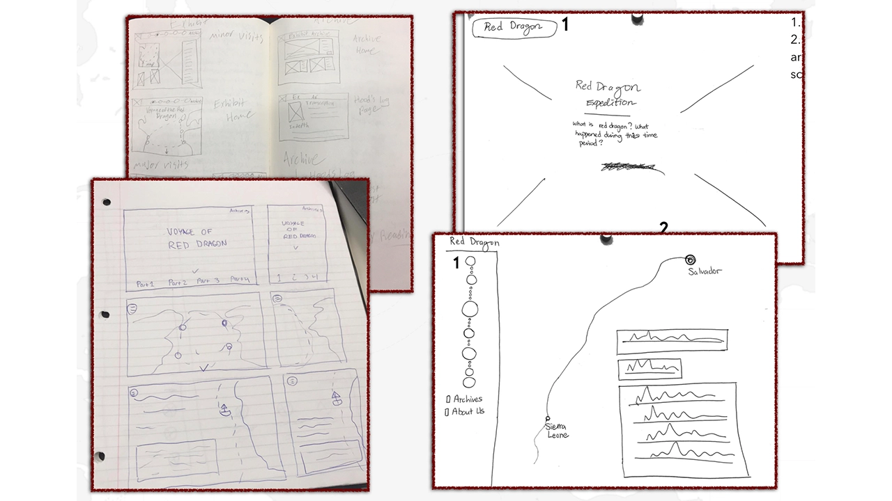
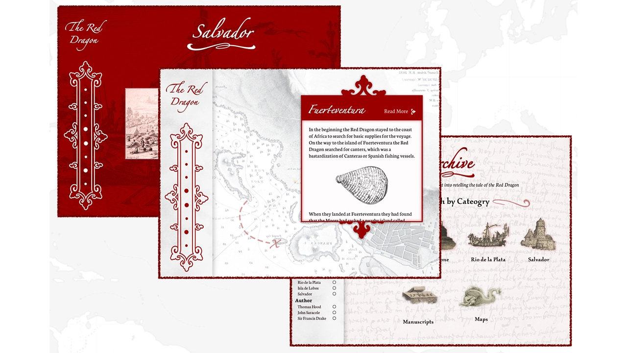
For the voyage, the progression of stops on the journey worked as a self-imposing structure. For the navigation of our entire site, we needed to answer the question of how the user would navigate from Voyage to Archive, and potentially a Main Hub/Home Page (a decision we initially decided against, but changed in the future to give users a hub to return to). Our conception of the site was that users would go to the Voyage, scroll through it, and if they found a part of the journey interesting, could click an accompanying link that would bring them to the archive, where the filter for that location will be pre-selected.
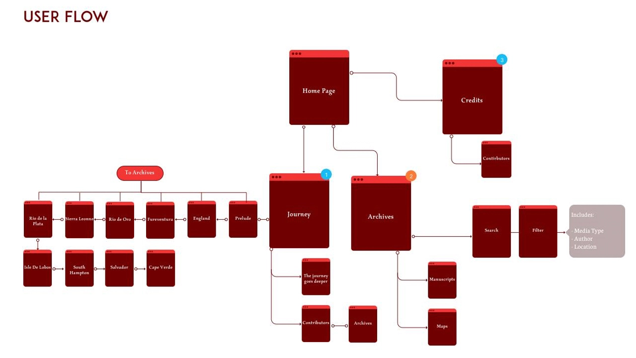
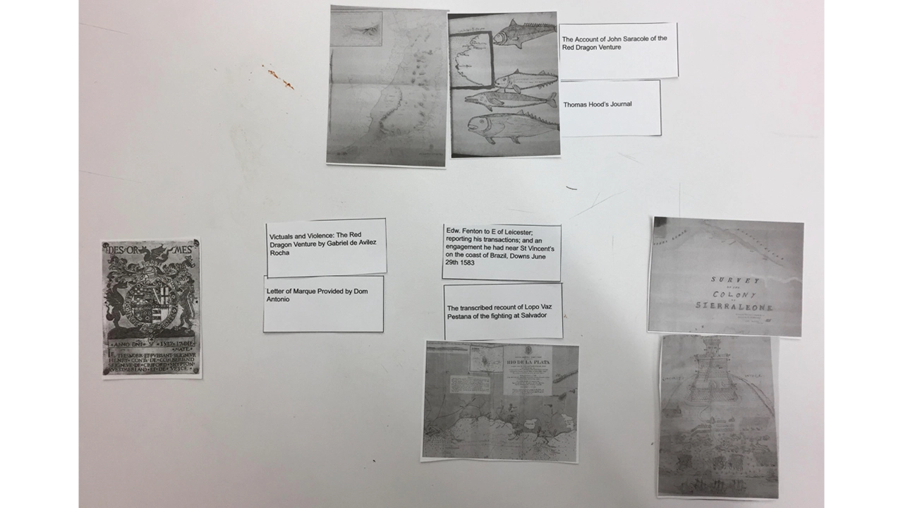
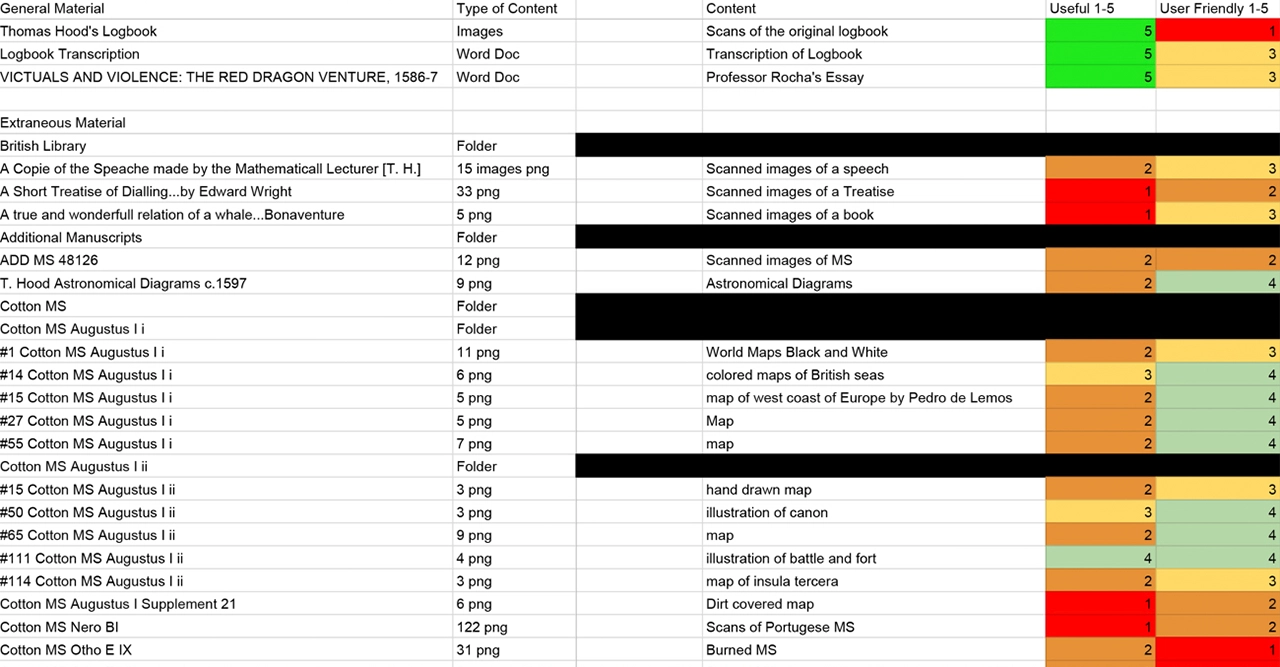
An extremely important and underrated part of our project was content management. Given the extent of the research that we were provided, it was important to determine what exactly was important to keep so that we could articulate the story. On the Archive specifically, we needed to make sure that the content was organized in a manner that agreed with the pre-existing habits of researchers, and for students, the mental models built from the Voyage. From this, we found that organizing the Archive items in terms of Location, Author (or no author), and Media Type struck a nice balance of specificity without overwhelming the user. As we said in the beginning, while we want to make sure professional researchers find the Archive useful and appealing, it should also be accessible to interested students as well.
PROCESS
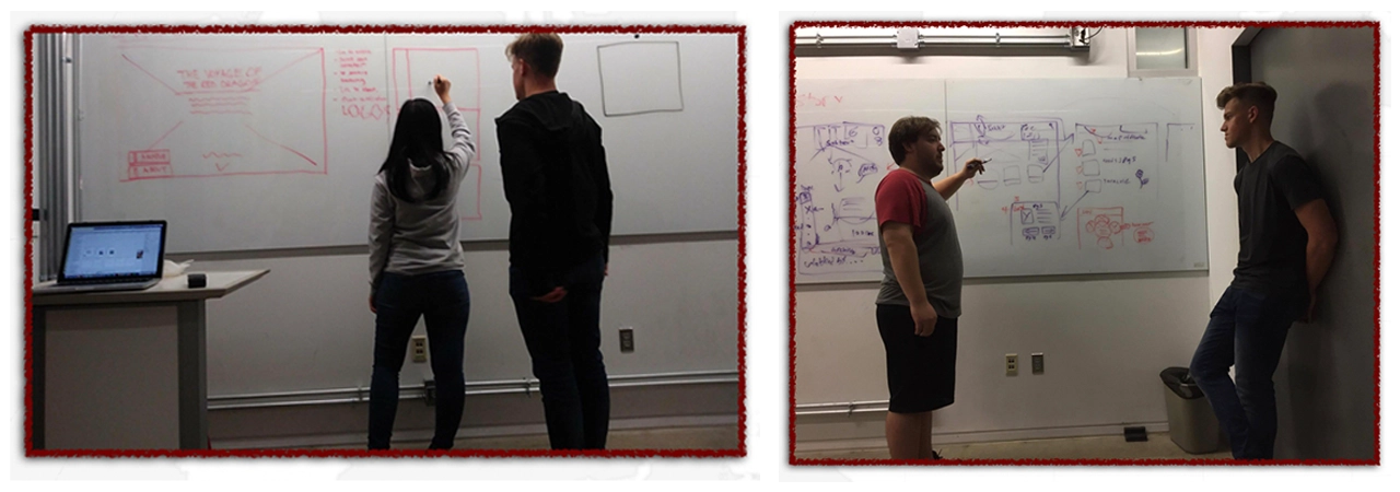
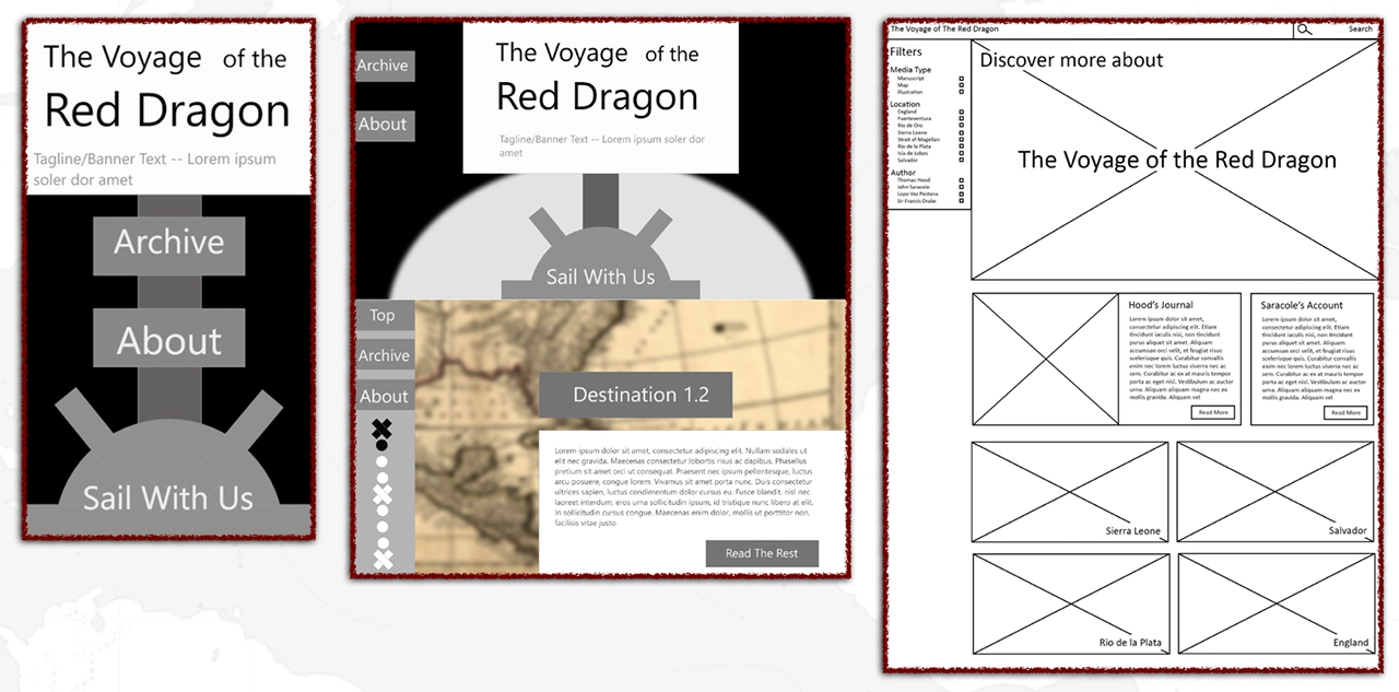
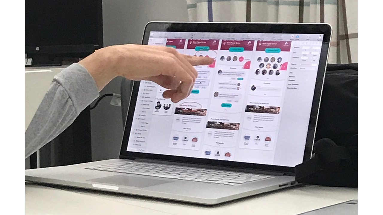
Now we get to design. We consolidated our ideas from the sketches and decided on a cohesive design pattern, which we presented in a low-fidelity wireframe.
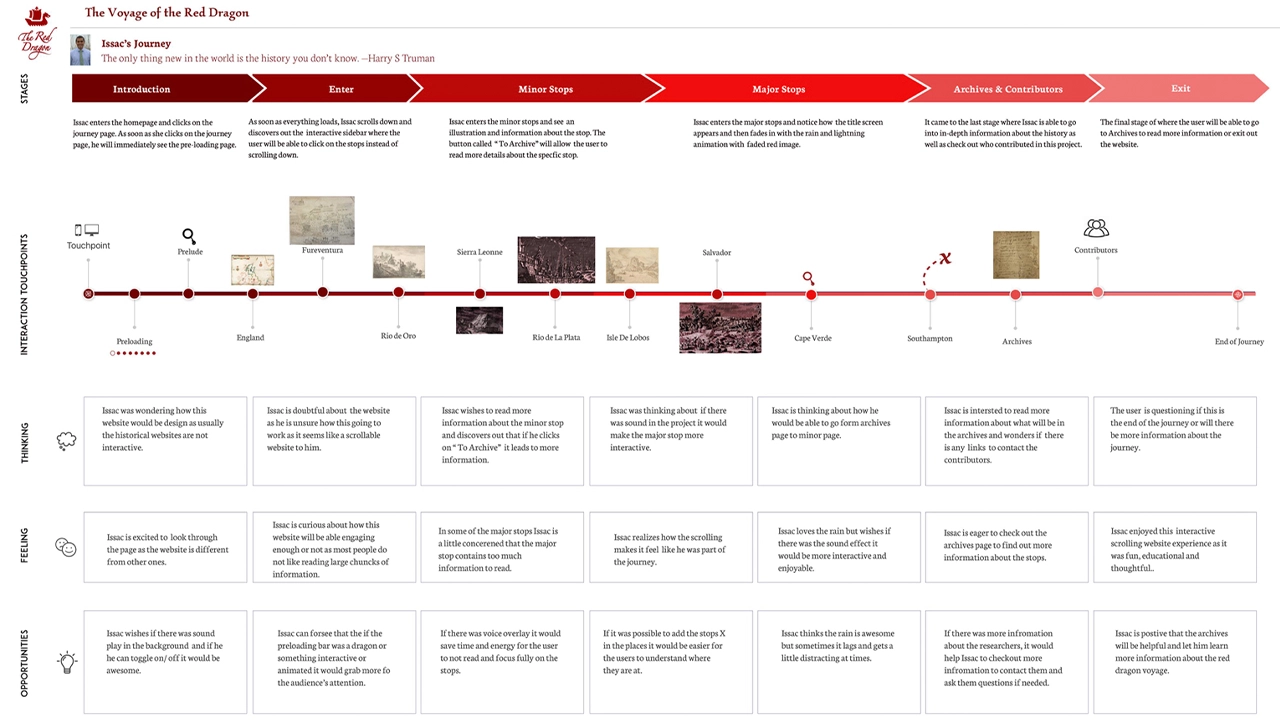
On the voyage, we were curious in what we could do to direct the attention of the user and how to differentiate the importance of information. One distinction we had, based off of our content management, was that some stops were more important than others. This was due to either that stop just having more content to work from, or actually being an important milestone or moment in the journey. This helped us differentiate into three phases: Large Stops, Small Stops, and the map. Large Stops are all encompassing and create a new environment to display the information, signaling to the user that they have arrived at an important moment. Small Stops display over a part of the map, which signals to the user that they should read the info but keep the context of the journey and the location in the back of their minds.
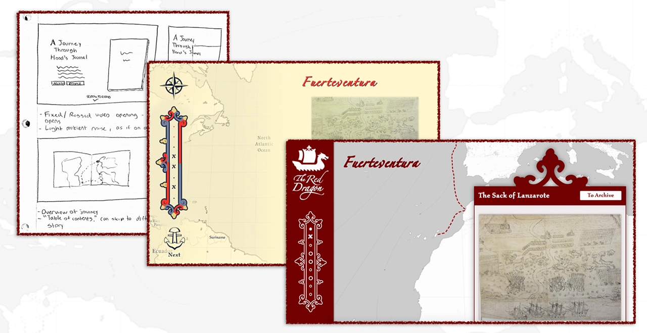
Within the stops themselves, we found that accompanying animations with the text increased the user’s likelihood of actually reading the text. Our initial conception of this was to have relevant images animate in, as if drawings in a journal, for different paragraphs. On large stops, the map will fade away and a full-screen image will draw in.
At this point, our team was ready to ideate on a potential visual style. We had one rule: avoid the “Pirates of the Caribbean” look. We wanted to avoid a visual style evoked by the cartoony feel that our culture sometimes displays pirates in, because the journey was an actual historical moment, not a fictionalized Disney franchise. In fact, part of our inspiration was to capture the violence (and there was violence) that accompanied The Red Dragon’s journey in a subtle way.
The reason we initially used this style is because the core of the research comes from the journal of Thomas Hood, and we wanted to communicate this visually. There is also a lot of content which we had, such as journal pages and drawings, that already fit into this visual style and we could then repurpose to use on the website.
We then proceeded to apply this style, which resulted in our mid-fidelity wireframes and mockups:
After our mid-fidelity, we realized that there were problems with our visual style. We all felt strongly on the handwritten, journalistic aesthetic, but we simply didn’t have the skills to produce this to the level that would bring it to life. When you are creating a style that bridges two mediums together, the balance is so precise that it is easy to fail in producing what you imagined. In this case, ours came off as amateurish instead of fluid and natural.
We went back to the drawing board: how could we display the qualities of the map and journal while bringing our project back into a more modern web aesthetic? Our solution used the same philosophy as contrasting Large Stops and Small Stops: hierarchy.
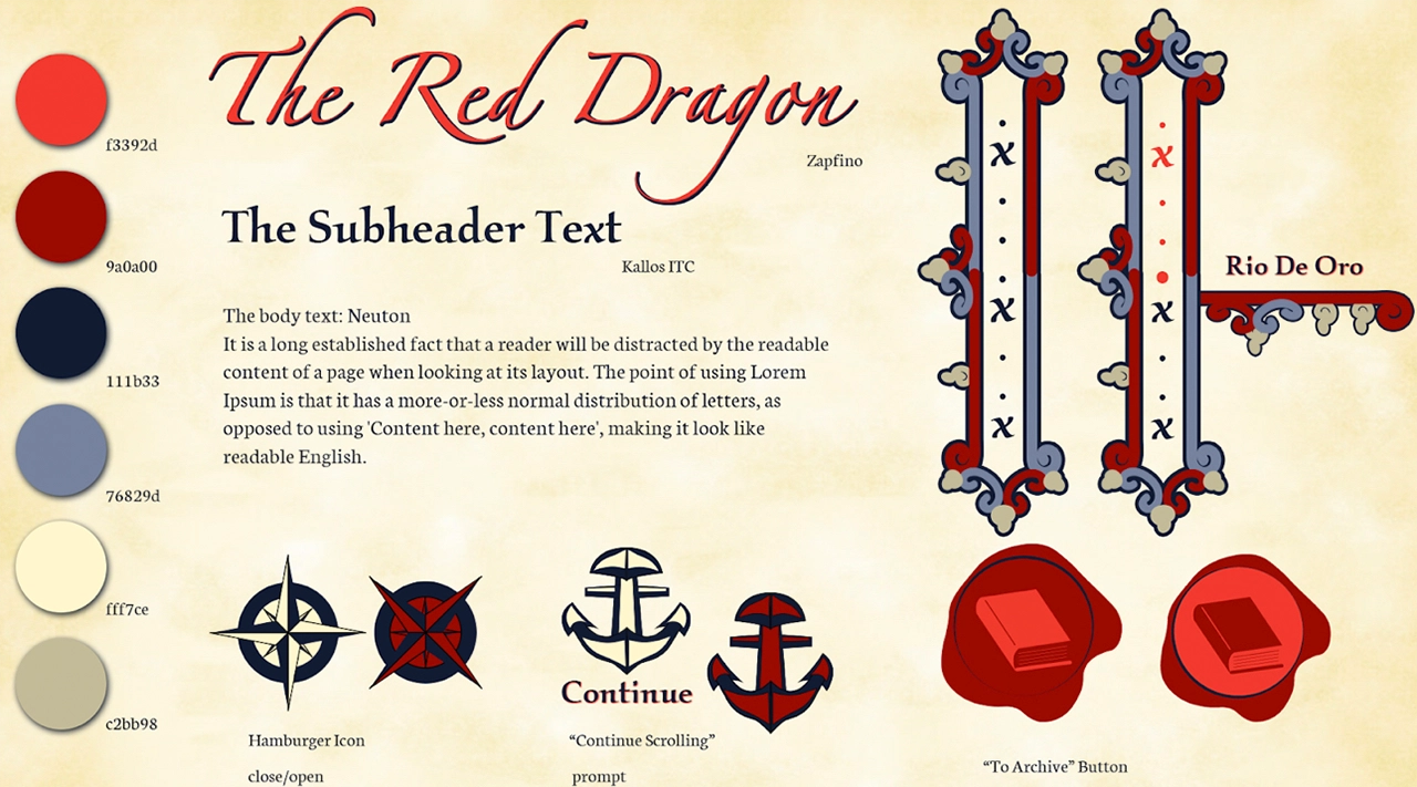
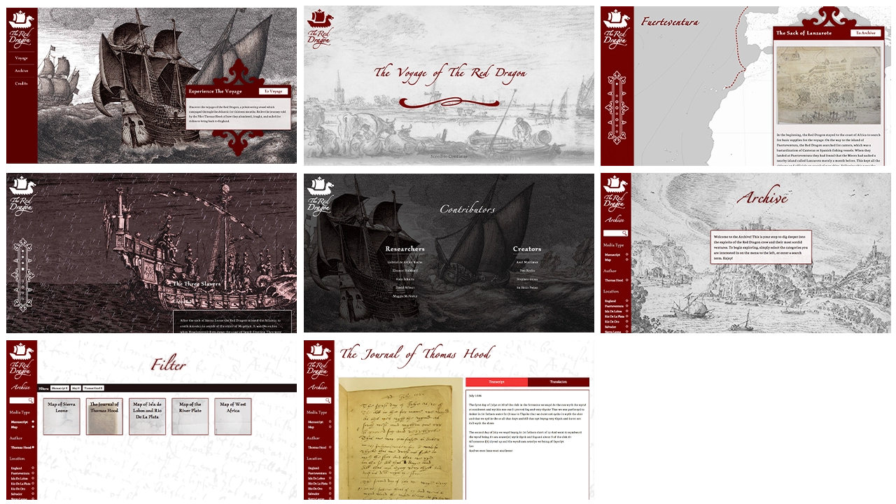
In our new aesthetic, we kept the hand-drawn content we had already but reformatted it in grayscale, then used a strong, dark red to draw the attention of the user to certain points along the journey. These red accents almost ubiquitously mark what we want to user to pay attention to as the journey progresses; one example being the dotted line that connects each stop of the journey. This new aesthetic allows us to present the content we were given from the journey, and display it through modern web design principles to bring it into the new digital world.
This project had us using current web development languages (HTML, CSS, JS, PHP), but also was cause for each of us to learn new technologies, including ScrollMagic, Mapbox, and WordPress.
As we have elaborated on previously, a huge part of bringing the journey to life is giving the user the feeling that they are progressing the story forward. To accomplish this, we used ScrollMagic, a javascript library for binding events on page location. This means that when a user scrolls over an element that has a ScrollMagic binding, we can change CSS or call a function in response. This allows us to also insert large images when the user enters a Large Stop, and other similar design features that enhance the storytelling experience.
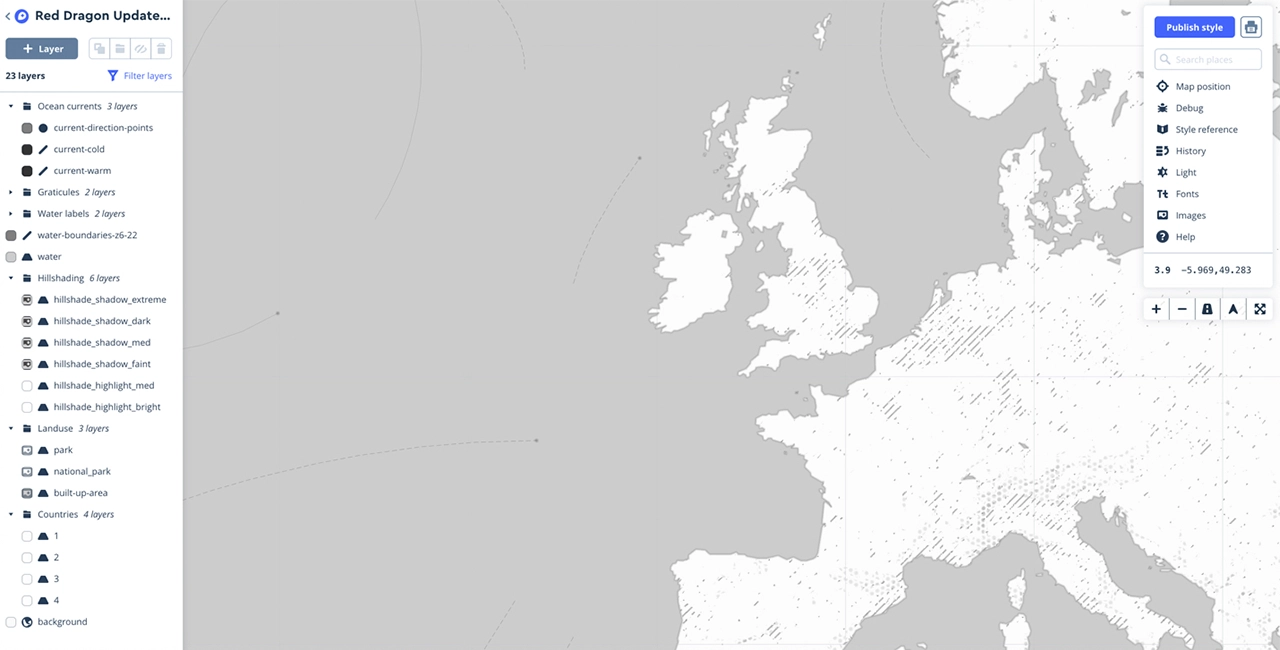
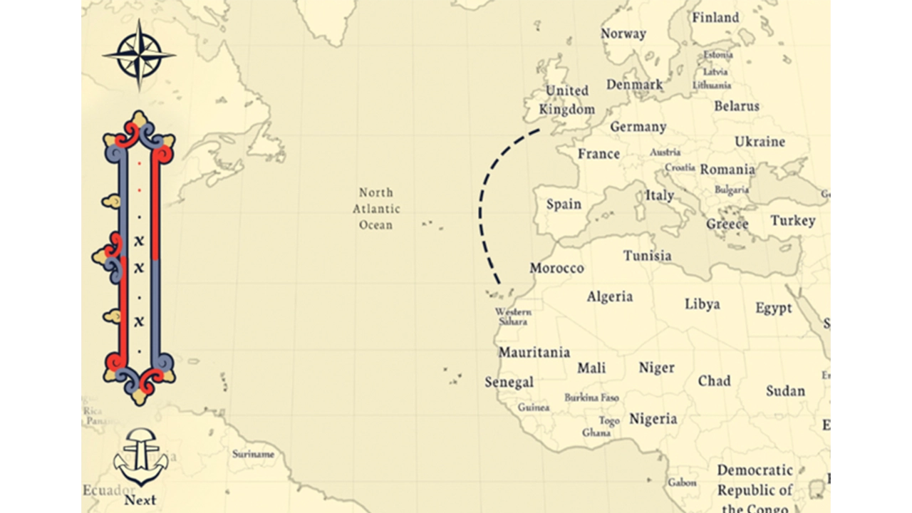
The next part to implement was Mapbox. Mapbox is a custom map and location data platform, providing custom maps which can be inserted into websites and applications. Thanks to their comprehensive API, it is easy to add functionality on top of the map itself. Unlike Google Maps, you can also add custom styles; this allowed us to create a map that looked as if it was drawn, while maintaining the interactivity of a Google Maps insert.
One feature is allowing developers to insert data in the map, which includes lines and markers. Interestingly, Professor Rocha has a working log of the ship’s approximate latitude and longitude, and we can use these coordinates to draw in the actual journey of the Red Dragon crew.
Unsurprisingly, we combined this and ScrollMagic:
Once the user finishes a stop, a ScrollMagic binding is triggered and we call a function that adds these coordinates into a Mapbox layer. Every time a new coordinate is added, Mapbox is refreshed. This creates the feeling that the line from stop to stop is being drawn in, as if on an actual map.
Mapbox uses WebGL, which can be intensive on less powerful hardware. Our site is experimental, so we can only do so much, but we wanted to do our best to make sure as many people as possible could use the site. This included making sure all code involved with scroll events was combined into our ScrollMagic script, reducing the file size, simplifying the data on the map, and being specific on how the browser renders each layer so the site is not constantly refreshing the animations.
The other component was the Archive. Professor Rocha expressed his desire early on for the Archive to be a space where he could add to his research after our part of the project was finished. Due to this, we had to create a space where he could input content without the need of a developer every time there is a new discovery. Therefore, we decided the best practice would be to create an archive using the popular content management system WordPress. We developed our own theme that would properly showcase the two main content types we identified. We focused on Maps and Manuscripts, as there were only a few Illustrations in the research which were not directly relevant to the voyage. This involved creating a function that would hide and display the individual posts on the homepage to present the content to the user in an easily digestible way. The filtering is utilized by a sidebar which contains checkboxes for all of the categories that are populated with posts. When a box is checked on, all posts within that category will display. This uses an inclusive filter so posts from every category will show regardless of if they contain every category that is checked on.
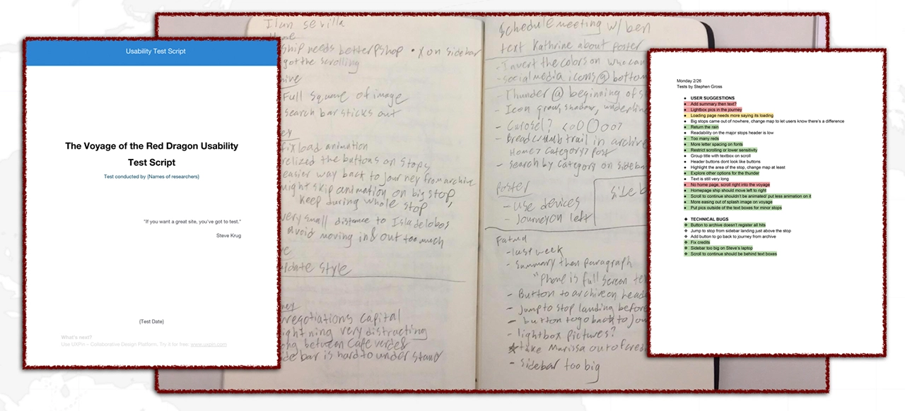
One prerogative we identified was the views of the user. We wanted as much feedback as we could gather for the site. Every member of the group was responsible of interviewing people and we also held several ‘open houses’ where members of the team set up a table with free cookies and invited anyone to test the site. For this purpose we had a script to follow so that each testing session would run similarly even if they were spread out in time. Once a tester was gathered we had them run through the site as they would naturally. From there we gathered useful data on their experiences using the interactions and the general flow of the site. This provided us with plenty of valuable insights that guided us through the latter half of design, development and bug fixes. We compiled documents of all of the testing notes so that the team could sift through the proposed ideas and filter which were relevant and in scope.
In many ways, the journey has just begun. We specifically designed parts of the site, like the Archive, so that Professor Rocha will be able to update the page as he discovers more about the Red Dragon. We hope that, as his research finalizes and is shared to a wider audience of students, that there will be an opportunity to observe students in live classrooms learning from our interactive journey and archive.
One of the most heartwarming reactions to the project came from the researchers themselves. In February 2018, a beta version of the project was presented by Professor Rocha to a gathering of researchers who were also working to uncover the secrets of the voyage of the Red Dragon. Even with a half-working version, they were dying to know when they could show it to their students.
Here is what Professor Gabriel de Avilez Rocha had to say about the project:
“Over the last six months I have had the good fortune to work with the IDM Red Dragon Team in ways that have approximated a client, a historical consultant, and a collaborator. Guided by my research into colonialism and slavery in the early modern Atlantic world, they have created a website giving users access to the transcription, narrative, and visualization of a logbook kept by the pilot of a sixteenth-century English war ship that went to West Africa and South America. The IDM Red Dragon team has taken a challenging task and delivered an exceptional end product. Scheduled to go live later this spring, the site is poised to make a significant contribution to teachers, students, and researchers across the English-speaking world.
To illustrate what I mean: At an academic History conference in UCLA this past February, as part of my presentation I had the chance to share the reddragonvoyage.com with a group of about 40 historians of colonial America and the Atlantic world – experts in the sub-fields of History where the logbook is most likely to be studied closely. Reactions were unanimously positive. Several faculty members approached me after the presentation to ask when exactly the site would go live, because they hoped to be able to incorporate the material into their courses. All of this is a testament to the great work that the IDM Red Dragon Team put into this project. The historians at the conference could tell that reddragonvoyage.com is a well conceptualized and comprehensive site that manages to express complex content in a straightforward, user-friendly manner. They appreciated that the site’s dual structure of narrative map and archive allows different users the choice of reading and visualizing a narrative of the voyage, or digging into the manuscript material themselves.
From the beginning, the students’ approach to the project was attentive, thoughtful, and methodical. In all interactions, every member of the team conducted themselves in an impeccably professional way. I was impressed by how the team maintained great rapport with one another while problem solving and delegating tasks. They were dependable, effectively communicated next steps, incorporated feedback, and were also courteous and easy to work with.
I should also note that I appreciate how the team has built space for growth especially in the archive section within the website in its current incarnation, essentially giving me a foundation upon which I can continue to build and refine the content. I currently have plans to translate the content into other languages so that more people across the world with internet connections will be able to access the site’s content. Thanks to the IDM Red Dragon team, a growing community of scholars, educators, and students will gain a lasting digital resource. Bravo and thank you!”
Here are some final lessons that we learned as a team to leave you with:
It’s hard to introduce a project like Souvinear, especially when talking about where the idea for the app stems from. In it’s original incarnation, Souvinear came from two unrelated concepts for projects in our IDM workshop. Anisa had an idea for an app that was used for journaling the experience of a concert, and finding ways to store information about the night before, along with a possible concert recommendation feature. Tori came up with an active way of sharing music, that involved people pinning songs to a specific location that they could share or add to a collection inside the application.
However, these two ideas aren’t completely unrelated from each other, considering both concept applications focus on one thing: sharing music.
The problem that Souvinear wishes to address with our application is the lack of humanity in sharing new music. In a world where algorithms and computer learning runs rampant, we’re trying to bring the human element back to sharing music. Our platform allows you to recommend hand-picked music, record what happened the night of a concert, and enhance your planning, preparation, and overall experience of the night – all within one application.
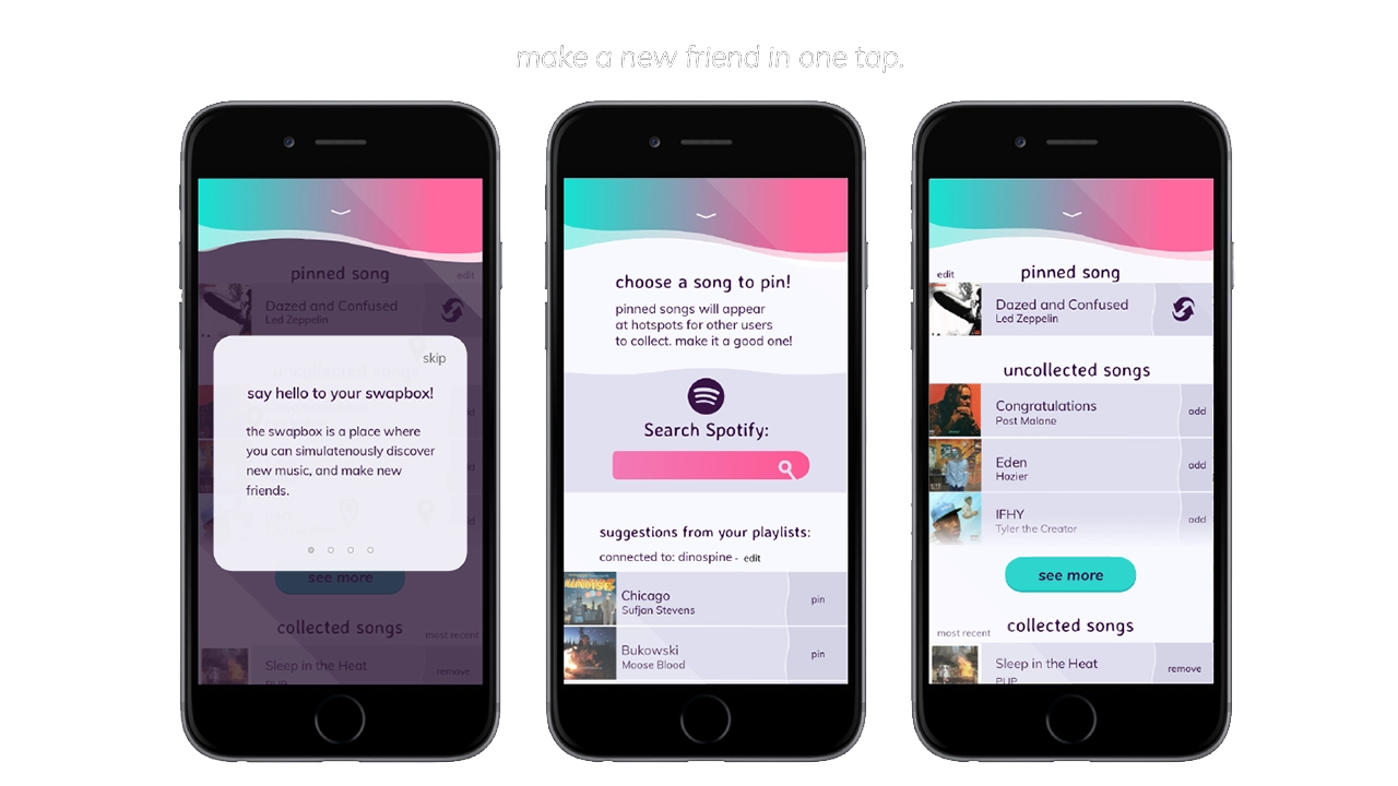
Before Souvinear, discovering new music and finding new shows was rather tedious; it was even misleading at times. However not all are entirely bad user experiences – Spotify does a great job at assisting in the discovery new artists, which is why we are using their database to fuel our song swapping. Despite this, discovering new music through these means still feels impersonal, being that the songs are picked based on popularity of the track, as they’re inserted into the playlist.
As far as saving memories from a concert, there isn’t really an app that effectively lets you store your photos and thoughts in an easily accessible database. Storing photos has to be done through several apps at a time, and can be either incredibly overwhelming when accessing media related to your favorite artists.
As far as getting to a show it’s the total opposite. There’s no effective way to coordinate a plan with anyone, as well as seeing who’s going to a show ahead of time, outside of Facebook events or ticket website pages. There’s also too many options when it comes to accessing this information, which creates a cycle of bad user experiences when it comes to locating these events. A good example of one of these kinds of concert recommendations applications is BandsInTown, an application that many users cited having a poor experience with when referencing our applications.
With this information and the copious amounts of user testing, we were able to build Souvinear so that it’s catered to the frequent concert goer and niche music listener.
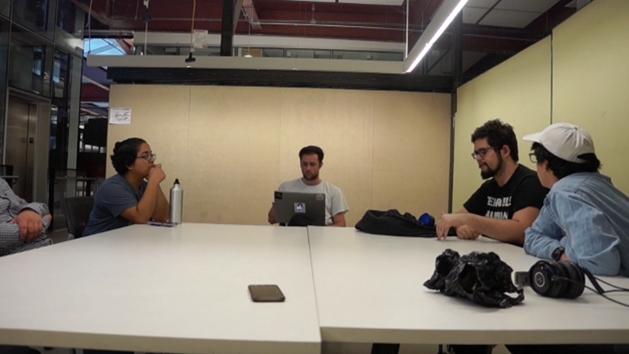
The audience for this application is just as important as the idea of selling our theme of enhancement and convenience in a concert/music discovery setting. We began identifying these user groups researching into who our target users would be for an application like Souvinear. Focus groups of a few potential users were brought together, asking what they would want to see out of an application like this.
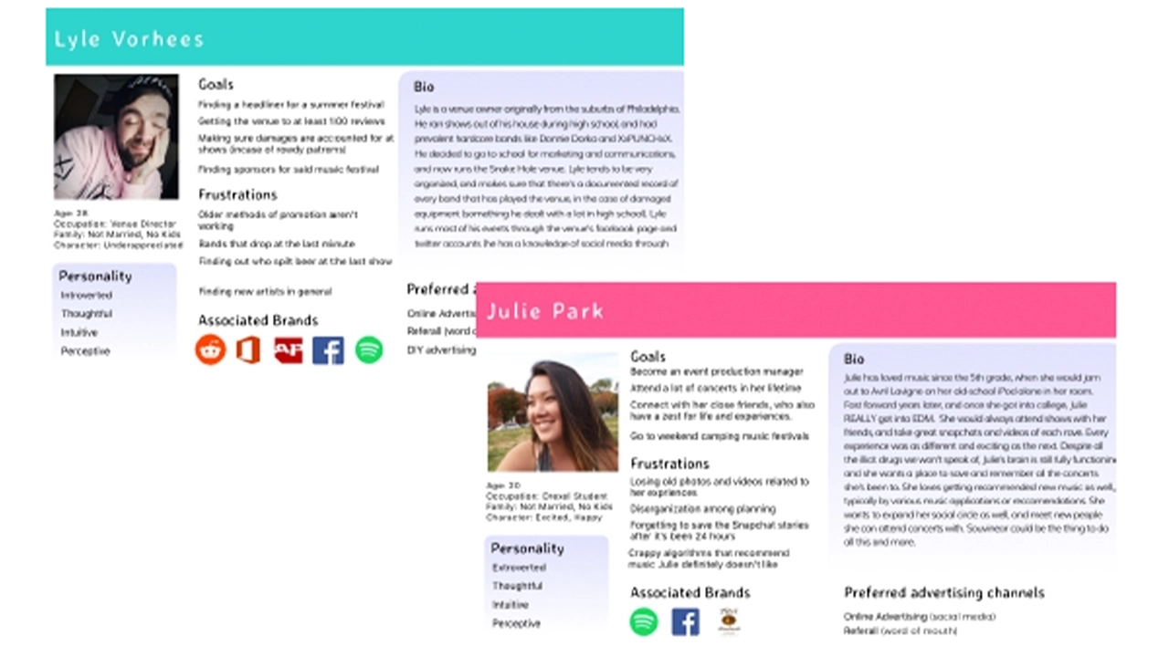
Our questionnaires were focused on asking questions about the user’s listening patterns, and the frequency of how often they go to shows. We then expanded upon this technique with the overall look of the application through online surveys via google, pulling in results from a niche music Facebook group that Jake administrates.
The results were overwhelmingly positive, helping us achieve what our target user base is, and provide the tools to create the fully fledged visual design that we currently are using in Souvinear’s most recent iteration.
We realized we wanted to be able to connect these users with their ideal concert experience. This is where the social media aspects of our project come into play, as they allow users to interact in a way that helps them organize into events and achieve their ideal concert experience.
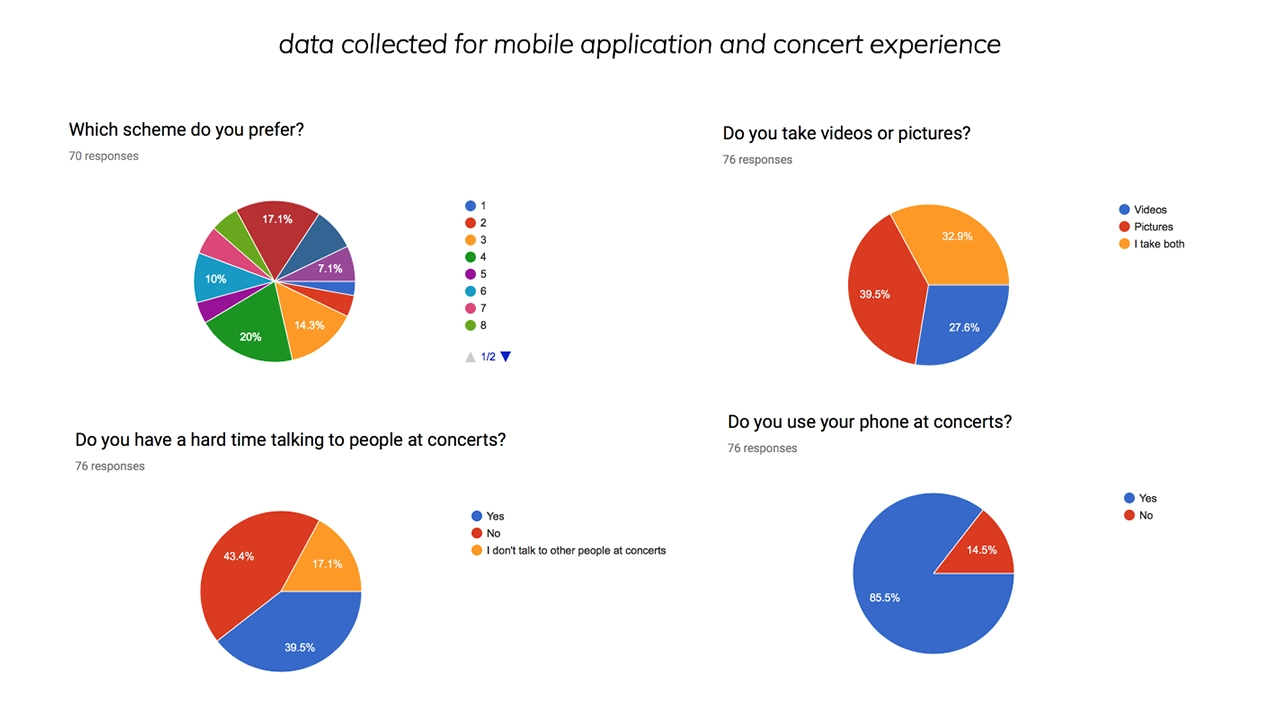
This need arose from some questions we asked users about how they feel when they’re actually at the concert. In our surveys and usability tests, we asked if they go to concerts with people or by themselves. One person specifically stated that they preferred to be by themselves at a show, and when questioned further, it was that they didn’t know anyone with a similar music taste to theirs.
When asked how they could solve this issue, they asked if they could see their contacts listed in an event page, which is what set forward the social media proof of concept that we created. With that intention in mind, we figured that we could create event pages for upcoming shows, that could be a place where people can discuss what they saw at a show publicly in a contained area. We also integrated a group chat feature, where users can create a group with their friends to congregate and organize the night as it begins.
The whole reason we developed it this way was so that our niche groups can commune and get together, and eventually plan the night accordingly all within the application, so that we really can create a one-stop easily accessible platform for not only exploring concerts, but even getting to them.
After countless user tests and iterations of code and development and visual design we finally came to something a bit more concrete than what we started with in fall term. Moving forward into senior project, we plan on expanding and innovating our project further, and making this platform from into a reality. Our development team has worked hard on creating a reliable backend that can store journal entries, and a visual pleasing and engaging front end.
The social media features will keep getting tested, and will probably change, but we plan on keeping the intention of them still there, which is to make the concert experience engaging and inclusive. We want to bring people together and enjoy music. Connecting it to the existing screens was already a challenge, but we overcame that by doing what we do best as IDM students, iteration and testing. This project has been a wild ride of ups and downs, but our team has stuck it out and met those challenges head on.
Our names are Jake, Tori, Kristen, Anisa, Kam, and Kaitlyn, and we are proud to present to you Souvinear.
Every day hundreds of people pass through Drexel University’s URBN Center, home to the Westphal College of Media Arts and Design. This winding maze of a building features endless staircases and a disorienting numerical structure that leaves its visitors struggling to find what they are looking for. I worked with a team of students to develop a mobile wayfinding application to help people successfully navigate the building.
This project used Estimote beacons. They are Bluetooth enabled sensors that can transform any building into a location-aware environment. Think in a sense like when you use a GPS or an app like Google Maps. Those devices are getting your location from a satellite way up in space. When you’re indoors, the beacons act like those satellites, being able to grab your location while you’re in the URBN Center and therefore make our app possible. With this initial technology we were ready to make our app. We started our project with a solid foundation in design and user experience.
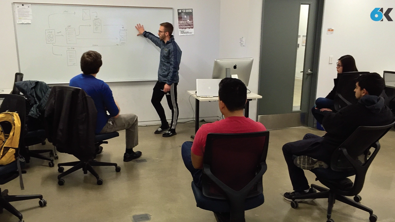
The team established three core values that were carried throughout the design process: “Simple, friendly and intuitive”. These served as a foundation to lean on in the face of the various design and development challenges that were experienced throughout the life of the project. The team utilized whiteboard brainstorming, user interviews, and quick iterations of wireframes to settle on screen layouts and a flow that they felt optimized the way-finding process.
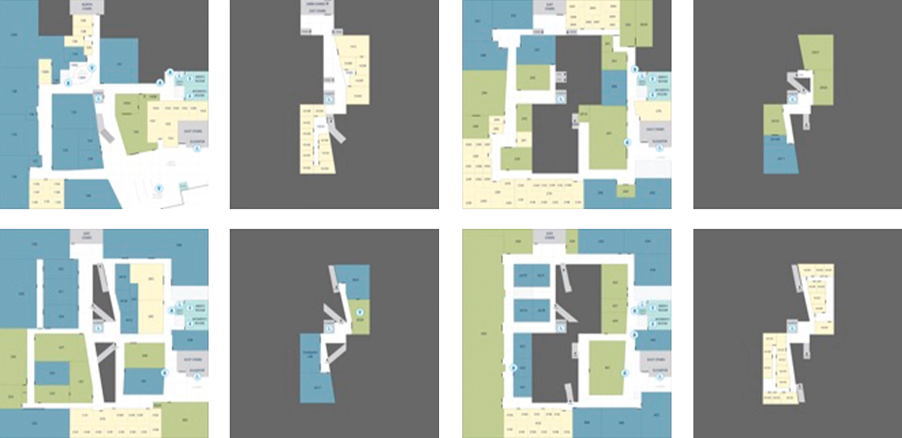
They developed a visual style guide based on the research and defined rules for the general experience, and made sure that the two worked alongside each other. They moved through a few iterations, and the final look is ultimately very much in line with the core principles. Next, they developed custom map designs, iconography, colors schemes and layout patterns that all work together to make for a refined and effective experience. They simplified the architectural floor maps by combined with our iconography, we used different colors to distinguish a classroom from an office, or an open lab, allowing users ease of use. Altogether, we incorporated these styles throughout the different floor levels into URBN Explore, to present the maps in a more clear and concise way to our users, as well as bring a better grasp on the space as a whole.
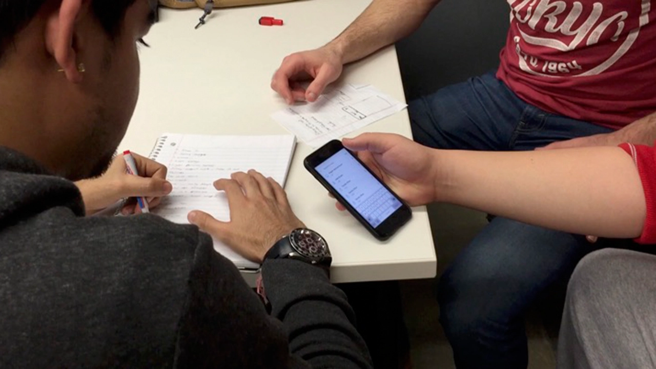
While the core functionality of the main app was still being developed, they created a prototype using a software known as Pixate. While this software did not have any of the actual location based functionality, they were able to simulate the kind of flow the users would go through when they opened the app. This involved things like what buttons they press, where all the elements are located, and the general timing of each step throughout the app’s workflow. With this prototype in place, they were able to get feedback from a bunch of potential users on the look, feel, and structure of the app’s workflow. They collected a lot of feedback regarding what did or did not work. They would then update the prototype based on based on their findings from these usability testing sessions. With this working prototype in place, the development team knew exactly what the real app needed to be as they worked on making it actually functional.
The majority of this app was made by using a software framework known as indoo.rs. Indoors is great because it allowed the team to build the app for both iOS and Android devices. They used it specifically to create the maps necessary for the app to function. The process starts by importing the map files that were created by the design team. Then defining the walls in order to label the rooms, and portals to let the app know how to plan its routes through the hallways, staircases and elevators. Now with the maps ready, the rest of our development team could start to build the app that would guide our users through them.
With the app, when a user needs to find a room, they can start by searching for it. The main search feature filters its results based off of the room number that all Drexel students see on their class schedule. However, the app can also filter the rooms by what technology it has in it, what type of room it is, and even by the student’s major. There’s a feature to let visitors take a pre-defined route of rooms based on major. The app gives users the ability to toggle on wheelchair accessibility so the app can recommend the best route for them to take. And last, but certainly not least, is the button that will guide users to the nearest restroom no matter what floor they are on.
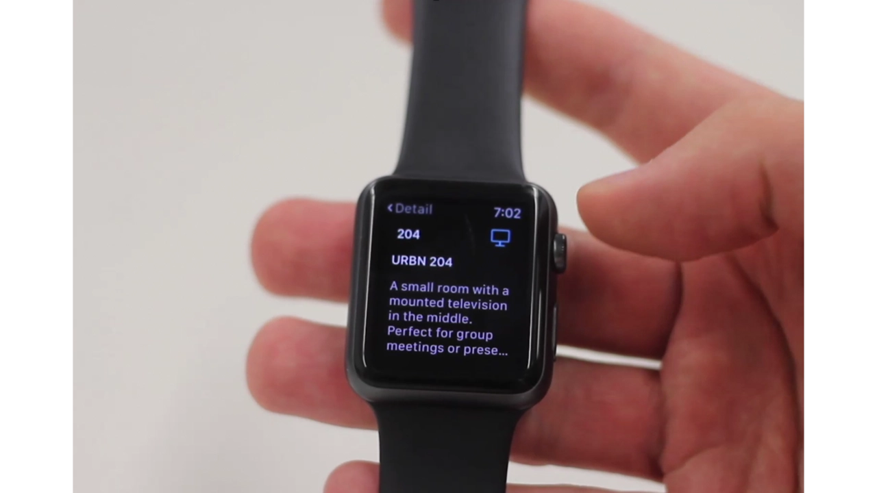
For the Apple Watch, they created a companion app to URBN Explore iOS app. This app gives the user subtle, non-interfering updates such as identifying what floor they are currently on, keeping them on track for the room they need to get to and notifying them of some engaging information about the room once they’ve visited it.