IDM362: Interactive App Design II
By Wooyoung Song – 2019
IDM362: Interactive App Design II
By Wooyoung Song – 2019
IDM362:Interactive App Design II by Erin Wiegman
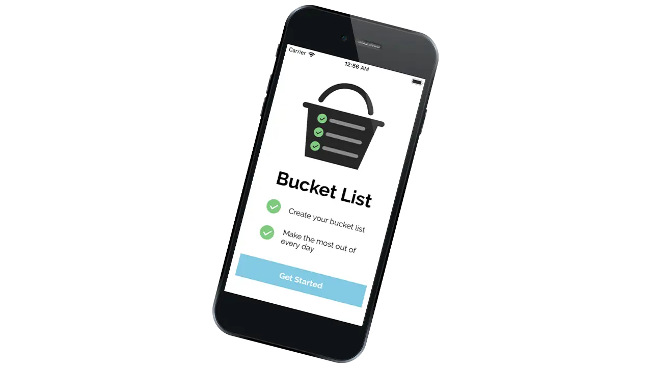
In just 10 weeks, I created “Bucket List,” a native mobile application built with Xcode and Swift. Users can add to and customize goals on their bucket list and easily check them off. I love making to-do lists and checking off tasks, so I chose to create a list app. After some research, I found that there were many to-do list apps available in the App Store but not specifically bucket list apps. Due to various design choices and some programming challenges, the end result of this app turned out differently from what I initially expected but overall successfully provides a user-friendly experience. Read the sections below to find out how I tackled this project.
When I was younger, my friends and I had an email chain where we would add our own goals to a “master” bucket list which we all shared. Since I was only a kid I didn’t think of the typical bucket list goals – skydiving, bungee jumping, etc. – instead, my goals tended to be much more accessible – water balloon fight, ice skating, etc. Along with my friends, I noticed that I always added items to the list based on what season it was. I wanted to make sure I got the most out of every year. Consequently, choosing which season each item on the list will be accomplished became a focus of my design for this app.
Working in Xcode for the first time was a major challenge throughout the process of creating this app. I was constantly researching how to do what I thought were small tasks (e.g. change the color of a button). Because I am a beginner with Xcode as well as Swift, working on this app proved to be very time-consuming and complex.
I started this process with a lot of sketching in order to get out as many ideas as possible and as quickly as possible. After I had sketches for each screen of my app and established a user flow, I began creating digital mockups directly in Xcode. At the same time, I created an app icon in Illustrator and chose a color scheme, font, and decided on the styling of buttons, headers, and icons, and more. I wasn’t sure exactly what I would be able to do in Xcode and because of this, my design decisions changed a lot.
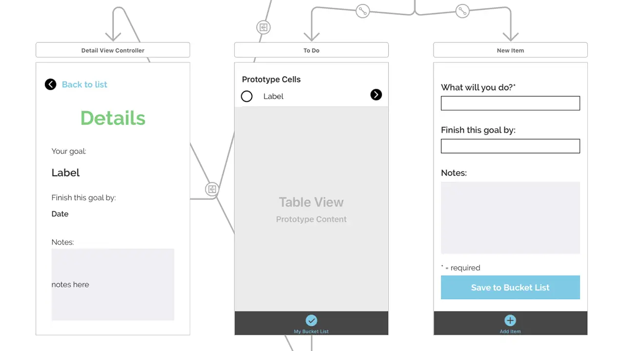
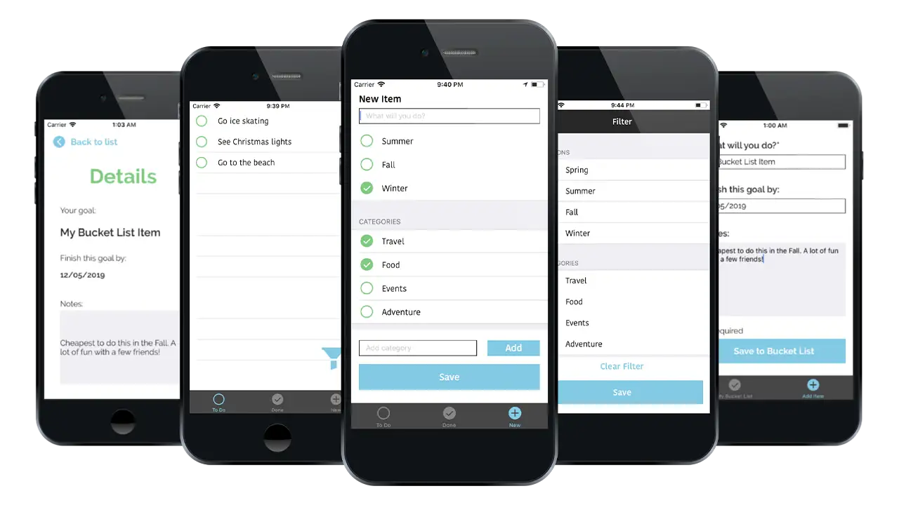
My initial design involved 3 tabs and a filter view. The first tab was the “to-do” screen, the second was the “done” screen, and the third was the “new item” screen. Users could see all of the bucket list items they have left to complete on the “to-do” screen and all of those they had completed on the “done” screen. They could add a new item on the third screen and assign it a season and/or various categories that they could create themselves. Users also had the ability to filter their “to-do” list by season and/or categories and swipe left to delete an item. I kept the interface for each screen very simple and used a circle motif for the incomplete, complete, and new items.
After learning the basics of core data, I struggled to apply it to these designs. At first, I felt that it was important to have both the “to-do” and “done” screens so that the user could see their completed items and uncheck items if they felt they weren’t complete. I realized that this was actually unnecessary as it’s rare for a user to take an item off of the completed list once they have checked it off. Additionally, the app does not have the ability to delete all of the items on a list at once, the user can only delete items individually, meaning they would have to swipe on each item on the complete list to clear the list. Rather than add another feature to fix this, I chose to remove the “done” screen and simplify the app.
I also struggled with the filter functionality using core data. If I were to continue working on this project, I would focus more time on creating the ability to filter by season because it was an important part of why I created this app. In the high fidelity version, I chose to remove the filter and allow users to instead add more information when they are creating a new item, including setting a date to complete their goal and adding any important details to remember. They can then click the item on the “to-do” screen to see that information.
Although the end result is different from what I designed in the beginning, I am still happy with the outcome of this app. The challenges I faced allowed me to learn a lot about Xcode and Swift in a short period of time, and I am ready to apply those skills to the next app I create.
IDM362: Interactive App Design II by Victoria Stewart
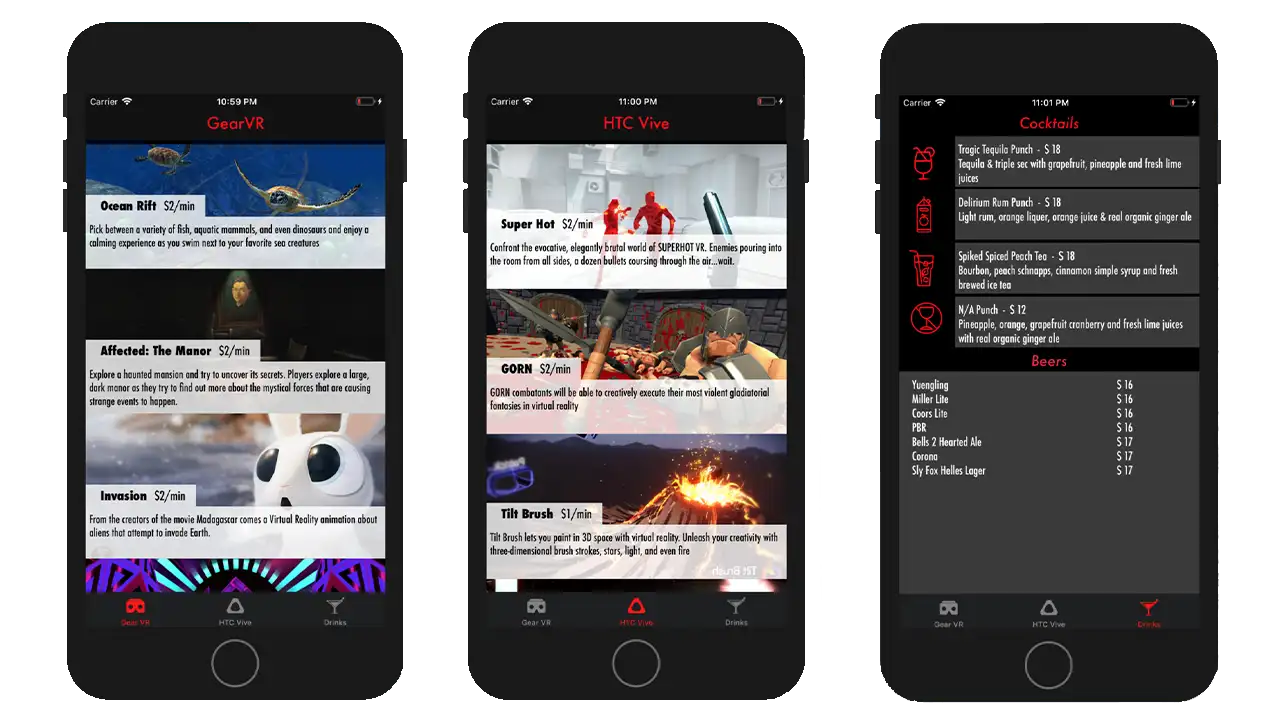
The app ended up spreading across three pages with a tab navigation at bottom. Important pieces of information are highlighted in red, with the main focus, the game entries, taking up 100% width of the device, stacked in a scrollable column. Upon clicking an element, the user is taken to an new page with all of the information one would need to know about that VR experience displayed individually.
IDM362: Interactive App Design II by Corey Hensley
Before tackling this project, I had never touched Xcode, which is an integrated development environment for mac operating systems, and contains software development tools developed by Apple for developing application software for apple devices. After learning how to make mobile web application during a college course, it was only logical for me to take a follow up class that dealt with creating native applications using Apple’s Xcode application creation software.
For the project I wanted to create a intuitive tipping calculator that was easy to download and use without any confusion. Within this case study I’ll be explaining the execution from inception, to design, to implementation, and finally to becoming fully functional.
In the fall of 2017, while attending Drexel University, I enrolled in Interactive App Design I, a course that focused on creating a user experience that was optimized for mobile devices. In the course, students learned to build unique web applications that would take advantage of modern mobile capabilities. While discussing possible class projects for me to undertake, it was suggested that due to the frequency in which I dine out, I should create a web application tipping calculator. I thought it was great prospect.
uTip Calculator has been 20 weeks in the making. The few weeks involved developing the app icons, button icons, basic user interfaces and creating responsive functionality that would display, or not display, certain content based on if screen orientation of the mobile device is in landscape or portrait mode. at the end of the ten weeks, I had a fully functioning web application prototype that allowed for me to input a single set of numbers and then use a slider to adjust the tip percentage; combined this gives any user their grand total with tip.
The whole reason, I got into this career field was for the prospect of working with mobile apps. Interactive App Design I allowed me create a web application. It was fun and I learned a lot, but to me, it wasn’t a true application; just a website that you can save to your home screen on you phone. Interactive App Design II, however, built upon the topics covered previously by exploring how to convert web-based applications into cross-platform native applications for mobile devices using Xcode.
The genesis of uTip Calculator was born out of my wife and I’s desire to frequently eat out and try new foods. We probably eat out two or three times a week. At the end of every meal I would pull out my iPhone and use the device’s default calculator app, input the bill amount, multiply it by whatever tip percentage I felt was warranted, then calculate that tip amount back into the bill amount to get the total amount owed. A very tedious effort and not very efficient. It never really occurred to me to download a tipping calculator application; for that matter, I didn’t even realize there were tipping calculators. This tipping calculator would seek to solve the issue of inconvenience; because let’s face it, after a good meal, when you are full and sleepy, do you really want to do math?
Working solo, I went into this project with just one simple goal in mind: make a tip calculator that works! Over time that goal expanded outward and milestones along the way were more clearly defined. Functionality was always paramount, with any type of user interface being secondary and only serving to present that functionality in a logical way. When I developed the web app version of the calculator, knew that I wanted to only wanted to have one input field with the tip percentage adjustment functionality being carried over by a slider. I wanted the app to be simple and easy to use. This mindset carried over to the native app. But after doing a bit of research, and looking at other tipping calculator apps, I knew I also wanted to add a split check feature; and this, too, would be executed using a slider. Once I defined and refined the objectives, I set out make those goals accomplishments.
I went about creating this application for my own needs. However, I think it’s safe to say that pretty much everyone goes out to eat once in a while. So the target audience for this app, is literally anyone with a smart phone; but more specifically, since I used Xcode, anyone with an iPhone. What follows is the processes I went through to create uTip Calculator …
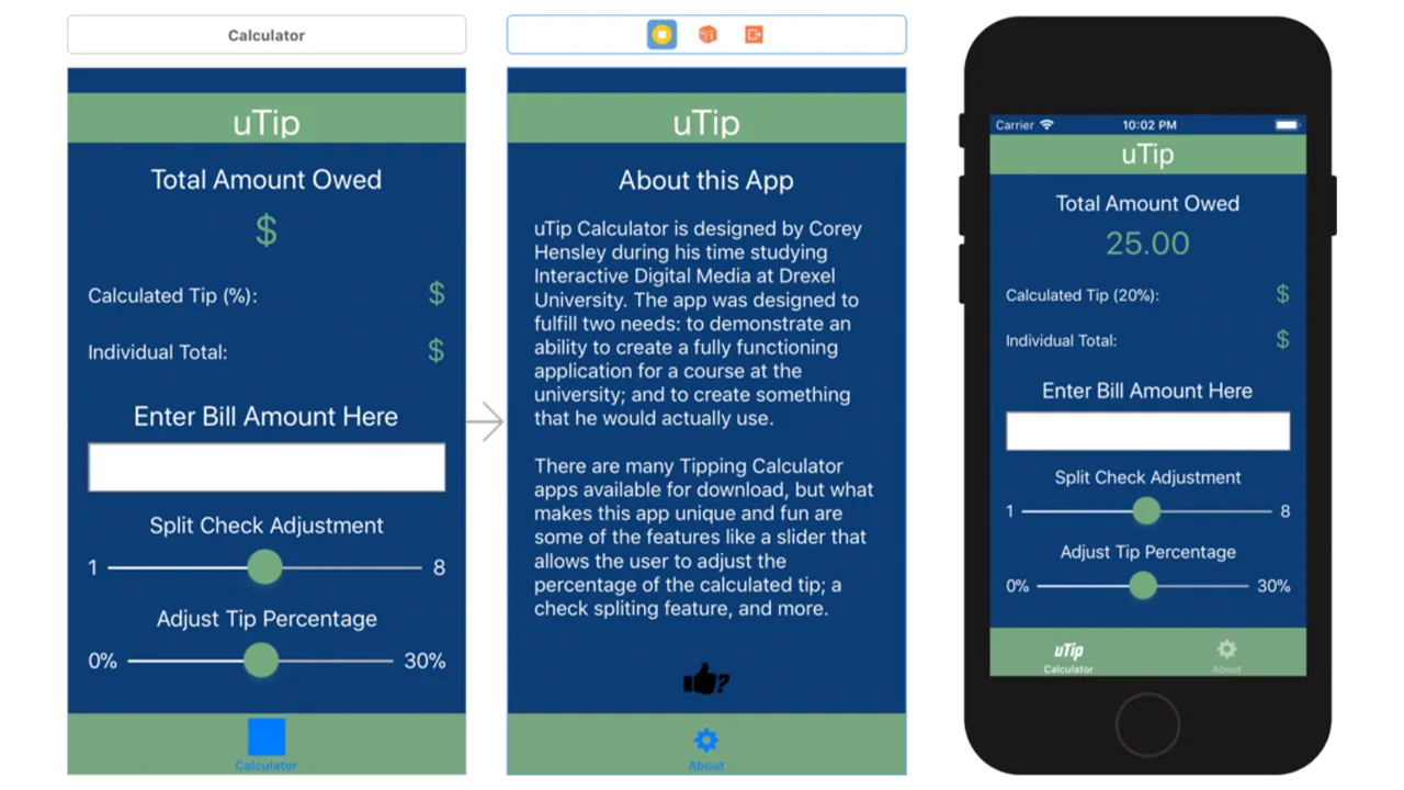
The App Icon: One first things I did, was to implement the app’s home screen icon into the assets folder in Xcode. I used the same icon that I used for the web version. The color scheme for the app wasn’t going to change even though I had planned on making some significant user interface changes. Because There are many different screen sizes and resolutions for a the various apple devices, Xcode encourages you upload various sizes on the same icon. In order to efficiently create all the required icon sizes I uploaded my template onto an online resource, makeappicon.com.
The App Wireframes: A lot of the initial designs are a little far removed from the finalized design; especially, the area for splitting the check. The first wireframe shows buttons instead of a slider, with an extra button that allows for additional inputting of numbers. I never fully thought through how the app would respond to the “Other” button being clicked; Would it have created a popup with an input field, or just show additional numbers. One thing I was sure on was that not only did I want the user to see the tip amount, but also what the tip percentage was. The idea I had, was to have the the label that says, “Calculated Tip (15%):” to update the default percentage of “15%” every time the user used the slider.
The second iteration of the design was a bit more refined. It was here that the vision of the app started to come together. Firstly, I got rid of the split check buttons and replaced them with a slider. I also switched the placements of the “Total Amount Owed” and “Bill Amount” text fields and input fields. This was not just an aesthetic choice, but a logical one, as it makes typing easier if the editable areas are on the bottom close to fingers and thumbs. Finally, I placed a bit of style adding more color and adjusting the font sizes based of the hierarchical importance of content. At this point in the process, the only working functionality was the ability to enter numbers into the bill amount input field.
Probably the most significant change for the third and final iteration of the wireframes for the calculator’s interface was to remove the white text boxes around all text fields that don’t allow for inputting data. Not only does make it less confusing to the user but it makes the bill amount input field standout, and in a sense directs the user to their first step. At this point, there was still only minimal functionality. But that was about to change.
One of the first real hard coding I did for the application was create a static output value of $25.00 for the total amount owed and a value of 20% on the tip percentage label. The purpose of this was two-fold: first, outputting these static values helped me gain a better understanding of how coding in Xcode works; second, it also gave me an avenue to explore on how I would code this particular application. You’ll notice in the calculator’s Xcode hosted user interface on the left that there are only symbols in the aforementioned fields; but when this interface is played through the prototype on the right, they are given values.
As you can see from the video below the app works! It was quite a process to get to this point. I would that probably the most taxing challenge I faced was getting the sliders to snap to designated whole values. At first I didn’t even contemplate that the sliders not snapping to values would be an issue, as they still worked at outputting a value. The problem was, I wasn’t getting precise tip percentages, nor was I getting precise split check numbers. The solution here was rethinking certain aspects of the code, going back to basics rethinking my approach to the code. Some key feature include: the keyboard pushing the content up so the user can see what they are typing into the input field; Both the tip percentage and split check labels, update with a value based off slider position.
On a whole I find the app a success. Given more time, I would like further develop the interface and refine the user experience. Perhaps in future updates I can create a rating system for the places, I’ve used my app in. This was a great experience, and got me excited to do more with mobile apps in the future.
IDM362: Interactive App Design II by Seamus Donaldson
“Quote of the Day” is a concept I came up with for my Interactive App Design course. Since this was my first time experimenting with apples integrated development environment, Xcode, I knew I wanted to create something simple so that I could focus on learning the basics. The concept for Quote of the Day came to me after seeing an inspirational quote on Facebook; my idea was to show users inspirational quotes every day from influential people on their birthdays, thus Quote of the Day was created.
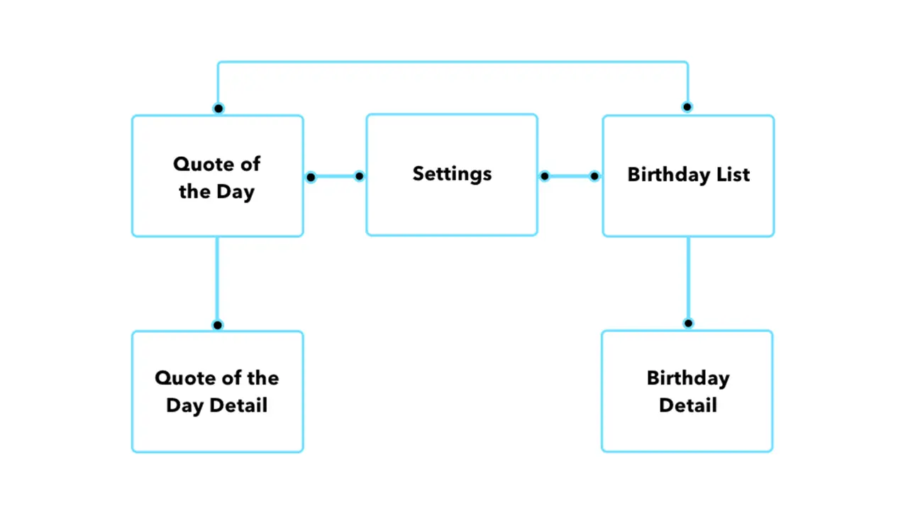
Once I had the idea for my app I needed to organize the content I wanted to include in a way that would make things easily accessible and user friendly. By creating a sitemap, I was able to clearly understand how users would get through the flow of the app. My goal was to make all pages accessible with just two taps.
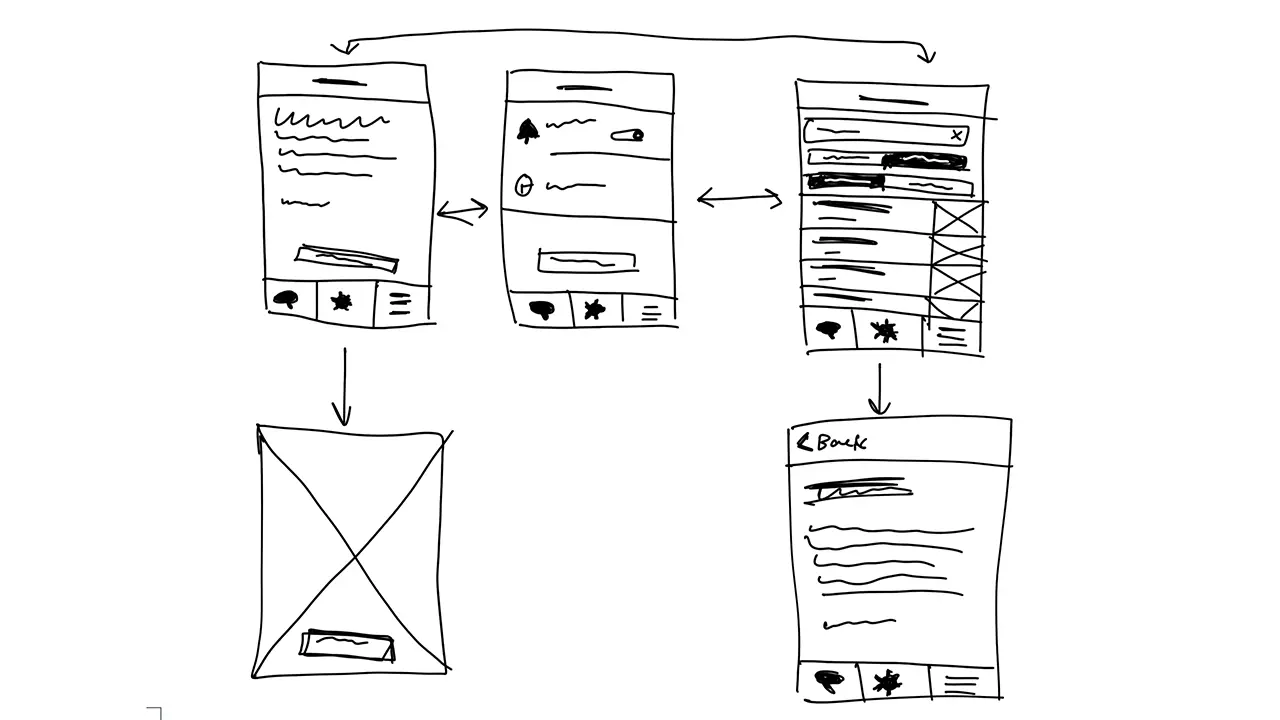
Before I could start designing my screens in Xcode I had to come up with some sketches that I could refer back to throughout development. I wanted the screens to be clean and free of all unnecessary content so I made sure to only include functional elements.
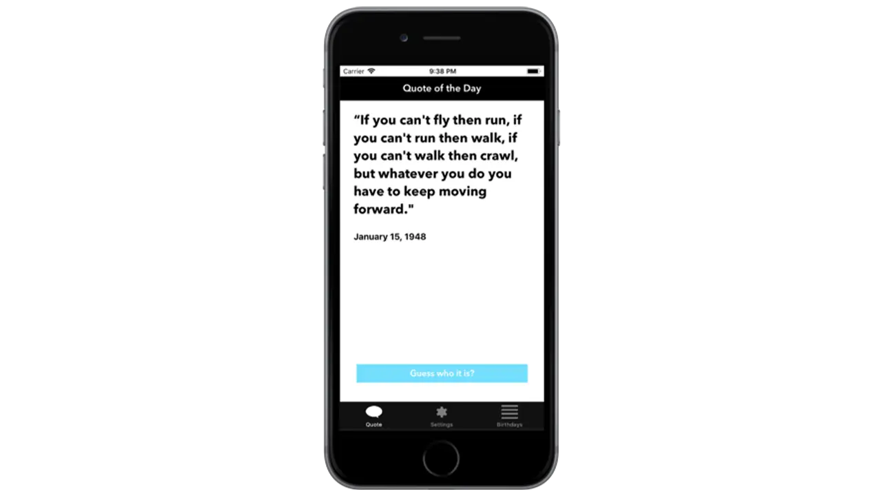
The first page I wanted people to see when opening up the app was the ‘Quote of the Day’. This is the primary function of the app so it made sense to show people the relevant quote of the day first. To make it a little more interesting I left out the name and picture of the person who’s being quoted so users could guess. Once a user had an idea, or just wanted to know who the quote came from, they could simply click ‘Guess who it is’ and the page would flip, showing the full portrait of the person as well as their name.
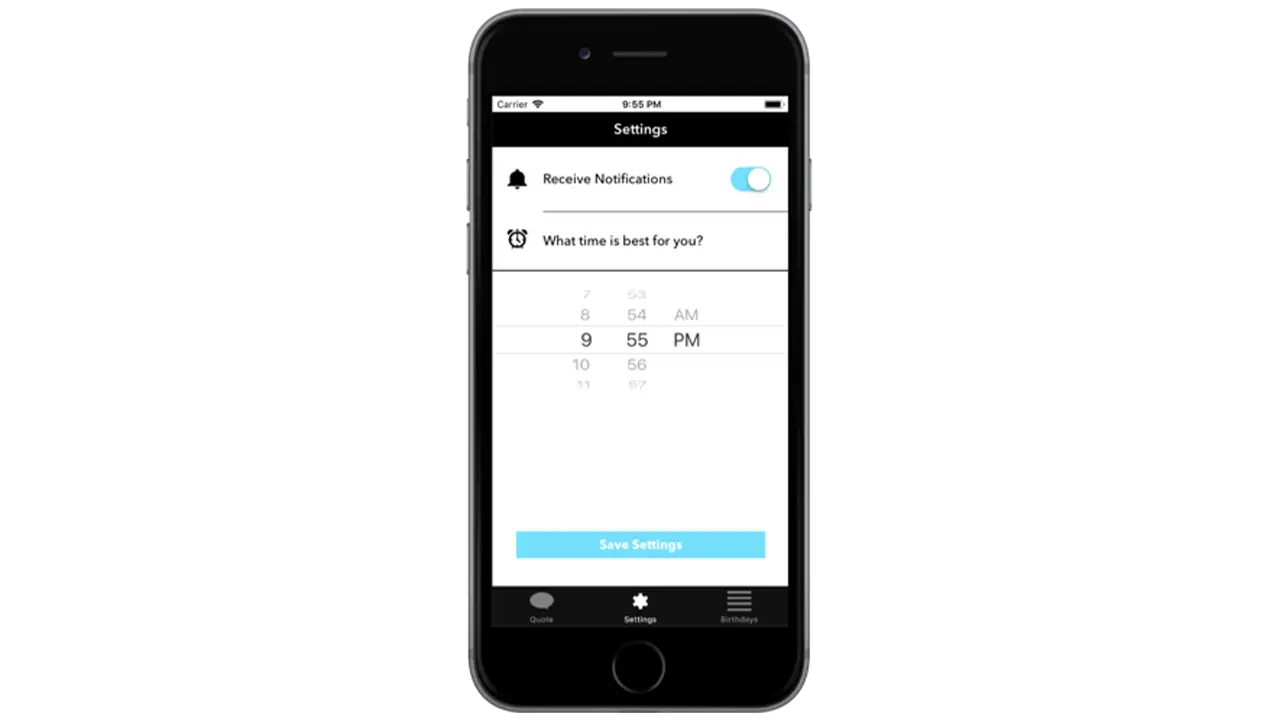
The settings page isn’t very interesting but when you’re creating a native app that takes advantage of notifications, it’s important to provide users with options for when they want to receive them, if at all. By simply asking users if and when they want to receive the notification for the quote of the day, I was able to create a clean and easy to understand interface that took advantage of premade elements in Xcode.
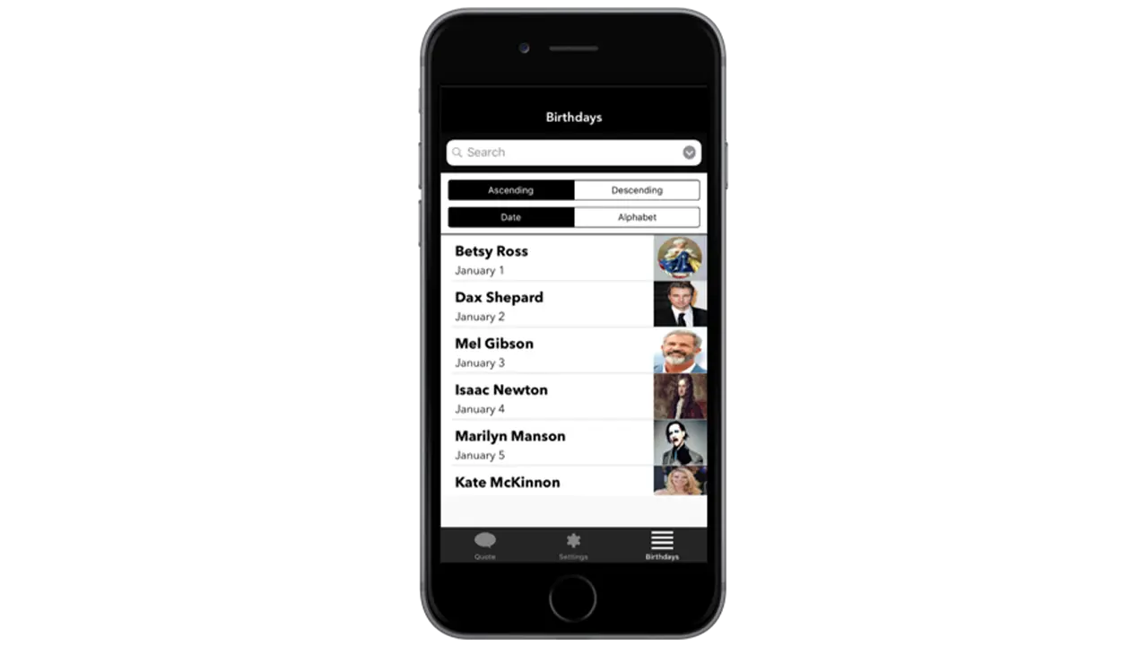
The birthday listing page is the secondary function of the app which is why it’s not the first page you see. If a user is curious to see more quotes they can go to the birthday listing page to see who’s featured on the app, and if they’re interested in seeing that persons quote, they can simply tap on their cell block and go to a detailed page that shows their quote.
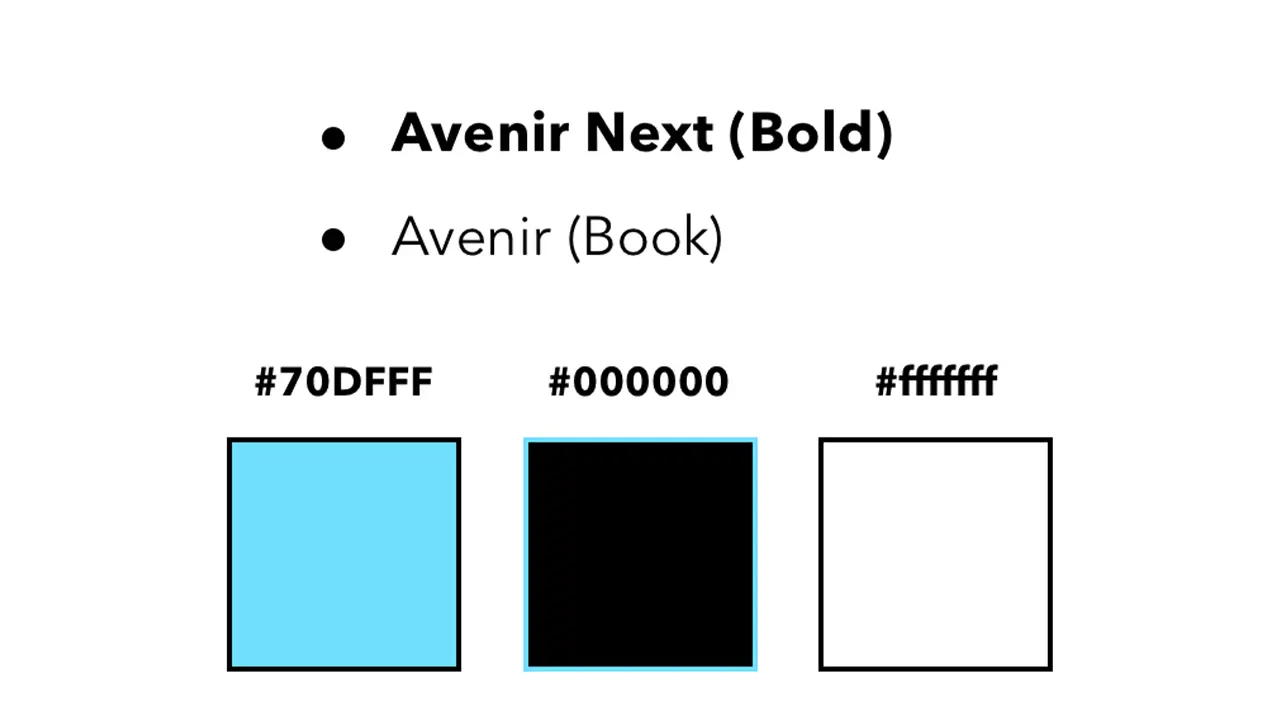
I wanted the aesthetic of the app to feel modern and sleek which is why I chose a black and white color scheme complimented by blue to represent functional buttons. I used Avenir next and regular because they’re both sans serif fonts and are easily readable.
All assets were created using Illustrator and Sketch. This included custom icons used throughout the app as well as the app icon. All images featuring influential people were edited in Photoshop to share equal proportions. The app was styled using Xcodes premade elements and constraints, and was then made functional using Swift.
To conclude, I’d first say, this was an awesome learning experience and definitely something I’d do again. Working in Xcode was not nearly as difficult as I thought it would be, and given that I’m very interested in app design, it’s a relief knowing I’ve got some experience under my belt. For the future, I’d try and get some more of my functionality down, but for now I am satisfied with what I’ve created.
IDM362: Interactive App Design II by Kristen Rehm
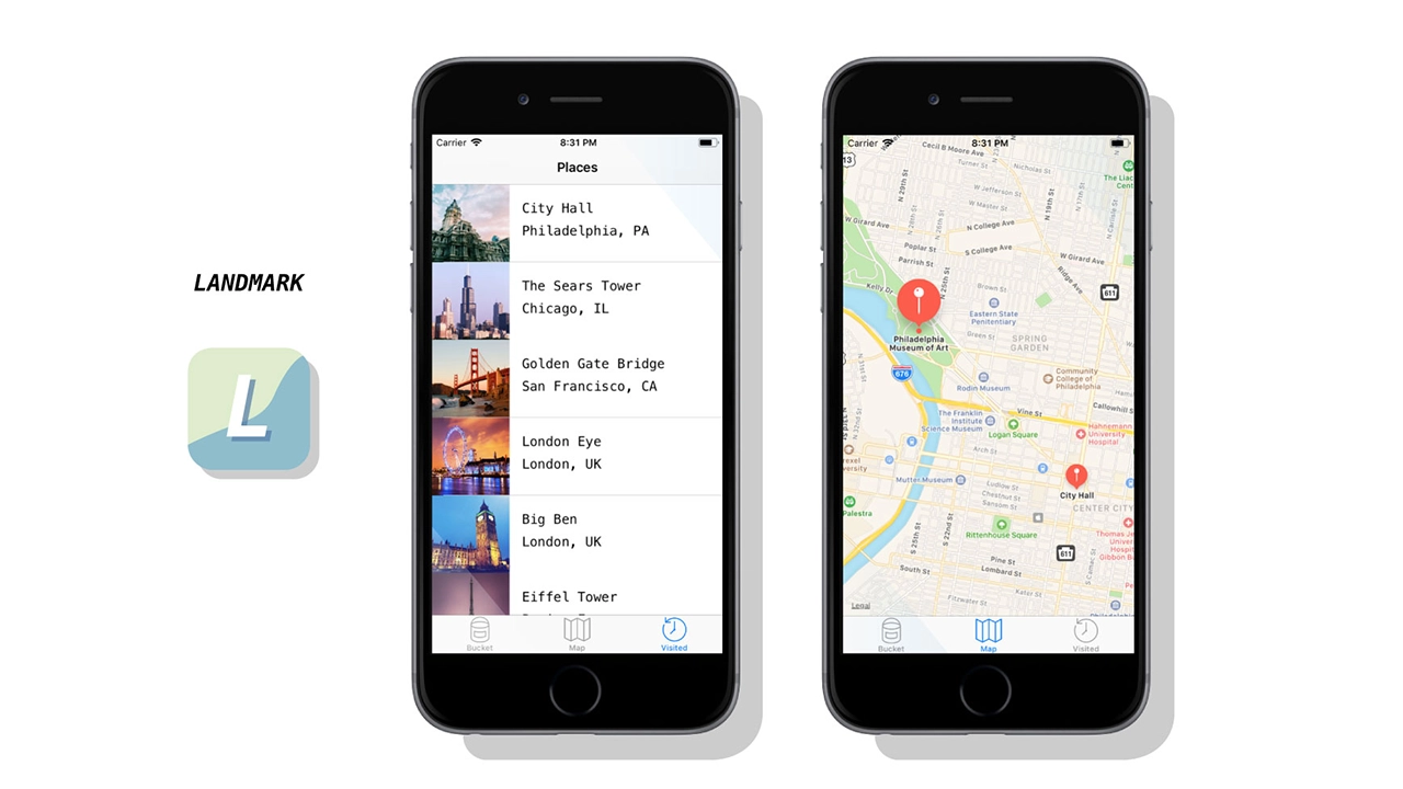
Simply put, Landmark is a travel companion application. But it’s also much more than that. The idea for Landmark originated as an AR application – one where a user could pick up 3D collectables once they’re at a physical tourist attraction. However, time (and knowledge) constraints left me condensing the idea into a tracking application instead. Landmark allows its users to track the tourist attractions they’ve visited, and create a bucket list of the ones they want to visit next. It features an interactive map, where users can explore the city they’re in, and see the popular spots to visit within.
This app was created with the intention of solving a problem – the cluttered camera roll. Oftentimes people who frequently travel, document their experiences by taking lots of photos on their mobile devices. But there isn’t a satisfying way to track where you’ve been, or what you’ve seen while traveling. Sure, you can scroll through vast amounts of pictures to finally find your selfie with Mount Rushmore – or you could use Landmark to document the experience, have it conveniently saved in one location, and to find new places you’d like to go next. Landmark is designed specifically to inspire it’s users to add to their bucket list.
Creating a native app for the first time meant a lot of challenges – aside from learning the ins-and-outs of xCode. One of those was discovering a solid task flow from screen to screen; what did users want to see first? Were they more interested in the map or the bucket list? The places they’ve already visited, perhaps? This led to user testing, which helped me solve some of these problems upfront. But as with any project, more roadblocks – and need for iteration – came after.
While creating Landmark, there were some ideas that I had to scrap. I originally was going to have a search feature for different cities and locations, thinking this would be the best way for people to discover new places for their bucket list. However, I found that users typically already have an idea in mind of where they’re going next – or want to go. Rather than having search functionality, I created an add button that allowed users to input their own locations and landmarks. This allows for more customization, and a more personalized experience.
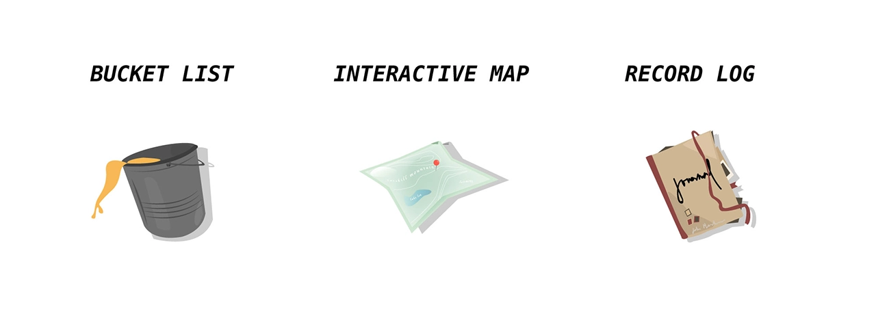
Landmark helps users record where they’ve been, when they visited a famous tourist location, and keep track of what they want to see next. It provides a unique space for this task, and is a great application for anyone who wants to travel more, document their experiences, or see what else is out there that they might’ve missed. I ensured the task-flow was simple and straightforward — there’s nothing more stressful and frustrating than not understanding how an application works. It might be simple in nature, but this really allows users of Landmark to take it and run with it. After several uses, Landmark becomes a reminiscent journal of sorts – one where you can enjoy the things you’ve done and seen, and look forward to the future and what’s next.
Despite being unable to create all that I envisioned, I think Landmark is absolutely a success. I wanted an app that users could keep returning to in order to track where they’ve been, and I’ve successfully created that. While additional features, such as AR collectables, gamification, etc would have been added bonuses, Landmark serves it’s original purpose, and serves it well. That being said, I am incredibly happy with the outcome of this app, and would enjoy working on it more in the future to live up to the higher potential it has.