IDM240: Interactive Graphics
by Josh Rouzer – 2019
IDM362:Interactive App Design II by Erin Wiegman
In just 10 weeks, I created “Bucket List,” a native mobile application built with Xcode and Swift. Users can add to and customize goals on their bucket list and easily check them off. I love making to-do lists and checking off tasks, so I chose to create a list app. After some research, I found that there were many to-do list apps available in the App Store but not specifically bucket list apps. Due to various design choices and some programming challenges, the end result of this app turned out differently from what I initially expected but overall successfully provides a user-friendly experience. Read the sections below to find out how I tackled this project.
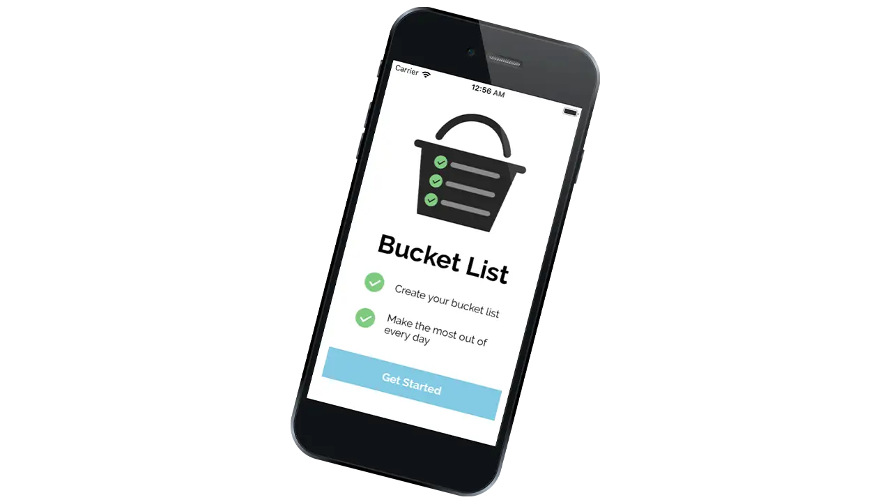
When I was younger, my friends and I had an email chain where we would add our own goals to a “master” bucket list which we all shared. Since I was only a kid I didn’t think of the typical bucket list goals – skydiving, bungee jumping, etc. – instead, my goals tended to be much more accessible – water balloon fight, ice skating, etc. Along with my friends, I noticed that I always added items to the list based on what season it was. I wanted to make sure I got the most out of every year. Consequently, choosing which season each item on the list will be accomplished became a focus of my design for this app.
Working in Xcode for the first time was a major challenge throughout the process of creating this app. I was constantly researching how to do what I thought were small tasks (e.g. change the color of a button). Because I am a beginner with Xcode as well as Swift, working on this app proved to be very time-consuming and complex.
I started this process with a lot of sketching in order to get out as many ideas as possible and as quickly as possible. After I had sketches for each screen of my app and established a user flow, I began creating digital mockups directly in Xcode. At the same time, I created an app icon in Illustrator and chose a color scheme, font, and decided on the styling of buttons, headers, and icons, and more. I wasn’t sure exactly what I would be able to do in Xcode and because of this, my design decisions changed a lot.
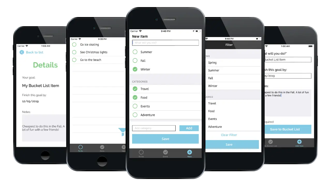
My initial design involved 3 tabs and a filter view. The first tab was the “to-do” screen, the second was the “done” screen, and the third was the “new item” screen. Users could see all of the bucket list items they have left to complete on the “to-do” screen and all of those they had completed on the “done” screen. They could add a new item on the third screen and assign it a season and/or various categories that they could create themselves. Users also had the ability to filter their “to-do” list by season and/or categories and swipe left to delete an item. I kept the interface for each screen very simple and used a circle motif for the incomplete, complete, and new items.
After learning the basics of core data, I struggled to apply it to these designs. At first, I felt that it was important to have both the “to-do” and “done” screens so that the user could see their completed items and uncheck items if they felt they weren’t complete. I realized that this was actually unnecessary as it’s rare for a user to take an item off of the completed list once they have checked it off. Additionally, the app does not have the ability to delete all of the items on a list at once, the user can only delete items individually, meaning they would have to swipe on each item on the complete list to clear the list. Rather than add another feature to fix this, I chose to remove the “done” screen and simplify the app.
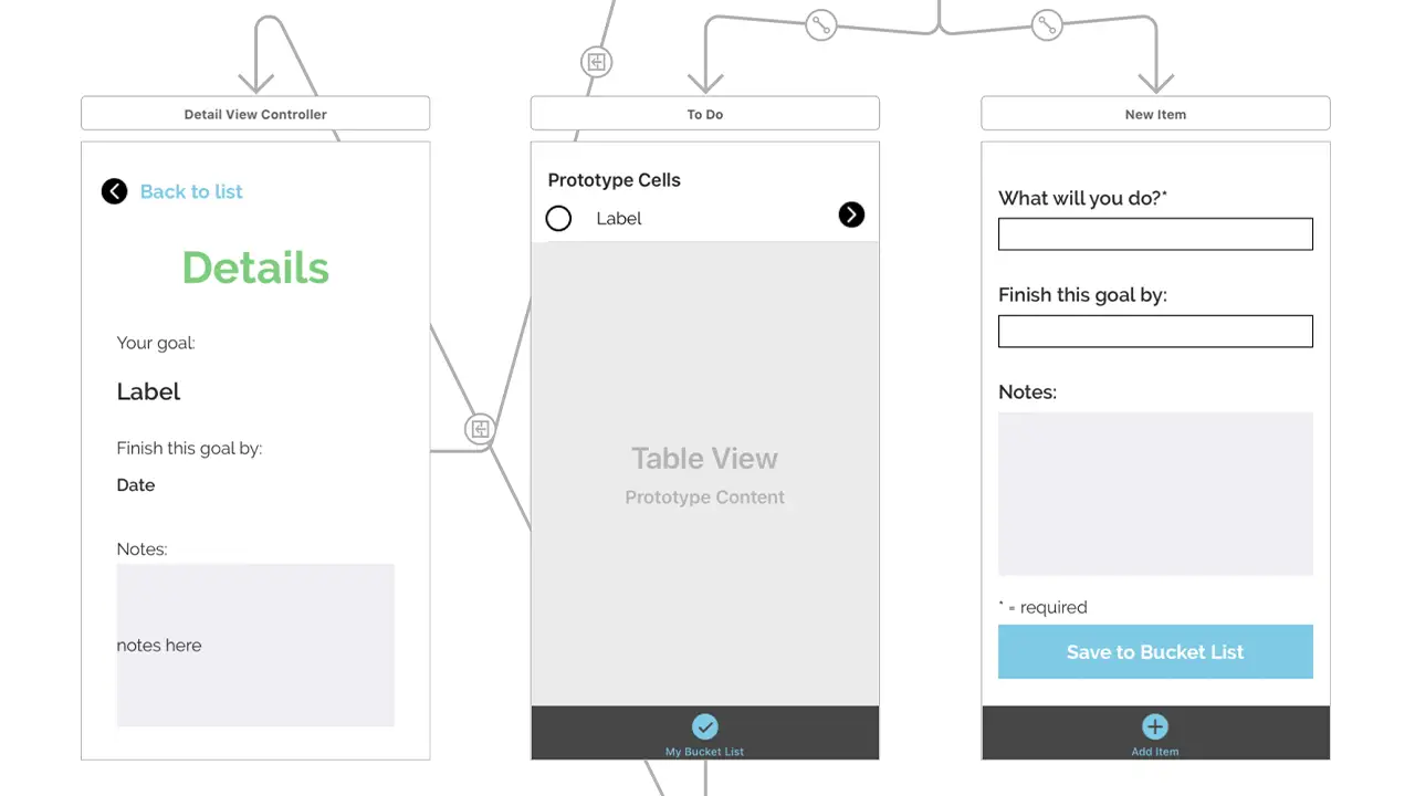
I also struggled with the filter functionality using core data. If I were to continue working on this project, I would focus more time on creating the ability to filter by season because it was an important part of why I created this app. In the high fidelity version, I chose to remove the filter and allow users to instead add more information when they are creating a new item, including setting a date to complete their goal and adding any important details to remember. They can then click the item on the “to-do” screen to see that information.
Although the end result is different from what I designed in the beginning, I am still happy with the outcome of this app. The challenges I faced allowed me to learn a lot about Xcode and Swift in a short period of time, and I am ready to apply those skills to the next app I create.
IDM362: Interactive App Design II by Victoria Stewart
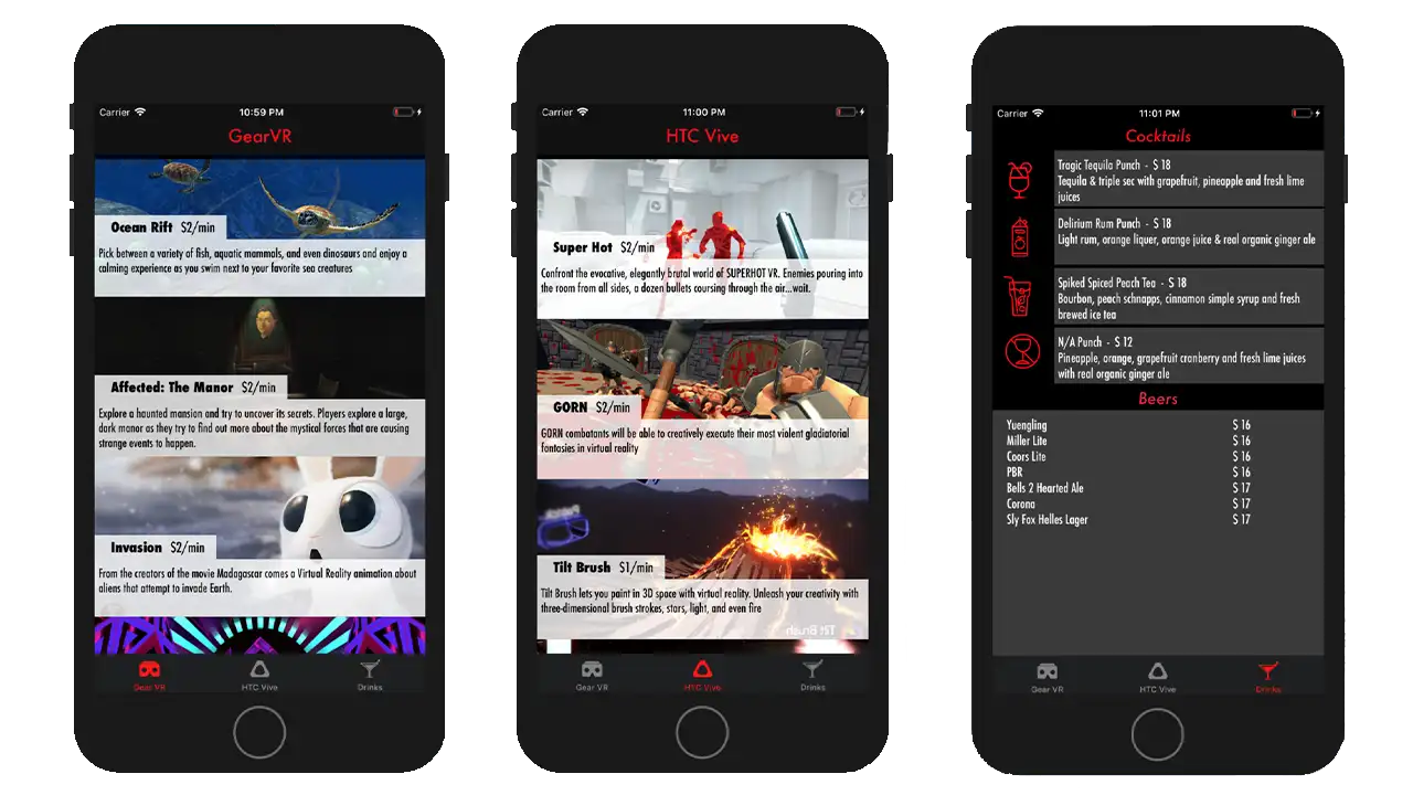
The app ended up spreading across three pages with a tab navigation at bottom. Important pieces of information are highlighted in red, with the main focus, the game entries, taking up 100% width of the device, stacked in a scrollable column. Upon clicking an element, the user is taken to an new page with all of the information one would need to know about that VR experience displayed individually.