Category: UXID

  • Souvinear V1: Sharing Music and Recording Concert Memories with a Touch of Humanity

    Overview

    It’s hard to introduce a project like Souvinear, especially when talking about where the idea for the app stems from. In it’s original incarnation, Souvinear came from two unrelated concepts for projects in our IDM workshop. Anisa had an idea for an app that was used for journaling the experience of a concert, and finding ways to store information about the night before, along with a possible concert recommendation feature. Tori came up with an active way of sharing music, that involved people pinning songs to a specific location that they could share or add to a collection inside the application.

    However, these two ideas aren’t completely unrelated from each other, considering both concept applications focus on one thing: sharing music.

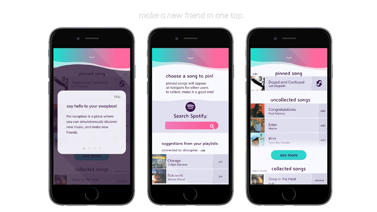
    The problem that Souvinear wishes to address with our application is the lack of humanity in sharing new music. In a world where algorithms and computer learning runs rampant, we’re trying to bring the human element back to sharing music. Our platform allows you to recommend hand-picked music, record what happened the night of a concert, and enhance your planning, preparation, and overall experience of the night – all within one application.

    The Team

    • Jake Bender
    • Tori Stewart
    • Kristen Rehm
    • Anisa Sloan
    • Kam Kutz
    • Kaitlyn Nunez

    Sample of the screens in the Souvinear app.

    Old User Journey

    Before Souvinear, discovering new music and finding new shows was rather tedious; it was even misleading at times. However not all are entirely bad user experiences – Spotify does a great job at assisting in the discovery new artists, which is why we are using their database to fuel our song swapping. Despite this, discovering new music through these means still feels impersonal, being that the songs are picked based on popularity of the track, as they’re inserted into the playlist.

    As far as saving memories from a concert, there isn’t really an app that effectively lets you store your photos and thoughts in an easily accessible database. Storing photos has to be done through several apps at a time, and can be either incredibly overwhelming when accessing media related to your favorite artists.

    Team meeting, discussing logistics of the Souvinear app.

    As far as getting to a show it’s the total opposite. There’s no effective way to coordinate a plan with anyone, as well as seeing who’s going to a show ahead of time, outside of Facebook events or ticket website pages. There’s also too many options when it comes to accessing this information, which creates a cycle of bad user experiences when it comes to locating these events. A good example of one of these kinds of concert recommendations applications is BandsInTown, an application that many users cited having a poor experience with when referencing our applications.

    With this information and the copious amounts of user testing, we were able to build Souvinear so that it’s catered to the frequent concert goer and niche music listener.

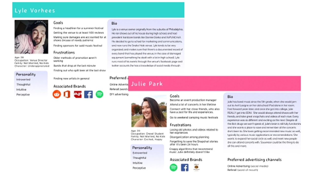
    Catering To The User

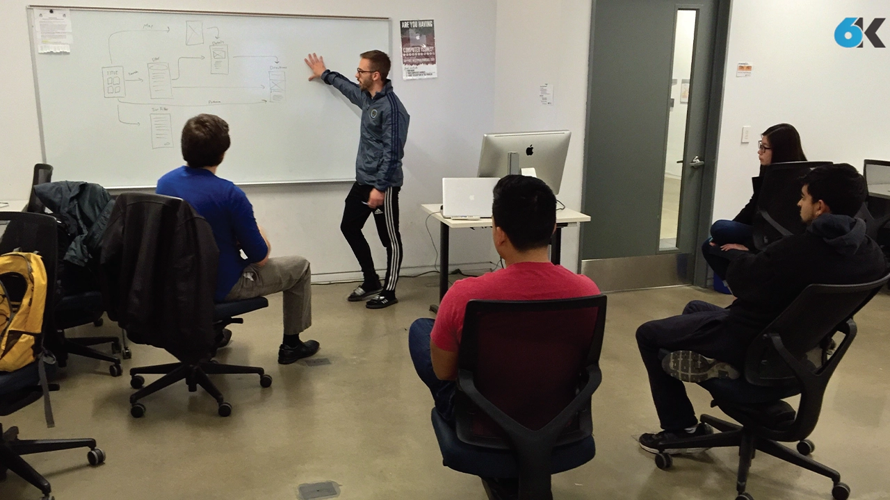
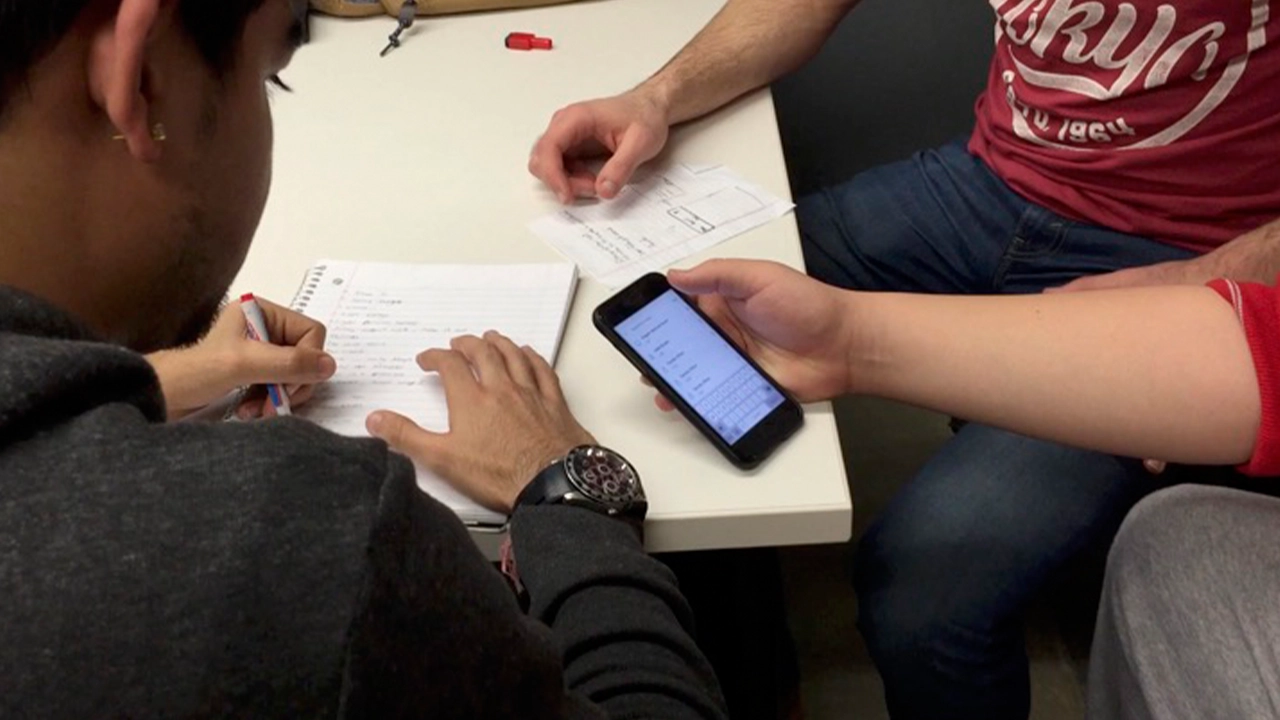
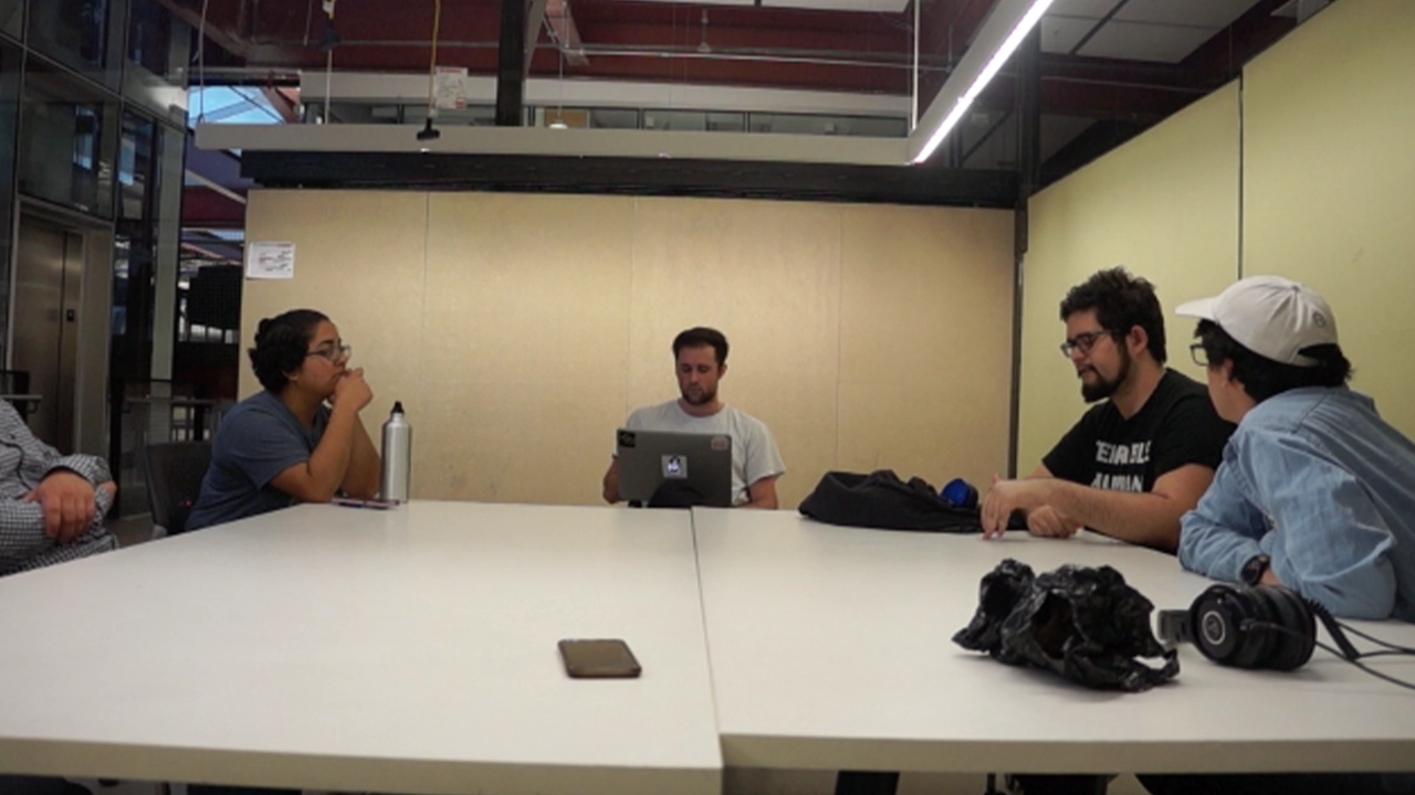
    The audience for this application is just as important as the idea of selling our theme of enhancement and convenience in a concert/music discovery setting. We began identifying these user groups researching into who our target users would be for an application like Souvinear. Focus groups of a few potential users were brought together, asking what they would want to see out of an application like this.

    User personas representing the audience Souvinear aims to appeal to.

    Our questionnaires were focused on asking questions about the user’s listening patterns, and the frequency of how often they go to shows. We then expanded upon this technique with the overall look of the application through online surveys via google, pulling in results from a niche music Facebook group that Jake administrates.

    Results of questionnaires sent to possible users.

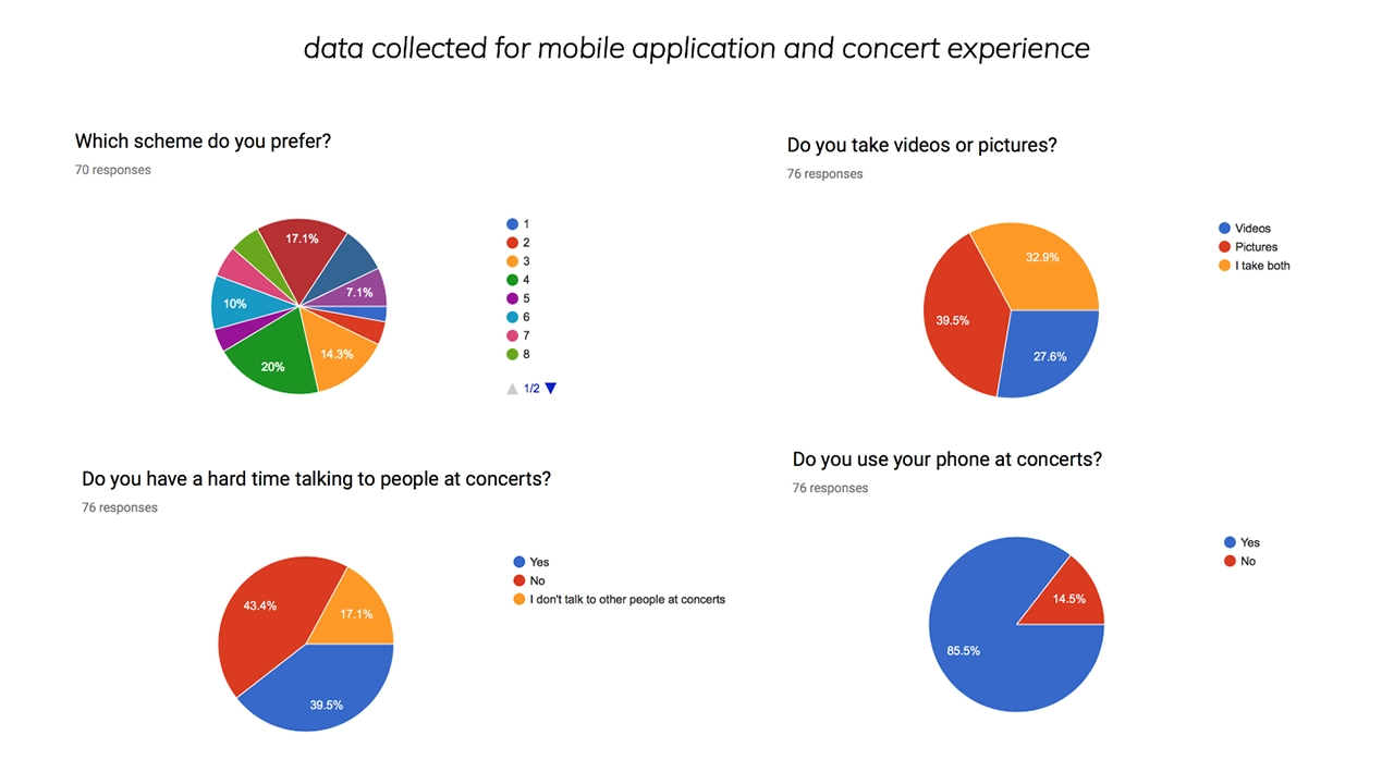
    The results were overwhelmingly positive, helping us achieve what our target user base is, and provide the tools to create the fully fledged visual design that we currently are using in Souvinear’s most recent iteration.

    We realized we wanted to be able to connect these users with their ideal concert experience. This is where the social media aspects of our project come into play, as they allow users to interact in a way that helps them organize into events and achieve their ideal concert experience.

    This need arose from some questions we asked users about how they feel when they’re actually at the concert. In our surveys and usability tests, we asked if they go to concerts with people or by themselves. One person specifically stated that they preferred to be by themselves at a show, and when questioned further, it was that they didn’t know anyone with a similar music taste to theirs.

    When asked how they could solve this issue, they asked if they could see their contacts listed in an event page, which is what set forward the social media proof of concept that we created. With that intention in mind, we figured that we could create event pages for upcoming shows, that could be a place where people can discuss what they saw at a show publicly in a contained area. We also integrated a group chat feature, where users can create a group with their friends to congregate and organize the night as it begins.

    The whole reason we developed it this way was so that our niche groups can commune and get together, and eventually plan the night accordingly all within the application, so that we really can create a one-stop easily accessible platform for not only exploring concerts, but even getting to them.

    Moving Forward

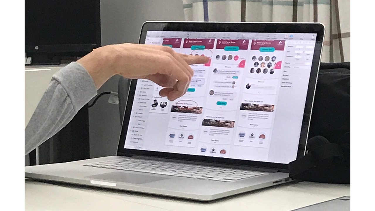
    After countless user tests and iterations of code and development and visual design we finally came to something a bit more concrete than what we started with in fall term. Moving forward into senior project, we plan on expanding and innovating our project further, and making this platform from into a reality. Our development team has worked hard on creating a reliable backend that can store journal entries, and a visual pleasing and engaging front end.

    Development of the Souvinear app on laptop.

    The social media features will keep getting tested, and will probably change, but we plan on keeping the intention of them still there, which is to make the concert experience engaging and inclusive. We want to bring people together and enjoy music. Connecting it to the existing screens was already a challenge, but we overcame that by doing what we do best as IDM students, iteration and testing. This project has been a wild ride of ups and downs, but our team has stuck it out and met those challenges head on.

    Our names are Jake, Tori, Kristen, Anisa, Kam, and Kaitlyn, and we are proud to present to you Souvinear.


    Final Showcase

  • URBN Explore: Navigating the URBN Center with Digital Assistance

    Every day hundreds of people pass through Drexel University’s URBN Center, home to the Westphal College of Media Arts and Design. This winding maze of a building features endless staircases and a disorienting numerical structure that leaves its visitors struggling to find what they are looking for. I worked with a team of students to develop a mobile wayfinding application to help people successfully navigate the building.

    Team 6K:

    • Rahul Jaggi, Designer
    • Jeff Matthews, Designer
    • XinYi Wang, Designer
    • Patrick Brady, Developer
    • Dan Mennella, Developer
    • Paul Phan, Developer
    • Zach Stockmal, Project Manager

    This project used Estimote beacons. They are Bluetooth enabled sensors that can transform any building into a location-aware environment. Think in a sense like when you use a GPS or an app like Google Maps. Those devices are getting your location from a satellite way up in space. When you’re indoors, the beacons act like those satellites, being able to grab your location while you’re in the URBN Center and therefore make our app possible. With this initial technology we were ready to make our app. We started our project with a solid foundation in design and user experience.

    Beacons made by Estimote used to tell the users via app where they are in a building.

    The team established three core values that were carried throughout the design process: “Simple, friendly and intuitive”. These served as a foundation to lean on in the face of the various design and development challenges that were experienced throughout the life of the project. The team utilized whiteboard brainstorming, user interviews, and quick iterations of wireframes to settle on screen layouts and a flow that they felt optimized the way-finding process.

    Team meeting going over the core functions and values of the URBN Explore app.

    They developed a visual style guide based on the research and defined rules for the general experience, and made sure that the two worked alongside each other. They moved through a few iterations, and the final look is ultimately very much in line with the core principles. Next, they developed custom map designs, iconography, colors schemes and layout patterns that all work together to make for a refined and effective experience. They simplified the architectural floor maps by combined with our iconography, we used different colors to distinguish a classroom from an office, or an open lab, allowing users ease of use. Altogether, we incorporated these styles throughout the different floor levels into URBN Explore, to present the maps in a more clear and concise way to our users, as well as bring a better grasp on the space as a whole.

    Floormap of each floor and area in the URBN Center.

    While the core functionality of the main app was still being developed, they created a prototype using a software known as Pixate. While this software did not have any of the actual location based functionality, they were able to simulate the kind of flow the users would go through when they opened the app. This involved things like what buttons they press, where all the elements are located, and the general timing of each step throughout the app’s workflow. With this prototype in place, they were able to get feedback from a bunch of potential users on the look, feel, and structure of the app’s workflow. They collected a lot of feedback regarding what did or did not work. They would then update the prototype based on based on their findings from these usability testing sessions. With this working prototype in place, the development team knew exactly what the real app needed to be as they worked on making it actually functional.

    Team testing the app for any problems user might run into while using the app.

    The majority of this app was made by using a software framework known as indoo.rs. Indoors is great because it allowed the team to build the app for both iOS and Android devices. They used it specifically to create the maps necessary for the app to function. The process starts by importing the map files that were created by the design team. Then defining the walls in order to label the rooms, and portals to let the app know how to plan its routes through the hallways, staircases and elevators. Now with the maps ready, the rest of our development team could start to build the app that would guide our users through them.

    Logo of indoo.rs software used to build app.

    With the app, when a user needs to find a room, they can start by searching for it. The main search feature filters its results based off of the room number that all Drexel students see on their class schedule. However, the app can also filter the rooms by what technology it has in it, what type of room it is, and even by the student’s major. There’s a feature to let visitors take a pre-defined route of rooms based on major. The app gives users the ability to toggle on wheelchair accessibility so the app can recommend the best route for them to take. And last, but certainly not least, is the button that will guide users to the nearest restroom no matter what floor they are on.

    For the Apple Watch, they created a companion app to URBN Explore iOS app. This app gives the user subtle, non-interfering updates such as identifying what floor they are currently on, keeping them on track for the room they need to get to and notifying them of some engaging information about the room once they’ve visited it.

    URBN Explore app on Apple Watch.

    Awards:

    Awards URBN Explore earned.

    Senior Showcase

  • Coffeebot: Finding Coffee Recommendations in an Instant

    CoffeebotOnline.com is an accessible responsive website that allows users to scroll panel by panel when viewing a comic on smaller devices. The website integrates the personality of the series into the actual site. User’s can receive coffee recommendations based off their location or current timezone.

    Coffeebot was created by Chelsea Myers, Eric Martin, Ross Reagan, and Ian Suen.

  • SS United States: Coming Aboard and Exploring a Historic Luxury Ship

    The SS United States app is a re-creation of the experience of being aboard the historic luxury liner. The interactive digital application that allows the user to walk around select areas of interest on board the ship, including the rooms that you just travelled through: the duck suite, Ballroom, and enclosed promenade deck, as well as several others. These rooms have been re-created from blueprints and photos to be as accurate to the 1952 SS United States as possible.

    The SS United States App was created by John Novak, James Maguire, Jessie Wu, Tom Welker, and Chris Elliott.

  • Museum Mystery: Discovering the Secrets of the Academy of Natural Sciences

    Museum Mystery is a mobile game for the Academy of Natural Sciences. This app targets pre-teens, because they make up a large portion of their visitors. In Museum Mystery you take on the role of a detective solving a case about a missing museum exhibit. In solving this case, you will find clues along the way. The answers lie in the exhibits and it’s up to you and your powers of deduction to follow the trail of clues to the missing artifact. As you follow the clues, you will be pulled to all corners of the museum. The museum holds many secrets. What will you find in your exploration?

    Museum Mystery was created by Ayanna Harris, Brian Kelley, Danzell Braswell, Dylan Holland and Sokvanna Seng

  • Scrapple TV: A News Network Catered Toward Its Users

    Scrapple TV is an online news network that is distributed on a responsive web platform. In addition the website design, a customized client dashboard and plugin were created which allows the client to maintain and manage the business without technical expertise.

    • Alex Lamberti: Team Leader & Developer
    • Robert Young: Designer & Developer
    • Evan Herman: Designer & Developer
    • Louis Peng: Asset Artist