Overview
For the spring 2018 User Experience (UX) course, our team was asked to build a mobile application prototype for a local food truck over a timeline of 10 weeks. We selected a truck called “PaperMill”, which sells Vietnamese-Mexican fusion food on Market street, at the heart of Drexel University’s campus.
Project Brief
Why:
- Bring more customers to the business
- Provide business an additional channel option to gain more customers
- Increase customer convenience and satisfaction
What:
- View menu options and order food remotely
- Collect data on participating customers to build the best customer experience
- Allow customer to create a profile that saves their past and favorite orders
- Provide many options for mobile payment
- Show the truck location and hours, as they are inconsistent throughout the week
How:
- Minimize in-person wait time in front of the truck
- Simple and effective design to display menu, pricing, promotions, etc.
- Display accurate information on the truck and keep it up to date
- Prevent customer turn-over by catering to the customers across multiple platforms
The Team:
- Hannah Juraifani
- Alyssa Klein
- Meet Palan
- Sanika Rann
- Woo Young Song
Introduction
Using a mobile device to order food has increasingly become common-place. Food trucks are generally individual businesses and operate locally, so the majority do not have their own individual digital application. Many of these trucks utilize third party services like GrubHub to take advantage of digital customers without having to build or maintain an application. While PaperMill does not have a digital application, the food truck itself is rather new and has become popular on Drexel’s campus. The truck itself alternates location between University City and Rittenhouse Square during the week, and on the weekends, it is commonly found at catering events throughout the tri-state area. Due to their local success, their business was a perfect client for our mobile application design. By having an app for PaperMill, the wait time spent at the truck is minimized, while providing customers with a convenient way to order and pay for food. It also provides up-to-date information on the trucks current location for those who are not familiar with the trucks whereabouts.
Background
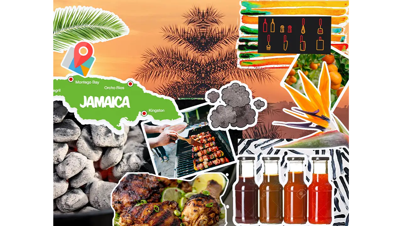
PaperMill was started in Sydney, Australia in 2016. It was initially a 10ft by 10ft tent at the Bondi Beach Farmers Market. As it grew in popularity, there was an opportunity to bring the fusion of South-East Asian and Australian style foods and favors to the United States, starting in Philadelphia. PaperMill throws a spin on the classic burrito by offering “spurritos” (a rice paper spring roll wrap around fresh ingredients), bowls for those not interested in the spurrito style, and Banh Mis (Vietnamese hoagies). Customers who prefer their food on the spicy side can add jalapenos or sriracha to their order, and the ever-popular option to add sliced avocado. The truck offers water bottles and LaCroix as their two beverage options.
Objective
The goal for this project is to increase the use of mobile ordering in order to reduce wait time spent in front of the truck. Our front-end development team consisted of 5 members: Hannah Juraifani, Alyssa Klein, Meet Palan, Sanika Rann, and Woo Young Song. We had similar responsibilities each week. Based on the results of several prototype testing sessions, we went through multiple refinement stages until we built a prototype that catered to our target audience best. Throughout the ten weeks, we were able to problem solve by using our increasing knowledge of user experience design.
Process
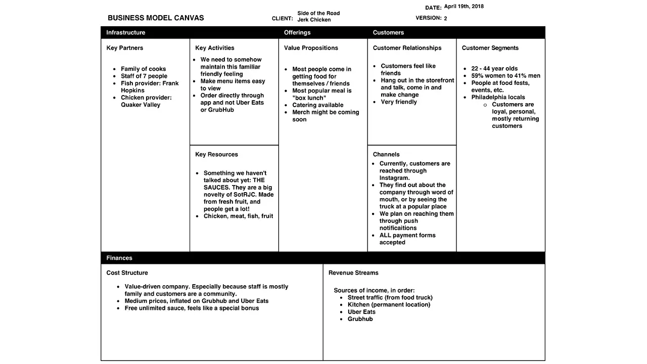
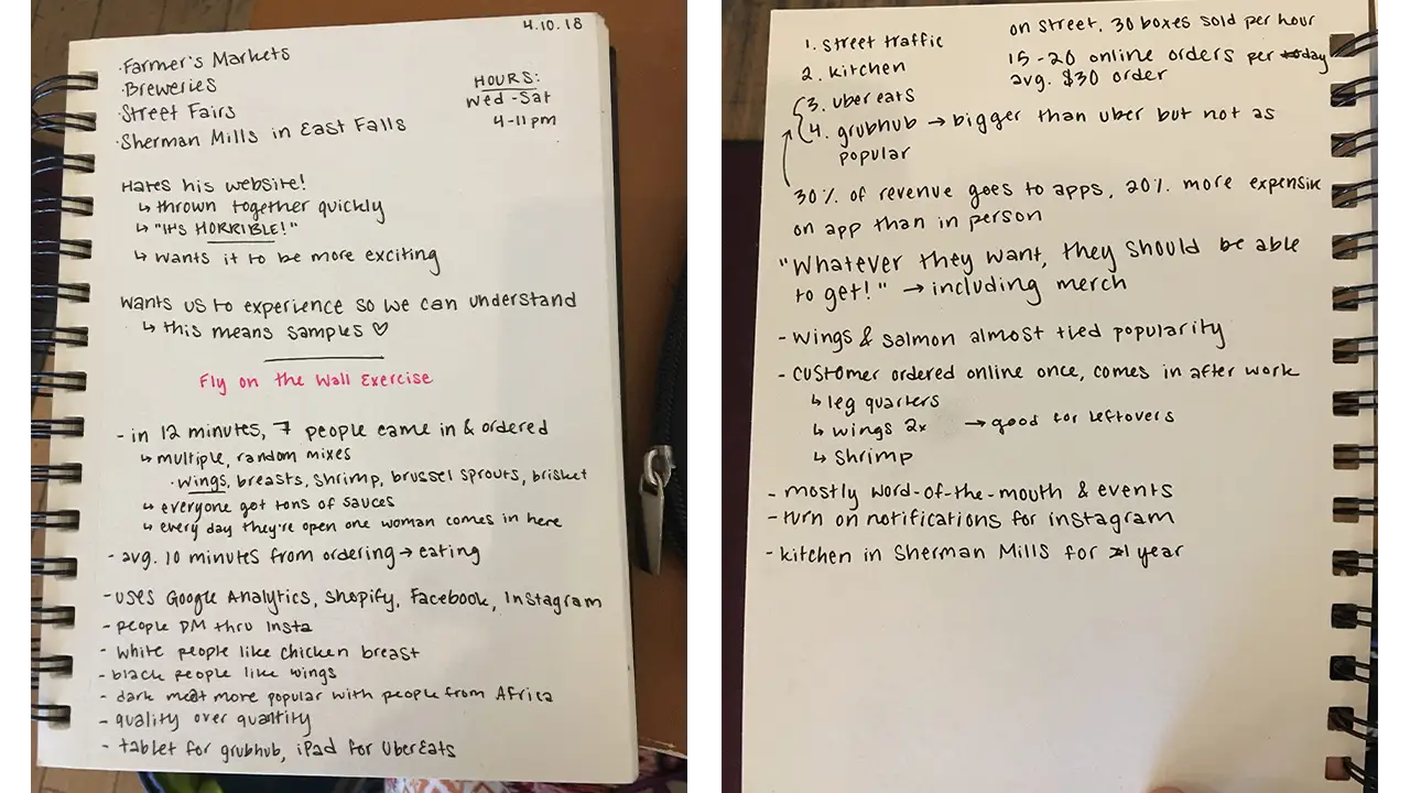
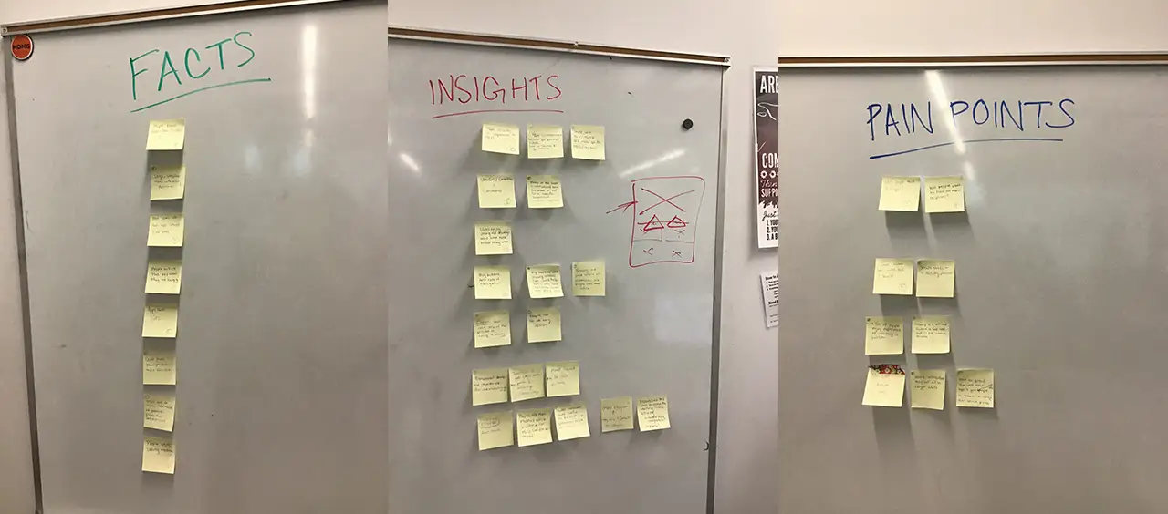
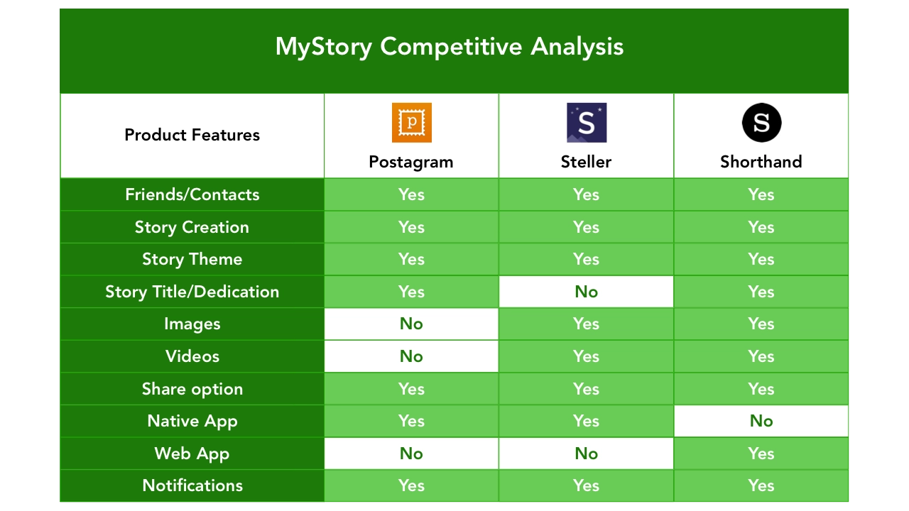
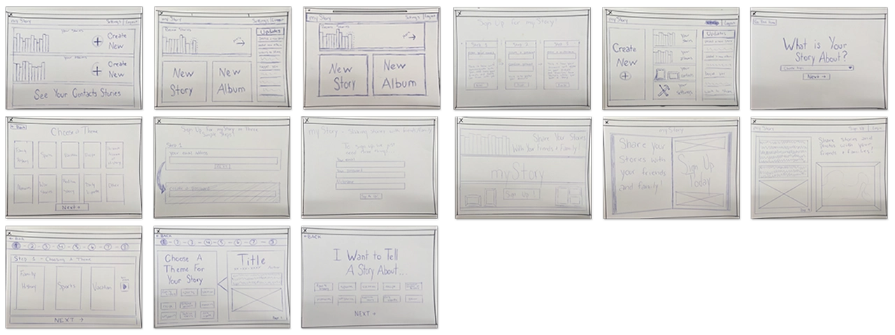
The process began listing our project’s strengths and weaknesses for analysis. As a team, we spend time each week on basic analyses via sticky notes. This allowed us to ideate on what features are most important to the app, the target audience, user pain points, and potential benefits. We began to compile wireframe sketches for possible iterations of the future application. We conducted primary research by doing observation sessions on-site. As a team, we took notes on the food truck’s interactions with customers, as well as constructing a journey map of the process of ordering food at the truck. This was recorded in the project canvas and business model documents. We also identified the components, characteristics, challenges, and characters of the necessary design. A project brief was created for our research on PaperMill’s competition, such as Chipotle, iPho, and Hawker, which are all within the same block on Drexel’s campus. The competitor analysis also included research on existing mobile food ordering applications, which we critiqued as a group to determine what should and should not be included in our design.
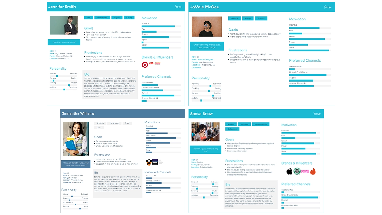
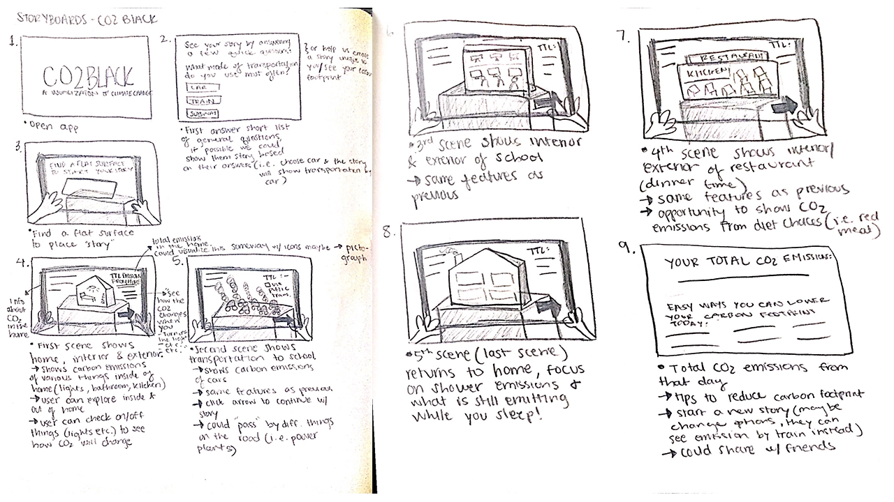
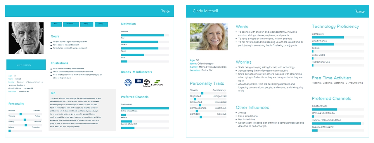
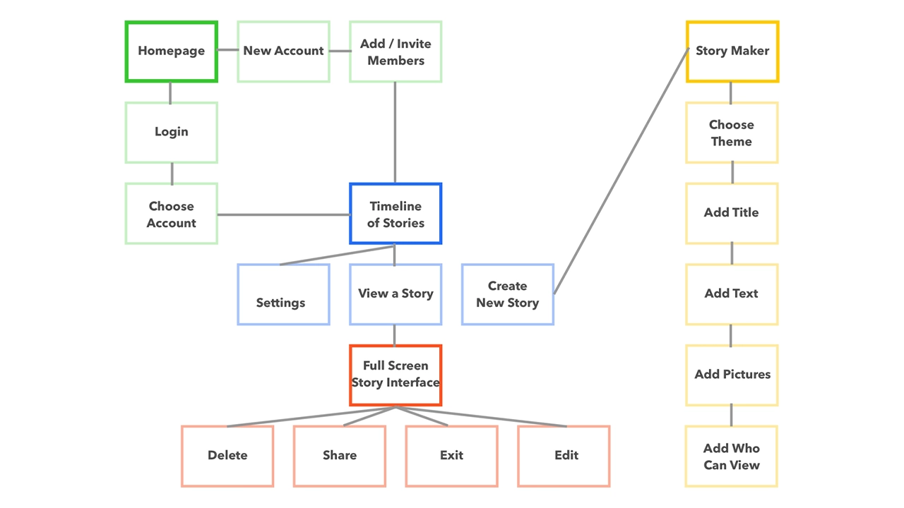
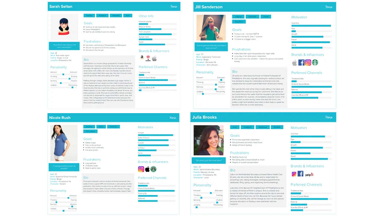
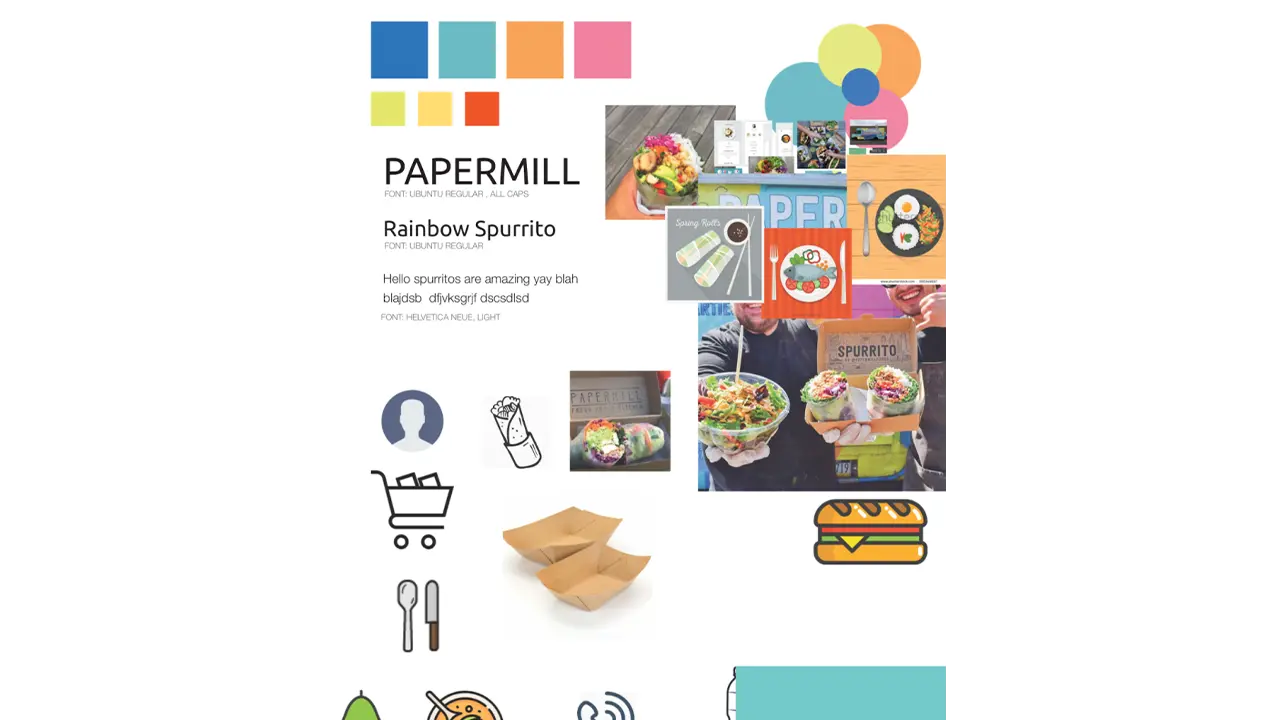
Each team member created an individual mood board, and a team mood board was derived from the individual ones to define a general aesthetic and color palette. We created an affinity map, and each team member sketched 50 possible designs for the future prototype. We crafted user personas of the potential target audiences: Drexel students/staff, locals, Drexel gym goers, and vegans/vegetarians. This gave a better understanding of who the users are and how to empathize with them to inform an appropriate design. We created a journey map and task flow for the application as well. As we got closer to implementing the actual design of the app, we continued to sketch ideas out as wireframes and we selected the best sketches for the prototype. From there, we created paper prototypes and asked potential users what they thought about the prototype’s usability.
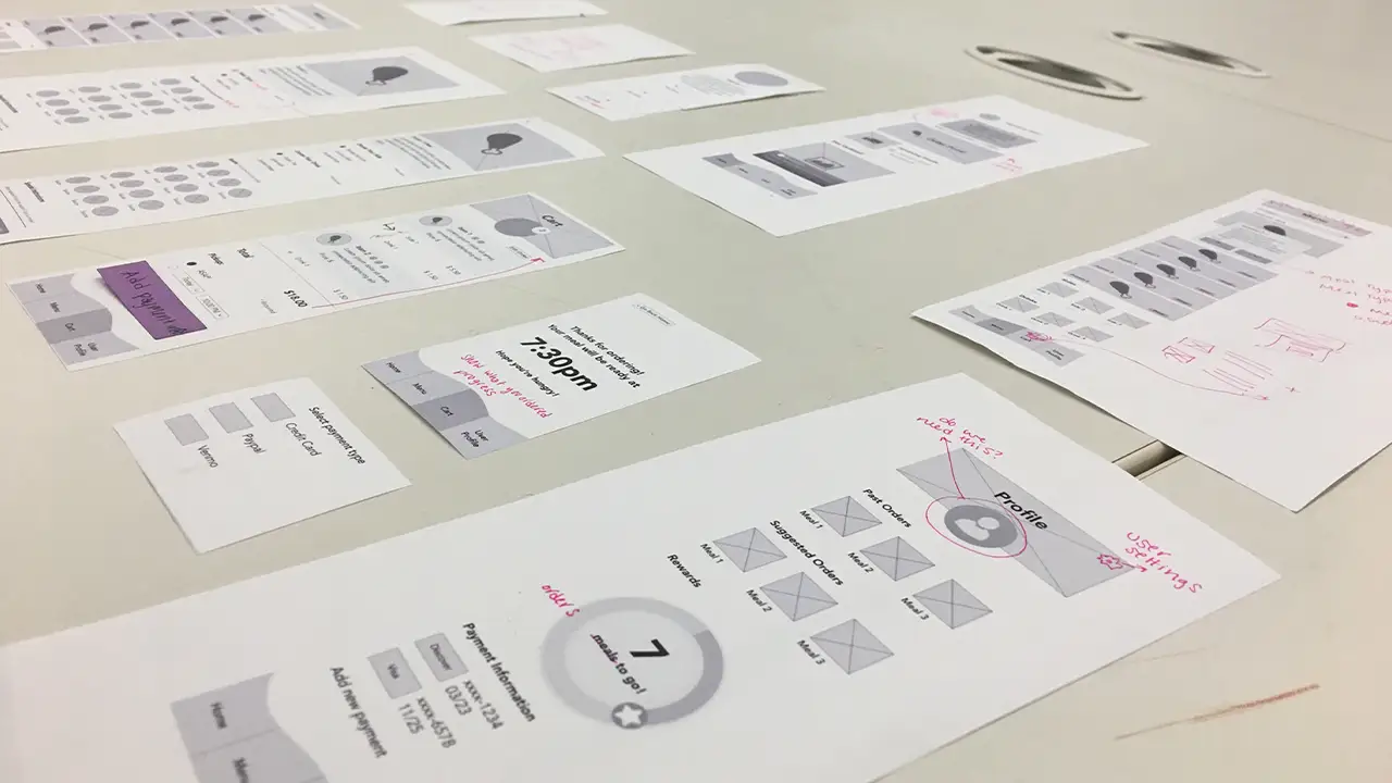
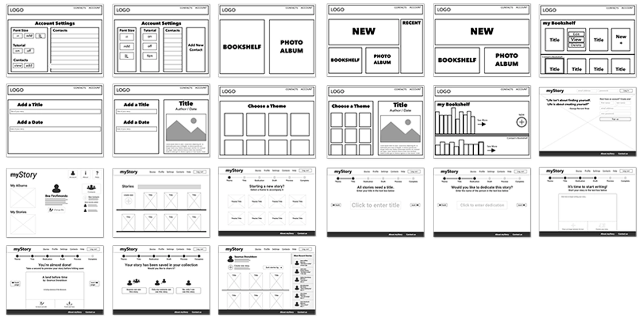
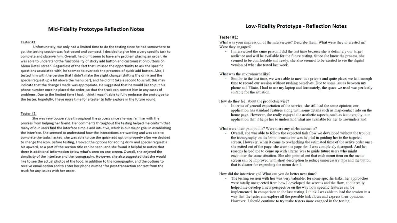
After gathering feedback from the tests with potential users, we came up with ideas as to what features will be included in the actual prototype as well as the basic layout and how it should work. The low-fidelity prototype had no colors, images, or style, everything was still greyed out. Our mid-fidelity prototype included colors, graphics, and style.
Research
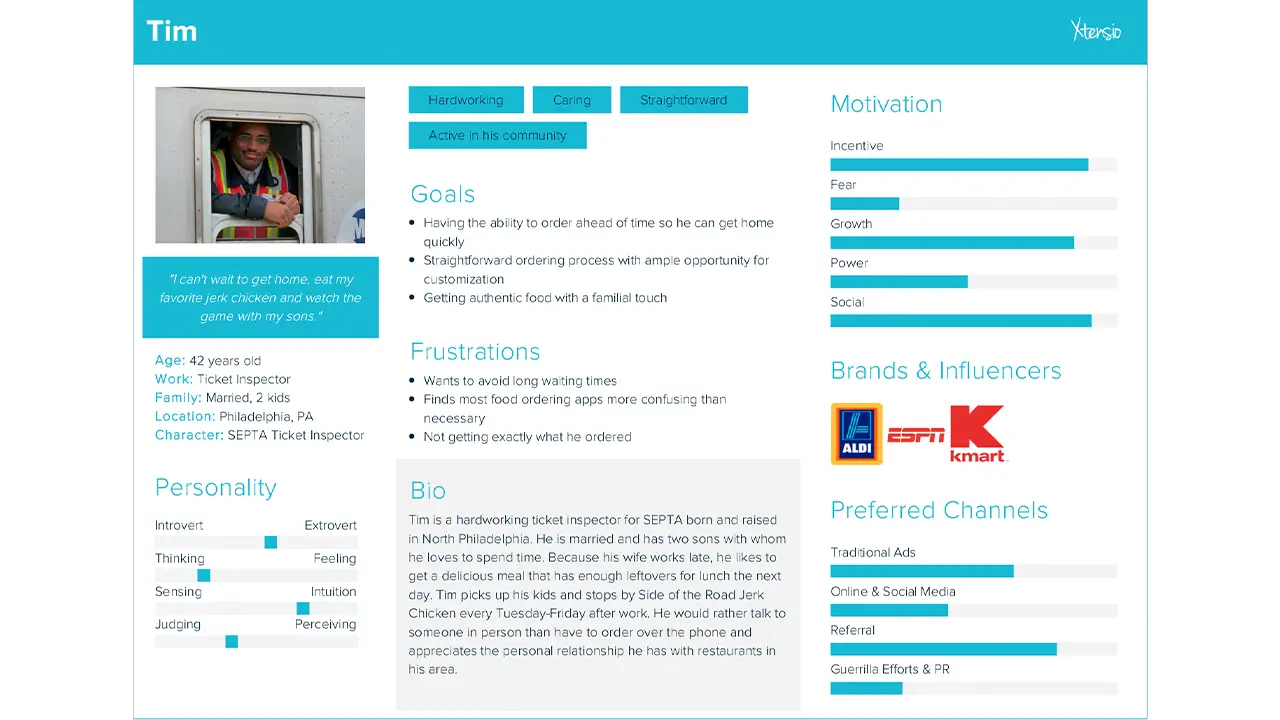
User Personas:
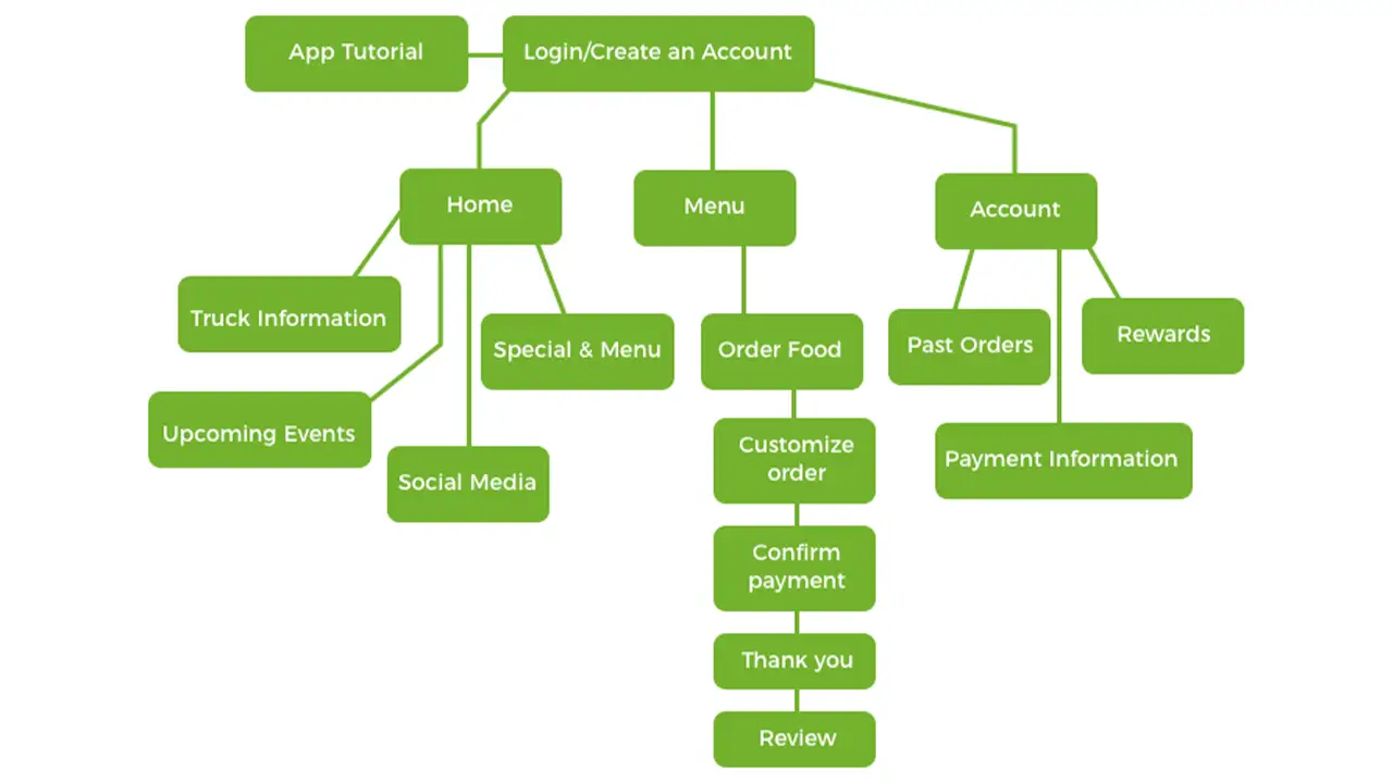
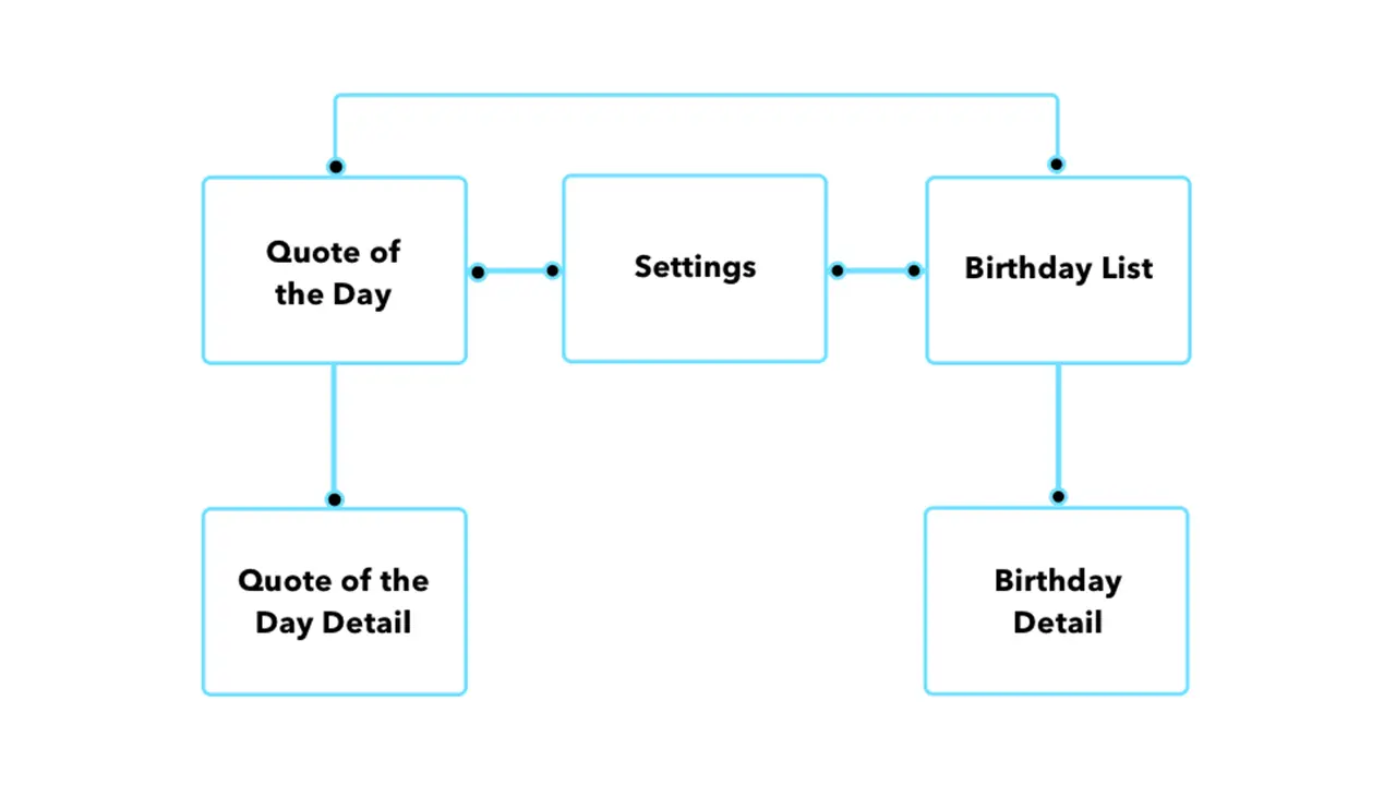
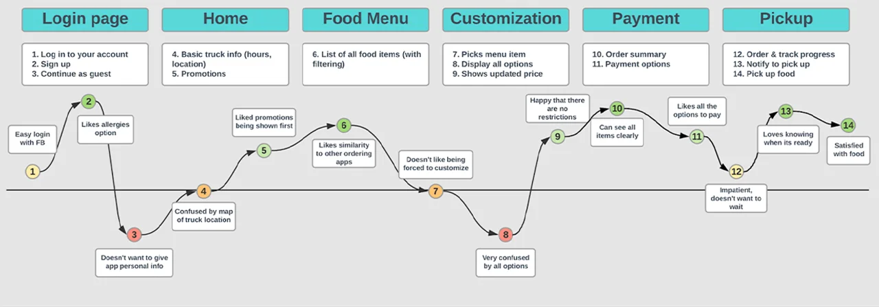
User Journey Map:
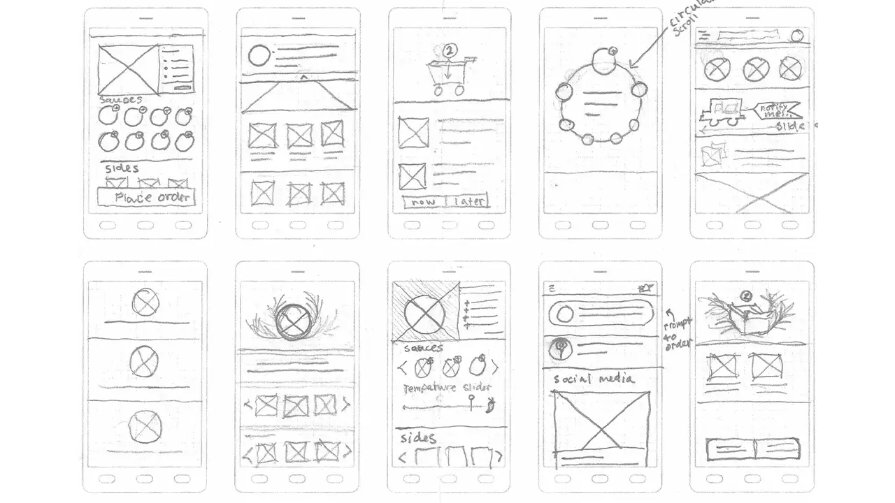
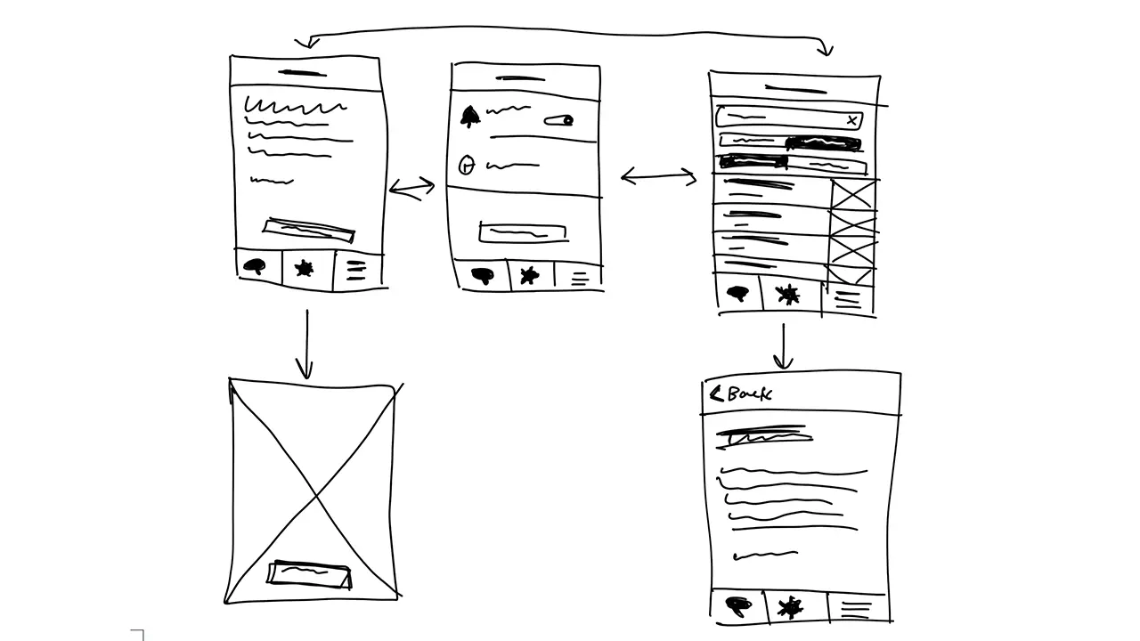
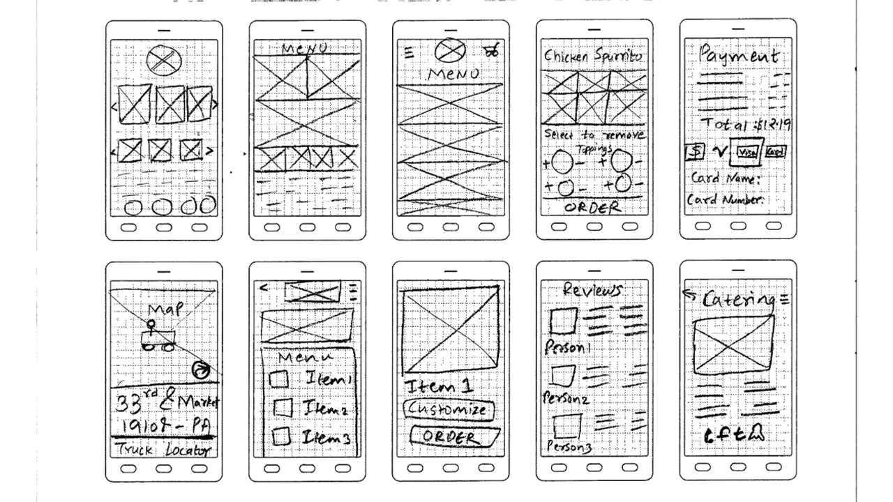
Wireframe Sketches:
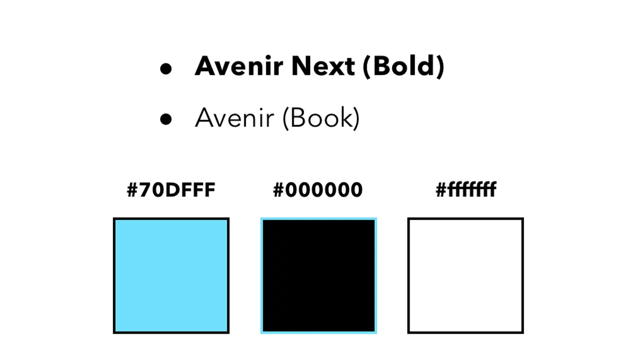
Style Guide:
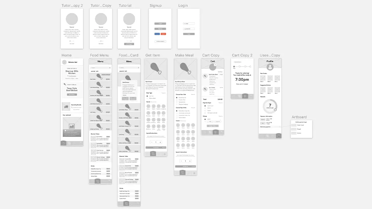
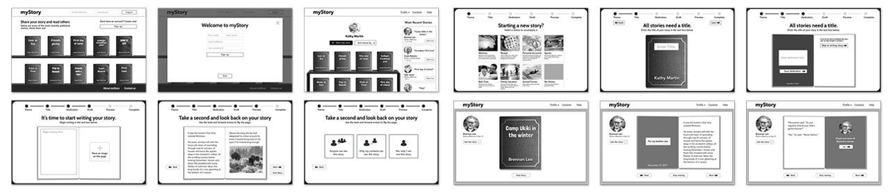
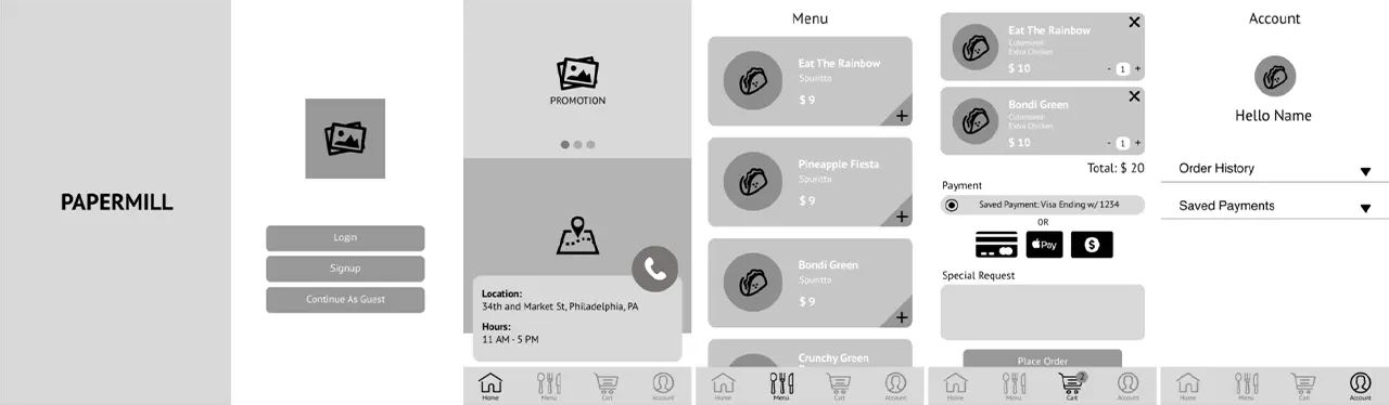
Low + Mid-Fidelity Prototypes:
Reflection Notes:
Solution
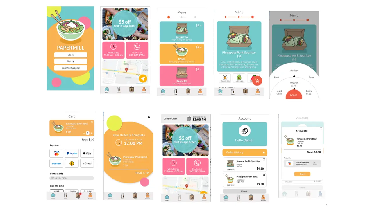
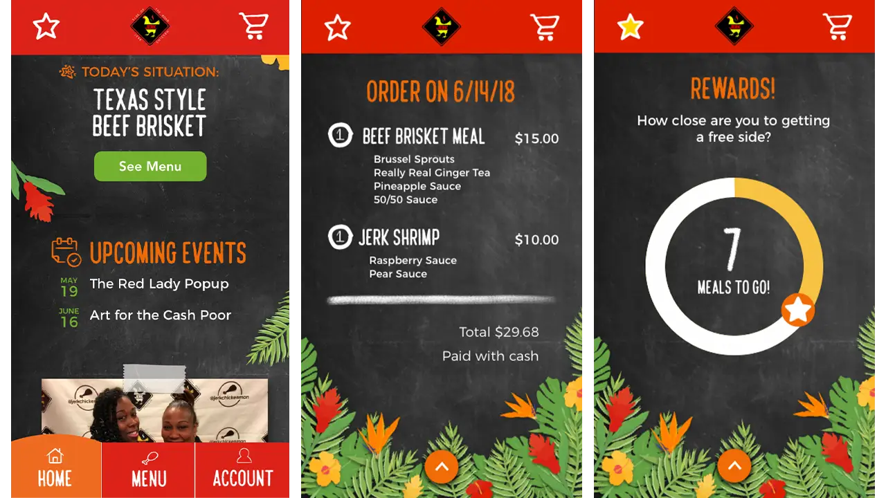
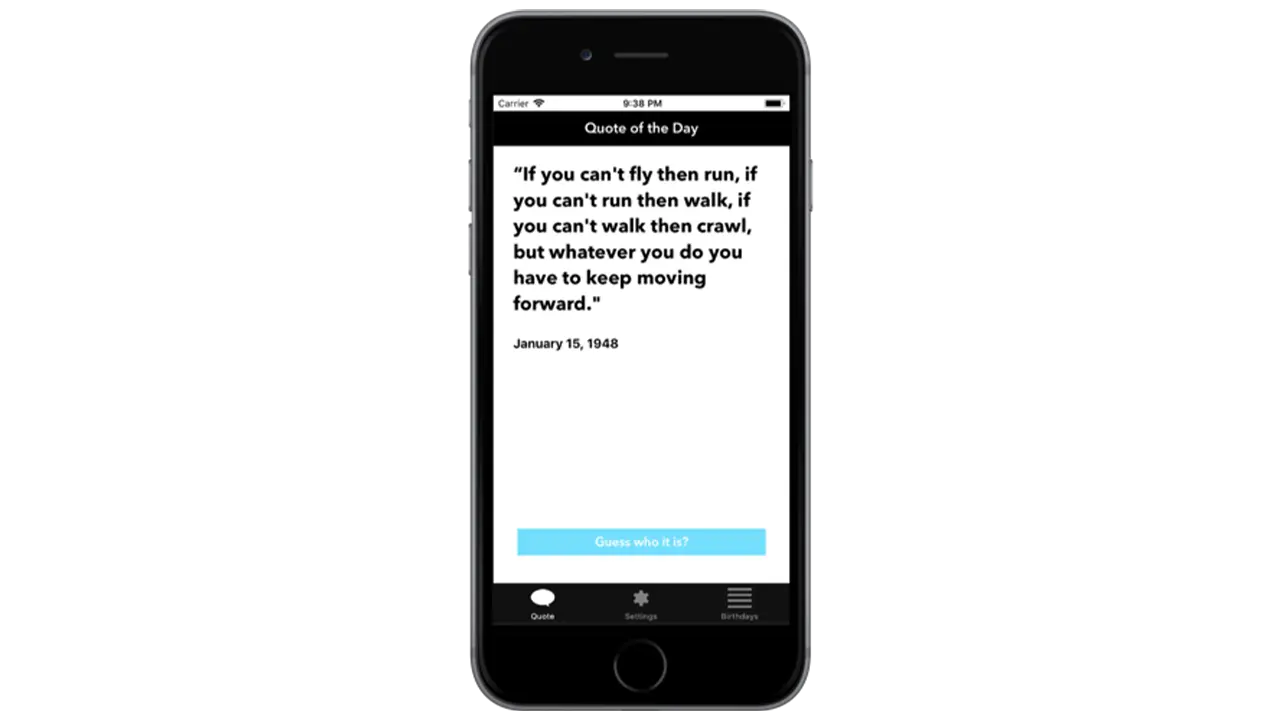
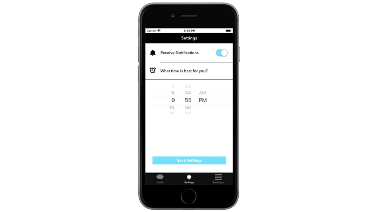
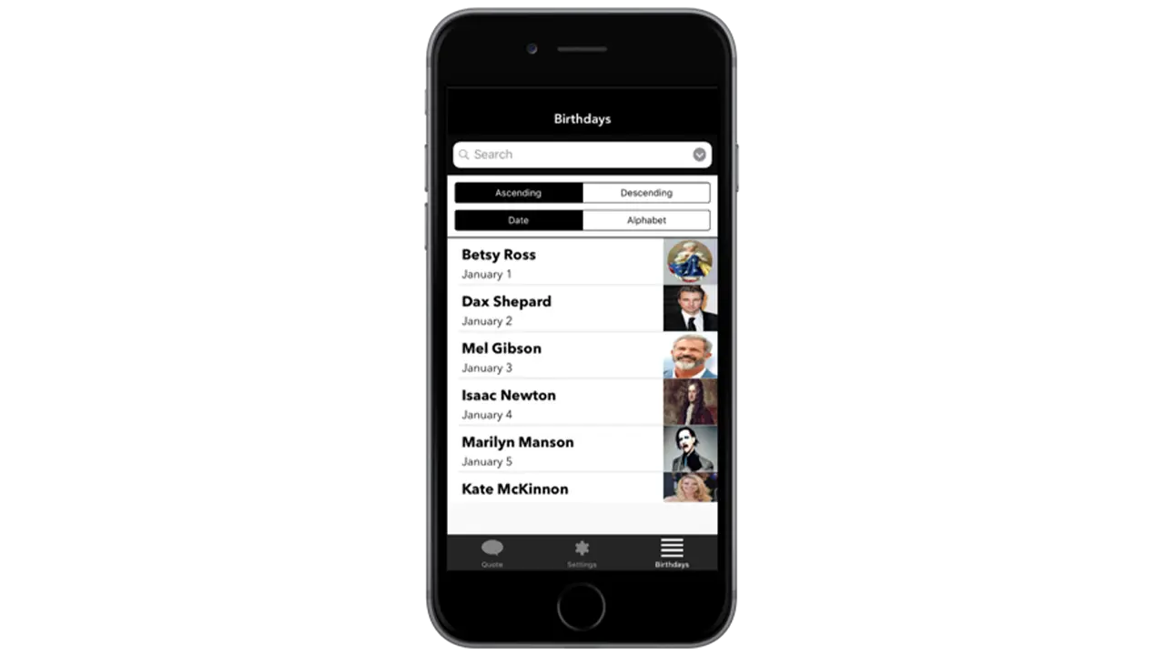
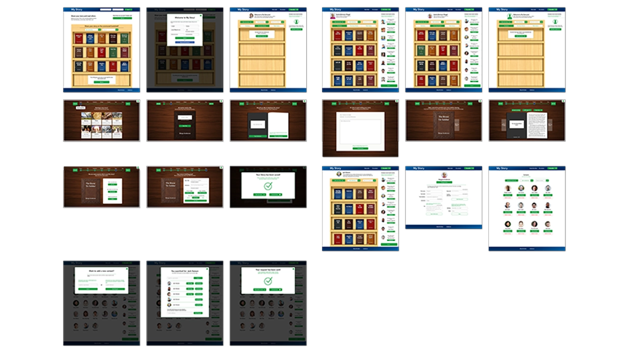
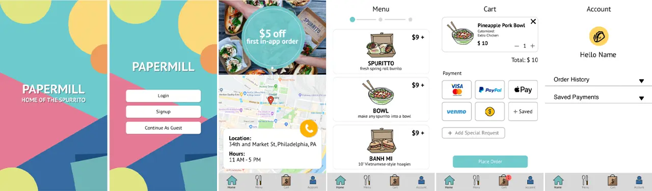
We added a splash page so that the user can get a feel for the app on its first time. The vibe we were aiming for is fun. We allow the log in and sign up to have connections with Facebook and Google because the user may prefer to have a different way to log in. For the home screen, there is a promotion so that users can know the promotions that the truck is having. There is also a map because the truck changes locations depending on the day of the week. We also showed the hours of the truck on the home page so that users can know the hours for that day. Lastly on the home screen, there is a way to call the truck in case the user needs to contact the truck directly. In the menu, there are only three different food items the user can choose so we created icons for the food and added a splash of color to continue the vibe we have in the splash page. In the individual food item menu, we kept the color scheme from the main menu to show consistency. Since the item is customizable, the user have the options to choose protein, add avocado, or add spices to their order along with a beverage item if they choose so. When you click on the customization options, you will get a wheel where you can choose the amount or protein you want on the order in a fun way. For the payment page, we added multiple different ways to pay for the order because each user is different in how they want to pay for their order. Carrying over from the splash page, the confirmation page keeps the vibe of the app while giving important information such as the total price and when the order will be ready. The user will then be taken to the home screen again, but this time, there is a tab on the top of the screen that shows the time that the order will be ready at. The profile page shows the user their order history and saved payments to show the user their history with the app and how they are paying. Within the order history, the user can reorder their previous order. We decided this was a good idea because users who order the same thing all the time can just order without going through the customization part again.
Results
In the end, we do think that we delivered a solid final product and it is definitely a success. After conducting usability testings as we progressed, we learned that designers mental models’ not always match users’ conceptual models. At times, users had problems understanding some of the things that we thought (as designers) would be great for users. This is where multiple usability testings helped us a lot as we kept on making changes as per the users’ needs. We divided our whole UX process into three main categories namely strategy, research and design (paired with testing). In the future, we would definitely follow this process in order to deliver a final product that is easier for the users to use.